Chapter 16 Introduction to machine learning
Machine learning (ML) is a tremendously popular method of gaining insights from data and to make predictions. It is somewhat distinct from artificial intelligence (AI) that we’ll discuss in Section 17.
16.1 What is machine learning
Machine learning is a way to automatically gain insights from data. Unlike analytical methods, such as graphs and tables, we did above, ML will “learn” from existing data with little user input, and based on the learned “knowledge” will either provide insights or make predictions. Traditionally, one tends to use the concept “machine learning” more often when making predictions, gaining insights is often just called statistics, analytics, or econometrics. But a large number of the methods overlap.
Also, the word “machine learning” is usually not used when talking about AI, large language models (LLM-s), and related methods. The name “ML” is typically reserved for “classical” ML methods.
Below I give only a brief intriduction and focus on predictions.
16.1.1 ML and AI
“Machine learning” (ML) was an extremely popular concept in 2010-s but in 2020-s, its popularity has be dwarfed by AI. But what exactly are machine learning and AI?
First, both of these terms are vague and there is nothing wrong when you talk about AI as “machine learning” and about ML as “artificial intelligence”. In practice, however, we tend to call ML methods that are relatively simple, and that get their input in terms of numbers and produce output that is also numbers, either predicted probabilities or categories. When talking about AI, people typically mean the Large Language Models (LLM-s). Unlike “classical ML”, LLM-s take the input as text and produce output that is text too.
Behind the scenes, however, LLM-s also predict probabilities–these are probabilities that the current word is followed with the next word. So if you enter a text prompt to AI, it will calculate what are the most likely words that follow your prompt.
But there are also important differences between ML and AI.
ML more produces much more consistent and well defined results. Many methods produce exactly the same results given the same data, however many times you try. This contrasts with LLM-s that every time come up with a different result.
ML methods typically rely you to provide training data, LLM-s use all available data (text) on the internet. So ML methods answer your questions based on your data, LLM-s answer your questions based on “internet knowledge”. The former is more desirable if you want your answer to be about this specific data or process, the latter is better for general questions.
ML method are (mostly) well understood, and it is known why you get the results you end up getting. But our understanding of LLM-s is rather incomplete.
Traditional ML methods are much less resource-demanding, a typical ML model may run 1,000,000 times faster and use 1,000 times less memory than when asking the same query from a LLM.
AI has very specific problems, including hallucinations and biased language. As LLM-s are language models, they are less strongly rooted in actual data. While predicting upcoming words, they may come up with claims that are not true. And because they are trained on text from “internet”, they learn all sorts of language that is out there, stereotypes, hate speech, and the like.
Note that traditional ML models are not immune to data bias either. But as you typically use your own data to train them, you have more control over such problems.
16.1.2 ML and analytics
ML is closely related to a number of analytical/statistical methods. In a sense, ML is just a branch of applied statistics that uses largely the same tools as other fields, such as econometrics or medicine. But in this context it is useful to distinguish between inference and prediction.
- inference is learning something about the world, about the process we are analyzing. For instance, “does the new drug cure the illness” is such a question. It is about a particular drug, but the question is rather general–not about a specific patient, but about all (or most) patients.
- prediction is predicting the results for particular cases. For instance, “will you heal if given that drug” is a prediction example. This example is about a single case, but you may also predict the outcome for many cases (even all cases).
Obviously, these two methods have a lot in common. Often you cannot do prediction without doing inference first. I may not be able to predict if the drug will help you, unless I know if it is effective in the first place.
But it turns out that many models that are good for inference, good for understanding the process, may not be very good for prediction, and the way around. For instance, neural networks may be very good in solving many problems, but they are extremely hard to understand. \(k\)-nearest neighbors, the model we discuss below, belongs to this group.
16.1.3 Supervised versus non-supervised methods
ML methods can be divided into two large categories: supervised methods and non-supervised methods, depending on whether you know what is the “correct” answer.
Supervised methods use data to predict the answer. Importantly, the “true answer” (often referred to as label) exists, although we may not know it. For instance, if you predict the students’ grade based on their first homework, or how long will a particular client be your cutomer are both examples of supervised learning. Even as we do not know the students’ grade, or the retention time for the customer right now, eventually there will be a “true” grade or “true” retention time.
Supervised models can be assessed based on how many predictions do they get right (see section 16.4). The more cases you get right, the better your model.
The \(k\)-NN method we discuss below is a supervised learnign method. Other popular methods include linear regression, decision trees and neural networks.
Unsupervised methods deal with cases where there is no “true” answer. A popular such method is clustering. Imagin a marketing department decides to use clustering to partition thousands of customers into three different groups. Their task is not to predict anything, but to manage a small number of marketing strategies–they can handle three different strategies, but not thousands. What is the best way to decide, which customer fits to which strategy?
Because there is no such thing as a true answer here–none of the customers walks around with marketing strategy label glued to their forehead. Hence we cannot even ask the questions like “did we get this customer right?”, and assessing the performance of non-supervised models requires different approaches.
Popular unsupervised methods include clustering and principal component analysis. On the simple end, you may count histograms and data plots as non-supervised ML methods; on the other end, the word embeddings that are fundamental tools for the large language models (LLM-s), are also constructed using unsupervised methods.
TBD: Data needed
- explanatory variables
- aka: exogenous variables, features, predictors, x-s…
- usually have many of these
- labels
- aka: endogenous variables, y-s..
- usually consider only one
16.1.4 Regression versus classification
Anothe important split runs between regression models and classification models. Both of these are supervised-type of learning where the “true” answer is of different type.
In case of regression, the label, the true answer is of numeric type. This includes income, education in years, probability the customer will leave, temperature tomorrow, and many other outcomes.
For classification or categorization, the outcome is categorical. For instance cat or dog, survived or died, cancer or no cancer, or one of a large number of college majors. In some sense the modern LLM-s belong to here too–based on your prompt and the previous words, they predict what the next word of the answer should be. So they predict one of many categories, word-by-word, and in this way come up with a textual answer.
In practice, both type of models are largely the same, and only require certain small twearks to work either for classification or regression. For instance, \(k\)-NN (see Section 16.3) can easily be adjusted for both tasks.
Below, we focus on classification tasks.
16.2 Decision boundary and decision boundary plot
It is very helpful to visualize classification tasks using decision boundaries and decision boundary plots. Imagine a dataset that contains three columns: x, y (numeric) and color (categorical). We know x and y for all points (these are predictors), but we know the color for only some of the points.
Take a look at the figure below. At left, it depicts the dataset as a scatterplot, with x and y on coordinate axis and color represented by color. We know the color for most datapoints–it is either green circle or red cross. But there two points where we do not know the color, labeled as gray “A” and “B”. The model’s task is to classify these two points. How would you do that?
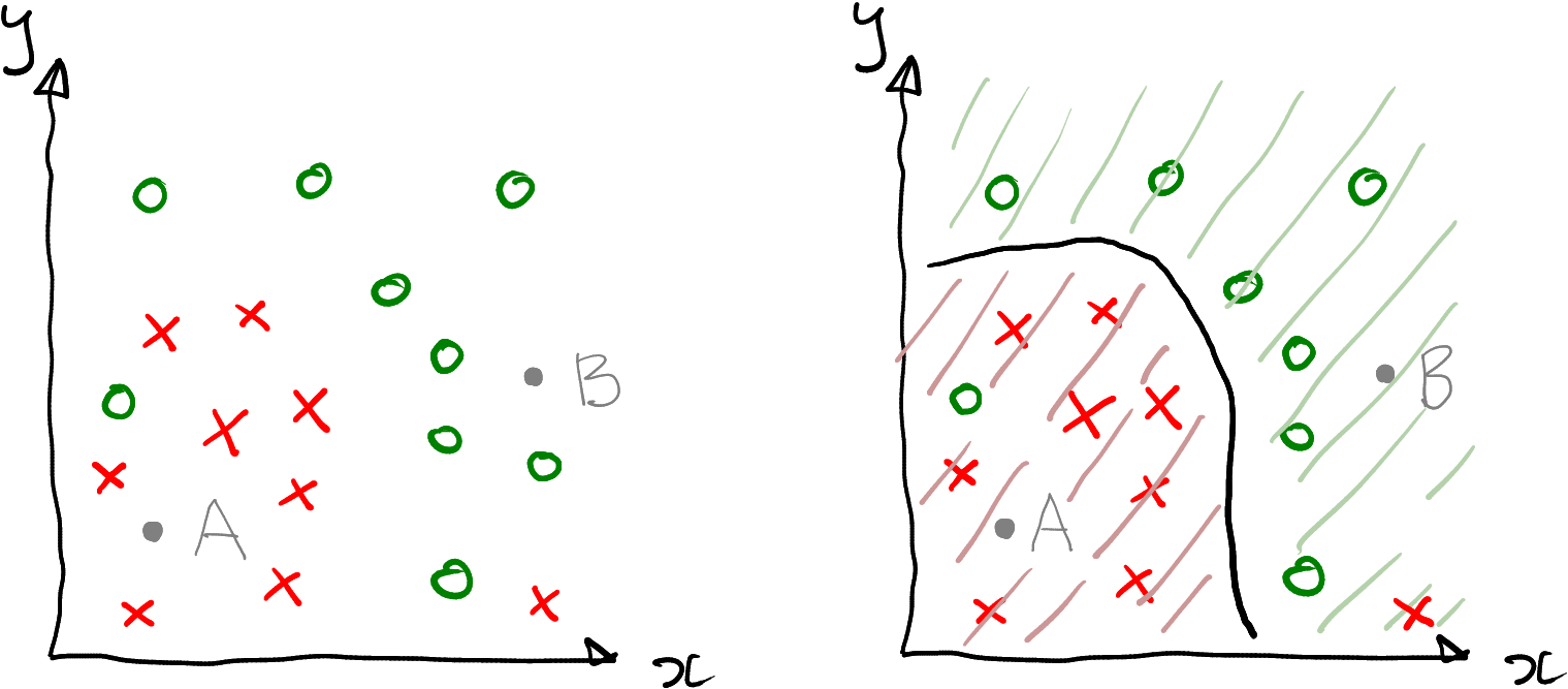
A simple 2-dimensional dataset where the task is to categorize data points into red crosses and green circles.
It is intuitive to red cross to “A” and green circle to “B”–after all, “A” is located in a “red region” and “B” in a “green region”. Even more, it makes sense to classify all points at lower-left part of the figure as reds, and everything upper-right part of the figure as greens.
At right, this idea is formalized as decision boundary. This is the thick black curve that separates the red and the green datapoints. In this example we classify all possible datapoints down-left of the boundary as red, and everything up-right of it as red. The corresponding regions are marked with green and red stripes accordingly.
Note also that this boundary misses two points–there is one green circle in the red area, that would be mis-classified as red; and one red cross in the green area, that would be mis-classified as green. Decision boundary may not classify all datapoints correctly. It is just the boundary between different kind of decisions (here either red or green), but the decisions themselves may be wrong. In practice, the common models tend to get most of the decisions right, but not all of them.
Decision boundaries are model-specific–different models, when trained on the same data, will result in different decision boundaries. In real applications we want to use models that are as precise as possible–but we also do not want the models to overfit (see Section 16.5).
Decision boundary plots are very very useful to visualize and understand how the models work. However, these can only be used for 2-D datasets. In 3-D, you need to visualize complex boundaries in space that splits the space in regions of different color. The result will probably look great but incomprehensible. In higher dimensions, it is altogether impossible to visualize decision boundaries.
Section 16.3.3 below demonstrates the decision boundary for a simple and popular nearest neighbor method.
TBD: exercise, maybe about male/female height and decision boundary?
16.3 A method example: \(k\)-nearest neighbors
This section demonstrates machine learning using \(k\)-nearest neighbor method. It covers predictions and decision boundary.
16.3.1 \(k\)-NN: the idea
The idea of \(k\)-nearest neighbors is simple: each datapoint will be categorized into the same group as its closest neighbors.
Look at the figure below. It displays a 2-D dataset with 9 datapoints, four reds, four greens, and one unknown (gray). If you pick the single closest neighbor (left), you would classify the unknown point as red, because its closest neighbor is red. This method is called nearest neighbors or 1-NN. However, if you pick three closest neighbors, it will have two green and one red neighbor. You would consider it to be green, as the two green dots “outvote” the single red (it is called majority voting). This method is called three-nearest-neighbor or 3-NN.
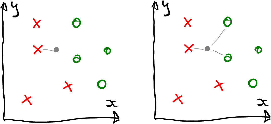
The unknown (gray) datapoint is classified as red based on the single closest neighbor, or as green if using three closest neighbors.
So the results of \(k\)-NN depend on the choice of \(k\). Normally you do not know what is its “correct” value (or more likely, the “best” value), it is something you have to figure out through modeling and testing. \(k\) is called hyperparameter, a parameter that is not interesting in terms of your results, but something you need to figure out in order to get the best results.
16.3.2 \(k\)-NN in R
Next, let’s demonstrate how to use \(k\)-NN in R using yin-yang data.
16.3.2.1 The basics
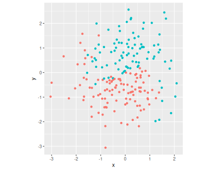
For a quick overview, let’s first plot the data. As the color c is coded as a number (0/1), I turn it into a factor for better plotting. c also has to bee a factor later when modeling with \(k\)-NN.
yinyang <- read_delim(
   "data/yin-yang.csv.bz2") %>%
   mutate(c = factor(c))
               # turn c to categorical
yinyang %>%
   ggplot(aes(x, y, col = c)) +
   geom_point(size = 2, alpha = 0.8) +
   coord_fixed() +
   theme(legend.position = "none")
The plot displays datapoints of two colors, arranged somewhat in
Yin-Yang pattern. (I have chosen to make the dots a little larger
(size = 2) and a little transparent (alpha = 0.8).
Note also that the boundary between the dots is not
quite clear but includes some orange dots “trespassing” into the green
area
and the way around. Obviously, the decision boundary should run
broadly follow the curved orange-green boundary line.
Next, it is time to use \(k\)-NN to make predictions. There are several
libraries in R that can do \(k\)-NN,
here we use
class library.
The important function in class is the
function knn(train, test, cl, k). The arguments are:
- train: training data. This is the set of datapoints where we know the correct color, currently either orange or green (coded as “0” or “1”). It should be a data frame of the predictors, here the columns x and y.
- test: validation data. These are the datapoints, color of which is to be predicted. These are either the points where we do not know the color and want to use the model to predict it; or maybe these are the points where we know the correct value, but we want to check (validate) how well does the model do in terms of getting the correct values.
- cl: classes. These are the known color values that correspond to the train datapoints.
- k: number of neighbors to consider.
Next, let’s train the model on the existing dataset and predict the color values on locations \((-2, 2)\), \((-1, 1)\), \((0, 0)\), \((1, -1)\) and \((2, -2)\). Finally, we can make a plot to see how well do the predicted colors align with the pattern of dots on the image. I am using a single neighbor, \(k = 1\) for this exercise.
16.3.2.2 Training the model and displaying its output
We can perform \(k\)-NN in the following fashion:
first, load the library and build the training data–the data that includes known color:
Here I call the coordinates (predictors) X and the colors y. X is the data that will be used by the model to predict the color at that location, and it is using values of both X and y to “learn” what location should be of what color.
Next, create the data frame of locations where we want to predict the color:
##    x  y
## 1 -2  2
## 2 -1  1
## 3  0  0
## 4  1 -1
## 5  2 -2
So newdata is a list of locations as discussed above.
Now it is time to fit the model.
knn()takes first training data X, thereafter the new data to predict on data, the known colors that are part of the training dataset y and finally the number of neighbors 1. It returns the colors, predicted for newdata:Here I add the predicted colors yhat as a column c to newdata. Now newdata also includes columns x, y and c, exactly as the training data, this simplifies the plotting below.
Finally, let’s plot both the original and predicted data points:
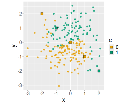
yinyang %>%
   ggplot(aes(x, y, col = c)) +
   geom_point(size = 2, alpha = 0.8) +
   coord_fixed() +
   geom_point(data = newdata,
              aes(fill = c),
              color = "black",
              pch = 22, size = 4)
The predicted data points (the second
geom_point()) are marked as color-filled (fill = c) rectangles (pch = 22) with black boundary instead of circles.The predictions look very sensible–in orange areas they are orange and in green areas they are green. The prediction at \((0, 0)\) is orange, it is hard to tell what it ought to be as that point is exactly at the boundary of green and yellow regions.
This example captures the basics of \(k\)-NN (and predictive modeling in general) — you used training data (X and y) in order to predict values on unknown location.
16.3.3 \(k\)-NN decision boundary
Decision boundary plot (see Section 16.2) is a way to demonstrate what values does the model predict in what region.
In the previous example, we used the model to predict the color in five different locations only (the black-framed boxes). But what about if we cover the whole are with such boxes, and predict the color in all of them? Let’s proceed with this idea step-by-step.
To begin with, let’s make a \(3\times3\) grid and mark the predicted values there. A convenient way of creating the grid is to merge two sequences (see Cartesian join in Section 14.1.4.4). For instance, we can create a grid that covers numbers \(-1, 0, 1\), both along \(x\) and along \(y\) as:
##    x  y
## 1 -1 -1
## 2  0 -1
## 3  1 -1
## 4 -1  0
## 5  0  0
## 6  1  0
## 7 -1  1
## 8  0  1
## 9  1  1
As a result, we get a \(3\times3\) grid that contains all combinations of -1, 0, 1 for both \(x\) and \(y\).
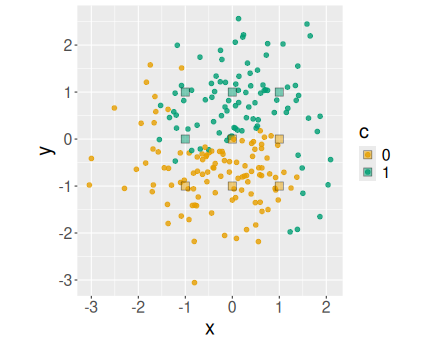
We can use the same code as above, except for the newdata we now use grid:
yhat <- knn(X, grid, cl = y, k = 1)
grid$c <- yhat
yinyang %>%
   ggplot(aes(x, y, col = c)) +
   geom_point(size = 2, alpha = 0.8) +
   coord_fixed() +
   geom_point(data = grid,
              aes(fill = c),
              color = "black",
              alpha = 0.5,
              pch = 22, size = 4)
The black-framed boxes are now arranged neatly on a grid. As you can see, the results are meaningful with orange grid rectangles in orange areas and green rectangles in green areas.
I have also chosen to make the grid points semi-transparent (alpha = 0.5),
in order
to make the data points underneath better visible.
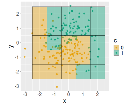
But instead of marking the grid points with fixed-size squares, we can
use ggplot’s geom_tile(): this geom automatically fills all the
space with the grid points:
grid:
## Make 5x5 grid
ex <- data.frame(x = -2:2)
               # -2, -1, 0, 1, 2
ey <- data.frame(y = -2:2)
grid <- merge(ex, ey)
yhat <- knn(X, grid, cl = y, k = 1)
grid$c <- yhat
yinyang %>%
   ggplot(aes(x, y, col = c)) +
   geom_point(size = 2, alpha = 0.8) +
   coord_fixed() +
   geom_tile(data = grid,
             aes(fill = c),
             color = "black",
             alpha = 0.4)
Now you can see a \(5\times5\) array of grid points that fill all the available space. The black boundaries are just marking the grid point boundaries. Transparency ensure that you can see the actual data points underneath.
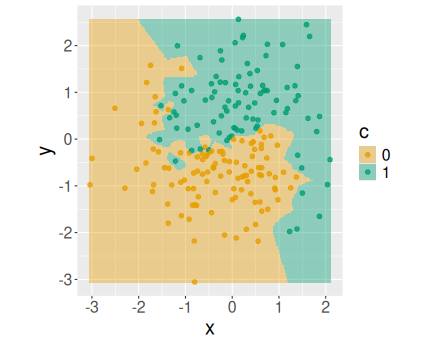
A smooth decision boundary plot of nearest neighbor model.
The \(5\times5\) grid above was quite crude. We get a much smoother picture by picking a finer grid, for instance \(200\times200\).
nGrid <- 200
## 200 points between smallest
## and largest valuee
ex <- data.frame(
   x = seq(min(X$x), max(X$x),
           length.out=nGrid))
ey <- data.frame(
   y = seq(min(X$y), max(X$y),
           length.out=nGrid))
grid <- merge(ex, ey)
yhat <- knn(X, grid, cl = y, k = 1)
grid$c <- yhat
yinyang %>%
   ggplot(aes(x, y, col = c)) +
   geom_point(size = 2, alpha = 0.8) +
   coord_fixed() +
   geom_tile(data = grid,
             aes(fill = c),
             col = NA,  # no border
             alpha = 0.4)
Here I
have chosen to create the grid with 200 equally spaced data points
between the minimum and maximum values of \(x\) and \(y\) respectively.
Besides a different grid, I also remove the border of tiles by setting
col = NA.
Exercise 16.1 Use iris data.
- Pick two features, petal length and petal width and predict to predict species using 1-NN (the single nearest neighbor). Make decision boundary plot. Based on the plot, how well can you separate virginica and versicolor? What about setosa and virginica?
- Now try two other features, e.g. sepal length and petal width. Do you get different conclusions?
16.4 Confusion matrix: how good are the predictions?
In the previous example, we created a model and predicted the color of the results. But how good are the predictions? Perhaps the most intuitive answer to that question is to look at accuracy.
16.4.1 Accuracy
Accuracy is just the percentage of correct predictions. Above, we
called the predicted values yhat, and we just need to check what
percentage of yhat equals to the actual outcome variable y. The
simplest way to do this is by computing of average of yhat == y (see
Section 6.6).
Here a small example, we model the yin-yang data using 3-nearest neighbors:
## [1] 0.94So we got 94 percent of predictions correct.
However, if we use 5-NN, we get
## [1] 0.9355-NN gets slightly fewer cases right, only 93.5 percent.
Note how we have given knn() the argument X twice as knn(X, X, ...). The first X tells the function which values to learn, the
second one which values to predict. Here it is important that we
predict values on the same X as these correspond to the y values
we already know. Without knowing y, we cannot tell if the
predictions are correct.
16.4.2 Confusion matrix
Accuracy is an easy and intuitive figure. But the model can be imprecise in two ways–by predicting a green dot to be orange, or by predicting an orange dot to be green. Accuracy does not distinguish these cases. Also, sometimes most of the dots are of one color, and in this way high accuracy does not show that the model is good–it only shows that most datapoints are either green or orange.
A more comprehensive picture is given by confusion matrix.
Confusion matrix is just a cross table of predicted and actual values,
and it tells the exact number of greens that are predicted green and
the exact
number of greens, predicted as orange. Confusion matrix can be
created with function table(), a generic function for cross-tables.
Here a confusion matrix of the
examples from above:
##          actual
## predicted   0   1
##         0 104   7
##         1   5  84
The columns of the table represent the actual (correct) values, and rows the predicted values.28 So the model predicts 104 actual “0”-s correctly as “0” (zeros are orange in the decision boundary plots above), but in 7 cases an actual “0” is mistakenly predicted as “1” (green). It also gets 84 actual “1”-s (greens) right, out of 91 in total.
When talking about confusion matrix, it is customary to label one of the outcomes as “positive” and the other as “negative”. “Positive” is typically the outcome we are more interested in, it does not need to be the outcome we like more.29 Here we can call zeroes as “negative” and ones as “positive”.
| Actual | |||
|---|---|---|---|
| Negative (0) | Positive (1) | ||
| Predicted | Negative (0) | True Negatives | False Negatives |
| Positive (1) | False Positives | True Positives |
- True Negatives (TN) are actual negatives that are correctly predicted as negative.
- True Positives (TP) are actual positives that are correctly predicted as positives.
- False Positives (FP, type-1 errors) are actual negatives that are falsely predicted as positive.
- False Negatives (FN, type-2 errors) are actual positives, that are falsely predicted as negative.
False predictions are labeled according to what is predicted: false negatives are predicted negatives that are incorrect (actual positives); false positives are predicted positives that are incorrect (actual negatives).
In the \(k=3\) example above, we had 104 true negatives, 84 true positives, 5 false positivs and 7 false negatives. Obviously, a good model will have many true positives and true negatives, and very few false positives and false negatives.
Confusion matrix will give more insight about why one model is better than another. For instance, here is the confusion matrix for \(k=5\) case:
##          actual
## predicted   0   1
##         0 105   9
##         1   4  82
Now we got TN = 105, more than previously. But “1”-s are not as good, TP = 82. Also, now we have many more false negatives than false positives; previously the number of type-2 and type-1 errors was more similar.
16.5 Overfitting and validation
16.5.1 Overfitting
But what percentage of predictions is correct when you use 1-NN? Let’s find it out:
## [1] 1so we get all 100% right! This can be confirmed with confusion matrix:
##          actual
## predicted   0   1
##         0 109   0
##         1   0  91
Indeed–all is correct, no “0” are predicted as “1” and vice versa. How came?
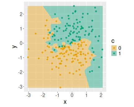
The decision boundary for 1-NN model. Every data point carves out its own little island. The accuracy is 100% because every point is closest to itself.
Here it is instructive to look at the decision boundary plot again (see Section 16.3.3).
You can see that the boundary is quite elaborate. Every green point has its own “cops” around it, and every yellow one has its own “sandbar”. This is because we only look at the closest point, and every point has a certain neighborhood where it is the closest one. So if we check the model predictions in that neighborhood, we’ll get the correct results.
But here we check the models’ predictions at the point itself. We
train the model on points X, and then we ask for the predictions at
X again. So obviously we’ll get correct results–every point is
always its own closest neighbor.30
But in real life we are not that much interested in model’s predictions on known data points. After all–why do you want to predict something that you know anyway? The whole point of predictive modeling is to tell something we do not know, i.e. to predict the color of points that are unknown. So the 100% accuracy on known data points is misleading. In fact \(k\)-NN effectively memorizes the training data, and if “asked questions” about it, it responds perfectly.
Instead of evaluating the models on training data, we need to evaluate them on unknown data.
16.5.2 Validation
But how can you tell whether a prediction on unknown datapoint is correct or not? After all, it is unknown.
Fortunately, it is not so bad. What we need is a datapoint that the model does not know, you as a data scientist may well know it. So if you only show a certain datapoints to the model, while keep the others in secret (for the model), you can use those for the test. This is the idea of training-validation split31
A simple way to validate the model is just to split the data into two parts: training data (typically 80% of total) and validation data (typically 20% of total). First you use only training data to train the model, and thereafter use validation data to test the model. Crucially, you know the correct results for validation data, but the model has not seen those.
First, we need to split the dataset. The split should be random,
i.e. you should not take the first 80%, or the last 80% as the
training data. A good way to achieve this is to create a vector of
random indices. If your dataset’s size is nrow(X), 80% of it can be
randomly selected by 0.8*nrow(X).
A random sample from a set of numbers can be made using the function
sample(). For instance, if you want to pick three random numbers
between 1 and 10, you can do32
## [1] 3 8 6(Note that the numbers are just random, and not ordered in any way.)
So here we want to find 0.8*nrow(X) random numbers from nrow(X)
rows. I call the vector of the rows it for “training index”:
## [1] 10 87 107 104 94 55 183 53 67 144You can see that the numbers are, indeed, between 1 and 200. These
can be used as the base-R data frame and vector indices (see Sections
12.3.3 and 6.4.1), or as
the indices for the dplyr’s slice() function
(see Section 13.6.2.4).
Now we can extract the rows, indexed by it as training data, and
those that are not indexed by it as validation data. R has a handy
way to achieve the latter–just use -it as the index. Below, I am
using base-R bracket indexing:
Xt <- X[it,]  # training features
Xv <- X[-it,]  # validation features
yt <- y[it]  # training labels
yv <- y[-it]  # validation labels
Now we can train on training data, and predict on validation data.
I call the predictions on validation data yhatv for \(\hat{y}_v\).
For a reminder, knn() expects the arguments to be knn(training features, prediction features, training labels, k). So we can
compute the validation accuracy:
## [1] 0.85Now the accuracy is not 100% any more.
But we can still compute training accuracy by predicting on the training data Xt:
## [1] 116.5.3 Find the best \(k\)
Now you learned that \(k = 1\) will give you perfect predictions on training data, but on the much more important validation data, the predictions are not as good. But which \(k\) value will give the best validation predictions?
There is no other way to find it out than just to try: compute the predictions and accuracy for a large number of \(k\)-s, and either compare the results, or even better–make a plot.
To begin with, you can just print the validation accuracy in a loop:
## 1 0.85
## 2 0.825
## 3 0.925
## 4 0.95
## 5 0.9
## 6 0.85
## 7 0.85
## 8 0.85
## 9 0.85
But it is instructive not just to look at the validation results, but to compare those with training results as well. Below, I will compute both results, store those in vectors, and combine those into a data frame:
ks <- 1:9
At <- Av <- numeric()  # empty containers for training/
               # validation accuracy
for(k in ks) {
   yhatt <- knn(Xt, Xt, yt, k = k)
   At[k] <- mean(yhatt == yt)
   yhatv <- knn(Xt, Xv, yt, k = k)
   Av[k] <- mean(yhatv == yv)
}
data.frame(k = ks, Av, At)
## k Av At
## 1 1 0.850 1.00000
## 2 2 0.800 0.95625
## 3 3 0.925 0.96250
## 4 4 0.900 0.93750
## 5 5 0.900 0.94375
## 6 6 0.825 0.93750
## 7 7 0.850 0.93125
## 8 8 0.850 0.92500
## 9 9 0.850 0.92500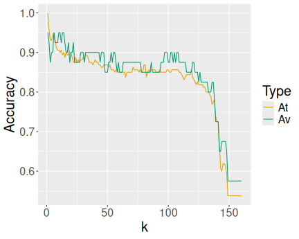
Finally, instead of printing the data frame, I’ll plot both accuracies as a function of \(k\) over the whole possible range of neighbors, 1–160, determined by the number of points in training data:
ks <- 1:160
## empty containers for
## training/validation accuracy:
At <- Av <- numeric()
for(k in ks) {
   yhatt <- knn(Xt, Xt, yt, k = k)
   At[k] <- mean(yhatt == yt)
   yhatv <- knn(Xt, Xv, yt, k = k)
   Av[k] <- mean(yhatv == yv)
}
data.frame(k = ks, Av, At) %>%
   pivot_longer(c(Av, At),
                names_to = "Type",
                values_to = "Accuracy") %>%
   ggplot(aes(k, Accuracy, col = Type)) +
   geom_line()
Initially, the data is in the wide form–accuracy is in two columns (At and Av). I pivot it to long form with different type of accuracy called Type (see Section 14.2). This is followed by a basic ggplot’s line plot.
You can see a basic decreasing pattern. Larger \(k\) tends to lead to worse results. Initially, at very small \(k\) values, the training accuracy exceeds validation accuracy, that is the region where we overfit. The best \(k\) values seem to be around 15.
Such process–splitting data into training and validation parts, training the model on training data and computing accuracy on validation data, is a very common task when you work with machine learning. You are trying to build the best model–and you need to know what \(k\), or what all other parameters you should choose. While more complex models have many more parameters, the basic idea, called hyperparameter tuning, remains the same.
Different sources do it differently: you can see confusion matrices where actual values are in columns but also in rows. You can see cases where “0” precedes “1” but also cases where “1” precedes “0”. All this makes confusion matrix more, well, confusing.↩︎
For instance, in medicine, it is customary to talk about “positive test result” if the test shows that you have the disease. So “positive” result may be bad news.↩︎
This may not be true if there are overlapping data points with different color.↩︎
It is also frequently called “training-testing split”. I prefer the word “validation” over testing because a) it aligns better with the method of “cross-validation”; b) it leaves the word “testing” for the final test with hold-out data; and c) the first letter of validation is “v”, not “t” as for “training” and “testing”. This allows for shorter variable names.↩︎
By default,
sample()returns the random numbers without replacement. This is exactly what we want for extracting a certain number of random rows from a data frame.↩︎