Chapter 16 Making maps: displaying spatial data
ggplot’s functionality can be easily applied to create maps. Maps are largely polygons filled with certain colors (e.g. administrative units or lakes), and amended with various line segments (e.g. rivers), dots (e.g. cities) and text. ggplot possesses all these tools. This section explains how to use most important ones of these.
16.1 Simple maps with ggplot
ggplot gives you access to a number of basic maps, such as the world map or the map of France. But before we use any of these, it is very helpful to make one out of scratch. This will explain all the tricks that you need to know, such as polygons, groups, order, and id-s when you use the ready-made maps.
16.1.1 How maps are made: a hand carved example
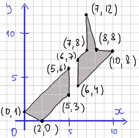
The map is made of lines that connect vertices. The picture demonstrates the vertices, lines, and polygons on a 2-D plane and indicates the coordinate pairs for each vertex. For instance, in the lower-left corner there is a line that connects point (0,1) to (2,0). The two polygons (South Island and North Island) are filled with gray.
If we want to plot this data as a map we should just draw the black lines that connect the vertices. We have to ensure though that we get these details right:
- We must be careful to only connect the
lines that correspond to the coastline of each island, we should not
draw a line across the sea from one coastline to the other.
- We must connect the points in the correct order, not in a criss-cross manner.
- And finally, we have to ensure that the polygons are closed, i.e. the last vertex of each polygon is connected to its first one.
Next, let’s create this map. We start with creating a data frame of the vertices. This is a little tedious process as data frames expect x and y to be given separately while for us it is easier to think of those as pairs. So if you need to make a somewhat larger map, you may want to enter data in a spreadsheet instead. But here is the R code:
nz <- data.frame(x = c(0, 2, 5, 5,  # south island
                       6, 10, 8, 7, 7, 6),  # north island
                 y = c(1, 0, 3, 6,  # south island
                       4, 8, 8, 12, 8, 7))  # north island
nz
## x y
## 1 0 1
## 2 2 0
## 3 5 3
## 4 5 6
## 5 6 4
## 6 10 8
## 7 8 8
## 8 7 12
## 9 7 8
## 10 6 7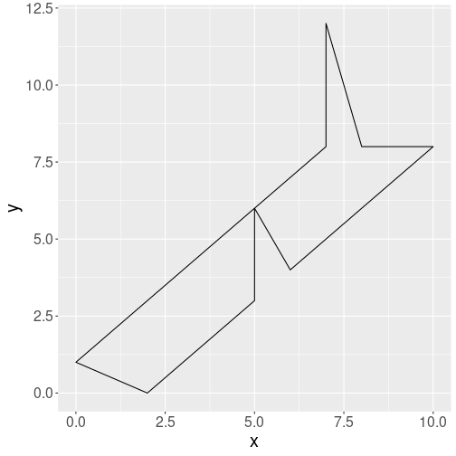
Plotting map data as a single polygon.
Now the data is ready and we can plot it using polygons:
geom_polygon() connects the vertices with lines in a similar manner
as geom_path() (see Section 14.9.3).
However, it also connects the last vertex to the first one, and allows
the polygons to be filled with color. Here
we ask the outline to be drawn in black, and the polygons not to be
filled (fill = NA).
But the result has serious problems. In particular, it connects both
islands by drawing a line from the last vertex of South Island to the
first vertex of the North island.
This is not surprising as we did not tell ggplot in
any way which points form separate islands. Note that geom_polygon
connected the last and first vertex automatically. Also, importantly,
we entered
the vertices in the correct order, and hence we got a nice coastline plot.
Next, let’s fix the island connection problem. This requires adding an island-id, an id that tells which vertex belongs to which island. This id is typically called group and consists of a numeric id. However, we can give it also more descriptive values, e.g. “south” and “north” to denote the south and north island respectively:
nz$group <- c("south", "south", "south", "south",
              "north", "north", "north", "north", "north", "north")
nz
## x y group
## 1 0 1 south
## 2 2 0 south
## 3 5 3 south
## 4 5 6 south
## 5 6 4 north
## 6 10 8 north
## 7 8 8 north
## 8 7 12 north
## 9 7 8 north
## 10 6 7 north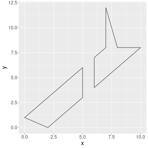
Plotting two separate polygons
Thereafter we tell ggplot that
each group is a separate polygon by using group aesthetic:
Indeed, we got the two islands separated: now geom_polygon()
understands that vertices labeled “north” belong to one polygon, and
should not be connected to vertices labeled “south”.
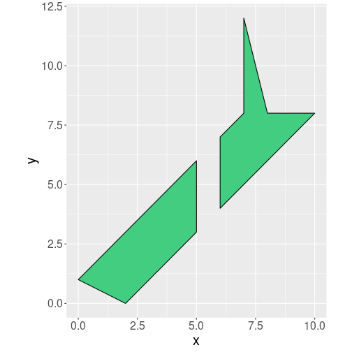
Finally, in order to avoid distorted maps, we use
coord_quickmap to ensure that the lengths correspond to the real map
lengths. We also fill the islands green:
coord_quickmap() is a handy tool for quick maps, but you can also
choose from many other map projections using coord_map(). See the
relevant documentation.
The result is fairly similar to real maps, except that our manually designed coastline is far too simplistic. But now we have all the tools we need to plot real maps given we get the suitable data.
16.1.2 Displaying data on maps
It is great that we now can plot a green map of New Zealand. But this alone is not very interesting. There are plenty of better maps already available. We want to use this map to display spatial data.
Imagine we want to display the weather map, and the temperature on North Island is 17C and on South Island it is 14C. A simple option is just to add this column to our map data:
##     x  y group temp
## 1   0  1 south   14
## 2   2  0 south   14
## 3   5  3 south   14
## 4   5  6 south   14
## 5   6  4 north   17
## 6  10  8 north   17
## 7   8  8 north   17
## 8   7 12 north   17
## 9   7  8 north   17
## 10  6  7 north   17
Here we just use ifelse() (see Section 10.3.3)
to assign value “17” for every data line where group is “north” and
“14” to all other lines.
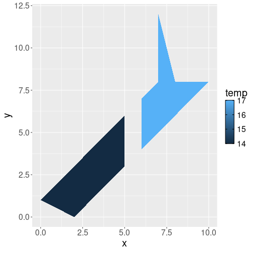
Map with regions colored by temperature.
We can achieve this by just speficying that we want to map data variable temp to the fill color:
But such approach–manually creating data column in the map data–is very inconvenient for anything resembling a real-world dataset. Temperature data is always loaded from another source and should be merged with map data. Let us now do this.
First, here is temperature data:
##   island temp
## 1  north   17
## 2  south   14
How can we merge this to the map data? The result should be similar what we got when we did above: it should be a dataset of one vertex per row, and there should be an additional column for temperature, that displays the corresponding temperature data. Here we need to use the island as the merge key–the island name is what connects polygons in the map data with the temperature in the temperature data. do not have
##    group  x  y temp
## 1  north  6  4   17
## 2  north 10  8   17
## 3  north  8  8   17
## 4  north  7 12   17
## 5  north  7  8   17
## 6  north  6  7   17
## 7  south  0  1   14
## 8  south  2  0   14
## 9  south  5  3   14
## 10 south  5  6   14
Exercise 16.1 The example here preserved only rows with matched keys. But in other
cases,
do you want to use all.x = TRUE, all.y = TRUE or something else
when performing the merge above? (inner, outer, left or right join?)
Explain!
Now we have automatically created a similar dataset as what we manually made above.
16.1.3 Bonus maps: map_data()
Fortunately we do not have to create maps manually. ggplot includes a few common maps, and there are straightforward tools to load standard map data, such as what you can dowload from the websites.
ggplot can directly access maps in the package maps using function
map_data(). First you need to install that package, or you’ll see
an error message
Error in
map_data(): ! The package “maps” is required formap_data()
(See Section 5.6 for how to install packages.) For instance, the world map can be accessed with
##        long      lat group order region subregion
## 1 -69.89912 12.45200     1     1  Aruba      <NA>
## 2 -69.89571 12.42300     1     2  Aruba      <NA>
## 3 -69.94219 12.43853     1     3  Aruba      <NA>
## 4 -70.00415 12.50049     1     4  Aruba      <NA>
## 5 -70.06612 12.54697     1     5  Aruba      <NA>
## 6 -70.05088 12.59707     1     6  Aruba      <NA>
This dataset is very similar to what we constructed for New Zealand above. The variables long and lat denote longitude and latitude (we used x and y above), and group is also the same as what we used above to distinguish between islands. There are a few differences we need to discuss though.
- Most importantly, order denotes the order by which the points must be connected. In case of the NZ map above, we created the vertices in the correct order. The same is true here–the vertices are in correct order, but the order may be violated after certain operations, for instance after merging map data with some other kind of data. If this is the case, then we can use the order variable to restore the order (but remember to group by group—the order is valid within each group!).
- The map distinguished between group and region. group is a
technical concept that tells
geom_polygon()which vertices to connect, region is country name. This matters in case if multiple polygons belong to the same country like in case of New Zealand that consists of multiple islands. Islands (group-s) must be drawn as separate polygons, but if you want to color the countries by their GDP, all New Zealand (region) should be of the same color. - Finally, the map also contains subregion, name of political subdivisions, such as the U.S. states (Aruba does not have any subregions).
We can plot the map as
ggplot(world, aes(long, lat, group=group)) +
   geom_polygon(
      fill = "seagreen",  # fill color
      col = "black",  # border color
      linewidth = 0.3) +
   coord_quickmap()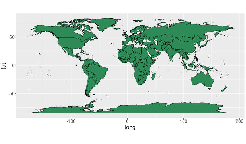
A quick world map with ggplot.
Next, let’s put some kind of data on the map. Here we use country-concept similarity data. This dataset contains similarity measures between country names and a set of different words. It looks like
## # A tibble: 2 × 12
##   country   terrorism nuclear  trade battery  regime volcano  palm
##   <chr>         <dbl>   <dbl>  <dbl>   <dbl>   <dbl>   <dbl> <dbl>
## 1 aruba        0.0891  -0.011 0.0504 -0.01   -0.0356   0.166 0.293
## 2 afghanis…    0.447    0.220 0.109   0.0578  0.180    0.129 0.116
## # ℹ 4 more variables: fir <dbl>, flood <dbl>, drought <dbl>,
## #   mountain <dbl>
It contains a list of country names (column country), and a list of words (terrorism, nuclear, trade and so on). The numbers are measures of similarity between the country name and the corresponding word. It is out of scope of this book to discuss how the similarity is calculated, but to but it broadly–it means how often these words are used in a similar context. For instance, “Aruba” and “terrorism” are less similar (similarity 0.891) than e.g. “Aruba” and “nuclear” (similarity -0.011).
Before we can plot the similarity data on a map, we have to merge to map data with similarity data. But note that that the map data is much larger (99338 rows) than similarity data (252 rows). This is because the map data contains one data point for each vertex–each turn of the coastline and political boundary, while the similarity data only contains a single value for each country. Hence we want to merge the map data in a way that we keep all world data points, and assign the same similarity value for each map datapoint that describes the same country. Also note that the merge key–the information that connects the map and similarities–is the country name (See section 15.1 for more about merging data). We also need to ensure that the country names have the same case, here we need to convert the world map country names to lower case. We can achieve this with:
similarityMap <- world %>%
   mutate(country = tolower(region)) %>%
   merge(similarity, by = "country", all.x = TRUE) %>%
   arrange(group, order)
The few lines of the result look like:
##   country      long      lat group order region subregion
## 1   aruba -69.89912 12.45200     1     1  Aruba      <NA>
## 2   aruba -69.89571 12.42300     1     2  Aruba      <NA>
## 3   aruba -69.94219 12.43853     1     3  Aruba      <NA>
##   terrorism nuclear  trade battery  regime volcano   palm    fir
## 1    0.0891  -0.011 0.0504   -0.01 -0.0356  0.1659 0.2927 0.0965
## 2    0.0891  -0.011 0.0504   -0.01 -0.0356  0.1659 0.2927 0.0965
## 3    0.0891  -0.011 0.0504   -0.01 -0.0356  0.1659 0.2927 0.0965
##    flood drought mountain
## 1 0.0158  0.0581   0.1073
## 2 0.0158  0.0581   0.1073
## 3 0.0158  0.0581   0.1073
You can see that the three first Aruba vertices all have similarity 0.0891 with “terrrorism”.
The result is just what it is supposed to be–a combination of the map data and word similarity data.
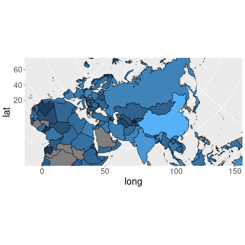
Finally, we can make a plot as we did above, but this time filling the polygons by a given word, e.g. by “trade”:
ggplot(similarityMap,
       aes(long, lat, group=group, fill=trade)) +
   geom_polygon(col="black", size=0.3) +
   coord_quickmap()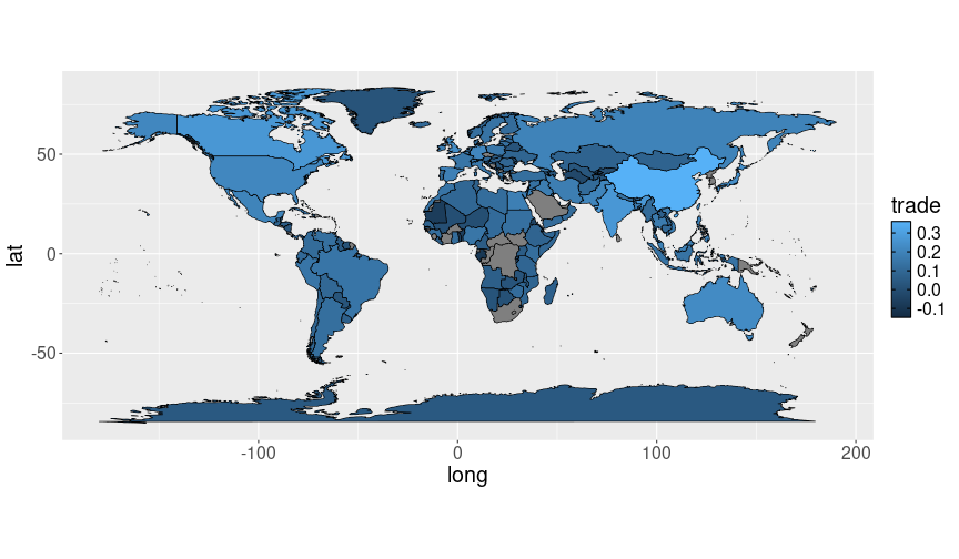
A world map where countries are colored according data, here according to how similar are the corresponding country names to the word “trade”.
We can see that the country name “China” is most often used in a similar context as “trade”, while the countries in central Asia and in Africa are not.
Exercise 16.2 Make similar plots but this time use words “fir” and “palm”. Do you see how geographic location is associated with trees?
Exercise 16.3 Merge world and similarity as above. However, this time
leave out re-ordering (arrange(group, order)).
What happens?
16.1.4 Map projections
The above examples use coord_quickmap() to make ensure the map scale
is roughly correct and the vertical/horizontal lines are of roughly
the same length. This works well for New Zealand above, but the world
map does not look very good–for instance, Greenland is about the
same size as South America, and Antarctica is enormous. This is just
not right. The problem, though, is only partially related to our
simplistic way to make maps. The main problem is elsewhere–namely,
we are trying to represent spherical Earth surface on a flat paper (or
screen). It is impossible to do it perfectly, and the smaller area
the map covers, the easier it is to make it look nice.
However, it is possible to do it better. This question–how to map
spherical Earth on flat paper–has been analyzed for centuries, and
cartographers can tell what are good ways to represent different maps,
depending on what exactly do you want to show. These ways are called map
projections, and ggplot can use those by adding + coord_map() to
the plotting command. But in
order to use those capabilities, you need to install mapproj library
(you do not need to load it, it will be loaded automatically as
needed).
mapproj offers a large number of different projections, some of which require additional arguments. Here is a few options, see the documentation of mapproj library for the complete list. We use the same world trade map as above (without legend):
map <- ggplot(similarityMap,
              aes(long, lat, group = group, fill = trade)) +
   geom_polygon(col = "black", linewidth = 0.3) +
   theme(legend.position = "none")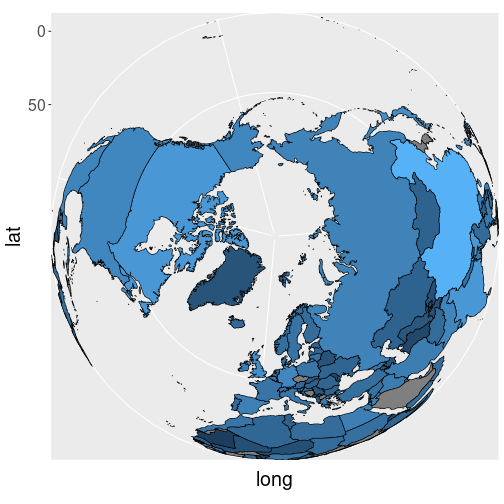
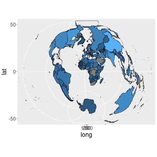
The world trade map using orthographic projection.
Orthographic projection views earth from infinity
The world trade map using Lambers projection.
Lambert projection is correct for two latitude values (lat0 and lat1). It has problems with boundaries that stretch jump from left side of the world to the right side of the world, like in case of Siberia, this is why the image only displays a subset of the world.
The world trade map using Polyconic projection.
Polyconic projection wraps the earth surface on paper in a weird manner.
There are many more options, see the documentation for coord_map() and
mapproj library for the rest.
16.2 Shapefiles and GeoJSON: using the professional maps
The example maps, included in ggplot, are fairly good, but there is only a small number of those to choose from. It is not a substitute for professional maps.
Fortunately, it is easy to use popular map files. There are multiple ways to store map data. One of the most popular formats is ESRI shapefiles (or just shapefiles). This format is widely used to store geographic data by government agencies, architects, and municipalities. You can find shapefiles for national boundaries, land use zones, and protected water bodies.
Another popular format is GeoJSON. This is an open standard, developed by geojson.org.
Below, we discuss how to use such files, using an example of Ukrainian regions.
16.2.1 Your first professional map: regions in Ukraine
In this example, we use a map of Ukrainian regions. This is stored in GeoJSON format, but working with shapefiles is very similar. The most convenient library for accessing geospatial data is sf, it also includes a nice integration with ggplot.
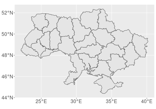
Ukrainian regions (oblasts). Map provided by Cartography Vectors.
First, let’s load the file and make the map:
library(sf)
map <- read_sf(
   "data/ukraine-with-regions_1530.geojson"
)
ggplot(map) +
geom_sf(linewidth = 0.5)- first, you need to load the sf library.
- thereafter, you load the map data.
read_sf()can load both GeoJSON and shapefiles. - finally, you can use
ggplot()to plot it.geom_sf()understands the spatial nature of the dataset and makes an appropriate plot. You can adjust it with ordinary aesthetics likelinewidth,col, andfill.
16.2.2 What is spatial data frame?
The map data we stored in variable map is a special type of data frame–spatial data frame. It is in many ways similar to ordinary data frame, but it also includes spatial data–coordinates of vertices, lines and polygons, and coordinate reference system.
Let’s take a closer look:
## Simple feature collection with 2 features and 4 fields
## Geometry type: POLYGON
## Dimension:     XY
## Bounding box:  xmin: 29.59279 ymin: 44.38104 xmax: 36.63834 ymax: 50.25143
## Geodetic CRS:  WGS 84
## # A tibble: 2 × 5
##   id    name               density path                   geometry
##   <chr> <chr>                <int> <chr>             <POLYGON [°]>
## 1 5656  Autonomous Republ…       0 /wor… ((34.97755 45.76285, 35.…
## 2 5653  Cherkasy Oblast          0 /wor… ((32.07941 50.23724, 32.…
First, the dataframe prints some overall information about the map. It tells that the map is made of polygons,35 what is it bounding box (the locations of the extreme left, right, top and bottom points), and coordinate reference system (CRS). Here it is “WGS 84”, the popular longitude-latitude coordinate system that is based on Greenwich meridian.
The data frame contains
5 variables,
id, name, density, path and geometry.
The first four are ordinary columns id, name, density and
path. The fourth one, geometry, is a special column that contains
polygons. This is the column that holds the most important map data,
and the column that geom_sf() uses to actually draw the map.
Exercise 16.4 Compare the spatial data frame map here with the manually created New Zealand map data frame in Section 16.1.1. What do you think, what is the most important difference? What other differences can you spot?
See the answer
16.2.3 Adding data to maps
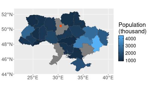
Adding data to professional maps works mostly in the same way as in case of ggplot-maps (see Section (maps-simple-data)). We need another data frame that contains polygon id-s and the value of interest. As this is a data of oblasts–each polygon is an oblast, we want to merge this with some other dataset about oblasts. The dataset ukraine-oblasts-population contains the oblasts’ population as in 2015:
## # A tibble: 3 × 4
##   Prefecture      Population `Urban population` `Rural population`
##   <chr>                <dbl>              <dbl>              <dbl>
## 1 Donetsk Oblast     4387702            3973317             414385
## 2 Dnipropetrovsk…    3258705            2724872             533833
## 3 Kyiv               2900920            2900920                 NA
This is an ordinary (non-spatial) data frame where Prefecture denotes the oblast. Here we are just interested in the column Population. Now we can merge population to the map data. Remember that the key, the oblast name, is called name in the latter:
Exercise 16.5 Why is the example using all.x = TRUE? What happens if some
population
information is missing? What happens if some oblasts are missing?
See the answer
Let’s visualize the result by printing two variables only–name and Population:
## Simple feature collection with 3 features and 2 fields
## Geometry type: POLYGON
## Dimension:     XY
## Bounding box:  xmin: 29.59279 ymin: 44.38104 xmax: 36.63834 ymax: 52.36893
## Geodetic CRS:  WGS 84
##                            name Population
## 1 Autonomous Republic of Crimea    1963770
## 2               Cherkasy Oblast    1246166
## 3              Chernihiv Oblast    1047023
##                         geometry
## 1 POLYGON ((34.97755 45.76285...
## 2 POLYGON ((32.07941 50.23724...
## 3 POLYGON ((33.29431 52.35727...
As you can see, now the column Population is included in the map data. Besides this, the map still includes CRS and the geometry column, even if we did not explicitly select the latter. This is because it is spatial data frame.

Population of Ukrainian oblasts, merged into the spatial data frame.
Finally, we can plot it:
The population is displayed in thousands as the resulting numbers are easier to grasp.
Exercise 16.6 Why is the population of three oblasts (Kiyv, Odesa and Zaporizhzhia) missing?
16.2.4 Working with different spatial files
Another task we frequently want to do is to add some other kind of data to the maps. Here we demonstrate it in only a rudimentary fashion, you can look up the more detailed instructions yourself. Let’s add the Kyiv, the capital city of Ukraine on the map as a red dot. Kyiv is located at 50°27′00″N, 30°31′24″E (lat/lon), or in decimal degrees 50.45N, 30.5233E.
This point (and more points or lines) can be added to the plot as follows:- Create a spatial data frame that contains the points requested
- Specify the coordinate referece system (CRS) for that spatial data
- Add the new data frame to the plot using another
geom_sf().
First, we create just a data frame of the coordinate. Thereafter we
convert it to a spatial data frame using st_as_sf. We can
immediately add CRS
the the result when doing the conversion:
## Simple feature collection with 1 feature and 0 fields
## Geometry type: POINT
## Dimension:     XY
## Bounding box:  xmin: 30.5233 ymin: 50.45 xmax: 30.5233 ymax: 50.45
## Geodetic CRS:  WGS 84
##                geometry
## 1 POINT (30.5233 50.45)
Here we use wgs84 as the coordinate reference system. Coordinate systems is a complicated topic, well beyond the scope of this book. To make it brief–Earth is broadly spherical, but not exactly spherical. If a high precision is required then much better models are needed than just a spherical earth. WGS 84 (World Geodetic System 1984 standard) is one of the most popular such models. It is based on longitude and latitude, and as a rule of thumb–if coordinates are given as longitude and latitude, then WGS 84 is good crs. If unsure, you can get crs of the current map using
Two spatial data frames combined: the first one contains the oblasts’ boundaries, and the second one the capital city.
Now we are ready to plot the map with Kyiv marked as a red dot:
ggplot() +
   geom_sf(data = ukraine,
           aes(fill = Population/1000)) +
   geom_sf(data = kyiv,
           col = "orangered", size = 3) +
   labs(fill = "Population\n(thousand)")
Here I have chosen to make it a way that data is only fed to the
corresponding geom_sf layer, not to the ggplot layer itself. This
is to make it more clear which layer uses which data.
16.3 Combining different layers
The previous map examples only included polygons (oblasts). The method allows to add other simple geometric objects, such as points and lines. But you may want to add much more on the map, for instance terrain or satellite images. This requires a different approach to mapping.
library(OpenStreetMap)

bbox <- st_bbox(ukraine)
terrain <- openmap(bbox[c("ymax", "xmin")], bbox[c("ymin", "xmax")],
                   type = "osm", mergeTiles = TRUE) %>%
   openproj()
# terrain <- openproj(terrain)
# use instead of 'ggplot()'
autoplot.OpenStreetMap(terrain) +
   coord_quickmap()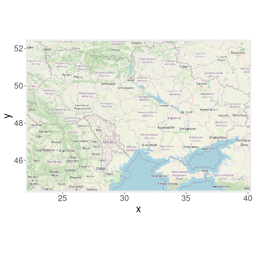
## autoplot.OpenStreetMap(terrain) +
##    coord_quickmap() +
##    geom_polygon(data= ukraine, aes(x=Longitude, y=Latitude))
TBD: openstreetmaps https://ajsmit.github.io/Intro_R_Official/mapping-google.html
Alternatively, map may only contain lines (e.g. river map) or points (e.g. map of electricity substations).↩︎