Chapter 14 Visualizations: the gglot2 Library
Data visualizations, including plotting, is one of the most powerful ways to communicate information and findings. R provides multiple visualization packages, in particular the base-R plotting tools (the graphics library) which is flexible and powerful. However, in this chapter we introduce ggplot2 library that is oriented to visualizing datasets. It has an intuitive and powerful interface and simplifies many tasks that are tedious to achieve with base-R graphics. But be aware that as other tools, so also ggplot2 has its limits, and sometimes it is better to use other visualization packages.
ggplot2 is called ggplot2, because once upon a time there was a package called ggplot. However, as the authors found its API somewhat limiting, they wanted to break compatibility and start from blank sheet. To distinguish the new package from the old one, they called it ggplot2.
14.1 A Grammar of Graphics
Just as the grammar of language helps us construct meaningful sentences out of words, the Grammar of Graphics helps us to construct graphical figures out of different visual elements. This grammar gives us a way to talk about parts of a plot: all the circles, lines, arrows, and words that are combined into a diagram for visualizing data. Originally developed by Leland Wilkinson, the Grammar of Graphics was adapted by Hadley Wickham to describe the components of a plot. It includes
- the data being plotted
- the aesthetics–visual elements, such as positions, colors and line styles, that make up the plot. It also covers the aesthetics mapping which visual elements are related to which data variables.
- the geometric objects (circles, lines, etc.) that appear on the plot
- a scale that describes how the data values are represented as visual elements
- a position adjustment for locating each geometric object on the plot
- a coordinate system used to organize the geometric objects
- the facets, a set of sub-plots to display different subsets of data.
ggplot organizes these components into layers, where each layer is a single geometric object, statistical transformation, and position adjustment. Following this grammar, you can think of each plot as a set of layers of images, where each image’s appearance is based on some aspect of the data set. This is somewhat similar to dplyr that developes a “grammar” for data processing. ggplot’s approach is intuitive in a similar fashion.
ggplot2 library provides a set of functions that mirror the above grammar, so you can fairly easily specify what you want a plot to look like. Compared to dplyr, it is somewhat less intuitive though.
ggplot2 is a part of tidyverse set of packages, so if you
installed and loaded tidyverse, then ggplot2 is ready to use.
Otherwise, you need to install it
(using install.packages("ggplot2") and load
it as:
14.2 Basic Plotting with ggplot2
Now it is time to take a quick look at simple plotting with ggplot. The first task is to understand the basics, we’ll discuss all the topics in more details below.
14.2.1 Diamonds data
ggplot2 library comes with a number of built-in data sets. One of the more interesting ones is diamonds (see Section I.8). It contains price, shape, color and other information for approximately 50,000 diamonds. A sample of it looks
## # A tibble: 4 × 10
##   carat cut   color clarity depth table price     x     y     z
##   <dbl> <ord> <ord> <ord>   <dbl> <dbl> <int> <dbl> <dbl> <dbl>
## 1  0.73 Ideal I     VS1      60.7    56  2397  5.85  5.81  3.54
## 2  0.7  Ideal G     VS1      60.8    56  3300  5.73  5.8   3.51
## 3  0.31 Ideal D     VS1      61.6    55   713  4.3   4.33  2.66
## 4  0.31 Ideal H     VVS1     62.2    56   707  4.34  4.37  2.71
It is included in the ggplot2 library, so you do not need to load it separately. Here we use variables
- carat: mass of diamonds in caracts (ct), 1 ct = 0.2g
- cut: cut describes the shape of diamond. There are five different cuts: Ideal is the best and Fair is the worst in these data. Better cuts make diamonds that are more brilliant.
- price: in $
As the dataset is big, we take a small subset for plotting:
14.2.2 Our first ggplot
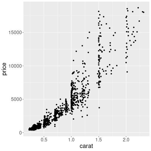
A simple scatterplot of mass versus price.
Let’s explain the plotting function with a small example, a simple scatterplot of diamonds’ mass (carat) versus price:
Here is the walk-through of the code above:
ggplot plotting starts with
ggplot(). This sets the plot up, but does not actually much else useful. It typically takes two arguments–the first one is the dataset we are using (here d1000, the 1000-observation subset of diamonds); and the second one is aesthetics mapping (see more below in Section 14.3). Here we tell ggplot that we want to put data variable carat on the horizontal axis (x) and price on the vertical axis (y).Aesthetic mappings are defined using the
aes()function. Theaes()function takes a number of arguments likex = carat. The first one, x is the visual property to map to, and the second one carat, is the column in the data to map from. In the example above,x = caratmeans to take the data variable carat, and map it to the visual property x: the horizontal position; in a similar fashion it maps price to y, the vertical position.We did not specify any other visual properties, such as color, point size or point shape, so by default the
geom_point()produced a set of black dots of the same size, positioned according to the carat and price. (See Section 14.3 below for how to use more aesthetics.) This is what the plot displays: each diamond is a dot, positioned according to carat and price.Next line,
geom_point(), does the actual plotting. It is one of the many geom-s, namedgeom_followed by the name of the kind of plot type you wish to create. Here,geom_point()will create a layer with “points”, usually called scatterplot (see Section 14.4.1).There are many other options, including
geom_line()to connect points with lines,geom_col()to make columns (barplots) and many more, see Sections 14.4 and 14.9.You can add other
geomlayers (see Section 14.4.2), or other elements, such as labels or color customization to the plot by using the addition (+) operator.
Thus, basic simple plots can be created just by specifying a data
set, a geom, and a set of aesthetic mappings. Although the graph we
did above does not look the best, it may be enough for many purposes.
Exercise 14.1 How are diamonds’ length and width related? Make a similar plot where you put diamonds’ length x on the horizontal axis and their width y on the vertical axis.
See the solution
As the example above shows, ggplot is very well suited to visualize data
in data frames. But sometimes you want to plot vectors instead. The
library includes qplot() function for such “quick plots”, but in
the base-R plotting may be quicker and easier (see Section
12.6.6).
Next, we discuss the ggplot tools in more detail.
14.3 Aesthetics mapping
The aesthetic mapping is a central concept of every data visualization. It means setting up the correspondence between aesthetics, the visual properties of the plot, such as position, color, size, or shape of the points and lines; and certain properties of the data, typically numeric values of certain variables. Aesthetics are the plot properties that you want to drive with your data values, rather than fix in code for all markers. Each property can therefore encode an aspect of the data and be used to express underlying patterns.
14.3.1 Specifying aesthetics
In our first example above we only use the horizontal position x and
vertical position y and mapped these to carat and price as
aes(x=carat, y=price).
We did not specify any other visual properties, such as
color, point size or point shape, so by default the geom_point()
produced a set of black dots of the same size, positioned according to the
carat and price. This is exactly what aesthetics means here: we
position the dots according to carat and price.
(See Section
14.3.3 for how to specify visuals that
are not linked to data.)
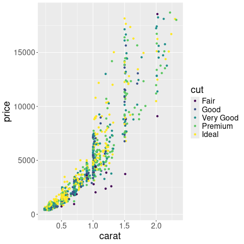
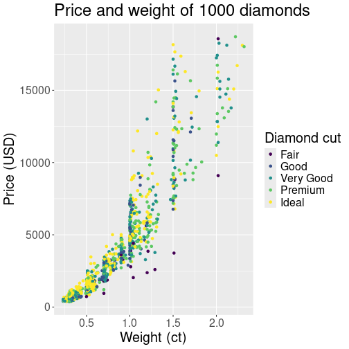
Plot of the same diamonds as above, but this time cut variable is mapped to color aesthetic.
The power of aes() function is the simplicity to add more visual
properties that are driven by data.
For instance, let’s color the dots according to cut (diamond shape).
This means to take an additional aesthetic, color, and to map it to
the variable cut in data as color=cut. This must be done in
aes() function as an additional named argument:
The resulting plot displays the same dots as the one in Section
14.2.2–it uses the same x = carat and y = price mapping. But now the dots are colored according to cut as we
added col = cut mapping. ggplot also adds the color key, telling
which color corresponds to which cut.
The aesthetics mapping can be specified in ggplot() function, as we
did above. In that case it applies to all following geom-s, here
just to the geom_point(). This is a handy approach when we want to
add multiple geoms using the same data, e.g. both points and lines.
But it can also be specified inside of the geom function, such as
geom_point(aes(...)). In that case it only applies to the
particular geom.
Exercise 14.2 Use aes() function twice: once inside ggplot() to specify x and
y position, and once inside geom_point() to specify color. What
happens?
See the solution
Finally, note that ggplot treats variables differently, depending on whether they are continuos, discrete, or ordered. This is a frequent source of confusion, see Section 14.5 below.
14.3.2 Most important aesthetics
There is a number of aesthetics that ggplot recognizes. The most important are:
- x, y: the horizontal and vertical position. These are the
default first and second argument for
aes()function, so you do not normally need to specify these. So instead ofaes(x = carat, y = price), we can also writeaes(carat, price). This is not true for any other aesthetics. - col or color: dot and line color. In case of scatterplot or
line plot (
geom_point()andgeom_line()), this is the color of the objects. In case of filled objects, such as bars on the barplot, it is the outline color, not the fill color! - fill: the fill color of area objects, such as bars on barplot or regions on a map. It has no effect on lines and points.
- size: size of points
- linewidth: width of line elements
- linetype: type of lines–solid, dotted, dashed and similar.
- alpha: transparency. alpha = 1 is completely oblique, and alpha = 0 is completely transparent (invisible).
- group: determines how data is grouped. For instance, in a children growth data that contains multiple children, measured at multiple time points, you may want to draw a separate line for each children. See Section 14.4.2.
14.3.3 Fixed aesthetics
Sometimes we do not want to map the visual properties to data, but just to specify some kind of fixed values. For instance, we want to make a plot, similar to the one above in Section 14.2.2, but request the points to be blue.
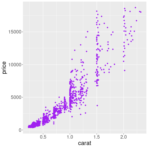
The same plot as above, but now we request “purple” color for the points.
Such request must be done inside of the corresponding geom, but
outside of the aes() function. For instance,
When used outside of aes(), there will not be any mapping to the
data, and the color is just what it is: a color.
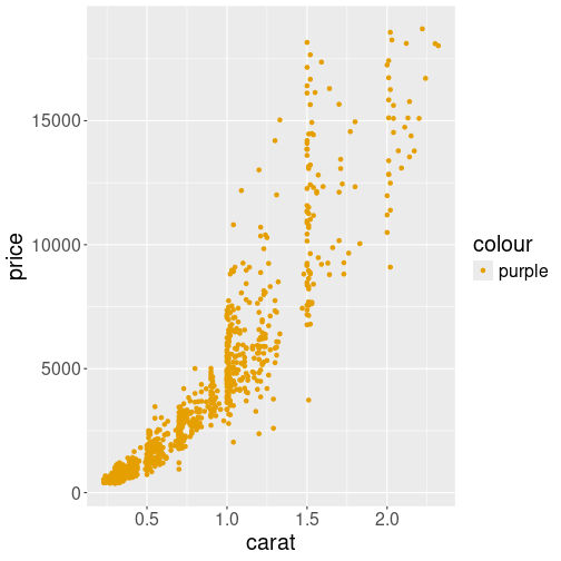
What happens if you map color to variable “purple”
But what happens if you specify a fixed color inside of the aes()
function? This is a frequent source of confusing errors for
beginners. This makes ggplot to think that we are mapping color to
a data vector c("purple"). So it thinks that “purple” is a data
value, not a color, and picks whatever color it considers appropriate:
Here the color turns out to be orange. ggplot is even helpful and adds a color key that tells you that the orange color corresponds to value “purple”!
Exercise 14.3 Amend the colored plot:
- Use a different color
- Make the dots larger
- Make them semi-transparent.
See the solution
14.4 Most important plot types
It is important to know how to produce the desired plots on computer. But it is perhaps even more important to know what kind of plots to produce. Here we discuss some of the most important types of plots, and when to use those.
Here we discuss scatterplot, line plot, barplot, histogram and boxplot. Picking one of these is enough in many circumstances.
14.4.1 Scatterplot
On of the most widely used plot type is scatterplots, plots of point clouds.
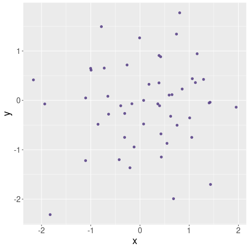
An example scatterplot of random data.
Scatterplots are good to visualize continuous data–it is best if the variable you put both on the horizontal and vertical axis are continuous. This includes values like income and age, usage percentage and reliability, and GDP and child mortality.
The objects you put on a scatterplot plot should be distinct–they should not transition from one to another. So different humans, hard disks or countries are good examples–one human does not transform into another, and neither do hard disks. Even for countries, such transitions are very rare.
There should also not be too many data points, typically it is good to display up to 1000 points. When the number of points gets too large, the plot will turn black in more dense areas, and it is hard to see what is there. You may consider taking a smaller sample of points, making the points semi-transparent, or using different plot types (see Section 14.9.4.1).
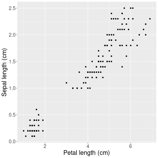
Petal length versus width for iris flowers.
Here is an example scatterplot of real data–of the R built-in iris dataset:
The plot depicts the relationship between length and width of petals of iris flowers. Scatterplot is a good choice here because each unit (observation) in data depics a separate flower. Obviously, flowers do not transition to each other, so it would be misleading (and very ugly) to connect the dots. We prefer a scatterplot.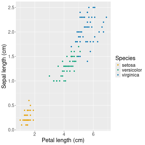
Petal length versus width for iris flowers, this time marking different species with different colors.
However, there are three different species included in the dataset. If we want to convey the difference of their petal size, we can use another aesthetic, for instance color, to represent species:
ggplot(iris,
## plot petal length vs width,
aes(Petal.Length, Petal.Width,
## mark species with color
col = Species)) +
geom_point() +
labs(x = "Petal length (cm)",
y = "Sepal length (cm)")Here col = Species tells ggplot that and additional aesthetic,
color, should be mapped according to the data variable Species.
Or
to put it simpler–use dots of different color for different species.
Note how ggplot automatically adds a color key–an
explanation, which
color denotes which species.
Exercise 14.4 Use Titanic data. Make a scatterplot of age (variable age) versus ticket price (variable fare). Use color to mark the sex of passengers (variable sex). What does the plot tell you about how passengers of different age and sex chose their fare? What do you think, how might you improve the plot?
14.4.2 Line plot
Line plot is another very popular way of presenting information. It is similar to scatterplot in a sense that it is well-suited for plotting continuous data. However, connecting points with lines is useful mainly if there is a clear transition from one observation to the next one. This is commonly the case with time series data–time flows continuously, and usually the features we measure at different point of time are also continuously changing.
We demonstrate line plot using Scandinavian COVID-19 data:
covS <- read_delim("data/covid-scandinavia.csv.bz2") %>%
filter(date > "2020-03-01",
date < "2020-07-01") %>%
# select a 4-month date range only
filter(type == "Deaths") %>%
select(country, date, count)
covS %>%
sample_n(4)## # A tibble: 4 × 3
## country date count
## <chr> <date> <dbl>
## 1 Sweden 2020-04-20 2159
## 2 Norway 2020-06-24 249
## 3 Finland 2020-04-25 186
## 4 Finland 2020-05-07 255The dataset includes the cumulative number of deaths and confirmed cases in four Scandinavian countries, Norway, Sweden Denmark and Finland, here we only keep the death tally. Note the structure of the resulting subset: an observation is country-date combination–for each country and date, there is the number count, the cumulative number of COVID-19 deaths.
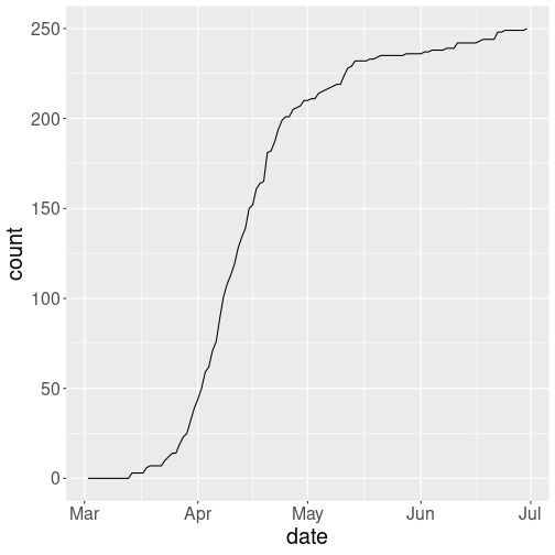
COVID-19 deaths in Norway. As the number was continuously changing from day-to-day, a line plot is a good choice here.
First, let’s plot the cumulative number of deaths in Norway only using line plot:
You can see how the number of deaths starts at zero at the beginning of March, and then rapidly climbs to 200 through the April. You can also see that the curve is not quite smooth but shows a number of steps of different size, this may be related to how the statistics is collected, but also to the fact that counts are not quite continuous figures–counts can only have integer values.
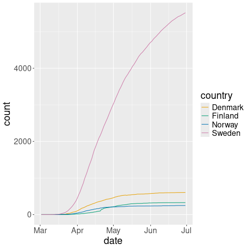
Line plot of total COVID-19 deaths. Different countries are depicted by different color.
But as the data contains four different countries, it is natural to
plot all four on one figure and
distinguish these using using lines of different color. This can be
done by picking
the color aesthetic and mapping it to variable country as:
col = country:
We can see that the pattern of deaths is broadly similar everywhere, but there were many more deaths in Sweden the elsewhere.
Why is line plot a good choice here? Because the counts are based on dates, and time flows continuously from one day to another. One can imagine replacing the lines by dots (scatterplot), and sometimes it is useful. But here lines stress that observations–the dots–are actually connected. As time flows, yesterday turns into today, and yesterday’s counts turn into today’s counts.
Choosing four different colors for four different countries works well. But this may give unexpected results if country, the grouping variable, is coded as a number. See more in Discrete versus continuous variables.
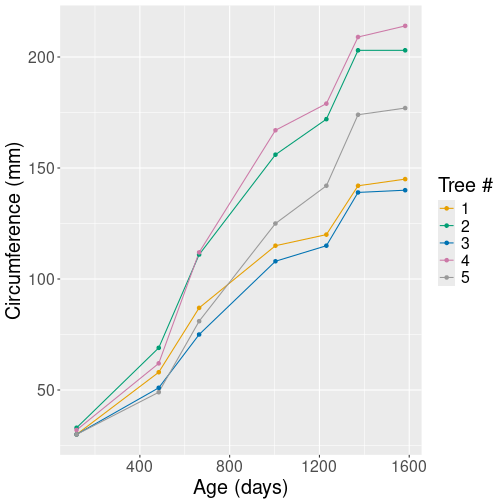
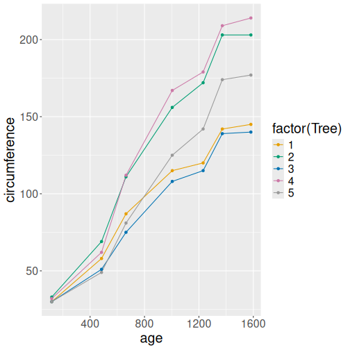
Other times it makes sense to use combined line- and point plots. Fortunately, this can be done easily by just adding additional geoms. Here we use Orange tree data, and display just the tree number 1:
## # A tibble: 3 × 3
## Tree age circumference
## <dbl> <dbl> <dbl>
## 1 1 118 30
## 2 1 484 58
## 3 1 664 87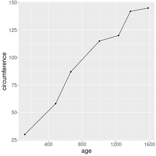
Growth of circumference in time. Combined line- and point plot.
Let’s display the growth pattern on a figure:
Why may it be a good idea to display the combined plot? Because it stresses the actual data points: as some of the kinks on the curve are rather subtle, marking the actual points (7 in total) with black dots makes it easier to see what is the actual data and what is interpolation.
Exercise 14.5 Will it be a good idea to display the actual data points in the Scandinavian COVID example as well? Try it, and explain what do you think!
14.4.3 Barplot
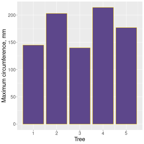
Barplots are suitable to display data where one variable is categorical and the other one is numerical. Here we use Orange tree data as above and demonstrate the barplot using the average size of orange trees:
orange <- read_delim("data/orange-trees.csv")
avg <- orange %>%
group_by(Tree) %>%
summarize(size = mean(circumference))
avg # average size of 5 orange trees## # A tibble: 5 × 2
## Tree size
## <dbl> <dbl>
## 1 1 99.6
## 2 2 135.
## 3 3 94
## 4 4 139.
## 5 5 111.As you can see, tree #3 is the smallest one and tree #4 the largest one, at least in average.
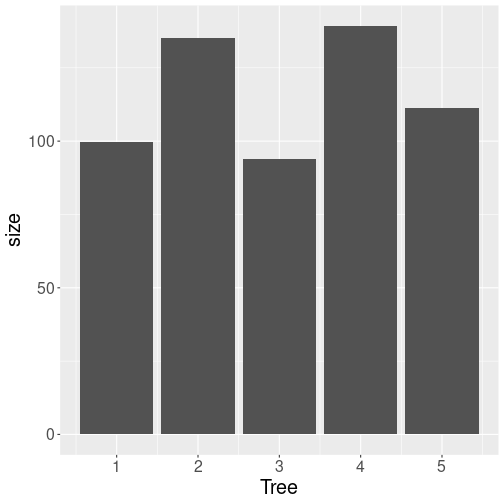
Barplot using the default options.
Barplots can be created with geom_col() (there is also geom_bar()
but that creates histograms by default!)
The default options of geom_col() create
a rather dull figure of gray bars, but it conveys all the
necessary information:
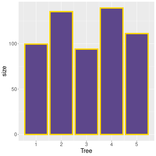
Adjusting colors of barplot. Remember that fill is the fill color and col is the border color. linewidth here is the width of the golden outline.
The gray color may be exactly what you want if you intend to print it on black-and-white printer. But if you want to show it on a color-aware device, you may want to specify colors:
Why is barplot a good plot type for such tasks? This is because the horizontal position of bars is rather arbitrary (often based on alphabetic ordering, here based on the tree id-s). Bars are just next to each other, they are typically also of equal width, and the fact that bar for tree #2 is next to the bar for tree #2 does not typically mean that these trees are “close” in any meaningful sense. The discrete bars stress that there is no natural smooth connection between trees, they are discrete, separate entities.
Exercise 14.6 Color each bar of different color by making the fill aesthetic to depend on the tree id. Do you like the result?
See the solution
14.4.4 Histogram
Histograms is a popular way to visualize distributions–what kind of values are more common and what kind of values are less common. In case of continuous data, the values are split into a limited number of “bins”, and then the computer counts the number of values that fall into each bin.

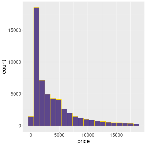
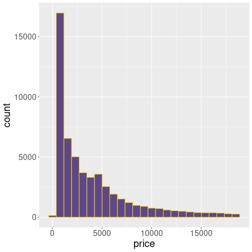
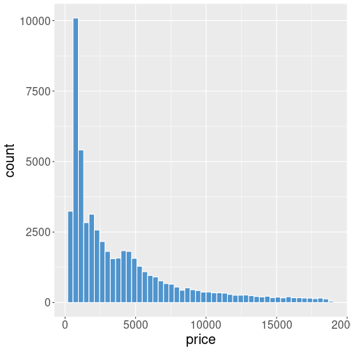
Histogram of diamonds’ price. Cheaper diamonds are more common.
Let’s visualize the distribution of diamonds’ price using the same color scheme as for the barplot in the Section 14.4.3 above:
ggplot(diamonds, aes(price)) +
geom_histogram(
bins = 20,
# split into 20 bins
fill = "mediumpurple4",
col = "gold1"
)The histogram shows that most diamonds are relatively cheap–the largest count is in the second-smallest price bin that contains prices of less than $1000. But there are diamonds that are much more expensive, almost up to $20,000.
Note that geom_histogram() only expects a single aesthetic, here
price. This is because price is used for the horizontal
location, the vertical location is the data counts for each bin. This
is computed from price.
Exercise 14.7
Use histograms to show two distributions:- Age of titanic passengers
- Fare paid by the passengers
Experiment with the bins= argument to make the histograms look good.
What do you think, why do these distributions look so different?
See the solution
Exercise 14.8
Distributions may reveal interesting facts about the underlying data.- use iris data and plot the histogram of the column Petal.Length.
- Does the result resemble the histogram of diamond price? Does it resemble any of the Titanic histograms?
- Can you explain, why this histogram show two peaks (it is bimodal)?
14.4.5 Boxplot
Boxplots are simplified histograms, typically used to display distribution differences for different groups. They are often appropriate where it is otherwise hard to show the relationship between different values.
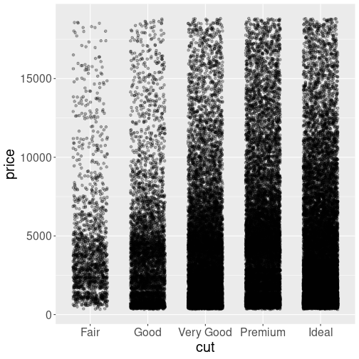
Scatterplot of cut versus price. The result is not readable.
For instance, let’s try to understand how are cut and price of diamonds related. We can attempt to do it using a scatterplot:
ggplot(diamonds,
aes(cut, price)) +
geom_point(
position = position_jitter(
width = 0.3,
# adjust horizontally..
height = 0
# ..but not verticall
),
alpha = 0.25
)We move the points randomly left and right from the discrete cut
values to avoid overplotting (this is what position = position_jitter() does) and make the points semi-transparent (alpha = 0.25).
But the results are still hard to understand.
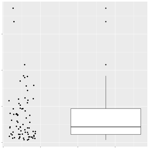
A good alternative to display such a relationship is by using boxplots. The image here displays identical data points (just random values) in two ways. At left, these are displayed as 77 dots on a scatterplot, in a similar fashion as in the diamond price plot above. At right, they are displayed as a boxplot. The boxplot consists of a box that normally stretches from the lowest to the highest quartile of the sample, and the sample median is prominently displayed by a bold line. The box has “whiskers”, lines that stretch up and down from the box by no more than 1.5 times of the height of the box, till the last data point within this range. Finally, all cases that do not fit inside the whiskers are marked by individual dots (and are often called outliers). See more in Wikipedia.
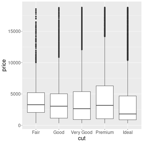
Boxplot is well suited to reveal how the price depends on diamonds’ cut.
Here is the price distribution by cut, the same figure as above, but now presented as a boxplot:
Technically, we have just replaced geom_point() with
geom_boxplot(), everything else remains the same.
The figure reveals that diamonds’ price is not closely related to their cut. if anything, there is an inverse relationship–better cut diamonds are cheaper.
Exercise 14.9
The message from the previous plot is that better cut diamonds are cheaper. This seems counter-intuitive and needs some explanation. Perhaps the ideal-cut diamonds are just smaller? Let’s check this out!- Select diamonds in a narrow price range only, e.g. in \([0.45, 0.5]\)ct and in \([0.95, 1.0]\)ct.
- Do a similar boxplot, separately for both of these ranges. Do you see now that more desirable cut commands higher price?
See the solution
Exercise 14.10
Use iris data.- Display the petal length by species.
- Based on the features of the plot, explain why all setosa petals are shorter than petals of the other species.
- Explain that versicolor and virginica petals have distribution that is partly overlapping.
When is boxplot a good choice? This is typically the case when:
- You want to compare distributions, not single values (like averages or maxima), and
- you have two or more discrete groups. In the example above there are five groups (different cuts of diamonds).
If you do not have discrete groups, then boxplot may not be a good choice, or not even possible. For instance, if you want to compare wind speed distribution depending on temperature, then you cannot just use boxplots. Temperature is not a set of discrete groups (although you can split it into groups like “cold” and “warm”), consider heatmaps instead (see Section @ref(#ggplot-moretypes-other-heatmap)).
14.4.6 Recap: when to use which plot type
We finish this section by a sort re-cap of the most important plot types. There are many more types, some of which are described in Section 14.9.
Scatterplot (geom_point())
is suitable to display relationship between two
continuous (or nearly continuous) variables. The data
points should not be
connected to some sort of smooth transitions. For instance,
diamonds do not transform to each other in a smooth way.
Alternatives: line plot.

Line plot (geom_line())
is suitable to show relationship between two continuous
variables, exactly like scatterplot. However, there should exist a smooth
transition between data points, and there should be a natural order of
the points. For instance, data points that
correspond to different age can be connected, to indicate that the
points are in fact connected–we just do not have data for the
intermediate age values. Also, age values are inherently ordered.
It may be useful to depict different subjects with different lines, and mark the actual data points on the lines.
Alternatives: scatterplot, barplot
Barplot (geom_col())
is suitable to describe the relationship between a
categorical and a continuous variable. The bars, in contrast to
lines,
indicate that data on the
\(x\)-axis is not continuous.
Alternatives: scatterplot, line plot
Histogram (geom_histogram()) is good to display distributions,
most likely for a single continuous variable. It is usually hard to
put several histograms on the same plot.
Alternatives: density plot, boxplot, violinplot.
Boxplot (geom_boxplot()) is well suited
to display distributions of a
continuous variable by different categories of a categorical
variable.
Alternatives: violinplot, histogram, density plot.
Exercise 14.11
Which plot type may you consider, if you want to visualize:- How does average ticket price depend on passenger class
- How does age distribution depend on passenger class
14.5 Discrete versus continuous variables
ggplot tries hard to guess what is what the user wants, and then make the plots accordingly. One important distinction is between continuous and discrete values (see Section 21.2 for how R describes discrete values).
14.5.1 Motivating example
Continuous variables are measured numerically and take any value, for instance age, distance, temperature or price. Discrete variables, however, can only contain a small set of pre-determined values. Examples include college majors (math, English, philosophy, …), college seniority (freshman, sophomore, junior, …), or the city name where you grew up (Seattle, Chongqing, Bangkok, …). It turns out that on the plots, discrete and continuous values are best to be represented somewhat differently.
Imagine you are working at an agricultural lab where your task is to analyze how tomatoes grow at different temperatures. You have three different tomato plants growing in climate-controlled greenhouses at 15, 20, and 25C; and you measure their size over 3 months. Unfortunately, life is not just a smooth sailing. Climate system in the second greenhouse does not work well, and before the experiment is over, the third greenhouse breaks. Instead of 25C, your third tomato is now at 18C. So your tomato data might look like
| Age (months) | Tomato 1 | Tomato 2 | Tomato 3 | |||
|---|---|---|---|---|---|---|
| Temp | Size | Temp | Size | Temp | Size | |
| 1 | 15 | 40 | 19 | 50 | 25 | 60 |
| 2 | 15 | 60 | 21 | 70 | 25 | 80 |
| 3 | 15 | 80 | 20 | 90 | 18 | 92 |
How would you visualize the results of your experiment?
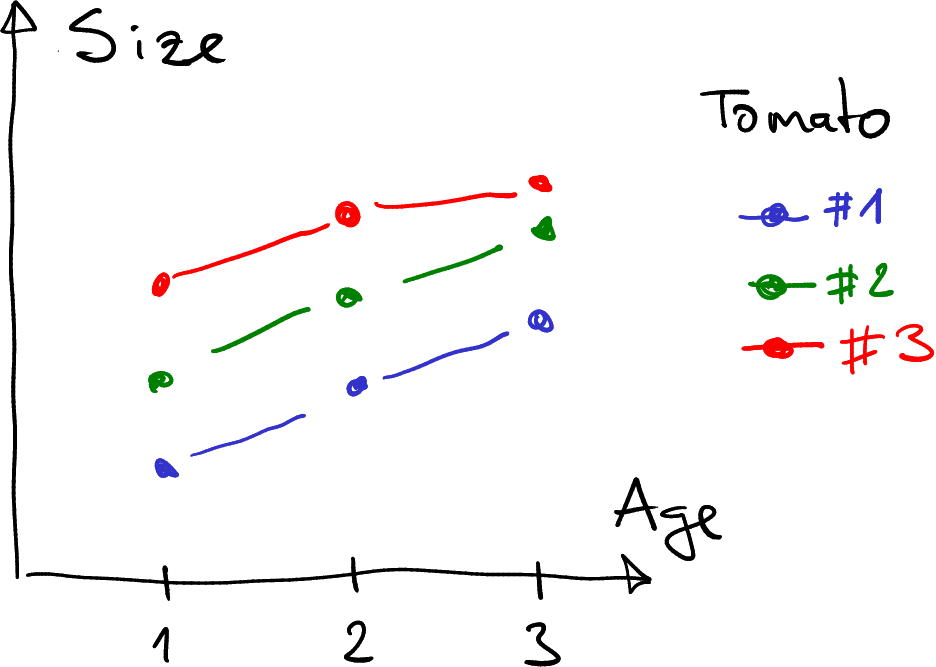
Growth of tomatoes. Different tomatoes are marked with different color, corresponding to different (intended) temperatures.
A simple option is to just mark different tomatoes with different color (this is what we did when plotting COVID-19 deaths across countries in Section 14.4.2).
This option may be all you need–after all, different tomatoes were (supposed) to be at different temperature. The tomato plants are distinct, they do not transition to each other, and hence distinct colors, like red, green and blue are a good choice.
But–your experiment was not about comparing different plants. It was about comparing growth at different temperature. And the figure above does not tell us much about the temperature. Can we make a similar plot that displays not different plants, but the relationship between temperature and growth?
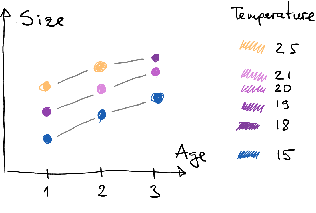
The same tomato growth data as above. This time, different colors do not denote different tomatoes but different temperature.
- Instead of clearly distinct colors, we may want to use a smooth color scale. This is because as the plants are distinct, the temperatures are not: temperature can smoothly change from one value to another, and hence we may want to have the option to display all the intermediate values.
- Here, I have connected the data points with gray lines, not the colored lines. This is because it is not immediately obvious of which color the lines should be. The temperature at the beginning? At the end? Something in-between? Smoothly changing? But the third greenhouse broke suddenly, so the color of that line should perhaps also change abrubtly?
14.5.2 Continuous and discrete values in ggplot
This small example demonstrates the different choices we have to do, depending on whether the data we display is discrete or continuous. Let’s now implement these ideas with ggplot.
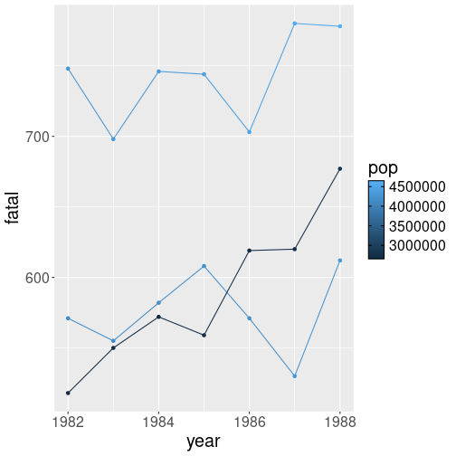
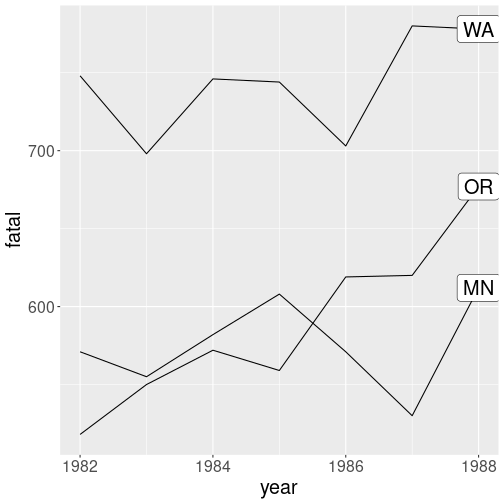
We use Fatalities data, the U.S. traffic fatalities data from 1980. Let’s focus on three states, Washington, Oregon and Minnesota as these are comparable in terms of population. For clarity, let’s work on only a subset of columns:
## # A tibble: 4 × 4
## year state fatal pop
## <dbl> <chr> <dbl> <dbl>
## 1 1982 WA 748 4278002.
## 2 1988 OR 677 2767004.
## 3 1982 OR 518 2669002.
## 4 1984 MN 582 4163001.Exercise 14.12 Make a plot that shows traffic fatalities over time (column fatal) and allows to compare the tree states. Which type of plot would you pick?
Hint: check out Section 14.4.2.
The a plot, if done correctly, will clearly show that there were more fatalities in Washington, Oregon and Minnesota were comparable. However, we cannot tell if the differences in fatality rates are somehow related to different population. Population is just not represented in this plot in any way.
Now let’s modify it so that colors represent the population, while the states are still separated. This corresponds to the tomato-temperature figure above. In that figure we made two things differently: a) we colored the points according to the temperature (now we need population); b) we still kept the plants separate, connected with distinct lines. Let’s implement a), using different colors for different population, first: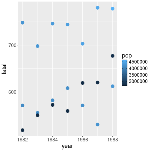
Traffic fatalities: population differences are represented in different colors. Now the problem is that we do not know which dots correspond to which states.
This figure we can see that the largest fatality figure (over 700) also correspond to large population (light colors). But we can also see that some of the large population cases are close to small population cases (dark colors). So states differ not just about their population, but also in terms of traffic culture.
Note the differences between this plot, and the one where states are displayed in the different colors. Here colors are not distinct but form a continuum (from dark to light blue). This is because population is a continuous variable and can take any value in-between. We need a colors scale that is not just discrete, but can represent all the intermediate values too.
It is an example where the figure layout will depend on the data type–we want to make it slightly different, depending on whether the data displayed (state or population) is discrete or continuous.
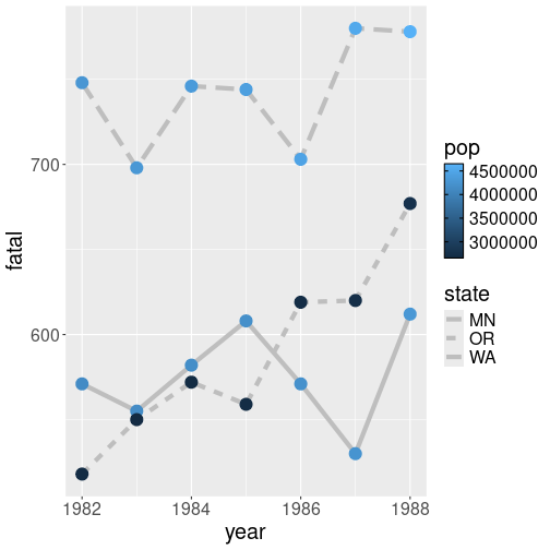
Different states represented by lines of different type. ggplot will also create the legend for you.
A straightforward way to do it is to use a different aesthetic for states. An obvious choice would be line type:
fts %>%
ggplot(aes(year, fatal, col = pop,
linetype = state)) +
geom_line(linewidth = 2, col = "gray") +
# thick line for clarity
geom_point(size = 5)This results in a reasonably clear plot, where we can compare states, their fatality figures, and population.
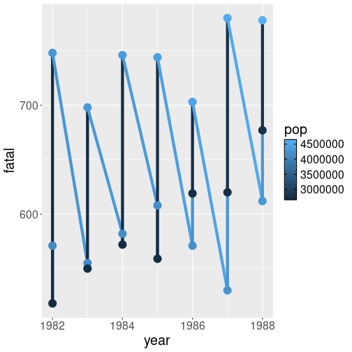
Similar lines for all states. The result is probably not what you want.
Let’s do it by just removing linetype = state from above. I am also
removing col = "gray" from geom_line() in order to make the result
more similar to the case where the color denotes the state:
The result is probably not what you want. Most importantly, different states are not represent by separate lines. Instead, all data points are ordered by year, and then connected.
This is another important difference between discrete and continuous
variables. If we specify col = <a discrete variable>, we get
distinct lines of different color. If we specify col = <a continuous variable>, we get a single line (colored according its starting point
value). Why?
This is because here it is not clear which continuous population values should be grouped into distinct lines. After all, every population value is different in these data. Should we make a distinct line for every single point then? But that would not represent states then… And you need at least two points to make a line anyway. So this will not work. ggplot solves the problem by just making a single line.
Grouping points by state with group aesthetics.
Fortunately, it is easy to separate the points by state–you need to
use group aesthetic. This just tells ggplot how to group the
points into separate lines:
fts %>%
ggplot(aes(year, fatal,
col = pop,
group = state)) +
# group points by state
geom_line() +
geom_point()The plot makes much more sense although we cannot tell which
line represents which state.
But this may be sometimes desirable,
for instance,
if there are too many groups to color them individually. We may want
to plot everything with the same gray color using geom_line(col = "gray"),
and add a selected few, marked with a distinct color on top of it.
When doing such plots, you may consider labeling the lines, see more in Section 14.8.1.
Exercise 14.13 Use Scandinavian COVID-19 data. Make a plot of confirmed cases over time, but use the same line type and color for all countries.
Use the same date range (March 1st–June 30th) as in Section 14.4.2.
14.5.3 A few technical considerations
Here we discuss two technical details regarding the continuous versus discrete variables.
First, which aesthetics are suitable for continuous or discrete values?
The answer is fairly obvious. For continuous values you want to use such aesthetics that can have continuous values! These include color, point size, transparency, line width and similar. It is easy to understand that these aesthetics can take any value in a given range.
In the opposite end, we have discrete aesthetics, such as line style and point shape. It is possible, in principle, to implement a continuum of point shapes between (say) circle and a cross, but ggplot only offers limited number of point shapes and line styles. These aesthetics can only be used with a discrete variable.
Exercise 14.14 What happens if you try to use a discrete aesthetics with a continuous variable? Try the US traffic state fatality plot above, but instead of color, use point shape or line style to mark population.
Another technical question is how does computer know which values are discrete? The answer here is fairly simple: it checks the data type–is it discrete or continuous? Continuous data types are numbers, discrete types are texts (character), logicals, and factors–the dedicated categorical values.
This is all simple and easy–except in practice, we frequently use
numbers to denote discrete values. For instance, orange tree
data uses numbers 1, 2, …, 5 to denote different
trees–discrete objects. In Titanic data, the
passenger class is denoted by numbers 1, 2, and 3. Again, here
continuous numbers are used to denote discrete categories.
Unfortunately, R has no way to know that what looks like a continuous
number to it is actually category. But it is easy to give it a
helping hand and tell that, for instance, the
variable pclass should be treated as categorical. This can be done
by writing col = factor(pclass) instead col = pclass.
factor() is a function that converts numbers to a
factor, a dedicated categorical data type (see more in Section
21.2).
Exercise 14.15
Use orange tree data and make a line plot tree circumference over time, using different color do denote different trees. Do this in two ways:- using just
col = Tree - using
col = factor(Tree)
Explain the difference.
Exercise 14.16
Use Titanic data. Make a boxplot that depicts the age distribution as a function of passenger class (pclass). Do it in two ways:- Use just
x = pclass - Use
x = factor(pclass).
Explain the differences!
14.6 Inheritance: aesthetics and data
This section discusses two similar traits of ggplot–aesthetics’ and data inheritance. These are often extremely handy when making more complex plots.
14.6.1 Aesthetics inheritance
Imagine you are working in an agricultural lab where you are analyzing growth of tomatoes depending on temperature and soil type. You want to use both dots and lines, color of both of which should depend on the soil type. You may write code like
Let’s discuss again what do these lines of code do:geom_line()connects sequential points with lines, using the default data and default aesthetics.geom_point()does the same–using default data and default aesthetics, it marks the data points with dots.- Finally,
ggplot(tomatoes, aes(age, size, col = soiltype))will set up the plot. In particular, it setstomatoesas the default dataset,colfor default x variable,sizefor default y variable, andsoiltypefor default color variable.
This is the essence of data and aesthetic inheritance: once set up
by ggplot(), all geoms will use the default data and aesthetics.
Fortunately, it is easy to change the default behavior. If you want
to make the line color depending not on the soil type (the default
variable) but temperature instead, we can use
geom_line(aes(temperature)). This tells geom_line() to override
the default color aesthetics and use temperature instead. As other
aesthetics (x and y) are not overridden, geom_line() will use
the default values. Effectively, we have written
geom_line(aes(age, size, col = temperature)). In case you want the
lines to be of the same color, not related to any data variable, you
can use fixed aesthetics as geom_line(col = "black").
Orange tree data: both point and line color is related to tree id.
Let’s demonstrate this with Orange tree data.
orange <- read_delim(
"data/orange-trees.csv"
)
ggplot(orange,
aes(age, circumference,
col = factor(Tree))) +
# 'Tree' is continuous,
# make it categorical
# for groups
geom_line() +
geom_point()This small program is equivalent to the tomato-example above, the only difference is that instead of soil type, we use the tree id Tree to color the lines and points.
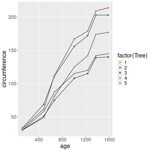
Point color uses the default data variable Tree, but line color is black.
Here is a slightly more complex example with aesthetics overriding.
ggplot(orange,
aes(age, circumference,
col = factor(Tree))) +
geom_line(aes(group = Tree),
col = "black") +
geom_point(size = 2)To begin with, we set up the default aesthetics as above. Below,
geom_point() uses the defaults and colors the points according to
Tree.
But geom_line() is slightly more complex: first, it overrides the
color aesthetic by specifying a fixed aesthetic col = "black".
But now we have a problem–if all colors are black, then there will be
no grouping, and we will get a single line instead. Hence we add
aes(group = Tree) to explain ggplot that the black lines must be
grouped by Tree.
Exercise 14.17 Use the example above. Leave out aes(group = Tree). What happens?
Explain!
Exercise 14.18 Use Ice Extent data. Make a line and point plot of the extent over years for February month (month = 2). Include both northern (region = “N”) and southern (region = “S”) hemisphere, use different colors for the hemispheres.
- Make a plot with both lines and points of different color
- Make a plot with only points of different color, but lines dark gray.
Now make a plot of ice extent in the Northern hemisphere only, but including three months: February, May, and September.
- Make a plot with both lines and points of different color
- Make a plot with only points of different color
Hint: use %in% operator to select from multiple monts (see Section
13.6.1.2).
See the solution
14.6.2 Data inheritance
The data inheritance is rather similar to aesthetics inheritance.
Returning to your tomato experiments above, remember that
ggplot(tomatoes, aes(...)) sets the default dataset to be
tomatoes. All geoms use the default data, unless you override it
with a different dataset. This can be done by specifying data =
argument in a geom, e.g. geom_point(data = eggplants). You do not
even have to specify aes() if your eggplant dataset also contains
age and size!
Overriding inherited data is useful in different contexts. For instance, if you want to combine different datasets on the same figure, like the example of tomatoes and eggplants.32
Traffic fatalities, Washington is highlighted in green.
Another case where overriding inherited data is where you want to mark certain data points out of many with different color. Let’s get back to traffic fatalities data, and plot the fatalities across all states as above (see Section 14.5.2).
We can achieve this by a) plotting all states in black; and b) adding a separate colored line for WA only:
fts <- read_delim("data/fatalities.csv")
## make a separate dataset for WA only
ftsWA <- fts %>%
filter(state == "WA")
## Now we have two different datasets:
## 'fts' and 'ftsWA'
ggplot(fts,
aes(year, fatal,
group = state)) +
# separate lines for
# states
geom_line() +
# all states in black
geom_line(data = ftsWA,
col = "seagreen3")
# WA in greenThe code snippets first creates a separate dataset for Washington, so we now have two datasets, fts and ftsWA. Thereafter it plots all lines from fts in black, and thereafter ftsWA in green.
Obviously, there are other ways to achieve this. To begin with, one can delete Washington from the original dataset. Alternatively, you may use color scales to manually set the different color for a few data points. But quite often, this is just the simplest approach.
Here a warning: all variables that related to inherited
aesthetics must exist in all the datasets, even if they may feel
unnecessary. For instance, if we remove the column state from
ftsWA as ftsWA <- filter(fts, state == "WA") %>% select(!state)
then the code above will fail. This is because geom_line() inherits
all the aesthetics, including group = state. And if state is
not in the new dataset, this is an error. A simple solution is to
provide a dummy group, e.g. geom_line(data = ftsWA, group = 1).
Exercise 14.19
Use ice extent data. Focus on monthly ice extent on the northern hemisphere. Plot:- all years as light gray lines
- year 2012 (the record minimum) as yellow
- the last year in the dataset as red
- the first year in the dataset as green
- the decadal monthly averages using different shades of blue (see Section @(dplyr-important-mutate) and the exercises there for how to compute decades).
See NSIDC “Charctic” graph for some other inspiration.
14.7 Tuning plots: scales and colors
ggplot2 can make a large variety of
plots. It will pick appropriate colors and
supply meaningful labels, so you immediately have something that can
be presented right away.
But even if reasonable, the resulting plot may not be good enough. Sometimes you are happy with the fonts and colors and want just to adjust the labels, but other times the colors are completely misleading and the plot looks like an incomprehensible mish-mash. There is no way around tuning the plots.
14.7.1 Scales: linking aesthetics and data
Before we get into adjustinc colors, we need to talk a bit about
scales. In Section 14.3 above, we discussed
aesthetics mapping. The mapping describes which visual properties,
such as position and color, are derived from which data variables.
For instance, aes(fill = Tree) tells that the bars should be filled
by a color that depends on variable Tree.
But which tree is painted with which color? Is tree number “1” going to be red and number “2” blue? Or the way around? Or something else completely? This is the place where scales come to play. Scales is a way to specify such kind of connection. There are multiple types of scales, some are relevant for discrete variables like the tree number, others for continuous variables like temperature, and third one for completely different tasks like setting logarithmic scale for coordinate axis (see Section 14.8.4.1).
Discrete scales let you to specify the exact color for each different tree (see Section 14.7.2), or line style for each political party. These are suitable for displaying a small number of distinct categories as different colors, fill patterns or point shapes.
Continuous scales specify gradients of colors or other continuous properties, such as transparency or point size. They are suitable for displaying continuous outcomes, such as temperature or income. For instance, you can tell ggplot to display temperature as colors with dark blue being the coldest and bright yellow the hottest (see Section 14.7.3).
Finally, there are other scales, that specify coordinate types, such as log scale (see Section 14.8.4.1).
What are aesthetics and what are scales?
| Aesthetics | Scales |
|---|---|
| Aesthetics mapping: which variable determines which visual property | Scales: how exactly is the property related to the values |
| Example: | |
| Color should depend on variable Tree | Tree #1 should be red, Tree #2 blue, … |
use aes(col = Tree) |
use scale_color_manual() (see below) |
Both aesthetic mapping and scales threat continuous and discrete variables differently.
14.7.2 Adjusting discrete colors
Colors is one of the most common things we want to adjust on plots.
We
discussed above how you can specify the element color manually as
geom_point(col = "black") (see Section
14.3.3). But this is often not enough,
as we want not to specify a single color but the dependency– how are
colors related to values.
How to use scales very much depends on the type of variables–continuous or categorical. This is similar to ho ggplot treats colors, line styles and many other plot parameters. We discuss discrete colors first, adjusting continuous colors is explained below in Section 14.7.3.
Consider a simple task: you are political analyst in India and you want to make a plot of election results–the number of seats in Lok Sabha (the lower house) won by the three largest parties, BJP (Bharatiya Janata Party), INC (Indian National Congress) and AITC (All India Trinamool Congress). You have a data frame that looks like:
## party seats
## 1 BJP 303
## 2 INC 52
## 3 AITC 23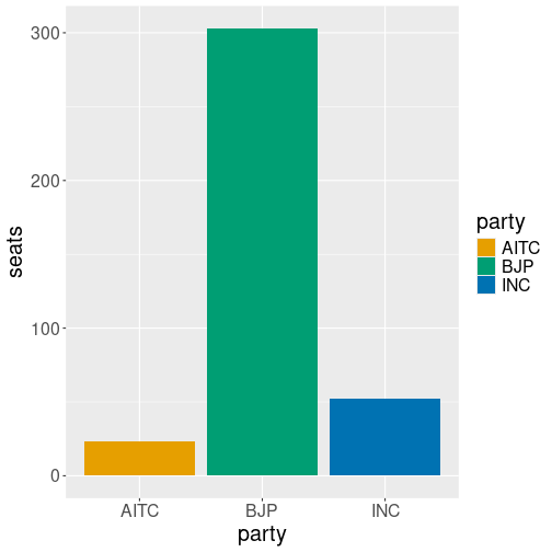
Seats by political parties using default colors.
It is easy to visualize the results with colored bars:
But now you have a problem. As in many other countries, the Indian political parties are traditionally represented with colors, but just not with these colors. BJP is usually saffron (orange), INC is sky blue, and AITC is light green. While you got INC blue, the colors of AITC and BJP are swapped around. This is just misleading.
So we need to tell ggplot that the default colors are not good, and it should pick different color values: value BJP should be “saffron”, value INC “sky blue”, and value AITC should be “light green”.
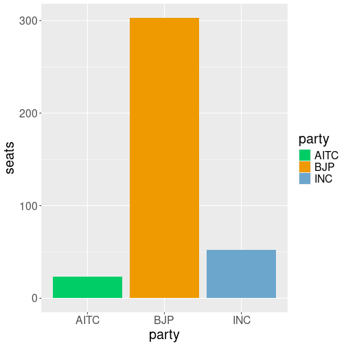
Seats by political parties represented by custom colors.
Fortunately, it is easy to achieve. We need to add a color scale,
that tells which party name should correspond to which color. This
can be achieved by scale_fill_manual(values = c(BJP="orange2", ...)):
ggplot(df,
aes(party, seats, fill=party)) +
geom_col() +
scale_fill_manual(
values = c(BJP="orange2",
INC="skyblue3",
AITC="springgreen3")
)This results in the desired colors for each political party.
Note the syntax of setting colors:
scale_fill_manual takes argument values, a named
vector where names correspond to the discrete values of the variable
(here party) and the vector components are the corresponding color
values. Obviously, one can also use different color codes, such as
c(BJP="#FF9933", INC="#19AAED", AITC="#20C646") for somewhat more
customary colors for these parties.
Exercise 14.20 What happens if you use scale_fill_manual() but do not specify the
color for one of the discrete value? Do you get an error, a default
color, or something else? Try it with the political party plot!
But now we need to talk a few more words about scale_fill_manual().
What exactly does it do and when should you use it?
manualinscale_fill_manual()means that we pick colors manually–we are manually providing colors for each value in data. This is a good choice when there are only a few values, and when the pre-defined color palettes do not contain a suitable set of colors. This is the case here–we have only three values, and there is not dedicated palette for Indian politics.fillinscale_fill_manualmeans you manually specify individual colors for the fill aesthetic. If you usecol = partyinstead offill = party, then you need to use its sibling function,scale_color_manual()instead.
scale_color_manual is a discrete scale. This
means that you can only specify colors for discrete
values.
If the data variable is not discrete, e.g. you want to specify
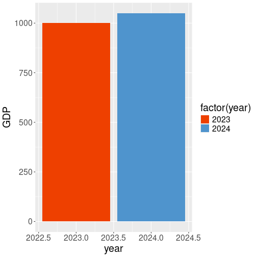
colors for different years, but year is a continuous number, then
scale_fill_manual() will not work. You get an error
gdp <- data.frame(GDP=c(1000, 1050), year=c(2023, 2024))
ggplot(gdp,
aes(year, GDP, fill=year)) +
geom_col() +
scale_fill_manual(
values = c("2023"="orangered2", "2024" = "steelblue3")
)## Error in `scale_fill_manual()`:
## ! Continuous value supplied to a discrete scale.
## ℹ Example values: 2023 and 2024.The error tells you exactly what it is–a continuous value (here
year) is supplied to a discrete scale (here
scale_fill_manual()). This is the same problem we encountered in
Section 14.5.
Forcing year to factor for the fill aesthetic allows to use discrete scale. Note that we haven’t forced it for x aesthetic, and hence we have fractions on the x-axis.
The solution is also the same:
the continuous variable should be forced to categorical by wrapping
it into factor():
ggplot(gdp,
aes(year, GDP, fill=factor(year))) +
geom_col() +
scale_fill_manual(
values = c("2023"="orangered2", "2024" = "steelblue3")
)(See more in Section 21.2.)
Exercise 14.21 Why is scale_color_manual() a discrete scale? Could you envision
a function where you can manually specify colors for a continuous
variable?
See the solution
Exercise 14.22 The GDP example above uses fill aesthetic and fill scale to
specify the fill colors. But what happens if you use another scale,
e.g. scale_color_manual() instead? Does it change the outline
colors? Do you get an error?
See the solution
14.7.3 Adjusting continuous colors
Specifying individual colors manually is a good choice when there is only a small number of discrete data values. But often we have data where the count of possible values is essentially unlimited. This includes many physical measurements, such as height, weight, temperature, elevation and light intensity. Also many economic measures, in particular those that involve money belong here–income, wealth, price and GDP, but also inflation and unemployment are such values. In such a case there is no way that we can specify the colors manually. We need a continuous scale for continuous variables.
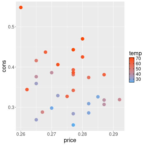
Below, we use Icecream dataset from Ecdat package (see Section I.11). This is a small dataset of ice cream consumption in the U.S. in the early 1950s, a sample of data looks like:
## cons income price temp
## 23 0.284 94 0.277 32
## 8 0.288 79 0.267 47
## 29 0.437 91 0.268 64here we use cons (ice cream consumption per person in pints), price (USD per pint), and temperature (in °F).
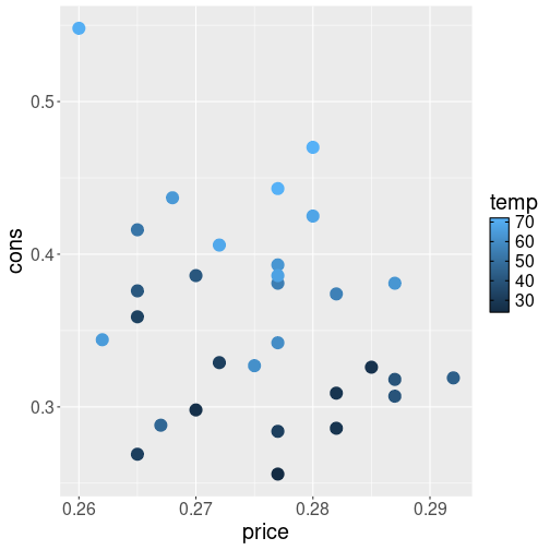
Now let’s make a simple plot about how consumption depends on price and temperature. We put price on x-axis, consumption on y-axis, and color the data points by temperature:
The picture suggests that there is little relationship between price and consumption–the dots are arranged fairly randomly.33 However, the relationship between weather and consumption is strong–you can see the light blue dots, denoting warmer weather, tend to be associated with more consumption.
In terms of colors, ggplot will automatically pick a scale to represent the various temperature values. The scale ranges from dark blue (low values) to light blue (high values). This is a continuous color scale, a color gradient, and it can represent unlimited number of colors, corresponding to unlimited number of potential temperature values.
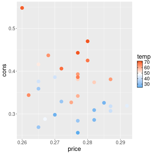
But we may want to show the
temperature not just as shades of blue but with red colors to
represent hot weather and blue colors
to represent cold weather. In order to achieve this, we need to
provide another color gradient where we supply our own custom colors
for low and high temperature values. This
can be done with scale_color_gradient(low="blue", high="red"). This
will make a similar color gradient from blue to red, representing
temperature from their lowest
value to the the highest value in data:
ggplot(Icecream,
aes(price, cons, col=temp)) +
geom_point(size=5) +
scale_color_gradient(
low="steelblue2",
high="orangered"
)The message from the image is similar but the choice of colors is a
more conventional one when representing temperatures.
In a similar fashion as with the discrete scales, your should replace
scale _color_gradient() with scale_fill_gradient() if you use
fill aesthetic instead of color aesthetic.
There are more ways to create gradients. For instance, if you want
the blues not to turn into reds directly, but first into white, and
thereafter into red, then you can use use scale_color_gradient2().
This scale takes three color values: low, mid and high, it also
requires the midpoint value midpoint–what is the middle temperature value that
should be represented as the middle color:
## pick average temp for midpoint
midpoint <- mean(Icecream$temp)
ggplot(Icecream,
aes(price, cons, col=temp)) +
geom_point(size=5) +
scale_color_gradient2(
low = "steelblue2",
mid = "white",
high = "orangered2",
midpoint = midpoint
)Here we picked the middle point value to be mean temperature in the data.
If two gradients with a middle point is still too few for you
then check out scale_color_gradientn() and pre-defined
palettes below.
In a similar fashion like the discrete manual scale (see Section 14.7.2), continuous scale fails if applied to discrete data. If we try to use color gradient with the political parties example above in Section 14.7.2, we get:
partySeats <- data.frame(party = c("BJP", "INC", "AITC"),
seats = c(303, 52, 23))
ggplot(partySeats,
aes(party, seats, fill=party)) +
geom_col() +
scale_fill_gradient()## Error in `scale_fill_gradient()`:
## ! Discrete values supplied to continuous scale.
## ℹ Example values: "BJP", "INC", and "AITC"This means that the scale is expecting all kinds of numbers, put it
was given with fill=party, and party only contains discrete values.
Exercise 14.23 Use ice extent data. Make a barplot of March ice extent on Northern Hemisphere only over all the years, where each bar represents the March ice extent for that particular year. Color the bars using blue-white-red gradient where blue represents a lot of ice, red represents little ice, and white is the period average.
See the solution
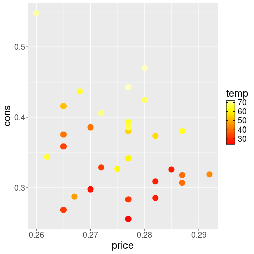
14.7.4 Pre-defined palettes
It is fairly easy to pick two-three colors that fit nicely together
and get a professional-looking plot in this manner. But if you want
to pick a larger number of colors, then it will rapidly become
tricky. The task gets even more complex if you intend your figures to
be readable for people with different types of color-blindness, or
when printed on a paper in just black and white. Fortunately, you are
not the first one who stumbles upon this problem. R includes a number
of pre-defined color palettes. These include
heat.colors(), terrain.colors(),
topo.colors() and others. These functions return a number of color
codes, e.g.
## [1] "#FF0000" "#FF8000" "#FFFF00" "#FFFF80"returns four color codes on red-yellow scale that may be good to represent “heat”.
Icecream consumption versus price. Outside temperature marked using
heat.colors().
If we
want to use such palettes for ggplot gradients then we can just feed
a number of color from the palette to scale_color_gradientn():
ggplot(Ecdat::Icecream,
aes(price, cons, col=temp)) +
geom_point(size=5) +
scale_color_gradientn(
colors=heat.colors(10)
)The result looks like different levels of heat, although the color codes may be more about melting steel and less about weather…
These palettes above are designed with a continuous data in mind, like the smooth transition of color with temperature above. If you are displaying discrete values, then you may prefer colors that are the opposite–not blending smoothly into each other but easy to distinguish instead. ggplot2 includes such a palette, e.g. the default colors for election results in Section 14.7.2 are selected from the ggplot’s built-in palette.
Another popular choice
is to use a pre-defined palette from
colorbrewer.org. Color brewer
palettes have been designed to look good and to be viewable both for
people with normal vision and also with certain forms of color
blindness. Colorbrewer’ color palettes are incorporated into R’s
RColorBrewer package, one can see all the palettes with
RColorBrewer::display.brewer.all()34
(but remember to install
RColorBrewer() first).
You can also get the palette and it’s color codes
colorbrewer website by looking at the
scheme query parameter in the URL.
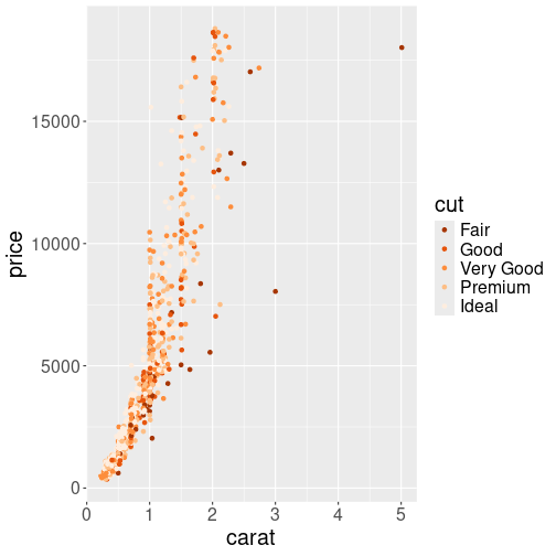
1000 random diamonds’ size versus price, with cut denoted by different oranges.
These palettes can be used with scale_color_brewer() function,
passing the palette as an argument. For instance, let’s plot the
diamonds price using “Accent” palette:
diamonds %>%
sample_n(1000) %>%
ggplot(aes(carat, price, col=cut)) +
geom_point() +
scale_color_brewer(palette = "Oranges",
direction = -1)The last argument, direction = -1, reverses the scale, so “Fair”
fill be dark and “Ideal” light orange.
Note that ColorBrewer’s palettes are discrete–even the
continuous–looking scales, like “YlOrRd” (yellow-orange-red) or
“Blues” (light blues to dark blues) are discrete scales with only a
limited number of possible values. This is because the human eye
cannot easily distinguish between a large number of similar tones, and
hence, if we want to make different continuous levels distinguishable,
we need to use fewer colors. If you want a true continuous scale, you
can always feed a color brewer palette into scale_color_gradientn,
for instance.
14.8 Tuning other parameters
There are many more things you may want to adjust than just colors. Some of these, e.g. line type or point shape behaves in a fairly similar fashion as color and can be adjusted with corresponding scales (see Section 14.8.2).
But there are other adjustments, e.g. position, labels, facets and coordinate systems. This section discusses all these.
14.8.1 Labels & Annotations
While ggplot picks suitable lables for axes, color keys and similar,
you may often want to adjust those. You may also want to add a title
to the plot, or add some text to the actual graph.
This is fairly straightforward with ggplot.
Plot of diamonds, here with adjusted labels and a title.
You can add titles and labels to a chart as a separate layer using the
labs() function. We can amend the diamond plot from Section
14.3.1 above as
ggplot(d1000,
       aes(x = carat, y = price,
           col = cut)) +
geom_point() +
labs(x = "Weight (ct)",
y = "Price (USD)",
col = "Diamond cut",
title =
paste("Price and weight of",
nrow(d1000),
"diamonds"))the labs() function accepts named arguments in the form aesthetic =
title. The aesthetic means the corresponding aesthetic, such as
x for the horizontal axis, or col for the color key. There are
also a few keywords that are not aesthetic-related, such as title
for the overall plot title. This example provides ready-made texts
for all titles, while the overall title contains a calculated value,
the total number of diamonds.
geom_text() or geom_label().
The former will just put the text on the plot, the latter surrounds
the text with a white frame.
For instance, we may want to label the states in the
traffic fatality plot from Section 14.6.2.
In this example, we only add the label at the last year for each
state, see Section 13.5.2.2 about how
this is done here.
We override the inherited data using data = ftsLast in geom_label() (see Section
14.6.1) to only include the last year:
## Find the last year for each state
ftsLast <- fts %>%
   group_by(state) %>%
   filter(rank(desc(year)) == 1)
## Now the plot
ggplot(fts,
       aes(year, fatal,
           group = state)) +
   geom_line() +
                # all data for lines
   geom_label(data = ftsLast,
                # only last year
              aes(label = state))
                # label is state code
geom_label() needs the aesthetic label, the text to be put on the
figure. It can be supplied as a data variable (like state in the
example above), or as a fixed aesthetic (See Section
14.3.3).
Check out the documentation for more information, such as adjusting
the label position. You may also check out the
ggrepel package to help the
label nudge each other off so that they do not overlap.
Exercise 14.24
The label position on the example plot above is a bit awkward–the labels’ white background merges with the plot edges.- Find a way to move the labels slightly left, so that they are surrounded by the gray background.
- Add suitable axis labels and a title to this plot.
- As year is obvious enough, we may remove the x-axis label altogether. Find a way to remove it!
Exercise 14.25 Use geom_text() to mark all individual data points (not just the
last ones)
on the traffic
fatality plot. The result should look similar to the line-point plot
in Section ggplot-types-lineplot, just instead of points, you should
have state codes.
Ensure that the codes are readable and distinct from the lines!
Do you like the result? Explain!
14.8.2 Scales for other aesthetics
There are many more aesthetics than just color and ggplot can map columns from data to those visual properties, and how exactly does the mapping occur is defined through the corresponding scales. Some of the other scales behave in a fairly similar fashion as color scales, for instance point shape or line style. But others, such as coordinate axes, have different properties.
- size: point size. It works with both discrete and continuous values.
- linewidth: width of lines, or outlines for bars and polygons. Works for both discrete and continuous values.
- shape: point shape. Discrete values only.
- alpha: transparency with “1” being completely oblique, and “0” being completely transparent (invisible). Works for both discrete and continuous values.
- linetype: different line types, such as solid, dotted or dashed, for line plots. Discrete values only.
- x, y: horizontal, vertical position.
14.8.2.1 Point shape and line type
Some of these aesthetics are discrete–they can only
display a limited set of discrete values. These are point shape and
line type–ggplot only offers a limited set of discrete shapes and
types. You will
get an error if you attempt to map continuous variables to shape or
linetype.
ggplot is also unhappy if you feed them with
ordered categoricals (see Section 21.2.3).
This is because there is no inherent ordering of point shapes like
+, x and o. Your audience cannot guess which value belongs
where in the ordered scale, and ggplot issues a warning.
Below, we demonstrate the usage of some of these with orange tree data (see Section I.14). As the aim is to explain the usage of scales, the result will not be very good.
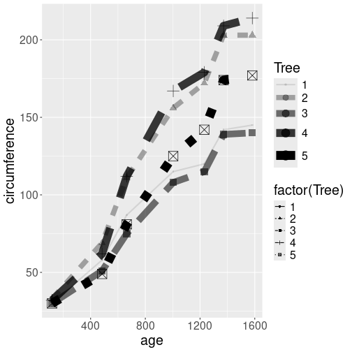
Growth of orange trees. Point size and shape, line width and style, and transparency, all differ by the tree.
We use a number of aesthetics–shape, linetype, alpha, and
size to denote tree number. As alpha and size can display
continuous variables, we can just map those as aes(alpha = Tree).
However, shape and linetype can only handle discrete values, and
hence we need to convert these to categoricals
using factor(Tree).
orange %>%
   ggplot(aes(age, circumference,
              shape = factor(Tree),
              linetype = factor(Tree),
              alpha = Tree,
              size = Tree)) +
   geom_line() +
   geom_point()
The plot, using the default scales, is not pleasant. All trees are marked with black color, but as the black lines are at least somewhat transparent, they appear as different shades of gray. Also, the line styles are hard to comprehend, notably a very wide dashed line resembles a series of dots instead.
Not also that we have two legends, one for Tree and another for factor(Tree). This is because we mapped both of these options to different aesthetics.
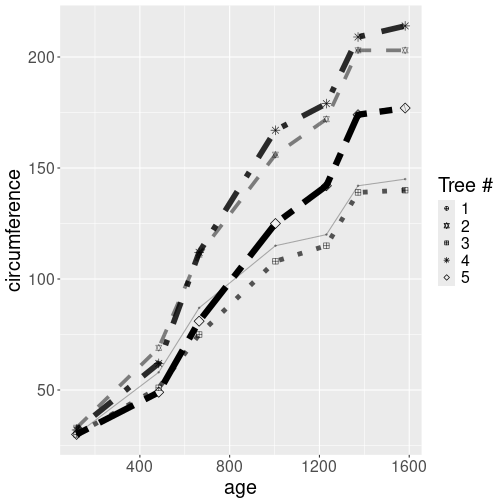
The same plot as above, just this time using manually designed scales.
orange %>%
   ggplot(aes(age, circumference,
              shape = factor(Tree),
              linetype = factor(Tree),
              alpha = Tree,
              size = Tree)) +
   geom_line() +
   geom_point() +
   scale_shape_manual(
      values = c("1" = 10, "2" = 11,
                 "3" = 12, "4" = 8,
                 "5" = 5)) +
   scale_linetype_manual(
      values = c("1" = "solid", "2" = "dashed",
                 "3" = "dotted", "4" = "dotdash",
                 "5" = "twodash")) +
   scale_size_continuous(range=c(0.5,3)) +
   scale_alpha_continuous(range=c(0.3,1)) +
   guides(linetype = "none",
          size = "none",
          alpha = "none") +
   labs(shape = "Tree #")
First, we hand-pick the values for two discrete scales. Each tree
will have it’s own dedicated line type and point shape.
For the continuous scales, we do not pick the individual values but
adjust the ranges instead. For line widths we choose values
between
0.5 and 3 (range = c(0.5, 3)) to make the lines of more equal width, and for alpha we
do a similar conversion forcing the lines to
be a bit more oblique. Finally, we tell that we do not want to see
the linetype, size, and alpha legends on the figure; and adjust the
legend label.
Exercise 14.26 What are the possible point shapes? Try this out:
data.frame(x = 1:25) %>%
  ggplot(aes(x, x)) +
  geom_point(shape = 1:25,
             col = "mediumpurple3",
             fill = "gold3",
             size = 2,
             stroke = 2)
(You may want to adjust size and stroke parameters).
- Which point shapes include fill and outline?
- What does stroke parameter do?
- Explain why can we use
shape = 1:25instead ofshape = factor(1:25). - shapes can also be specified as letters. What does
shape = "m"do? - If you want to use three different point shapes, which ones would you choose? What are your considerations?
Exercise 14.27 Use the same aesthetics as above–point shape, line type, transparency and line width. Make the plot into an aesthetically pleasant publication-quality figure. Do not use colors!
14.8.3 Position Adjustments
In addition to a default statistical transformation, each geom also
has a default position adjustment which specifies a set of “rules”
as to how different components should be positioned relative to each
other.
One of the plot type where the position adjustment is used quite often
is geom_col() and geom_histogram().
This allows you to show different sides of the same
data. Below we demonstrate four different histograms of diamond size
depending on cut. Each of these histograms stresses a different side
of data.
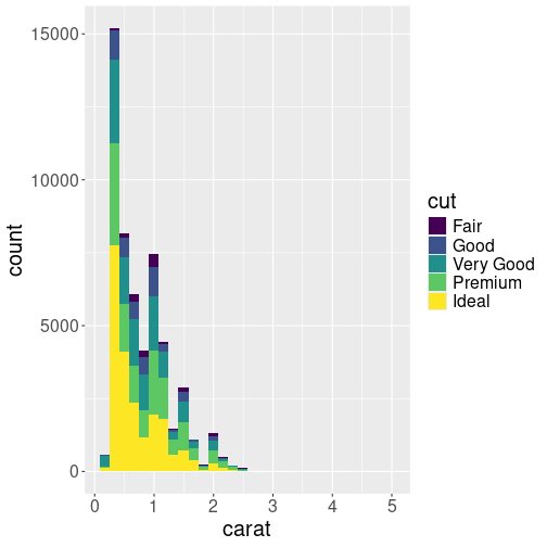
When we color fill the diamond histogram by cut, then by default the bars are stacked on top of each other:
Let’s show this by plotting the histogram of diamonds’ mass (carat), by coloring the bars different according to cut:
This shows the histogram–count by binned carat values. The counts are done separately for different cut-s, and the corresponding bars are stacked on top of each other. This plot is good to show the overall distribution of diamonds, and show what kind of role do gems of different cut play there. We see that by far the most diamonds are small, less than 0.5 ct. But there are secondary peaks at 1ct, 1.5ct and 2ct. We can also see that there are many “ideal” diamonds, although the number differ in different bins.
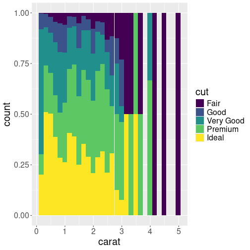
Another histogram of carat, split into five different groups by cut. Now all the bars are of the same height, stressing the proportion of different cuts.
But the previous plot is not very informative if we are interested in
comparing the share of different cuts. The bars are of different
lenbth, and in particular the shorter ones, it is hard to see what
proportion of ideal and other diamonds are there. But we can make the
proportion visible by making the bars of equal height with pos = "fill" argument:
In this form, the histogram shows that ideal cut is more common for small diamonds, and larger diamonds tend to be of less valuable cut.
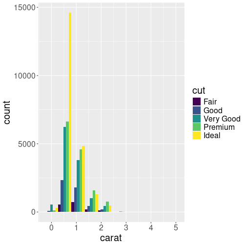
Third similar histogram. Now the bars are located next to each other, allowing a comparison of the mass distribution for differently cut diamonds. We only show 10 bins to make the bars easier to read.
But if we want to compare how the differently cut diamonds are
distributed, neither of the plots above are good. We may want to put
the bars next to each other with position = "dodge" instead:
(We only show 10 bins to make the bars easier to read.) This plot
gives a somewhat similar messages as the one above (position = "fill"). This time, however, we can also see that diamonds between
0.5 to 2.5ct are the most common ones of every cut,
diamonds larger than 3ct are
extremely rare, no matter which cut you are looking at.
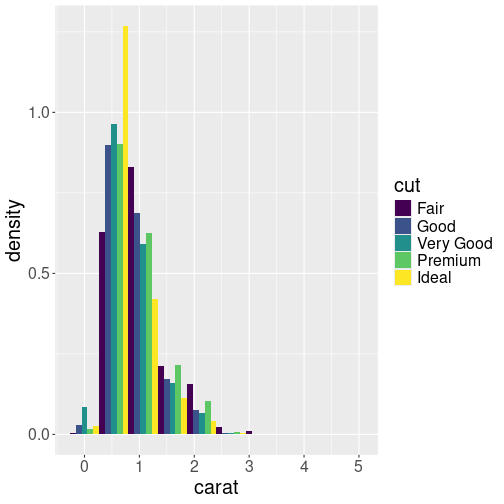
Plotting density instead of counts. This is a better way to see what kind of diamonds are more or less common for a given cut.
Finally, if we are not interested in the distribution of different
cuts given the diamond size, we can compare the densities by setting
y = ..density.. (see Sectino 14.4.4)
in the aesthetics mapping:
Here we can see that most common ideal-cut diamonds are around 0.5ct, but the most common fair-cut diamonds are of 1ct.
As you can see from these examples, there is a variety of ways to display the same data. Each of these sends a different message, and which one you want to use, depends on which side you want to stress.
14.8.4 Coordinate Systems
There are a number of ways to adjust the x and y axes. This includes simple tricks, like reversing the scale or flipping the axes, log scales, and using completely different scales instead of the ordinary x-y cartesian coordinates.
14.8.4.1 Linear and log scale
Diamonds’ price. Both the horizontal and vertical axes are in linear scale.
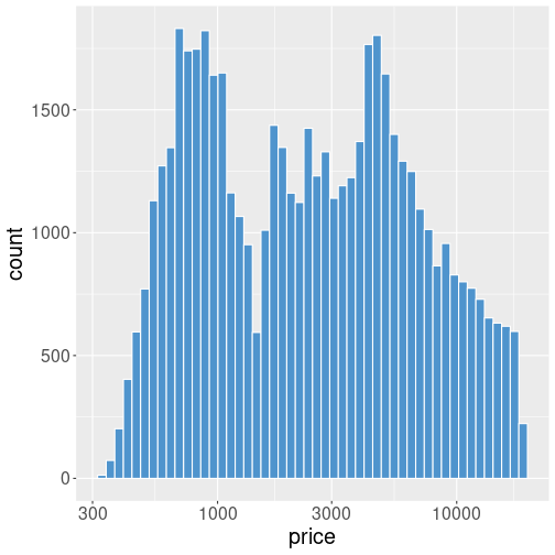
Many datasets contain a lot of small values and not so many large values. For instance, the histogram of diamond’s price will look like this:
This may be exactly what you want–it shows that there are many cheap diamonds (in a few thousand dollar price range), and not that many expensive ones with a price over $10,000. But this plot also has it’s downsides–only a small portion of the figure is devoted to the most common price range, while over a half of it is almost empty, and confirming what we may know anyway–there are not that many expensive gems.
Diamonds’ price. The vertical axis is still linear, but the horizontal axis is now in log scale. It is a log-linear plot.
Let’s repeat the above example using log scale:
ggplot(diamonds, aes(price)) +
   geom_histogram(bins=50,
                  fill="steelblue3",
col="white") +
scale_x_log10()Code-wise, we just add + scale_x_log10() to the previous example,
this forces the x-axis to be logarithmic.
(See Section 14.8.2 for more about scales).
Now the plot looks very different. The bars are of broadly equal
height and a problem with the previous plot–a lot of empty space–is
gone.
Exercise 14.28
Look at the diamonds’ weight-price graph in Section 14.2.2.- Do you think the figure would gain from log scale?
- Replicate the figure using log scale for x only;
- … for y only;
- … and for both x and y.
Discuss the results: which one do you think is the best figure? Do they convey a different message?
14.8.4.2 Other ways to tune x and y
There are a number of other ways to tune x and y. Some of it
works through scales (like scale_x_reverse()), others through
coordinate systems (like coord_cartesian()). Here is a short
list:
scale_x_reverse()reverses the direction of the x axis.scale_x_continuous()is the default x scale and normally not needed. But it is handy if you want to change certain layout elements, such as tick marks.coord_cartesian()the default cartesian coordinate system, where you specifyxandyvalues. Again, you do not normally need to specify it, except when you want to change certain parameters, such as the plot region.coord_flip()a cartesian system with thexandyflippedcoord_fixed()a cartesian system with a “fixed” aspect ratio (e.g., 1.78 for a “widescreen” plot)coord_polar()a plot using polar coordinates. This is useful when plotting repeated directions (like in wind diagrams) or cyclic processes (like hours through the day).coord_quickmap()a coordinate system that approximates a good aspect ratio for maps. See Section 16.1.1.

Weight-price relationship. The weight range is limited to 0.2–0.5ct.
Here is an example how to manually set the range of x-axis:
diamonds %>%
   sample_n(1000) %>%
   ggplot(aes(carat, price)) +
   geom_point() +
   scale_x_continuous(
      limits = c(0.2, 0.5))
As you can see, the range of y axis still spans the whole price range, you may want to use manual limits for that as well.
Exercise 14.29 Use Ice extent data to plot a version of “Arctic Death Spiral”: plot the value of ice extent versus month across all the years, but use polar coordinates! Use the Northern Hemisphere only.
Try to tune the plot to look as good as you can.
Hint: you may want to set axis limits, try scale_x_continuous() and
scale_y_continuous(). In case of polar coordinates, the former
manipulates the angle \(\theta\) and the latter radius \(r\).
14.9 More geoms and plot types
In Section 14.4 we introduced the most important plot types and the corresponding geoms. Here we discuss a selection of other plot types, and other tasks that can be achieved with different geoms.
14.9.1 When scatterplots are not good enough
TBD: geom_jitter()
TBD: better data for density
We use ice extent data, a dataset, compiled by from NSIDC, that contains monthly satellite measures of polar ice area and extent from 1978 on. A sample of the dataset looks like
##      year month data.type region extent  area     time
## 1059 2022    12   NRTSI-G      N  11.92 10.23 2022.958
## 1060 2022    12   NRTSI-G      S   8.69  5.12 2022.958
## 1061 2023     1   NRTSI-G      N  13.35 11.83 2023.042
## 1062 2023     1   NRTSI-G      S   3.23  1.95 2023.042
The relevant variables here are
- time: time, measured in years at mid-month.
- extent: sea ice extent, M \(km^2\). Sea ice extent is sea area where ice concentration is over 15%. This is a measure of sea ice that is less error prone that sea ice area, area where sea is completely frozen over.
- region: “N”/“S” for Northern or Southern hemisphere.
14.9.2 Density plots
Above, in Section 14.4.4, we introduced histograms. These are basically counts of observations by binned x.
14.9.2.1 More about histograms
However, histograms have two undesirable properties:
- The bin heights–counts–depend not just on how data is distributed, but also on the bin width and the dataset size. Obviously, narrow bins on a small dataset contain few observations. But this makes it hard to compare two different distributions.
- The shape of histograms depends on the exact width and location of the bins. This is quite a big problem for discrete values, such as age (almost always measured in full years), and may create spurious patterns on histograms.
The solution to the first problem is fairly simple: instead of plotting the number (count) of observations in each bin, we plot density–percentage of data points per unit bin with. The density numbers do not change much when changing the dataset size or number of bins.
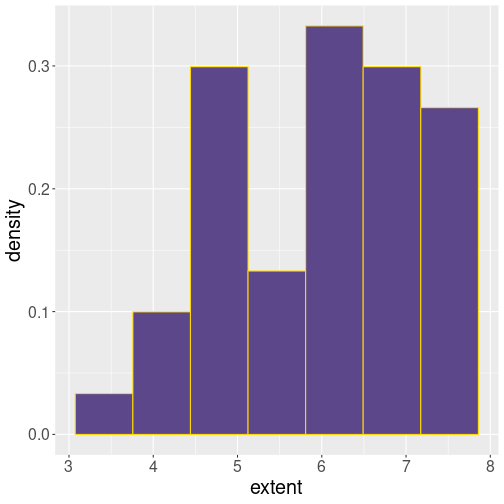
Histogram of September ice extent. Bin heights correspond to density.
In order to replace counts with density, you need to specify
after_stat(density) in the aes() function for the y aesthetics:
ggplot(septemberData,
       aes(extent,
           after_stat(density))) +
   geom_histogram(
      bins=7,
      fill="mediumpurple4",
      col="gold1"
   )
We see that the smallest extent values are less than 3 (M km\(^2\)), and the largest values are close to 8.
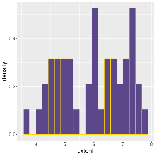
The same histogram, now with 20 bins. The density values are comparable.
For comparison, let’s repeat the same plot with 20 bins:
ggplot(septemberData,
       aes(extent,
           after_stat(density))) +
   geom_histogram(
      bins=20,
      fill="mediumpurple4",
      col="gold1"
   )
This is clearly too many bins for such a small dataset. But as you can see, while the bin count and shape are rather different, the density values are comparable.
14.9.2.2 Density plot
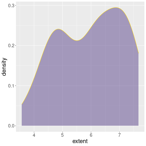
Smooth density curve (black), filled from below with semi-transparent blue.
Unfortunately, this does not solve the second problem–histograms are
sensitive to the exact location
of bins. A solution is not to use discrete bins, but to “smear” the
observations around on the plot. The result will look something like
a “smoothed
histogram”, this can be done with geom_density():
ggplot(septemberData, aes(extent)) +
   geom_density(
      fill = "mediumpurple4",
      col = "gold1",
      alpha = 0.5
   )
By default, geom_density() just draws the smooth golden curve. When
you specify fill = then it also fills the area under the curve. Here we also
set alpha = 0.5, making the fill color semi-transparent to make the
underlying coordinate lines somewhat visible.
Such semi-transparent density curves may be good for comparing distribution across different categorical variables.
Exercise 14.30 Make such a density plot for the ticket price (fare) distribution on Titanic for all 3 passenger classes. Mark the different classes by different color.
See the solution
14.9.2.3 Violin plots
The third type of density plot we discuss here is violin plot. The relationship between density plot and violin plot is about the same as between histogram and boxplot: violinplots are just density plots, where density is grouped by some kind of categorical variable. Here is a replica of the boxplot from Section 14.4.5, but now in the form of violinplot: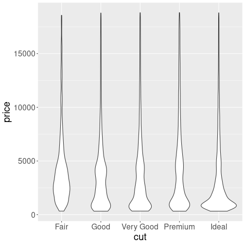
Price distribution by cut. Violinplot.
In terms of code, we have just replaced geom_boxplot() with
geom_violin(), everything else is the same.
Violinplot is essentially just a series of “double-sided” density plots, arranged vertically by the category. The resulting objects somewhat resemble violins (or other string instruments), hence the name.
As you can see, the distribution depends on the cut: the better cut, the more cheap diamonds there seems to be. This is the same problem what we discussed above. Compared to boxplots, the violinplots give a more detailed overview–we can see the actual shape of the distribution. But now it is harder to compare quartiles.
Exercise 14.31 The figure seems a bit dull and boring. Color the violins differently for each value of cut. Do more plot tuning if you like.
14.9.3 Paths and lines
Line plot (see Section 14.4.2) is one of the simplest and most popular plot types. It first orders observations by x and then connects the corresponding data points with lines.
14.9.3.1 Plotting paths
But sometimes we
do not want to order the observations. For instance, we may want to
plot a path of something moving over time. In such case we can
use geom_path()–it is otherwise similar to geom_line(), just the
points remain unordered.
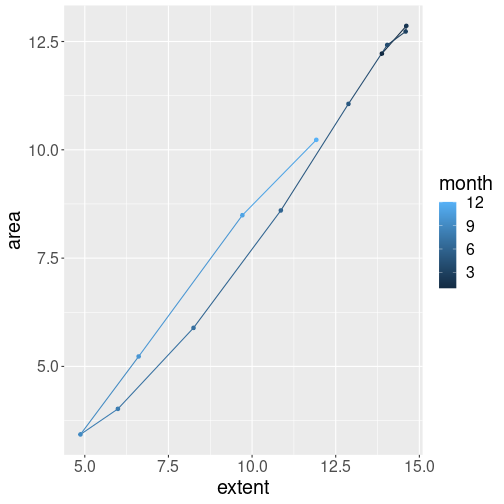
For instance, here is how ice extent and area changed through 2022:
ice %>%
   filter(year == 2022,
          region == "N") %>%
   ggplot(
      aes(extent, area,
          col = month)
   ) +
   geom_path() +
   geom_point()
In winter, both area and extent were large. However, area fall faster through the melt season, as the melting ice weakened and broke up. This made area smaller than extent. The opposite happens during the fall freezing season: sea freezes over with little breakups, and hence extent area can almost catch up the extent.
- Both plots connect points with lines, hence they are best suited for such features that smoothly transform from one to another. In the figure above, we know that the extent of ice tranforms smoothly over time as the sea melts or freezes. When discussing COVID deaths above, it was the number of deaths that changed from day to day.
- Line plot is a good choice if the natural order of the datapoints is
the same as the x-axis. In case of COVID deaths, the x-axis
depicted time, and the numbers also changed in time. Here the ice
extent still changes in time–but now the axes do not represent time
any more but area and extent instead. Hence line plot is not a good
choice, but
geom_path()will connect the points in a natural order.
Exercise 14.32 Repeat the above ice extent-area plot. But now include all years as a gray semi-transparent path (see Section 14.6.2). On top of the gray figure, mark the latest year in data using blue colors.
14.9.3.2 Marking values by lines
There are also a number of geoms which’ primary purpose is not to
display data but to mark certain values on the figure. This includes
geom_vline() for vertical lines, geom_hline() for horizontal
lines, and geom_abline() for diagonal lines. These geoms can be
used to display data, but the result is often not particularly useful.
Northern ice extents in September, from 1979 to 2022, displayed as vertical lines.
For instance, we can plot all the ice extent using vertical lines while coloring those according to year:
The figure is somewhat useful (it is a form of rugplot), but alone, it is usually not the best way to visualize data. Nevertheless, when colored like this, it shows that there was much more ice in September in 1980-s, compared to 2010-s.
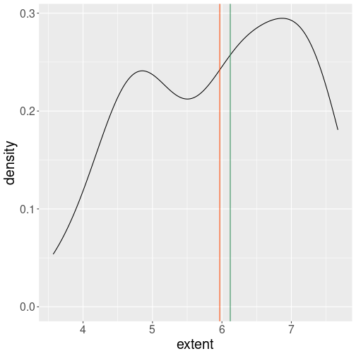
The period average and median ice extent marked as vertical lines of different color.
Vertical lines are typically used to display certain values on the figure. For instance, we can add the sample mean and median to the density plot as vertical lines of different color:
ggplot(septemberData, aes(extent)) +
   geom_density() +
   geom_vline(
      xintercept=c(
         mean(septemberData$extent),
         median(septemberData$extent)
      ),
      col = c("orangered1",
                # mean is red
              "seagreen4")
                # median is green
   )
Note that while aes() accepts the data variable names directly, the
xintercept = inside geom_vline() does look for workspace variables
only. One has to use dollar notation to extract
columns from the data frame.
14.9.3.3 Smoothing lines
Lines are also a very common way to display trends.
Ice extend in September, from 1979 to 2022. The blue line marks the trend, here the best linear fit (linear regression).
For instance, you may notice that the September ice extent has been falling over time.
The figure here adds the trend line, more specifically linear regression trend. As displayed here, it just helps to guide the eye and to evaluate whether a linear trend is a good description of the pattern.
geom_smooth() can display different smoothers. The argument
method = "lm" tells it to use line (instead of a curve), and
se = FALSE tells not to display the confidence bands.
Exercise 14.33 Remove method = "lm" from the code above. What happens? Do the
message given by these plots differ? What do you think, which one
conveys a clearer message?
14.9.4 Other plot types
14.9.4.1 Heatmaps and 2D-histograms
In Section 14.4.1 above, we discussed that scatterplots cannot easily handle a very large number of data points. If this is the case, 2D heatmaps and histograms may offer a solution.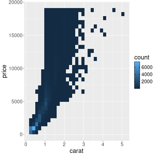
2D histogram where bin heights are conveyed with different colors.
Here is an example of 2D histogram of the diamonds, displayed on carat-price axes:
Unlike in case of scatterplot, individual diamonds are not displayed as separate dots, but the plot space is split into small rectangles, color of which corresponds to the count of diamonds there. The legend displays the count, exactly as in case of 1D histogram (see Section 14.4.4).
The figure here shows that by far most common diamonds are of size around 0.5ct, and cost approximately $1000.
Exercise 14.34
Repeat the above plot, but now:- Use hexagonal bins instead of rectangular (
geom_hex()) - Make a smooth density plot (
geom_density_2d()).
Explain the differences. What do you think, which options gives the best results here?
See also R graph gallery.
14.9.5 Facets: another way to display more data
Facets are ways of grouping a data plot into multiple different
pieces (subplots). This allows you to view a separate plot for each
each category of a a certain variable.
Conceptually, breaking a plot up into facets is similar to using the
group_by() verb in dplyr (see Section 13.5),
with each facet acting like a level in an R factor.
You can construct a plot with multiple facets by using the
facet_wrap() function. This will produce a “row” of subplots,
one for each category of the grouping variable
(the number of rows can be specified with an additional argument).
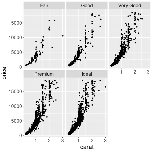
Here is an example, how to split the carat-price graph of diamonds into different facets:
diamonds %>%
   sample_n(3000) %>%
   ggplot() +
   geom_point(aes(carat, price)) +
   facet_wrap(~cut)
                # make separate facets
                # for each value of 'cut'
Note that the argument to facet_wrap() function is written with a
tilde (~) in front of it. This specifies that the column name
should be treated as a formula.
A formula is a bit like an equation in mathematics; it’s like a string representing what set of operations you want to perform.
The plot reveals that the curves differ–better cuts tend to command higher prices. But the difference is not quite easy to spot. You may consider a single scatterplot instead, with colors denoting different cuts, as in Section 14.3.1–although in that case the difference is not easily visible either.
Exercise 14.35 Use all the ggplot tools you can, and try to create a plot that makes the cut-price differences as clearly visible as possible.
14.10 Programming with ggplot2
ggplot is well suited to be incorporated into code. So far, we have been focusing on the interactive usage, or usage in small code snippets. When you run the code in a more extensive program, there are a number of issues you may run into. Here we discuss some of these.
14.10.1 Outputting plots
The typical usage of ggplot in short code snippets is something like
When you run this code, you’ll see the plot popping up in the plot
window. This may make you to think that the ggplot() function that
itself draws the image on screen. But this is not true!
A call to ggplot() just creates a ggplot-object, a data structure
that contains data and all other necessary details for creating the
plot. But it does not create the image.
The image is created instead by the print-method. This is analogous
with all other R expression on the console–if you just type an
expression, then R evaluates and prints the result.
This is why we can use it as a manual calculator for simple math, such as 2 + 2. The same is true for ggplot: it returns a ggplot-object, and given you don’t store it into a variable, it is printed, and the print method of ggplot-object actually makes the image. This is why we can immediately see the images when we work with ggplot on console.
Things may be different, however, if we do this in a script. When you execute a script, the returned objects are not printed, even if you do not save those in a variable. For instance, the script
will not produce any output when sourced as a single script (Source-d, not sourced with echo, and not run line-by-line). If this is the problem you run into, then you may want to store the plot into a variable and afterward print it explicitly:
As an additional bonus, now you have stored your plot in a variable and you can also add additional layers to it (see Section 14.10.2).
Note that this also applies to other contexts where ggplot is used, e.g. when making plots in shiny (see Section E).
In scripts we often want the code not to produce image on screen, but store it in a file instead. This can be achieved in a variety of ways, for instance through redirecting graphical output to a pdf device with the command pdf():
data <- diamonds %>%
   sample_n(1000)
p <- ggplot(data) +
   geom_point(aes(carat, price))  # store here
pdf(file="diamonds.pdf", width=10, height=8)
                           # redirect to a pdf file
print(p)  # print here
dev.off()  # remember to close the file
After redirecting the output, all plots will be written to the pdf file (as separate pages if you create more than one plot). Note you have to close the file with dev.off(), otherwise it will be broken. There are other output options besides pdf, you may want to check jpeg and png image outputs. Finally, ggplot also has a dedicated way to save individual plots to file using ggsave.
14.10.2 Re-using your code: adding layers with +
You frequently need to make multiple rather similar plot. You want the plots to be rather similar but not exactly the same. This means most of the plotting commands are the same, but a few are different. A good way to achieve this in ggplot is to store the parts of your plot you want to re-use into variables. For instance, let’s do two plots of diamonds, one in linear-linear, and the other in log-log scale.
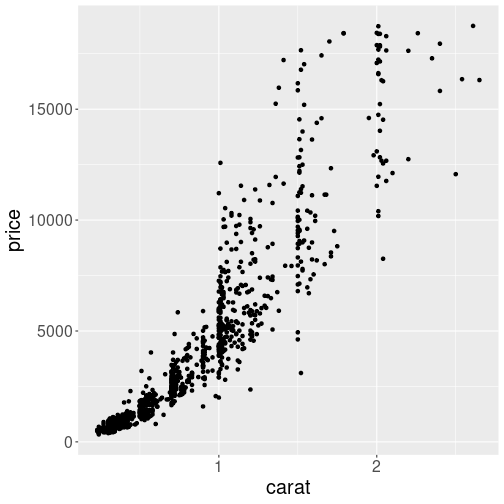
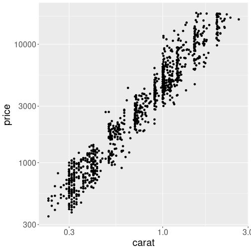
Two similar plots, done by re-using the same code.
First, we select a subsample of diamonds and make a simple scatterplot:
This scatterplot is saved as p, and we can create the plot by just printing it as
As we did not specify any special scale, the plot will be in linear-linear scale. The other plot is created from the same variable p by adding the log-log scales:
As we do not store this into a new variable, the result will just be printed (plotted).
Note how we just add more layers to p, in a similar fashion as one
can add numbers to a numberic variable. The + sign understands that
these are ggplot objects and combines the appropriate layers instead.
14.10.3 Indirect variable names
Another common task when programming is to use indirect variable names (see Section 12.3.1).
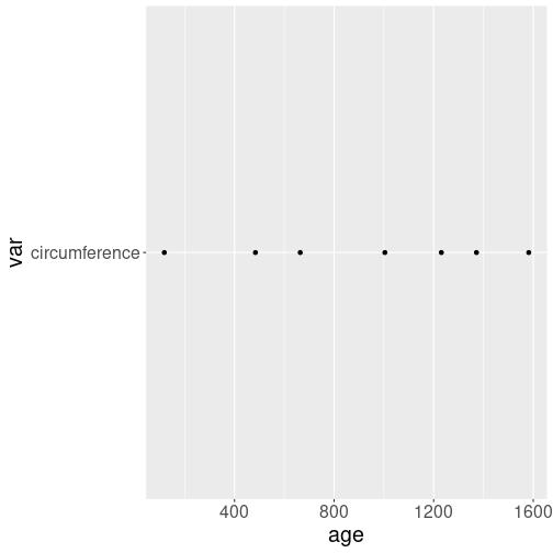
Indirect variable name used in a wrong way. ggplot assumes that the vertical position is given through the workspace variable “var”, and it’s value is “circumference”. That’s why every signle dot is at level “circumference”.
It is not immediately obvious how to do it–a naive attempt with
data <- read_delim(
   "data/orange-trees.csv") %>%
   filter(Tree == 1)
var <- "circumference"
ggplot(data, aes(age, var)) +
   geom_point()
will result in a weird plot that is almost certainly not what you want.
an error where ggplot complains about “var” not found. The problem is similar as with dollar versus double bracket notation in case of data frames–ggplot expects “var” to be the data variable name, and complains that it cannot find it.
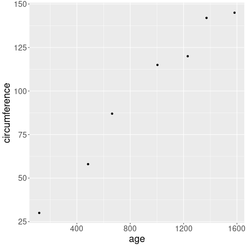
Indirect variable names can be used with aes_string(). Note that
“age” must be quoted too.
Fortunately, there is an easy remedy. aes_string(), instead of
aes() will expect the arguments to be strings, not unqoted variable
names. And one can easily pass string values indirectly:
data <- read_delim(
   "data/orange-trees.csv") %>%
   filter(Tree == 1)
var <- "circumference"
ggplot(data, aes_string("age", var)) +
   geom_point()
Note that all variable names must be passed as character to
aes_string(), so you must write aes_string("age", var), not
aes_string(age, var). “Var” must be left unquoted as it is a
workspace variable, but “age” is the name of a data variable.
14.11 Other Visualization Libraries
ggplot2 is easily the most popular library for producing data visualizations in R. That said, ggplot2 is used to produce static visualizations: unchanging “pictures” of plots. Static plots are great for for explanatory visualizations: visualizations that are used to communicate some information—or more commonly, an argument about that information. All of the above visualizations have been ways to explain and demonstrate an argument about the data (e.g., the relationship between car engines and fuel efficiency).
Data visualizations can also be highly effective for exploratory analysis, in which the visualization is used as a way to ask and answer questions about the data (rather than to convey an answer or argument). While it is perfectly feasible to do such exploration on a static visualization, many explorations can be better served with interactive visualizations in which the user can select and change the view and presentation of that data in order to understand it.
While ggplot2 does not directly support interactive visualizations, there are a number of additional R libraries that provide this functionality, including:
ggvisis a library that uses the Grammar of Graphics (similar toggplot), but for interactive visualizations. The interactivity is provided through theshinylibrary, which is introduced in a later chapter.Bokeh is an open-source library for developing interactive visualizations. It automatically provides a number of “standard” interactions (pop-up labels, drag to pan, select to zoom, etc) automatically. It is similar to
ggplot2, in that you create a figure and then and then add layers representing different geometries (points, lines etc). It has detailed and readable documentation, and is also available to other programming languages (such as Python).Plotly is another library similar to Bokeh, in that it automatically provided standard interactions. It is also possible to take a
ggplot2plot and wrap it in Plotly in order to make it interactive. Plotly has many examples to learn from, though a less effective set of documentation than other libraries.rChartsprovides a way to utilize a number of JavaScript interactive visualization libraries. JavaScript is the programming language used to create interactive websites (HTML files), and so is highly specialized for creating interactive experiences.
There are many other libraries as well; searching around for a specific feature you need may lead you to a useful tool!
Resources
- gglot2 Documentation (particularly the function reference)
- Data Visualization (R4DS) - tutorial using
ggplot2 - Graphics for Communication (R4DS) - “part 2” of tutorial using
ggplot - Telling stories with the grammar of graphics
- A Layered Grammar of Graphics (Wickham 2010)
It is often better to combine the datasets into one, instead of overriding datasets. But this is not always the case.↩︎
This conclusion is perhaps a bit pre-mature. Namely, the variation in price is fairly small, compared to that of temperature.↩︎
RColorBrewer::display.brewer.all() calls the function display.brewer.all() from the RColorBrewer package, without loading it first. It is mostly equivalent to two separate commands,
library(RColorBrewer)anddisplay.brewer.all().↩︎