Chapter 11 How are values related
This section discusses relationships in data. Often these are relationships that we are interested in, e.g. how is income related to education, or how is global temperature changing over years. Relationships are worth analyzing as they tell us something about the problem. Even if a positive correlation is not proof that more education gives you better salary, it may still provide some evidence that this is true.
11.1 Visualizing trend lines
One of the simplest and most powerful tools to understand simple relationships is to visualize these using similar tools like what we were using in Section 10. We demonstrate the trends using Ice extent data. This can be loaded as:
Now we have loaded the dataset and stored it under name ice in
the R workspace. The dataset looks like
## # A tibble: 3 × 7
##    year month `data-type` region extent  area  time
##   <dbl> <dbl> <chr>       <chr>   <dbl> <dbl> <dbl>
## 1  1978    11 Goddard     N        11.6  9.04 1979.
## 2  1978    11 Goddard     S        15.9 11.7  1979.
## 3  1978    12 Goddard     N        13.7 10.9  1979.
For our purpose, the important variables are year, month, region, extent, and area. Region means the hemisphere, “N” for north and “S” for south. Extent and area are sea ice extent and area (in millions of km2). Area is just the sea surface area that is covered by ice, extent is defined as sea surface area where there is at least 15% of ice concentration. This is a widely used measure, as satellite measurements of extent are more precise than that of the area.
When you look at the figures in Section 10.3, you may have have got an impression that the monthly ice area is falling over years. Let us now focus not on the plot, but how to show this trend. First, let’s plot the September ice area in north over years:
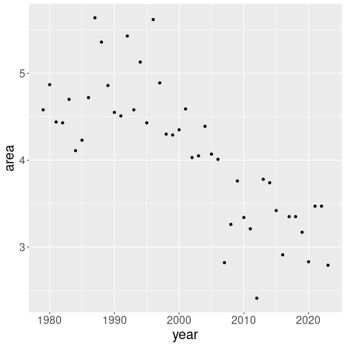
We filtered only valid values (area > 0), September month
(month == 9) and northern hemisphere (region == "N"). We also
choose to use only points
and not lines to avoid interference with the trend
line later. The dots seem to be heading downward at a fairly steady
pace, although there is a lot of yearly fluctuation around this
trend.
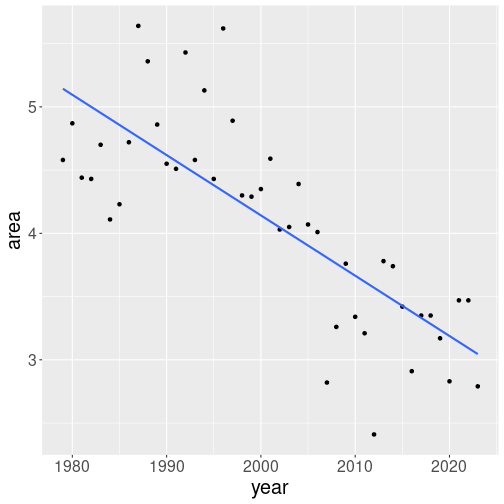
Next, let’s add a trend line on it. This can be done using
ggplot’s geom_smooth()–you just add another layer as
+ geom_smooth(method="lm", se=FALSE):
ice %>%
   filter(area > 0,
          month == 9,
          region == "N") %>%
   ggplot(aes(x=year, y=area)) +
geom_point() +
geom_smooth(method="lm", se=FALSE)We tell geom_smooth to mark a trend line, not curve (method = "lm" for linear model, see Section 11.3).
We also tell it not to plot
the confidence region (se = FALSE for standard errors). As a result,
we have a single clean trend line. The line suggest that September
ice area has fallen from approximately 5 million km2 at 1980 to
approximately 3 million by 2020.
Exercise 11.1 Repeat the plot, but this time leave out the method="lm" and
se=FALSE. What happens? Which plot do you like more?
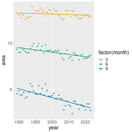
geom_smooth works perfectly with data groups (see Section
10.3). For instance, let’s replicate the same
example but using data for three month–March, June and September:
ice %>%
   filter(area > 0,
          month %in% c(3, 6, 9),
          region == "N") %>%
   ggplot(aes(x=year, y=area,
              col=factor(month))) +
   geom_point() +
   geom_smooth(method="lm", se=FALSE)
The differences are quite small:
- we select March, June and September this time, not just September
- we add
col = factor(month)to the aesthetics. This means separate the dots (and trend lines) into three monthly groups, each of which is displayed with a different color.factor(month)is needed to convert numeric month into a categorical variable (see Section 10.3). - finally, we use
month %in% c(3, 6, 9)to specify that we want to preserve only those months that are in the given list (See Section 5.3.2.2).
Now we see three differently colored sets of points, and also three trend lines, one for each month, displayed with the respective color. The figure shows that while September ice area is trending down fairly fast, the trend for March is very small, almost non-existing. While we may see ice-free Septembers in a few decades, completely ice-free Arctic Ocean is still far away.
Exercise 11.2 Remove the function factor from col=factor(month). What happens?
How many trend lines will you see now?
See the solution
We can do a quick back-of-the-envelope calculation about when will the ice completely vanish. It took approximately 40 years for the ice to fall from 5 to 3 M km2, hence it will take another 60 years to fall to 0. Obviously, this is only true if the current trend continues.
11.2 Strength of the relationship: correlation
TBD: move after regression
There are two ways to describe the strength of a relationship: correlation and slope. Here we discuss correlation, slope is explained below in the Linear Regression section.
11.2.1 Why regression is not enough
Section 11.3 discusses linear regression. A central concept in regression models is slope, the slope of the regression line. But slope may not be enough to describe how two values are related.
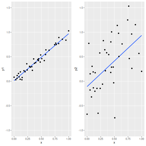
Two relationships with virtually the same slope (0.958 and 1.045) but different noisiness.
The figure here shows the problem: it displays two relationships that have virtually the same slope, but one is a lot more noisy than the other. If we run the linear regression both these datasets, we would conclude that the relationships are similar, while they clearly are not. In case of the left-hand image, \(y\) is clearly very closely related to \(x\), while in case of the right-hand image, the relationship is much less clear.
TBD: explain why the same slope but different noisiness may matter.
11.2.2 What is correlation
Correlation is a measure that describes how closely are two variables related. It can be “+1” if both variables are related exactly in a linear fashion, and there is no wiggle room for one to change while the other stays the same. The “+” in front of “+1” stresses that the relationship is positive, i.e. if one variable increases, then the other necessarily increases too. Alternatively, if correlation is “-1”, then there no wiggle room either, but if one variable increases, the other one necessarily decreases.
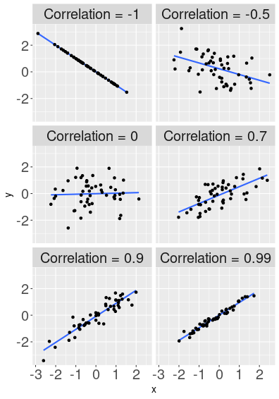
How correlation describes the shape of the point cloud.
Here are a few examples that display two randomly generated variables, that are correlated to a different degree. The top-left image shows relationship with correlation exactly “-1”. Hence all the data points are exactly on the blue line (“1” means perfect correlation), and when \(x\) increases then \(y\) falls (this is what “-” in front of “1” means). The next image, “-0.5”, shows a point cloud that is clearly negatively related–larger \(x\) values are associated with smaller \(y\) values, but the relationship is far from perfect. When \(x\) grows then \(y\) tends to decrease, but this is not always the case–sometimes larger \(x\) corresponds to larger \(y\) instead. When correlation is 0 (middle left image), then the line is almost flat, and we cannot see any obvious relationship. These variables are unrelated. Further, the plot shows a few possible positive correlations. Now larger \(x\) values correspond to larger \(y\) values. The largest positive value displayed here is 0.99, the points align very well with the line, but not perfectly.
You can play and learn more on dedicated websites, such as Guess The Correlation.
Note that correlation is agnostic about the scale. In these figures both \(x\) and \(y\) are scaled in a similar fashion, but that is not necessary. Correlation measures how well do the points fall on the line, not what is the slope of the line. Whatever are the measurement units we are using, we can always scale the plot down to roughly a square, and see how well the points line up there.
Because correlation describes the relationship between two variables in such an intuitive and easily understandable manner, it is widely used in practice.
11.2.3 Example: how similar are iris flower parts
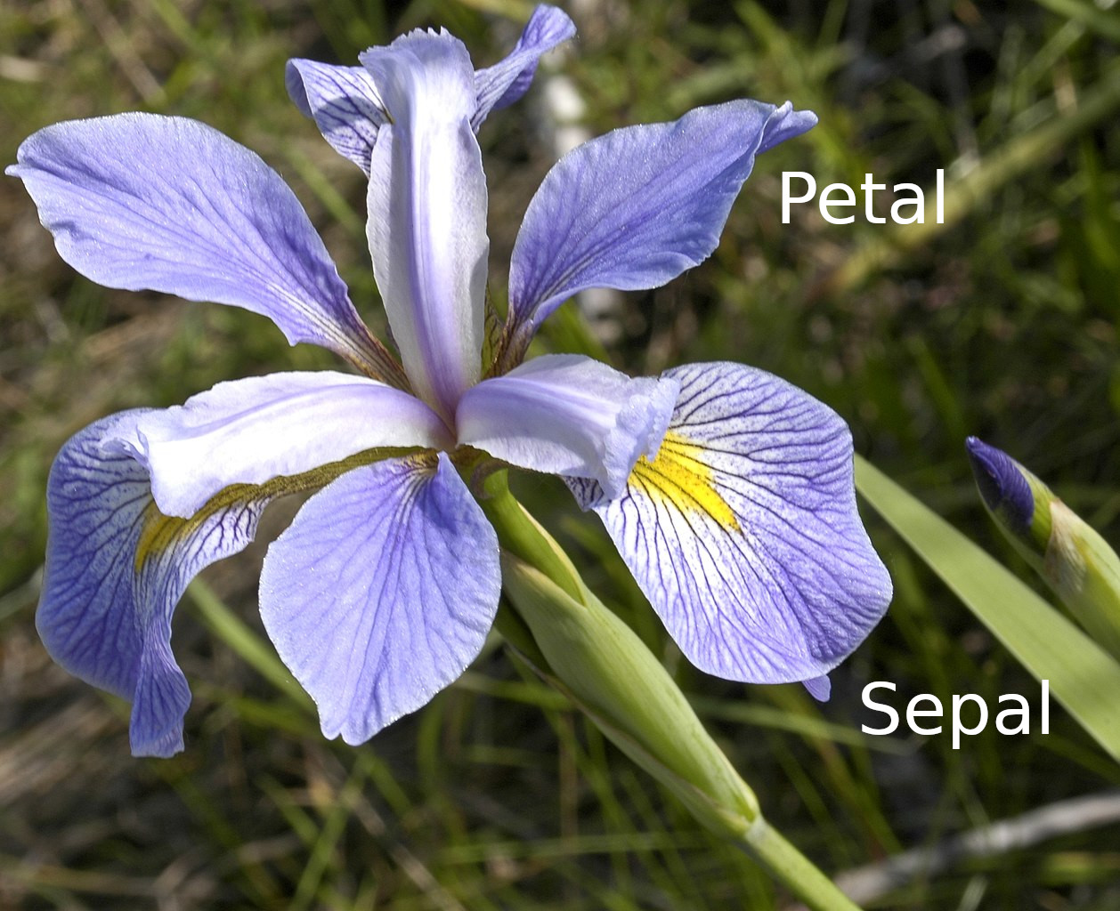
Virginica flower. Unlike in the colloquial language, petals in the botanical sense are only the simpler, smaller, secondary components of the flower, here light purple with darker purple veins. The large base components with yellow patch in the center and dark purple veins are sepals.
Frank Mayfield, CC BY-SA 2.0, via Wikimedia Commons
Now it is time for an example. We use iris dataset, first used by R. Fisher in 1936. It consists of measures of three different iris species, 50 flowers from each—their sepal and petal length and width (see the figure). Below, we focus on virginica flowers only, combining multiple species on the same figure will make the picture unnecessarily complex.
It is intuitively obvious that the different measures of flowers are positively related: longer petals tend to be wider too, and large flowers have both large petals and large sepals. We may not even think separately about length and width but instead about the “size” of flowers. Given the shape remains broadly similar, larger petals are both longer and wider.
Let us now compute the correlation. First we load data and
The dataset contains the following variables:
## # A tibble: 3 × 5
##   Sepal.Length Sepal.Width Petal.Length Petal.Width Species
##          <dbl>       <dbl>        <dbl>       <dbl> <chr>
## 1          6.3         3.3          6           2.5 virginica
## 2          5.8         2.7          5.1         1.9 virginica
## 3          7.1         3            5.9         2.1 virginica
The first four columns are the dimensions–sepal length, sepal width, petal length, petal width; and the last column is the species.
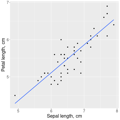
Relationship between virginica sepals and petals.
Let use focus on the relationship between sepal length and petal length. This can be visualized as
ggplot(virginica,
       aes(x = Sepal.Length,
           y = Petal.Length)) +
   geom_point() +
   geom_smooth(method="lm",
               se=FALSE) +
   labs(x = "Sepal length, cm",
        y = "Petal length, cm")
As expected, we see a positive relationship: flowers with longer sepals also tend to have longer petals. Larger flowers are, well, larger. The trend line seems to fit the point cloud rather well–the points do not spread too much around it, and there are no clear outliers. We do not spot any problems highlighted above.
Now we can compute the correlation. We use function cor() that
prints the correlation matrix:
##              Sepal.Length Petal.Length
## Sepal.Length    1.0000000    0.8642247
## Petal.Length    0.8642247    1.0000000
The matrix consists of two rows and two columns, one for each variable. The most important number here is 0.864–the correlation between petal length and sepal length. The 1.000 on the diagonal means that each variable is perfectly correlated with itself (they always are). So the only purpose they serve is to remind the reader that this table is about correlation. We also see that both the bottom-left and top-right cell of the table contain the same number–0.864. This just means that we can compute the correlation in both ways, between petal length and sepal length, and between sepal length and petal length, and the result is exactly the same.
The value 0.864 itself means that the lengths of petals and sepals are closely correlated. This is confirmed by the impression that the petal-sepal length figure is most similar to the figure that depicts correlation 0.9 Section 11.2.2. So flowers with longer sepals have longer petals too, the relationship is very strong but not perfect.
We can also print the correlation of more than two variables in an analogous table:
##              Sepal.Length Sepal.Width Petal.Length Petal.Width
## Sepal.Length    1.0000000   0.4572278    0.8642247   0.2811077
## Sepal.Width     0.4572278   1.0000000    0.4010446   0.5377280
## Petal.Length    0.8642247   0.4010446    1.0000000   0.3221082
## Petal.Width     0.2811077   0.5377280    0.3221082   1.0000000
The output is a similar correlation matrix. However, this time it contains four rows and four columns, one for each variable that was left in data. The cells contain the correlation values for the corresponding variables. For instance, we can see that correlation between sepal width and sepal length is 0.457, and correlation between petal width and petal length is 0.322. All the diagonal values are 1.000–all variables are always perfectly correlated with themselves.
This example shows that the sizes of all flower parts are positively related. Maybe somewhat surprisingly, the closest relationship there is between lengths–between petal length and sepal length. The link between length and width is weaker, and the weakest correlation (0.281) is there between petal width and sepal length. Seems like flowers are happy to have these parts of different shape.
11.2.4 Example: basketball score and time played
Let’s take another example, this time from the world of basketball. It is intuitively obvious that the more time players play, the more they score. It is also clear that the relationship is far from perfect, sometimes they just get lucky and score a lot, other times they may be mainly playing in defense where opportunities to score are not as good.

Harden playing for Rockets in 2016.
Keith Allison from Hanover, MD, USA, CC BY-SA 2.0, via Wikimedia Commons.jpg)
Let’s look at James Harden’s, a NBA basketball player, 2021-2022 game season results. How did his total score depend on the minutes he played? See the Data Appendix to learn more about the data, another appendix below explains how this data is processed to get the results in this section.
During the 2021-2022 season, Harden played in 65 games. His shortest contribution was 28 min and 39 sec and his longest play was 44 min and 4 sec During his shortest game he scored 11 points and during the longest game he scored 26 points. So the longer game resulted in more points.
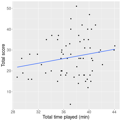
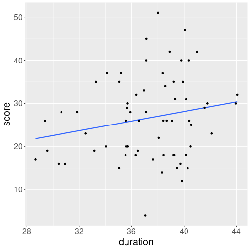
But how is the number of points related to time played? Intuitively, staying in the game for more minutes should lead to more points scored. But how close is the relationship? Here is a plot that shows his playing time (in minutes) and his score (total points).
We see a cloud of dots denoting games. There seems to be and upward trend but the relationship is far from clear, and just by guess, one might think that the correlation is around 0.2-0.3 (see the figures above in Section 11.2.2). When computing the actual correlation, it turn out to be 0.308. So playing time and player’s score are positively related, but the score seems to be primarily determined by other factors, the playing time only plays a secondary role.
11.2.5 Caveats of correlation
But one should be aware that correlation describes the linear relationship, i.e. how well do the points fit on a line. If the relationship is non-linear, correlation may display surprising results.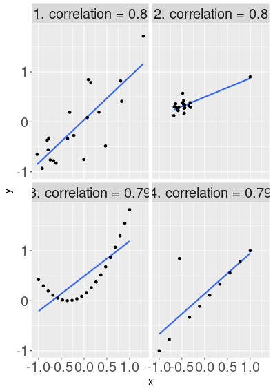
Foru images with the same correlation value, but very different messages. Image 1 depicts a simple point cloud, but all other images show potential data or model problems.
Here are several examples of data where correlation is approximately the same, but data is arranged in a very different fashion. The first figure displays a case that is similar to the previous figure–a noisy but positive relationship that approximately follows a line.
The second figure, however, shows a cloud of points where \(x\) and \(y\) are not related at all. But in addition to the correlation-zero cloud, there is a single outlier up-right from the cloud. This outlier causes data to be highly correlated.
The third figure shows perfectly aligned data. But this time it is not aligned in a linear fashion–along a line, but along a curve. As the curve still resembles the a line somewhat, the correlation is high here too.
The fourth image shows data that are aligned in an almost perfect linear fashion–except one outlier. That outlier causes the correlation to fall from 1.0 down to approximately 0.8.
These caveats demonstrate that while correlation is a useful way to analyze “closeness” of relationships, one should always check the corresponding plots too. The correlation number alone may be fairly misleading. It does not necessarily mean that any of these plots is “wrong” (although this may be the case). It means that a single number, correlation, may not represent data in a way that we expect.
Take for instance the 2nd image with an uncorrelated point cloud and a large outlier. Such pictures are common if we analyze e.g. settlement size and income. Typical datasets (and typical countries or states) have many small towns, and a few big cities with much higher income. In that case we may see that most of the small towns have similar low income, but the single outlier, the only big city in data, is much wealthier. Size and income are genuinely positively correlated, it is not just an error in data.
The examples above assume that both variables, \(x\) and \(y\), are numeric. In that case we can compute correlation (more specifically, Pearson correlation coefficient) as \[\begin{equation} r_{xy} = \frac{\sum\limits_{i=1}^n (x_i-\bar{x})(y_i-\bar{y})} {\sqrt{\sum\limits_{i=1}^n (x_i-\bar{x})^2} \sqrt{\sum\limits_{i=1}^n (y_i-\bar{y})^2}}. \end{equation}\] Here \(i\) describes the rows and \(x_i\) and \(y_i\) are the values of variables \(x\) and \(y\) in row \(i\). \(\bar x\) and \(\bar y\) are average values of \(x\) and \(y\). But these days we almost always use statistical software can do these calculations.
11.3 Measuring the relationship: linear regression
Sometimes correlation is all we want to do. The knowledge that flower shape can change, but some flowers tend to be taller overall while others are wider, may be exactly what we want. But in other times we want to know more. For instance, how much wider tend sepals be if they are 1cm longer? How fast does the ice cover decrease from year to year? How much more do people with more education earn? Such questions cannot be addressed with correlation. The best correlation can do is to tell that ice cover is fluctuating a lot and the yearly values are dispersed widely around the trend line. But it does not answer the how fast question.
This where linear regression comes in. Linear regression is the most popular way to compute trend lines, and behind the scenes, the visualizations in Section 11.1 used linear regression as well.
Linear regression is a way to find the trend lines through data (there are other ways). The linear part refers to the fact that we are looking for a line (not curve or a step function), regression refers to the concept of regression to the mean, the fact explained by Galton (1886).20 It is a little bit of an accident as the “regression” part of these models is usually not relevant. This is also why linear regression is sometimes called linear model (LM), or ordinary least squares (OLS). Here ordinary refers to the fact that it is the most popular of the least squares models, and least squares is related to the definition of OLS: the line is chosen such a way that the squared errors are as small as possible (see Section 11.3.4).
Below, we introduce linear regression with an example, thereafter provide the more formal definition of it, and finally discuss other examples and problems.
11.3.1 Linear regression: an example
A simple way to understand linear regression is to analyze trends in time. Below, we use HadCRUT data, a temperature data collected by Hadley Centre/Climatic Research Unit Temperature, and maintained by the UK Met Office. It covers years from 1850 onward, the earlier results are less precise though.
The dataset includes four columns: year, temperature anomaly relative to the 1961-1990 period (global yearly average), and the lower and upper 2.5% confidence bands of the latter:
## # A tibble: 5 × 4
##    Time `Anomaly (deg C)` `Lower confidence limit (2.5%)`
##   <dbl>             <dbl>                           <dbl>
## 1  1935            -0.206                          -0.303
## 2  1892            -0.508                          -0.644
## 3  2010             0.680                           0.649
## 4  1996             0.277                           0.243
## 5  1867            -0.357                          -0.553
## # ℹ 1 more variable: `Upper confidence limit (97.5%)` <dbl>
Below, we only analyze anomaly and ignore the confidence bounds.
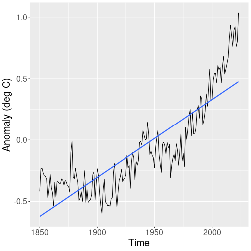
Let’s start with a plot that displays the global temperature:
hadcrut %>%
   ggplot(
      aes(Time, `Anomaly (deg C)`)) +
   geom_line() +
   geom_smooth(method="lm", se=FALSE)
(Remember: as the column name “Anomaly (deg C)” contains spaces and parenthesis, we need to quote it with backtics, see Section 5.3.1.)
The plot shows a zig-zaggy pattern, but from 1900 onward, the temperature seems to be heading consistently upward. We also display the trend line (blue), but a line like this seems not to capture the complicated trend pattern well.
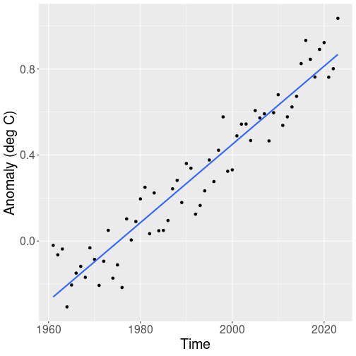
So next we only look for the time period 1961 onward, as that part of data seems to follow a linear trend much more closely:
hadcrut %>%
   filter(Time > 1960) %>%
   ggplot(
      aes(Time, `Anomaly (deg C)`)) +
   geom_point() +
   geom_smooth(method="lm", se=FALSE)
Indeed, the global surface temperature in the last 60 years seem to be well approximated with a linear trend. The lowest datapoint in this figure is in early 1960-s, and the highest in 2023.
Exercise 11.3 The first picture, the trend 1850-2023 is displayed with lines while the second picture uses lines. What do you think, which is the better way to display the temperature and the trend? Replicate these figures using points for the whole range and lines for the period from 1961 onward.
But how strong exactly is the trend? One can just look at the figure
and estimate that the temperature seems to have been increasing from
-0.25 to +0.8 or so through the last 60 years, i.e. 0.175 degrees per
decade.
But it would be nice
to get the exact number without manual calculations. This is
the exact question that linear regression can answer. In R, you can
use the lm() function for this task (see Section
11.3.3 for details):
hadcrut %>%  # take 'hadcrut' data...
   filter(Time > 1960) %>%  # keep only years after 1960...
   lm(`Anomaly (deg C)` ~ Time, data = .)  # compute linear regression
##
## Call:
## lm(formula = `Anomaly (deg C)` ~ Time, data = .)
##
## Coefficients:
## (Intercept) Time
## -35.92526 0.01819lm() is a function that computes the linear regression (“lm” stands
for “linear
model”). It normally takes two arguments: first the formula–what to
calculate, and thereafter the dataset to be used for the
calculations. Here we use the pipe operator instead of the dataset
to feed the
filtered
data using data = . (see Section 5.7).
The function returns two numbers, here labeled as “(Intercept)” and “Time”. The latter means that through this time period, the global temperature has been growing by 0.0182 degrees each year, in average.
Next, we discuss these numbers in more detail.
11.3.2 Intercept and slope
Before discussing these numbers any further, let’s talk more about lines.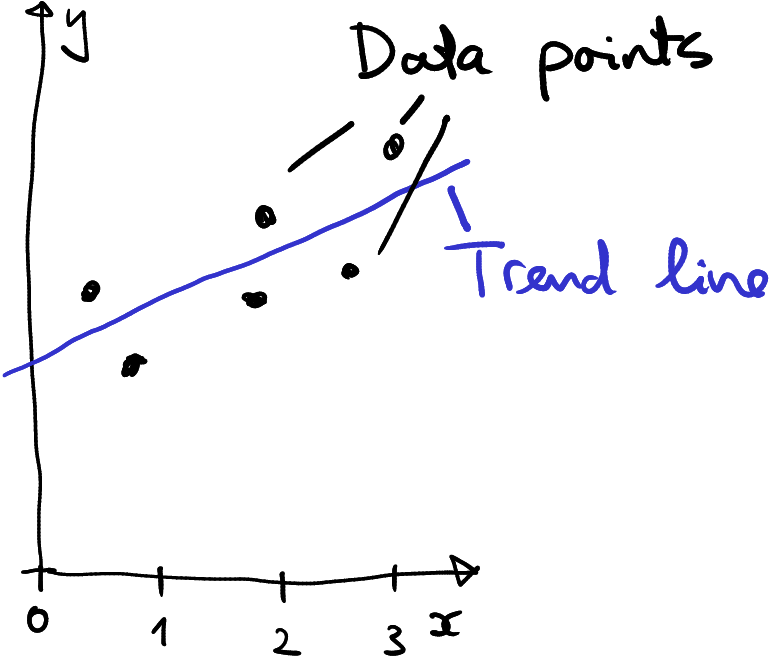
Describing a trend in data using a line–a linear trend.
Linear regression models the pattern in data using a line. In the figure here, data is depicted by black dots, the trend line is blue. In this example, a line describes the trend rather well. This may not always be the case, sometimes the trend may not look like a line but some kind of curve instead, or we may not find any trend in data at all. But we can always find the “best” line, even if the “best” is not necessarily be good. This is what linear regression does–it finds the “best” line (see Section 11.3.4 about how the best line is defined).
In the time-temperature figures above, the trend is depicted as the blue line. And it describes the line by two numbers, one of them called intercept (-35.9253 in the example above) and slope (0.0182 above, but named not “slope” but Time). What do these numbers mean?
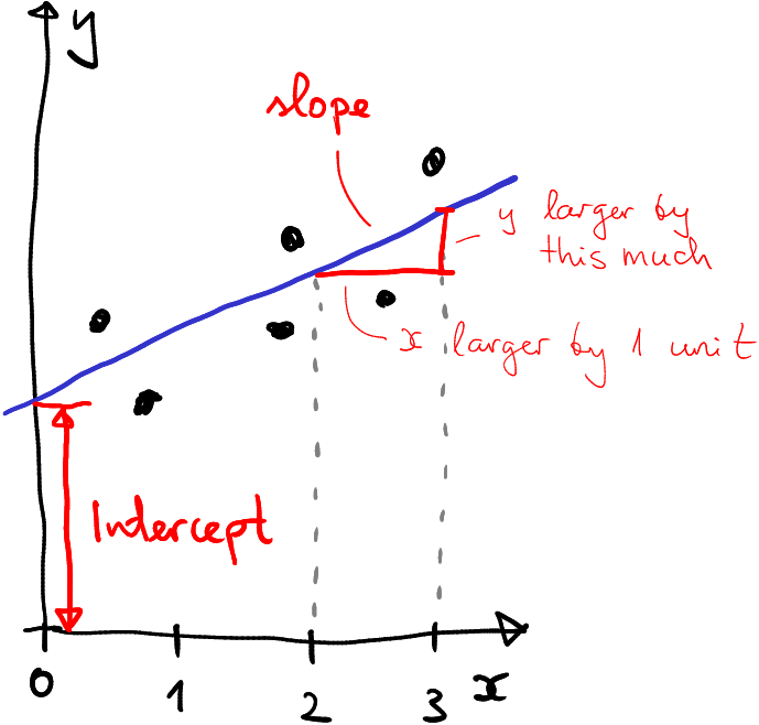
How intercept and slope are defined.
The figure here shows a line (blue) on a plane. It broadly describes the trend in six datapoints (black), but the concepts of intercept and slope apply to all lines, not just to those that describe data. Besides of the line, the figure displays the axes, labeled as \(x\) (horizontal) and \(y\) (vertical). These define the “location” on the plane. The blue line intersects with the \(y\) axis at a certain point–where \(x=0\) (that is where the \(y\)-axis is) and at a certain height. That height is called intercept.
Slope, in turn, describes the slope of the line. More precisely, slope tells how much larger is \(y\) if \(x\) is larger by the one unit. On the figure, the horizontal red line shows \(x\) difference by one unit, and the vertical red line shows how much larger is the corresponding \(y\)–this is exactly what slope is.
In case of linear regression, intercept and slope have a distinct meaning.
Intercept is the height, at which the trend line cuts the \(y\) axis, the \(y\) value that corresponds to the \(x\) value zero. In the example above, the intercept is -35.925. This means that when \(x\) is zero, \(y\)-value will be -35.925. In the example above, we were had the global temperature anomaly as \(y\) and year as \(x\). So we can re-phrase the intercept that “At year 0, the global temperature anomaly was -35.925 degrees”. We’ll discuss this number more below.
Slope shows how much larger is \(y\) if \(x\) is larger by one unit. Here it is 0.0182 units. Although correct, such language is confusing. As we measure \(x\), time, in years instead of “units”, and \(y\), temperature, in degrees C, we can re-phrase it as “as year is larger by 1, temperature is larger by 0.0182C”. Or even better: “Each year, the global temperature is increasing by 0.0182C”21. Obviously, both of these numbers are not what the actual temperature does (these are the black dots that jump up and down), but what the temperature trend, the blue line, does. So even better way to explain the number would be “Global temperature is trending upward by 0.0182C per year”.
The figure above depicted a positive intercept and a positive trend. Here are a few examples showing a negative intercept, a negative slope, and a zero slope. In the latter case we can say that there is really no trend in the data.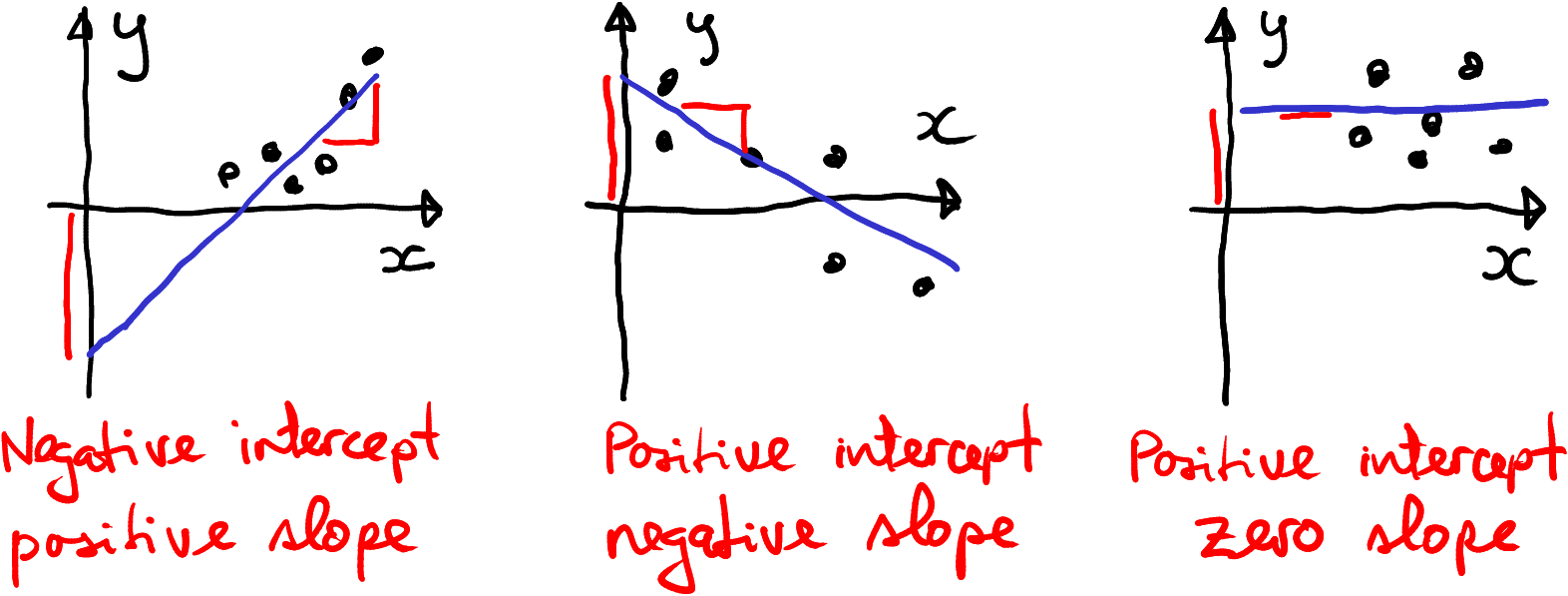
Example data with negative intercept, negative slope, and no trend at all.
Note also one peculiar thing with the example with negative intercept–despite all data points being positive, the intercept is negative. This is because there are no data points close to where the trend line meets the vertical axis. All data points are further away, in the positive territory. It is just the trend line that has negative intercept.

Qaanaaq in late summer 2007. There is little vegetation, and a glacier is lurking on the mountains in background. For most of the year, the landscape is covered with snow and ice. The yearly average temperature is -9C, or approximately 25C below the Earth’s average.
Col. Lee-Volker Cox, Public domain, via Wikimedia Commons
Now let’s return to the intercept -35.925. This means temperature anomaly compared to 1961-1990 average in degrees C. Or in other words, the temperature at year 0 should have been 35.925 degrees colder than 1961-1990 average. Now if you know anything about temperature, that would be very .. chilly, close to -20C or 0F. It is about 10C colder that average in Qaanaaq town (also known as “Thule”) in Northern Greenland. Was the weather during Han dynasty really that cold?
Obviously not. The intercept, again, describes the blue trend line, not the actual data pattern. As the images in the previous section indicate, the blue line is quite a good approximation of the temperature trend since 1960. It is much worse approximation for the whole 1850-2023 time period. And it will probably be a miserable one to describe temperature through the last two millennia, just we do not have the data. In this sense it is similar to the example with negative intercept above–there are no data points near where year 0. So a better wording to explain the intercept will include a qualifying remark: “At year 0, the global temperature anomaly was -35.925 degrees, if the current trend stayed the same”. And here we have good reasons to believe that it did not stay the same.
11.3.3 How to use the lm() function
Next, we’ll discuss how to perform linear regression using the lm()
function in R. The basic syntax of it is
the first argument,
y ~ xis the formula. It tells which variables should be related. In this example, these areyandx.If you write it as
y ~ x, the intercept is the averageyvalue wherexis zero, and the slope shows how much larger isyifxis larger by one unit. But if you write it the other way around,x ~ y, then the intercept means the averagexvalue whereyis zero, and the slope means how much larger isxifyis larger by one unit.datais just a dataset where the columnsxandyare to be taken from. This may be a dataset, or if you use a pipeline to feed data tolm(), you may writedata = .instead.
In the example in section 11.3.1 we invoked
lm() as
The formula here is `Anomaly (deg C)` ~ Time. You can imagine
that we put the anomaly on \(y\)-axis and year on \(x\) axis. Hence the
intercept mean the temperature at year 0, and the slope is the yearly
temperature growth.
But what happens if you swap the formula around and write it as
Time ~ `Anomaly (deg C)`? Let’s try!
##
## Call:
## lm(formula = Time ~ `Anomaly (deg C)`, data = .)
##
## Coefficients:
##       (Intercept)  `Anomaly (deg C)`
##            1976.8               50.1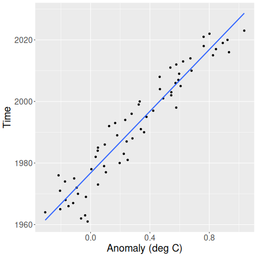
Year as a function of temperature. Although not wrong, the data is much harder to interpret in this way.
- Intercept is the year where the temperature anomaly is 0. This turns out to be 1976.
- Slope is 50. From its general interpretation: if \(x\) is larger by one unit, \(y\) is larger by 50 units. Here it means that when temperature grows by one degree, time grows by 50 years. The temperature trend is roughly 50 years per degree.
It is not wrong to present data in this way, but it is typically much more confusing. So when doing the actual analysis, you should always think what is a better way to present your data.
Note the difference in how lm() and ggplot() treat data: lm()
needs the formula y ~ x while ggplot()
needs the aesthetics aes(x, y).
So in one case \(y\) comes first, in the other case \(x\) comes first.
This is related to how such formulas are traditionally written in
mathematics, in case of linear regression (see Section
11.3.4):
\[\begin{equation}
y = b_0 + b_1 \cdot x,
\end{equation}\]
i.e. \(y\) comes first and \(x\) second, and tilde ~ will be in place of
\(=\).
lm() is traditionally used together with it’s dedicated summary
function. It outputs much more information than the plain lm():
##
## Call:
## lm(formula = `Anomaly (deg C)` ~ Time, data = .)
##
## Residuals:
##      Min       1Q   Median       3Q      Max
## -0.22884 -0.09464  0.01395  0.07744  0.23983
##
## Coefficients:
##               Estimate Std. Error t value Pr(>|t|)
## (Intercept) -3.593e+01  1.448e+00  -24.81   <2e-16 ***
## Time         1.819e-02  7.268e-04   25.02   <2e-16 ***
## ---
## Signif. codes:  0 '***' 0.001 '**' 0.01 '*' 0.05 '.' 0.1 ' ' 1
##
## Residual standard error: 0.1049 on 61 degrees of freedom
## Multiple R-squared:  0.9112, Adjusted R-squared:  0.9098
## F-statistic: 626.3 on 1 and 61 DF,  p-value: < 2.2e-16
However, as we rarely use the additional information in this book,
we usually
invoke lm() without summary().
11.3.4 Linear regression: formal definition
Linear regression uses a line to describe the data. You can always write the equation for a line like \[\begin{equation} y = b_0 + b_1 \cdot x \end{equation}\] where \(b_0\) is the intercept and \(b_1\) is the slope. If you pick different values for \(b_0\) and \(b_1\), you’ll get different lines.
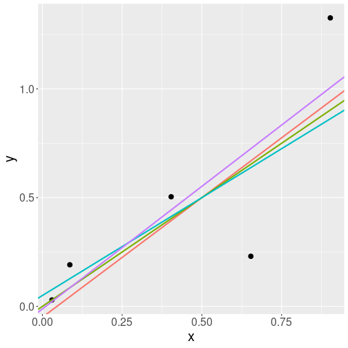
Four different lines that all describe the data points well.
So by picking different intercepts and slopes, you can draw a number of lines through the data points. If the lines are fairly similar, you cannot tell which one is the best. Let’s look at a hypothetical dataset, the black dots on the figure at right. It depicts 5 data points and four lines that describe the relationship. All lines are rather similar, but they are not exactly the same. Which one is the best?
Obviously, the answer to such questions is “it depends”. To begin with, we cannot even talk about “the best line” unless we define the “goodness of a line” in a more precise way.
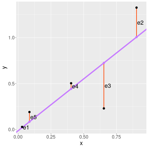
The five datapoints (black), the regression line (blue), and the residuals (red).
Linear regression has it’s own particular way of telling how good is a line. It is based on residuals, the differences between the actual data points (black) and the corresponding trend points (blue). On the figure, residuals are the red vertical lines, denoted by \(e_1\), \(e_2\) and so on. We can see that \(e_3\) is rather large because the third data point is rather far from the trend line. \(e_1\), however, is small because here the data point is almost exactly on the line.
Regression line is defined as the line where sum of squared residuals is as small as possible. We can write the sum of squared residuals as \[\begin{equation} \mathit{SSE} = e_1^2 + e_2^2 + e_3^2 + e_4^2 + e_5^2 \end{equation}\] or, when using the standard mathematical notation, \[\begin{equation} \mathit{SSE} = \sum_{i=1}^5 e_i^2. \end{equation}\] (SSE stands for sum of squared errors.) So if we want to get the regression line, we have to choose from from all possible lines the one where SSE is as small as possible.22
As every line is defined by its two parameters, intercept \(b_0\)
and slope \(b_1\), we can pick the best line by picking the best \(b_0\)
and \(b_1\). These are the two parameters that the lm() function
returns.
But why do we want to define the regression line using squared residuals, and not something else? In fact, there are models that use something else. For instance, if you define line based on sum of absolute values of residuals, not squares of residuals, then you get what is called median regression. It is a less popular method, but it is a better choice in certain tasks.
Second, when squaring residuals, then we are exaggerating large residuals. Large residual is large to begin with, and squaring it makes it extra large. So as a result, larger residuals weight more in deciding how the line should go. Linear regression works hard to avoid few large residuals, unlike median regression. This is often, although not always, what we want.
11.3.5 Two examples
This section presents two linear regression examples, one using the iris flower data, and another using basketball data.
11.3.5.1 Linear regression: virginica flower
Above, in Section 11.2.3, we used iris data and found that for virginica flowers, \[\begin{equation} cor(\text{petal length}, \text{sepal length}) = 0.864 \end{equation}\]
The number 0.864 tells use that the lengths of these two flower parts are closely related, if one is longer, then the other is usually longer too. The value is close to one, this means that there is not much wiggle room, if you make the plot, the data points line up fairly closely.
But how much longer are the petals in the flowers with longer sepals? This is not what the correlation coefficient tells us. We need to use linear regression to answer this question. The resulting slope will tell exactly that–flowers with one unit longer sepals tend to have that much longer petals:
iris <- read_delim("data/iris.csv") %>%  # load data...
   filter(Species == "virginica")  # ... and keep only virginica
lm(Petal.Length ~ Sepal.Length, data = virginica)
##
## Call:
## lm(formula = Petal.Length ~ Sepal.Length, data = virginica)
##
## Coefficients:
## (Intercept) Sepal.Length
## 0.6105 0.7501- The formula is stated as
Petal.length ~ Sepal.Length. This means the slope tells how much longer are petals for flowers with longer sepals.
- Note also that here we feed data directly using
data = virginica, not through a pipe.
We see that the coefficient for sepal length is 0.7501. This means that virginica flowers that have 1cm longer sepals tend to have 0.75cm longer petals. As here the units for both \(x\) and \(y\) are the same (both are measured in centimeters), this also holds for other length units. So we can also tell that 1mm (or 1 mile if you wish) longer sepals are associated with 0.75mm (or 0.75 mile) longer petals.
The value of the intercept is 0.61. This means that flowers with 0-length sepals have petals that are 0.61cm long. This is obviously an absurd result. It is similar to the case with an unrealistic temperature at year 0 (see Section 11.3.2). However, it will likely not be a problem, as in our dataset there are no virginicas with sepal length close to zero.
Exercise 11.4 Use iris data.
- Find the shortest and longest sepal length for virginica flowers.
- Find the same for all three species. Try to do this within a single pipeline using grouped operations! (See Section 5.6.)
11.3.5.2 Linear regression: playing time and score in basketball
In Section 11.2.4 above we displayed the relationship between the game time and score for James Harden for his game 2021-2022 season. See the Appendix about Harden data and Appendix 11.5 for explanations about the data processing. Here we just copy the final code from the appendix and store the cleaned data into a new data frame:
harden <- read_delim("data/harden-21-22.csv")

cleanHarden <- harden %>%
   select(MP, PTS) %>%
   mutate(pts = as.numeric(PTS)) %>%
   filter(!is.na(pts)) %>%
   separate(MP,
            into=c("min", "sec"),
            convert=TRUE) %>%
   mutate(duration = min + sec/60)
As a reminder, the correlation between time played and score was 0.3:
##                pts  duration
## pts      1.0000000 0.3084074
## duration 0.3084074 1.0000000
But again, this number does not tell how much more will Harden score if he will play more time. But this can be answered with linear regression:
##
## Call:
## lm(formula = pts ~ duration, data = cleanHarden)
##
## Coefficients:
## (Intercept)     duration
##     -3.8367       0.6949
Here we see that the duration coefficient is 0.69. This tells that one more unit of duration is associated with 0.69 points. As we measure duration in minutes, it is better to express the result that “In games where Harden played one more minute, he scored in average 0.7 points more”.
11.4 Linear regression: categorical variables
All linear regression examples above were done assuming that the explanatory variable, \(x\) is continuous. This included years (for global temperature), sepal size (for flowers), and game time (for basketball). But linear regression can also be used with categorical variables. Below we discuss binary variables, categorical variables that can only take two values.
Next, we discuss what are binary (dummy) variables, thereafter we give examples about where they may be useful for linear regression, and finally we discuss how to interpret the corresponding regression results.
11.4.1 Binary (dummy) variables
The explanatory variables we looked at earlier, such as year or game time can take all kinds of values (they are continuous), although the “all kinds” is often limited to certain range (e.g. game time cannot be negative). Linear regression helps to analyze the how the outcome depends on the explanatory variable. But what to do if we are interested in relationship between some kind of outcome and a categorical variable?
There are a lot of similar categorical variables that are important to analyze. Smoking–with two possible options (smoker/non-smoker) is one example of binary variables. These can take two values only, and usually these values are some sort of categories, such as male/female, science/arts, working/not working, and so on.23 All these examples are categorical–the categories are not numbers–but binary variable can also be numeric.
11.4.1.1 Birth weight and mother’s smoking
Below, we analyze how the babies’ birth weight depends on whether the mother smokes or not. Babies’ birth weight is considered a good indicator of their health–low weight is an indicator of certain problems in their development.
We use North Carolina births’ data. This is a sample of 1000 births from North Carolina. It includes the baby weight, and information about their mother and the pregnancy, including whether the mother was a smoker. Let’s only keep the birth weight (weight, in pounds) and smoking status (habit, either “smoker” or “nonsmoker”). We do not need the other variables.
Let’s take a quick look at the dataset. A few lines of it looks like
births <- read_delim("data/ncbirths.csv") %>%
   select(habit, weight) %>%
   filter(!is.na(habit))  # remove missing smoking status
births %>%
   sample_n(4)
## # A tibble: 4 × 2
## habit weight
## <chr> <dbl>
## 1 smoker 7.69
## 2 smoker 7.13
## 3 smoker 7.94
## 4 nonsmoker 7.44How many smokers/non-smokers do we have?
## # A tibble: 2 × 2
##   habit     `n()`
##   <chr>     <int>
## 1 nonsmoker   873
## 2 smoker      126
So the dataset is not well balanced–there are many more non-smokers than smokers (approximately 85%-15%).
Is smoking actually related to birth weight? Let’s calculate the average birth weight of babies for smoking and for non-smoking moms:
## # A tibble: 2 × 2
##   habit     `mean(weight)`
##   <chr>              <dbl>
## 1 nonsmoker           7.14
## 2 smoker              6.83
Indeed, we see that babies of non-smoking mothers weigh a bit more– 7.14 versus 6.83, i.e. they weigh 0.32 lb more.
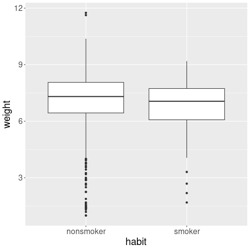
Distribution of birth weight–smokers versus non-smokers.
Finally, let’s take a quick look at the weight distribution. Does it differ between smokers and non-smokers? A good option to display distribution by category is boxplot (see Section 10.2.5):
The boxplot suggests that the distributions are fairly similar. But the smoking moms’ babies distribution is shifted slightly toward the lower birth birth weight.
11.4.1.2 Creating dummies
But when we want to do any computations, then we cannot use values like “smoker” and “non-smoker” because we cannot compute with words. We need numbers. A common approach is to convert categorical variables to dummy variables or dummies. These are dummy, “stupid”, variables that can only take values “0” or “1”. Importantly, these are numeric variables.
The most common way to convert a categorical to dummy is to pick one of the categories (typically the one that is first alphabetically, here “nonsmoker”), and say that is “0”. The other, “smoker”, will this be “1”. We can call such dummy smoker to stress that value “1” means smoking and value “0” means non-smoking. Here is an example how the results may look like:
| id | weight | habit | smoker |
|---|---|---|---|
| 1 | 7.63 | nonsmoker | 0 |
| 2 | 7.88 | nonsmoker | 0 |
| 160 | 6.69 | smoker | 1 |
| 161 | 5.25 | smoker | 1 |
The first two mothers in this sample are not smokers (habit = “nonsmoker”), and hence their smoker dummy is “0”. The next two moms are smokers, and accordingly their dummy smoker = 1.
The category that corresponds to value 0 is called reference category. Here the reference category is “nonsmoker”.
The software typically converts categorical variables to dummies
automatically, but if you want to do it manually, you can
use something like ifelse(habit == "smoker", 1, 0). This creates a
column where “1” represents habit “smoker” and “0” represents
“nonsmoker” (see Section 5.3.5).
For instance:
## # A tibble: 4 × 3
##   habit     weight smoker
##   <chr>      <dbl>  <dbl>
## 1 nonsmoker   7.63      0
## 2 nonsmoker   7.88      0
## 3 smoker      6.69      1
## 4 smoker 5.25 1We can use this to re-compute the average birth weight by smoking status:
births %>%
   mutate(smoker = ifelse(habit == "smoker", 1, 0)) %>%
   group_by(smoker) %>%
   summarize(mean(weight))
## # A tibble: 2 × 2
## smoker `mean(weight)`
## <dbl> <dbl>
## 1 0 7.14
## 2 1 6.83The results are exactly the same as above, just now the groups are not called “smoker” and “nonsmoker”, but “0” and “1”. This may seem like an un-necessary exercise, but this is what needs to be done if you want to compute using categorical variables. Even if the software does it automatically, knowing how dummies are done helps you to understand the results.
11.4.2 Analyzing the difference with linear regression
Now we have a numeric variable, the smoker dummy we created above, that specifies whether the mom is smoking or not. True, it can only take two values 0 and 1, but both of these are numbers. So now we can calculate.
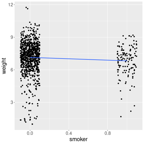
Next, let’s visualize the trend. Because smoker is a number,
we can plot data and add the trend line. In order to make
the data points better visible, I use geom_jitter(), this shifts
the points a little bit (here by 0.1) off from their horizontal
position, while leaving the vertical position unchanged
(see Section 10.4):
births %>%
   mutate(smoker = ifelse(
             habit == "smoker", 1, 0
          )) %>%
   ggplot(aes(smoker, weight)) +
   geom_jitter(width = 0.1, height = 0) +
   geom_smooth(method = "lm",
               se = FALSE)
The x-axis (“smoker-axis”) may look a bit weird: after all, only values “0” and “1” should be present there. But let’s the axis values stay what they are for now.
The main message from the figure is that the trend line heads down–smokers’ babies tend to be smaller.
Now we can use linear regression exactly the same way as we did above:
##
## Call:
## lm(formula = weight ~ smoker, data = .)
##
## Coefficients:
## (Intercept)       smoker
##      7.1443      -0.3155
How to interpret these results?
The basic interpretation is the same as in case when just using numeric variables.
The intercept means that where smoker = 0, the babies’ average weight is 7.144lb. This corresponds exactly to what we computed above by just doing grouped averages–non-moking moms’ babies weigh 7.144lb in average.
the slope, here labeled “smoker”, tells that the moms who have smoker larger by one unit, have babies who weigh -0.316lb more (in average). This is a clumsy and awkward sentence. But smoker can only have two values–“0” and “1”. Hence “smoker larger by one unit” means a smoking mom, instead of a non-smoking mom. Hence the correct but clumsy sentence above can be re-phrased as “babies by smoking moms weigh 0.316lb less (in average)”.
So slope -0.316 means that babies of smoking moms weight more by -0.316lb than … than who exactly? Here the answer to “who exactly” is easy–these are babies of non-smoking moms. We chose the name of the dummy–smoker–to make it easy to understand. But sometimes dummies are not chosen in such a smart way. For instance, you may find analyses where they find that the slope, labeled sex has value 0.5. So who exactly has 0.5 more–men or women? Or someone else? In order to be able to interpret the slope, you need to know what is the reference category. Without knowing the reference category, here non-smokers, you cannot interpret the dummies.
Comparing the results with those in Section 11.4.1, we can see that linear regression captured a) the average weight for non-smokers, and b) the weight difference between smokers and non-smokers.
Normally, we do not create the dummies manually–software does it for you behind the scenes. So you can just write
##
## Call:
## lm(formula = weight ~ habit, data = .)
##
## Coefficients:
## (Intercept)  habitsmoker
##      7.1443      -0.3155
The results are identical to those above, except that now the slope labeled as “habitsmoker” instead of “smoker”. It is made of two things–the column name (habit) and the category that corresponds to the dummy value “1” (smoker).
Here, as before, we need to understand what is the reference category. This is the category that corresponds to the dummy value “0”. If you do not know, you have to figure out what are the possible categories. This can be done in different ways, one example was provided above in Section 11.4.1.1 is one option:
## # A tibble: 2 × 2
##   habit     `n()`
##   <chr>     <int>
## 1 nonsmoker   873
## 2 smoker      126
This tells you that the category nonsmoker was left out–it is the reference category. This is the reason that reference category is sometimes called left-out category.
11.5 Appendix: how to process Harden data
Harden data is mostly clean, but for our purpose, it has two problems: first, because it contains data about games where Harden did not play, the points and other columns are not numeric; and second, his playing time is stored as mm:ss. This cannot be directly used for computing and must be separated into minutes and seconds.
For our purpose, we only need two columns: MP
(minutes played) and PTS (points).
First load data
and take a quick look:
## # A tibble: 3 × 30
##      Rk     G Date       Age    Tm    ...6  Opp   ...8    GS    MP    FG    FGA
##   <dbl> <dbl> <date>     <chr>  <chr> <chr> <chr> <chr>   <chr> <chr> <chr> <chr>
## 1     1     1 2021-10-19 32-054 BRK   @     MIL   L (-23) 1     30:38 6     16
## 2     2     2 2021-10-22 32-057 BRK   @     PHI   W (+5)  1     38:25 7     17
## 3     3     3 2021-10-24 32-059 BRK   <NA>  CHO   L (-16) 1     33:09 6     16
##   `FG%` `3P`  `3PA` `3P%` FT    FTA   `FT%` ORB   DRB   TRB   AST   STL   BLK   TOV
##   <chr> <chr> <chr> <chr> <chr> <chr> <chr> <chr> <chr> <chr> <chr> <chr> <chr> <chr>
## 1 .375  4     8     .500  4     4     1.000 3     5     8     8     1     2     4
## 2 .412  3     7     .429  3     4     .750  1     6     7     8     2     0     5
## 3 .375  2     8     .250  1     1     1.000 2     5     7     8     1     1     8
##   PF    PTS   GmSc  `+/-`
##   <chr> <chr> <chr> <chr>
## 1 3     20    17.6  -20
## 2 0     20    15.6  -1
## 3 5     15    6.4   -15
As there are too many variables, let’s select only the ones we
actually need. These are MP (minutes played) and PTS (points):
## # A tibble: 3 × 2
##   MP    PTS
##   <chr> <chr>
## 1 30:38 20
## 2 38:25 20
## 3 33:09 15
This gives us a much more understandable picture. We can see that minutes played is coded as MM:SS, and stored as text (“<chr>” = character, see Section 6.1). Points are all numbers but for some reason stored as character.
The first thing we need to do now is to understand why are numbers
stored as characters. Normally, numbers are read as numbers for some
reason this is not the case here. But because the points must be
numbers, we need to convert the column to numbers.
But before converting, we should understand the root of
the problem. A simple option is to convert PTS to numeric, and
see if it resulted in any missings:
harden %>%
   select(MP, PTS) %>%
   mutate(pts = as.numeric(PTS)) %>%
               # converted column is in lower case, the original in
               # upper case
   filter(is.na(pts)) %>%  # keep only those cases where 'pts' is NA
   head(3)
## # A tibble: 3 × 3
## MP PTS pts
## <chr> <chr> <dbl>
## 1 Inactive Inactive NA
## 2 Inactive Inactive NA
## 3 Inactive Inactive NAWe see a number of cases where PTS is listed as “Inactive”,
i.e. Harden did not play.
For some reason the point values are not left
empty (or set to zero), but instead contain a
text, either “Inactive”, “Did Not Dress” or
“Did Not Play”.24
As this seems to be an otherwise harmless way to denote missing
data, we can just proceed by removing these missings:
harden %>%
   select(MP, PTS) %>%
   mutate(pts = as.numeric(PTS)) %>%
   filter(!is.na(pts)) %>%  # keep only those cases where 'pts' is not NA
   head(3)
## # A tibble: 3 × 3
## MP PTS pts
## <chr> <chr> <dbl>
## 1 30:38 20 20
## 2 38:25 20 20
## 3 33:09 15 15Now we have a numeric pts column, denoted by “<dbl>” (double).
But we are not done just yet. We
need to convert playing time into some sort of decimal time,
e.g. measured in minutes. This can be achieved with function
separate(). It separates a text
column into two or more parts based on
the patterns in text. This is exactly what we need here–separate a
text like “30:38” into two parts, “30” and “38”, where colon is the
separator. There are many options about how to define the pattern and
what to do with the original and resulting values, for now the default
split pattern (anything that is neither a character nor a number)
works well:
harden %>%
   select(MP, PTS) %>%
   mutate(pts = as.numeric(PTS)) %>%
   filter(!is.na(pts)) %>%
   separate(MP,  # separate `MP` column
            into=c("min", "sec"),  # ... into columns `min` and `sec`
            convert=TRUE) %>%  # and auto-convert to numbers
   head(3)
## # A tibble: 3 × 4
## min sec PTS pts
## <int> <int> <chr> <dbl>
## 1 30 38 20 20
## 2 38 25 20 20
## 3 33 9 15 15So we tell separate() to split the variable “MP” into two new
variables, called “min” and “sec”, based on anything that is neither a
letter nor a number (this is the default behavior). We also tell it
to convert the resulting “min” and “sec” columns to numbers.
Finally, for plotting we can compute the playing duration in minutes
as just min + sec/60:
cleanHarden <- harden %>%
   select(MP, PTS) %>%
   mutate(pts = as.numeric(PTS)) %>%
   filter(!is.na(pts)) %>%
   separate(MP,
            into=c("min", "sec"),
            convert=TRUE) %>%
   mutate(duration = min + sec/60)  # continuous duration in min

cleanHarden %>%
   head(3)
## # A tibble: 3 × 5
## min sec PTS pts duration
## <int> <int> <chr> <dbl> <dbl>
## 1 30 38 20 20 30.6
## 2 38 25 20 20 38.4
## 3 33 9 15 15 33.2For instance, in the first game 30min and 38 seconds is approximately 30.6 minutes.
We store this into a new variable “cleanHarden” for future use.
Now we can plot the game duration versus score as:
This is the same plot that was shown in Section 11.2.4.
The shortest and longest duration can be found by ordering the games
with arrange(), there are other options too.
Galton, F. (1886) Regression towards mediocrity in hereditary stature, The Journal of the Anthropological Institute of Great Britain and Ireland, 15, 246–263↩︎
Media typically reports temperature trend per decade, not per year. Obviously, 0.0182C per year is the same as 0.182C per decade.↩︎
This is why linear regression is also called least squares.↩︎
Some of these, e.g. smoking, does not have to be binary. Instead of binary “smoker”/“non-smoker”, we can also record how many cigarettes a day someone is smoking, with possibly “0” for non-smokers. However, in many accessible datasets, smoking is coded as binary. The same applies to gender and many other variables.↩︎
Obviously, we could also just have looked at the table either in data viewer, or on the Basketball Reference website. But that option only works for small datasets.↩︎