Chapter 7 Descriptive statistics
We typically collect data for some purpose. Or even if we just stumble upon a dataset, we may want to use it to answer certain questions and to draw certain conclusions. Statistics is a set of tools that helps one to do just that.
Statistics is one of the most important components of data science, and every data scientist should have at least a basic knowledge of statistics. However, be aware that statistics alone does not help you to ask good questions, or to understant the meaning of your answers. Nowadays, statistical computations are almost exclusively done with computers, so without sufficient computer skills it is hard to apply the statistical methods. But computers are not a substitute to understanding the methods.
Below, we discuss some of the central statistical methods that are used in data analysis.
7.1 Descriptive statistics and inferential statistics
Descriptive statistics is about describing and summarizing data. It is in many ways similar to the preliminary data analysis, but it focuses less on data quality and coding, and more about the information in the data. Questions like average income in the dataset, most popular college major among students surveyed, or the shortest dog in the dog show can be answered with the tools of descriptive statistics. This section is devoted to descriptive statistics.
Another type of statistics, inferential statistics, also analyses samples of data, but attempts to answer more general questions, either about the population or otherwise about the process. So inferential statistics may use the same dataset to tell something about the average income in the whole economy, use the same survey to determine the most popular college major in the country, or use the dog show data to find the smallest dog breed out there. Obviously, these questions are much more demanding–we are not just concerned about data we have but we also want to say something about the rest of the world, the rest that we do not have in our data. Hence inferential statistics tends to use much more complex methods, and the results tend to be imprecise. Even more, the results provided by inferential statistics are hardly ever precise. Inferential statistics is discussed in Section 12.
We start with the simpler type of statistics–descriptive statistics. It is about describing data, and does not attempt to say anything about things that are not in data. Data is all there is, at least from the viewpoint of descriptive statistics. It is typically done for a few different purposes:
- You want to understand data. Datasets are large and complex and hard to understand, so you compute a few “descriptive” figures, such as mean, minimum and standard deviation. It is a crude simplification, but we cannot understand without simplification.
- You want to describe and compare the complexity of the world in a simple way. For instance, modern economies are incredibly complex, and how can you compare, for instance, Japan with Malaysia? One way is just to compare the GDP per capita (39,300 and 11,40018 respectively). Although it is a crude simplification, the fact that the Japanese GDP is several times larger tells us surprisingly much about how does life in these two countries differ.
- You do not want to keep that much data, because it is hard to handle and unnecessary for what you do. For instance, instead of a long list of all college majors you may just say which three are the most popular ones.
In all these cases we use tools from descriptive statistics to achieve the results.
7.2 Basic properties of data: location, range, distribution
Here we focus on three basic properties of numeric data: location (what are the typical values), range (how far from the typical values do the data “get”), and distribution (which kind of values are more common or less common). These are all quite basic properties that may tell you a lot both about data and the actual question we are trying to answer based on data. There are many ways to characterize these properties, and you may want to choose a different one depending on your task.
7.2.1 Location
Location describes the “typical values” in data.
7.2.1.1 Mean (average)
Perhaps the most familiar way to show the “typical” values is mean–the arithmetic average. Average is a simple and intuitive way of describing the typical values. Also, humans are good in evaluating and understanding the average. The average is just sum of the values divided by how many of those we have. If we have \(N\) values \(x_1, x_2, \dots, x_N\) then we have the average \[\begin{equation} \bar x = \frac{1}{N} \sum_{i=1}^N x_i. \end{equation}\]
Exercise 7.1

Consider the blue lines at right.
- What do you think, how long is the average line length? Try to put the length on your screen with your finger.
- What do you think, what is the total length (sum of length) of all the lines?
If your brain works like the braing of most other people, then you find the average length much easier to evaluate than the total length.
See the answer
Let’s demonstrate some of the average-related functionality with Titanic data. First load it:
The function to compute arithmetic average is mean(). For instance,
the mean age is:
## # A tibble: 1 × 1
##     age
##   <dbl>
## 1    NA
Here is a brief summary of the commands: 1) Take Titanic data; 2)
compute an aggregate statistic mean(age). Label it age.
You can also use pull() functionality as we did in Section
6.4. See more in Section
5.3.4.
Why is the mean age missing? Because mean can only be computed if we
know all values. Have a single unknown value in data and you cannot
compute mean (we’ll talk more about it below).
If we want to ignore missing values, we need to specify
na.rm=TRUE (see Section 6.3 for more):
## # A tibble: 1 × 1
##     age
##   <dbl>
## 1  29.9
So mean age of Titanic passengers, those where we know their age, is approximately 30 years. If we want, we can say that “typical passenger is 30 years old”. It is not a precise claim, but as the word “typical” is imprecise, it is definitely not wrong.
Exercise 7.2 Compute the average ticket price (variable fare) on Titanic.
See the solution
But it turns out that the intuitive concepts of mean has a few major issues.
First, and most obviously, it can only be computed in case of numeric variables. We cannot talk about “mean college major” or “average holiday destination”.
Second, the average may describe a non-existing case, a case that is inherently impossible, or a case that is in no way typical. For instance, if we learn that an “average family has 1.5 kids” then such a “typical” family cannot even exist. The number, 1.5, may still be relevant, e.g. how many school places we need for 1000 families who live in the city. But it is not a “typical” family, the typical ones have either one or two children, not 1.5.
Average may also be far away from anything in data. Imagine Bill Gates enters a classroom of 99 students. Bill Gates’ net worth is approximately $100 billion. Next to that figure we can safely say that the net worth of typical students, maybe a few thousand dollars, is almost nothing. But now the average wealth in the room is billion dollars per person. If we were just presenting the average to describe the people in the room, then we may give the wrong impression that everyone here is a billionaire. This may be very misleading.
Finally, average is sensitive to outliers and data entry errors. For instance, consider the following sequence: \(7, 8, 9\). Obviously, the average is 8. However, it someone makes a simple typo at data entry and types \(7, 8, 90\), then the average is 35 instead. A small data error can throw the average off quite a bit. Average is not a robust statistic, i.e. it is very sensitive to various kinds of errors.
This is also the reason that we cannot compute average as soon as a single value is missing. If we do not know what is the missing value then we have no way telling how much would it throw off the average.19
7.2.1.2 Median
Median is another popular way to characterize the “typical values”. Median is the “middle value”, the value where there is an equal number of smaller and larger values.
Consider the dataset about the price of bunch of green onion (collected in 2022 in the U.S West Coast):
| price | store | city |
|---|---|---|
| 1.29 | QFC | Seattle (fall) |
| 1.29 | Whole Foods | Seattle |
| 0.99 | QFC | Seattle (spring) |
| 0.29 | H-Mart | LA |
| 0.50 | Stater Bros | LA |
| 1.49 | Asian Family Market | Seattle |
| 2.99 | Uwajimaya | Seattle |
One can easily compute the average onion price across these stores ($1.26 per bunch). In order to compute the median, we can look at an ordered list of the price values. This is
## 0.29, 0.5, 0.99, 1.29, 1.29, 1.49, 2.99
“Typical” green onion in QFC. It is sold at the median price, at least the median price in this dataset. Photo: Chesie Yu.
The middle value here is “1.29”. There are three values left of it (0.29, 0.50 and 0.99) and three values right of it (1.29, 1.49, and 2.99). Note that the value “1.29” is there twice, we cannot tell “which one” of these is the middle value, but that does not matter. They are both exactly 1.29.
When just looking at the values you can see that there is a clear outlier–Uwajimaya $2.99 is twice as expensive. What happens to the mean and median if we remove that price? Now the mean is $0.98. Obviously, by removing the most expensive price we got a smaller mean. But what about the median? The six remaining prices are now
## 0.29, 0.5, 0.99, 1.29, 1.29, 1.49You can immediately see that there is not clear-cut “middle value” any more. In that case we typically define that the median is in the middle between 0.99 and 1.29, i.e. $1.14. We see that by removing the outlier, mean changed more than the median.
This property–median is less sensitive to outliers than mean–is not limited to these price data. Imagine what happens if we replace the outlier $2.99 with something completely different. What will happen to mean and median if Uwajimaya would charge for green onion not $2.99 but $7 billion? The price list will now look like
## 0.29, 0.5, 0.99, 1.29, 1.29, 1.49, 7e+09Now the price in the other stores is as well as 0, and the mean is roughly $1 billion. An outlier will throw the mean completely off. But what happens to the median? As you can see from the ordered values above, the middle value is still 1.29! An extreme outlier in data did not have any effect on the median! Usually though it is not that simple, and outliers in data will influence median. But it is still normally much less sensitive than mean.
Exercise 7.3 What happens to the median if you replace Uwajimaya’s price by a large negative outlier, e.g. -7 billion?
What can you say about the median if you do not know what is Uwajimaya’s price?
Unfortunately, median is not without its problems.
- First, median is less intuitive. We are good at understanding mean, we are less good at understanding median.
- Second, median does not answer some of important questions. The fact that the median household has one children does not mean we need 1000 school places for 1000 families. We need the know the mean to do such calculations.
- Finally, median as “typical value” fails in cases where such “typical” does not exist. In a room with 9 students and Bill Gates, the median wealth will be low, that of a “typical student”. But the problem here is that such a typical value tells us nothing about the super rich in the room.
7.2.1.3 Mode
The third common way to describe the “typical values” is mode. Mode is just the “most common value”. For instance, in case of the passenger classes on Titanic, the class counts are
## .
##   3   1   2
## 709 323 277
The most common value is “3”, i.e. “typical” passenger was traveling in the 3rd class.
Mode is a very good descriptor for categorical values–we do not need to be able to do any math in order to find the most common value. You can compute the most popular college major, color, song, everything. The values do not have to be numeric.
Even more, mode may be a bit tricky for numeric variables. If we do the frequency table of green onion price above, we get
## .
## 1.29 0.29  0.5 0.99 1.49 2.99
##    2    1    1    1    1    1
So the most popular price is $1.29, the only value that is twice in data.
But what if QFC would sell it not for 1.29 but for 1.28? Would we now say that all values are equally popular? On the other hand, there is probably hardly any customers who would bother about the one cent price difference. $1.29 and $1.28 are as well as the same price. In order to compute the mode of continuous variables we typically either bin the values, or smooth those. Obviously, there are many ways to do it, and hence the mode of continuous values is less clear-cut than for categorical values.
TBD: unimodal/bimodal example
7.2.2 Spread
After learning about “typical” values, the next thing we want to know is how are the values spread around the typical ones. We want to learn something about variability.
7.2.2.1 Range
Range is just the minimum and maximum value of a variable (sometimes also defined as their difference). It is easy to compute and intuitive. For instance, the age range on titanic is
## [1] 0.1667 80.0000So the youngest passenger was 0.1667 years (2 months) old, and the oldest one was 80 years old. The range of onion prices is
## [1] 0.29 2.99While range is easy and intuitive, it may also be misleading. Range, the minimum and maximum values, is by construction defined by outliers. Range is outliers. It is a good and understandable measure in datasets where there are no big outliers, e.g. in case of age on Titanic, or onion prices. But if there are big outliers, then range tells us only about the outliers and not about the spread of most of the data. In the classroom of 99 students and Bill Gates, the range would be between (say) $100 and $100 billion. It does not tell us much about the fact that 99% of the people in the room are very-very far below the maximum value.
7.2.2.2 Standard deviation
Standard deviation is the most popular way to overcome the problem with range, the fact that range is defined by outliers. Standard deviation is a “certain kind of” average deviation from mean. In particular, it is average square deviation, and square root of it: \[\begin{equation} \mathrm{sd}\, x = \sqrt{ \frac{1}{N} \sum_{i=1}^{N} (x_i - \bar x)^2 }. \end{equation}\] Here \(\bar x\) is the average value and \((x_i - \bar x)^2\) is the squared deviation from the mean. But note that it is not just an arithmetic average of the deviations, it is square root of average squared deviation. This is why we call it “certain average”, not just “average”.
Exercise 7.4 What will you get if you compute average deviation (not average squared deviation)?
We can find the standard deviation of the age on Titanic as
## [1] 14.4135So standard deviation of age is approximately 15 years, about a half of the average age on the ship. Standard deviation of onion’s price is
## [1] 0.8792935Standard deviation avoids the major outlier problem of range–after all, it is “made of” average squared deviation and hence many small deviations will outweigh a single big one. For instance, in the hypothetical classroom of 99 students (each of whom have wealth of $1000) and Bill Gates, the average wealth is roughly $1 billion, and the standard deviation is approximately $1 billion too. It is still affected by the huge outlier, but remember, the range was $100 billions.
The other, perhaps even more important reason why standard deviation is so widely used in practice, is the fact that it has many important theoretical implications. We do not discuss those in these notes.
7.2.3 Distribution
The final measure of descriptive statistics we discuss here is distribution–how are the values distributed. Are there more small values or large values? Are most common values in the middle? These questions are best to be answered using histograms–an intuitive visual representation of the distribution.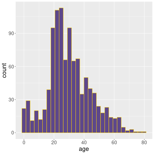
Here is histogram of age on Titanic:
The anatomy of the command is the following:
- take titanic data
ggplot(): use ggplot package to visualize itaes(age): visualize variable age+ geom_histogram(): make a histogram of it, and adjust the colors a bit (otherwise it looks ugly gray).
This figure tells us quite a bit about the passengers on the board of the ocean liner. For instance, we see that the most common age of passengers was early 20s. We can also see that older passengers get less and less common, but there is not clear “upper limit”. The passenger counts just get smaller and smaller when we look at the older people. We also see that there is a secondary peak–young children under age 10. We can guess these are children of the young adults, parents in their mid-20s. Remember: we are talking about events of 1912, time when people tended to marry and get children much earlier than nowadays. Third fact we see here is that most age values are not too different from the typical ones. Humans are of roughly similar age, at least when on a boat as passengers. This is a common feature when measuring humans, or not just humans but many other kinds of adult organisms.
We can also make a histogram of the fare they paid:
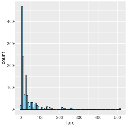
The anatomy of the command is pretty much the same as above, just now we ask for more bins (80) instead of the default 30. We do this to make the dense cluster of bins at the small values better visible.
This figure also tells interesting things about the fare. Most prominently, the distribution is strikingly different from that of age. While the age histogram is broadly symmetric, this is not at all true for fare. Most people paid little, around 10 pounds, but there are passengers who paid hundreds of pounds. This distribution is highly right skewed. Highly right-skewed distributions are very common when analyzing price, income, popularity and similar features.
Exercise 7.5 Try to replicate the figure, but using a different number of bins, from 10 to 250. Which number of bins, in your opinion, is the best?
See an answer
Such skewed histograms are often better to be displayed in log scale:
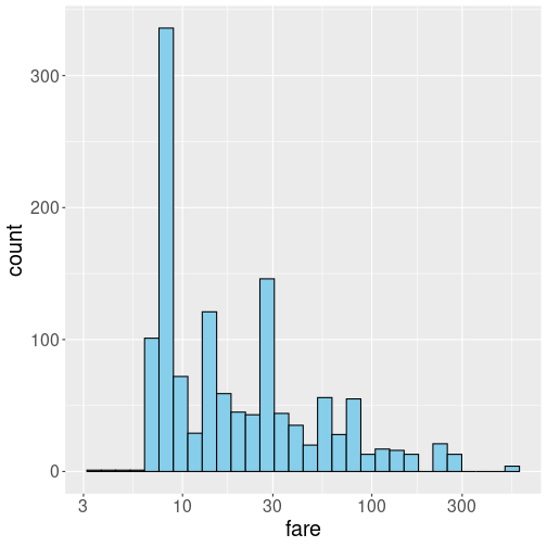
Logarithm expands small numbers while contracting large numbers, and in this way makes the histograms easier to read. The histogram looks less skewed now, but one has to be careful to understand it is in log-scale, not in a linear scale any more.
Why do we have so different pictures for age and fare? There are several reasons. First, human age has pretty strong natural limits. Children will be able to travel alone at age maybe 15 (remember, we are talking about year 1912 here), while there are very few people above 75 who are still healthy enough to travel. This means we have roughly five-fold age span, from 15 to 75, that encompasses almost all passengers. In contrast, no such boundaries exist for fare. If you are rich, you can afford an expensive ticket. If you are very rich, you can afford a very expensive ticket. So ticket price is a reflection of wealth distribution. Wealth and income is an example of rich-get-richer type of processes, wealthy people find it easier to increase their wealth even more.
Another reason for such extremely skewed distributions is related to
the fact that we care a lot about relative ranking. Consider the
figure below, the histogram of marathon finishing times:
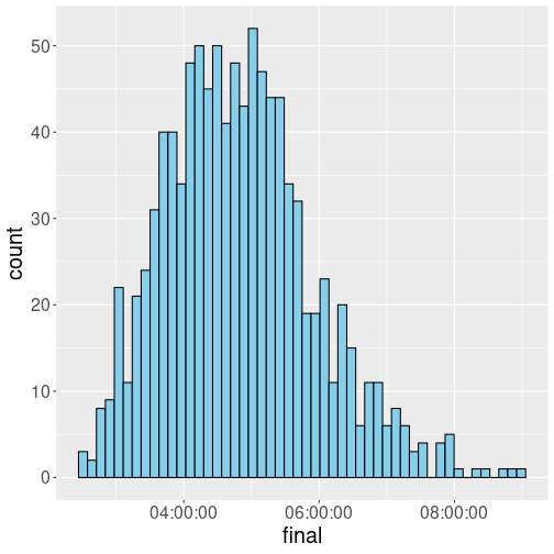
This is a random sample of 1000 from the full dataset that can be downloaded from Github. As one can see, the finishing time is roughly symmetric. We also see that the difference in finishing times is not that big–the fastest runner in this sample finished in 2:29:15 and the slowest runner in almost 9 hours. This is an approximately four-fold time difference, comparable to what we see in case of Titanic age. As above, we are looking the properties of adult humans (although only those humans who actually run marathon).
However, now consider how much “fame” did the finishers get. Did the winner also get roughly four times more fame than the one who finished last? This was most likely not the case. In such competitive settings, the winner (and a few following athletes) usually get pretty much all the prices, attention and fame. This is a “winner-takes-all” type of situation. This is another reason why we often see extremely skewed distributions.
2021, Wold Bank data↩︎
But we can still make an educated guess. For instance, we can safely assume that the passenger’s age on Titanic was between 0 and 100 years. Hence we can just replace the missings with “0” to get the smallest possible average, and with “100” to get the largest possible average age. The true average must be between these two values.↩︎