Chapter 14 Predictive modeling
14.1 Prediction versus inferences
So far we have mainly discussed inferential modeling. We computed linear regression slopes or logit marginal effects, and in each case we asked what does the number mean? Such insights are valuable and a major way of learning about natural and social phenomena. But sometimes this is not what we need.
For instance, imagine we are considering whether to have a picnic in a park tomorrow. We all agree that we’ll have the picnic, but only if it is not raining. How will inferential modeling help us with our decision? Sure, it will–we can learn that in case of north-westerly winds, and if the Ocean temperature is above a certain level, and in case of high-pressure area over British Columbia… and so on and so forth. Understanding the processes behind weather are definitely valuable, but … should we have picnic tomorrow or not? What we want to know is a simple yes/no answer: will it be raining tomorrow?
This is an example where we are interested in predictive modeling. Instead of interpreting the wind patterns and air humidity, we just want an answer, not an interpretation. This is not to say that interpretation is not valuable, but can we happily leave this valuable information to the weather forecasters.
There are many other similar problems where we are primarily interested in the outcome, not interpretation of the process. For instance, doctors’ immediate task is to find diagnosis given the symptoms. How are symptoms related to illness is a valid and important question–but I’d happily leave this to medical researchers for another time, and expect a quick answer to another question–what is the diagnosis–instead.
This section discusses the tools needed for such prediction, tools for predictive modeling. These include both R tools and general concepts such as RMSE or confusion matrix.
14.2 Predicting linear regression
First, we discuss how to do and how to understand predictions with linear regression models. Logistic regression–categorization–tasks are discussed below in Section 14.3.1.
14.2.1 Computing the predictions manually
Above, in Section 11.3.4, we discussed that every line on \(x\)-\(y\) plane can be written as \[\begin{equation} y = b_0 + b_1 \cdot x \end{equation}\] where \(b_0\) is the intercept and \(b_1\) is the slope. As these are the numbers that linear regression calculates, one can easily do the predictions manually.
Let’s do this using the global temperature trend analysis from Section 11.3.1 with HadCRUT temperature data. For a refresher, the dataset looks like
## # A tibble: 4 × 4
##    Time `Anomaly (deg C)` `Lower confidence limit (2.5%)`
##   <dbl>             <dbl>                           <dbl>
## 1  1850            -0.418                          -0.589
## 2  1851            -0.233                          -0.412
## 3  1852            -0.229                          -0.409
## 4  1853            -0.270                          -0.430
##   `Upper confidence limit (97.5%)`
##                              <dbl>
## 1                          -0.246
## 2                          -0.0548
## 3                          -0.0494
## 4                          -0.111
We only need the year and anomaly columns for the analysis.
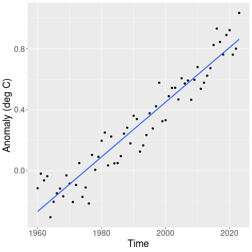
A simple graphical analysis reveals that from 1960 onward, the temperature shows a fairly steady upward trend:
hadcrut %>%
   filter(Time >= 1960) %>%
   ggplot(
      aes(Time, `Anomaly (deg C)`)) +
   geom_point() +
   geom_smooth(method="lm", se=FALSE)
Because the variable names in HadCRUT dataset contain
spaces and parenthesis, we need to quote those with backticks below,
for instance
`Anomaly (deg C)`. See Section
5.3.1.
We estimate this trend with linear regression, and make corresponding predictions. We can do this as (see Section 11.3.1):
##
## Call:
## lm(formula = `Anomaly (deg C)` ~ Time, data = .)
##
## Coefficients:
## (Intercept) Time
## -35.92526 0.01819Previously, we just interpreted the results, in particular we noted that the global temperature is increasing 0.18C per decade. But now our focus is on prediction–how much will the global temperature be at year 2050, 2100 and so on.
We can just plug the numbers into the formula and write
Temperature in 2100 = -35.925 + 0.018 \(\times\) 2100 = 2.268
So the prediction for year 2100 is 2.268. What does the number mean? There are several important things to keep in mind.
- first, it does not mean that “temperature” is 2.268. We are predicting exactly the same measure, using exactly the same units, as we used in our data. So it is temperature anomaly relative to 1961-1990 average, measured in degrees C. So our model will predict that in 2100, the globe will be 2.268 degrees C warmer than 1961-1990 average.
- Second, yearly temperature is largely driven by chaotic weather, se the Earth may actually be warmer or colder. But in average, we expect it to be that much warmer.
- Third, the prediction is only valid if the current trend continues. The global temperature trend has been fairly steady since 1960, but that may change–global warming may either slow down or accelerate. In these cases our predictions will probably be quite a bit off.
So a correct way to interpret the prediction would be
If the current trend continues, we expect the average global temperature in 2100 to be in average 2.268C above the 1961-1990 average.
Exercise 14.1 The sentence above includes “average” three times. What are these averages? What happens if you leave one out?
14.2.2 R prediction tools: the predict() method
It is useful how to compute the predictions manually, and sometimes it
is exactly what we want to do. But other times it is easier to use
the built-in prediction tools.
Below we use the predict() method. It is somewhat easier (and much
easier if you work with logistic regression), and you’ll make fewer
typos.
As the first step, we want to store the fitted model into a variable,
here I call the result just m but you can pick whatever name you
like:
You don’t see the values for intercept and slope as those are now
stored in m. But you can still print them by just
typing m:
##
## Call:
## lm(formula = `Anomaly (deg C)` ~ Time, data = .)
##
## Coefficients:
## (Intercept) Time
## -35.92526 0.01819These are exactly the same results as above.
There are two ways to use the predict() method. If you want to
predict the values in data, you can just call predict(m):
## 1 2 3 4
## -0.259831343 -0.241643977 -0.223456611 -0.205269245
## 5 6 7 8
## -0.187081879 -0.168894513 -0.150707147 -0.132519781
## 9 10 11 12
## -0.114332415 -0.096145049 -0.077957683 -0.059770317
## 13 14 15 16
## -0.041582951 -0.023395585 -0.005208219 0.012979147
## 17 18 19 20
## 0.031166513 0.049353879 0.067541246 0.085728612
## 21 22 23 24
## 0.103915978 0.122103344 0.140290710 0.158478076
## 25 26 27 28
## 0.176665442 0.194852808 0.213040174 0.231227540
## 29 30 31 32
## 0.249414906 0.267602272 0.285789638 0.303977004
## 33 34 35 36
## 0.322164370 0.340351736 0.358539102 0.376726468
## 37 38 39 40
## 0.394913834 0.413101201 0.431288567 0.449475933
## 41 42 43 44
## 0.467663299 0.485850665 0.504038031 0.522225397
## 45 46 47 48
## 0.540412763 0.558600129 0.576787495 0.594974861
## 49 50 51 52
## 0.613162227 0.631349593 0.649536959 0.667724325
## 53 54 55 56
## 0.685911691 0.704099057 0.722286423 0.740473789
## 57 58 59 60
## 0.758661155 0.776848522 0.795035888 0.813223254
## 61 62 63
## 0.831410620 0.849597986 0.867785352This prints a long list of numbers. These are predicted temperature values for all these years we included into the model, 1961 till 2023, in the same order as years are stored in the dataset. So we can see that the predicted temperature anomaly for the first year we included in the model, 1961 is -0.26, and for the last year, it is 2023 it is 0.868.
But these are just the values for the actual years we have in data.
One can argue that such predictions are not very interesting–why do
we need to predict the value for, say, 2023 if you already know the
true number anyway? What we would like to predict is temperature for
a year where we do not know the correct number, for instance for 2050
or 2100.
If we want to use years there were not in data, e.g. 2050, we need
to supply a new dataset to predict(). For instance,
## 1
## 1.358844So the predicted temperature anomaly for 2050 is 1.36.
The newdata = data.frame() tells predict() that this time we do
not want to hear what we already know–namely, what was the temperature
1960-2023, but instead, want it to tell us what does it think the
temperature in 2050 will be. data.frame(Time = 2050), in turn,
creates a new dataset with a column Time:
## Time
## 1 2050This new dataset is used for prediction. The column name, Time,
must be exactly the same as used in the model (the lm() function)
above, where we asked
for lm(`Anomaly (deg C)` ~ Time).
But as discussed in Section 14.2.1, we cannot ignore interpretation in predictive modeling either. What does the number 1.36 mean? It must be understood in the same way as the numbers in HadCRUT data: these are global surface temperature anomalies, in °C, above 1961-1990 average. Hence the model predicts that by 2050, the average global surface temperature is 1.36°C above 1961-1990 average.
The other extremely important point to understand is what kind of assumptions are our predictions based on. Here it is very simple–we describe the temperature 1960-2023 by a linear trend and we assume the same trend continues into 2050. But we do not know if it is correct. We cannot know. It has hold steady for the last 60 years, so it is a plausible assumption, but it is still an assumption. See more in Section 14.4 below.
Exercise 14.2 Use the model above and the predict() method to predict the
temperature anomaly in 2050, 2100, and 2200. What numbers do you get?
What do you think, how reliable are those figures?
14.2.3 Model goodness: RMSE and \(R^2\)
Besides just predicting the numbers, we also want to know how “good” are the predicted values it provides, and how good is the model overall. Here we discuss one answer for each of these questions: the “goodness” of the values can be described by root mean squared error (RMSE), and the overall model goodness by R-squared (\(R^2\)).
14.2.3.1 RMSE
RMSE – root mean squared error – is defined exactly as it is worded: root of mean of squared errors: \[\begin{equation*} \mathit{RMSE} = \sqrt{ \frac{1}{N} \sum_{i} (y_{i} - \hat y_{i})^{2} } \end{equation*}\] It can be easily understood by its name “RMSE”:- “E” stands for “error”, the prediction error \(y - \hat y\).
- “S” stands for “squared”, the errors squared: \((y - \hat y)^2\).
- “M” stands for “mean”, the mean of squared errors: \(\frac{1}{N} \sum_{i} (y_{i} - \hat y_{i})^{2}\)
- “R”, finally, stands for “root”, the square root of the mean.
This is the definition. But what does it mean? It is fairly easy to see that RMSE describes some kind of “typical” prediction error. After all, it is a certain average error–but not “ordinary”, the arithmetic average, but an average that involves squares and roots. So let’s call it a “typical” error, not “average” error, to avoid mislead your readers to think it is an arithmetic average.
If you use info180 package, it is very simple to compute RSME. Here I compute RMSE for the linear regression model of Section 14.2.2, the one where we computed the global temperature as a function of time:
library(info180)
hadcrut %>%
   filter(Time > 1960) %>%
lm(`Anomaly (deg C)` ~ Time, data = .) %>% # linear model
rmse() # RMSE## [1] 0.1032174The answer, 0.1, can be interpreted as “typically, the model’s predictions are off by 0.1 (deg C)”.
14.2.3.2 \(R^2\)
RMSE will tell us something about the size of “typical” prediction errors, but it will not say much about how good is the model overall.
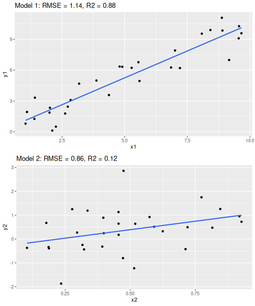
Two regression models with similar RMSE but different \(R^2\)
Look at the two regression models at right. These depict a linear trend line through two data clouds. RMSE, the “typical” error is the similar in both cases, between 0.9 and 1.1. But the point clouds give a rather different message–in the first case, the points align very well with the line; but in the second case it seems as there are other very important factors besides \(x_2\). The errors are not that different, but the overall variation is–in the former case, the errors are only a small part of the overall variation while in the latter case the errors is the largest part of the variation.
This is what \(R^2\) captures. It tells how big of a percentage of the overall variation is captured by the model. In the upper figure (Model 1), the model explains 88% of the variation but in the lower (Model 2), it only captures 12% of the variation.
Technically, \(R^2\) is defined as: \[\begin{equation*} R^{2} = 1 - \frac{ \sum_{i} (y_{i} - \hat y_{i})^{2} }{ \sum_{i} (y_{i} - \bar y)^{2} } \end{equation*}\] Its largest possible value, \(R^2 = 1\) means that the model explains everything–there are no wiggle room and all data points fall exactly on the line. This corresponds to the correlation coefficient 1, and means that the model does not have any prediction errors.
Its lowest possible value is \(R^2 = 0\).31 This means that the model does not predict anything (effectively predicting the average value for every data point), and all that we have are errors.
How good values can you expect in practice? How good must \(R^2\) be for the model to be considered “good”? This very much depends on the application. In case we model human behavior with typical survey data, it is rare to get $R^2 above 0.25. Humans are just so hard to predict and so complicated. But when predicting today’s outcome based on yesterdays outcome, we can easily get \(R^2 = 0.99\). This is because for many phenomena, the trends are slow and today will be very similar to yesterday.
Also–if you are primarily interested in the slope value, then \(R^2\) should not be your major concern: low \(R^2\) just indicates that there are other important factors besides what you use in the model.
14.3 Categorization: predicting categorical outcomes
So far we were predicting linear regression results. As linear regression expects a continuous outcome, such as basketball score or temperature, measures such as \(R^2\) and RMSE are appropriate.
But not all prediction tasks are like that. There is an important class of problems, called classification or categorization, where the outcome is categorical. Here are a few examples of classification problems:
- image categorization: does it depict a cat or a dog?
- email categorization: is it spam or not?
- loan processing: approve the application or not?
- analyzing bank transaction: fraudulent or not?
None of these case are concerned of a numeric outcome. Instead, it is a category, cat versus dog, spam or non-spam, and so on. Obviously, linear regression is not suitable for such tasks–what would you decide about email being spam if the model responds “7.4”? Fortunately, there are other tools that are designed for just such tasks. Above we introduced logistic regression, am model that is designed to describe how probability of one category depends on the other characteristics. This is one of the models we will use below as well.
In a similar fashion, we cannot easily compute values like RMSE or \(R^2\), as the concepts like “approve - not approve” do not make much sense. We discuss these tools below.
14.3.1 Predicting logistic regression results
Logistic regression results can be predicted in a fairly similar way as linear regression results. Using info180 package32
library(info180)
data(titanic)
m <- titanic %>%
                           # save the fitted model to 'm'
   logit(survived ~ age, data = .)
predict(m) %>%
                           # predict based on model 'm'
   head(5)  # none survived...
## 1 2 3 4 5
## 0 0 0 0 0Or predict for a certain passenger:
## 1
## 0
The output should be understand as follows: for the first 5 passengers
in data (this is the first line 1 2 3 4 5) we predict value “0”
(died) for
each of them (this is the second row 0 0 0 0 0).
We can also try a different model with different variables, e.g. sex:
titanic %>%
                           # do not save
   logit(survived ~ sex, data = .) %>%
   predict() %>%
                           # predict based on the model here
   head(5)
## 1 2 3 4 5
## 1 0 1 0 1The “1” and “0” in the output means that for the first person in the new data, we predict “0” (died).
We can also see what is predicted survival for males and females:
titanic %>%
   logit(survived ~ sex, data = .) %>%
   predict(newdata = data.frame(sex = c("male", "female"))) %>%
                           # predicted survival for a man and a woman
   head(5)
## 1 2
## 0 1Here we see that the first passenger (a man) is predicted to die, and the second one (a woman) is predicted to survive.
14.3.2 How good is categorization? Confusion matrix
But how to tell how good is a model for categorization? Remember–for a continuous outcome, we can use RMSE (the typical error) and \(R^2\), that tells how closely are \(x\) and \(y\) related. But as we discussed above, such measures for categorical outcomes do not work well as results like “cat - dog” carry little meaning. So what can we do instead?
Assume we design a cat/dog distinguishing model, that looks at the pictures, and predicts either “cat” or “dog” for each one. How can we analyze its performance?
Let’s begin with a single image, say, of a cat. Now our model can either (correctly) tell it is a cat, or (incorrectly) that it is a dog. Hence there are only two possible outcomes–correct, and incorrect. When we show an image of a dog instead, then the model can again only be correct or incorrect. This suggests an obvious way to measure the model goodness: in case of multiple images, just count the number of correct or incorrect predictions.
If our data contains images of both cats and dogs, then the picture is slightly more complex: we can be correct in two ways (cat is recognized as a cat and dog as a dog), and we can be wrong in two ways (cat is mistaken for a dog and the way around). This is the idea of confusion matrix.
| Actual animals | Model predictions | correct |
|---|---|---|
| cat | cat | ✅ |
| cat | cat | ✅ |
| dog | dog | ✅ |
| dog | dog | ✅ |
| cat | dog | ❌ |
| cat | cat | ✅ |
| dog | cat | ❌ |
| dog | dog | ✅ |
| cat | cat | ✅ |
| cat | cat | ✅ |
| dog | cat | ❌ |
| dog | dog | ✅ |
| cat | cat | ✅ |
| cat | cat | ✅ |
Imagine 15 pet pictures: cat, cat, dog, dog, cat, cat, dog, dog, cat, cat, dog, dog, cat, cat. And we have 15 predictions: cat, cat, dog, dog, dog, cat, cat, dog, cat, cat, cat, dog, cat, cat. Such a list is quite hard to understand, so we should make it into a table instead, as displayed here. We can use the table to count that, e.g., we got 7 cats right.
| cat | dog | |
|---|---|---|
| cat | 7 | 2 | Predicted |
| dog | 1 | 4 |
The table above is much better than the list, but it is still laborious to count cats and dogs there. It would be even better to have some kind of overview: how many dogs and cats did we get right? How many cats did we mistake for dogs, and the way around? Such a table is displayed here. It’s columns display the actual values and its rows display the predicted values.
We can immediately see that we got 7 cats and 4 dogs right, while the model mistook 1 dogs for cats and 2 cat for a dog.
This table is called confusion matrix. Confusion matrix is a table that shows the counts of different kind of correct and incorrect predictions.33
\(R^2 = 0\) is the lowest possible value for a linear regression model that contains and intercept and is evaluated on training data. For models without intercept, or when evaluating on a different dataset, there is no lower limit. But the upper limit is still \(R^2 = 1\).↩︎
As a refresher: the most recent version can be installed by
install.packages("https://faculty.uw.edu/otoomet/info180.tar.gz").↩︎Here we only work with counts, but confusion matrix can as well be written in terms of percentages (e.g. we got 90% of dogs right) or probabilities (e.g., the probability to mistake cat for a dog is 20%).↩︎