D Exercise Solutions
D.1 R
D.1.2 Packages
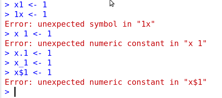
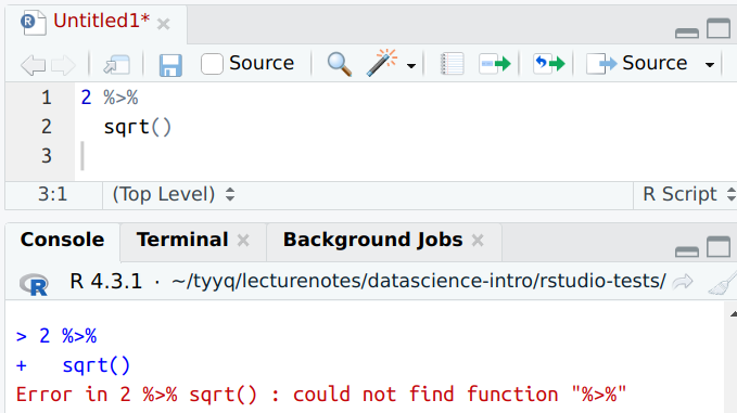
D.1.2.1 Pipeline on two lines
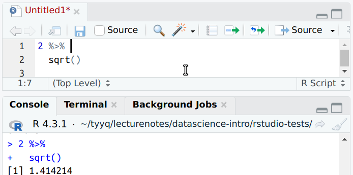
dplyr pipelines can extend over two (or more lines)
R is smart enough to understand that the second line is part of the
same command. However, this only works if the pipe %>% is the
last thing on the first line. Then R realizes that the next line
must be some kind of continuation of the same command.
D.2 Data
D.2.1 What is data
D.2.1.1 Data about students
Obviously, here is no unique answer. But here is a few things you might collect:
- Personal and health information like age, gender, family income, city of origin, height, weight, immunization…
- UW-related information like (intended) major, courses taken, GPA, (intended) graduation year…
- Some information may require quite a bit of text. We might ask “why did you take info180?”, “what are your main interests?”, “what is your favorite food?”…
- We can also collect pictures of students
And you can come up with many more things.
Personal information may tell us something about how closely does the student body represent the general population. What kind of regions are overrepresented? How many students from poor/rich families do we have? Are students mostly healthy, and those who are not, what kind of issues are more common?
The free text answers allow to see what is students’ motivation to join the class, what are the students interested in, and so forth. Understanding the motivation can potentially be used for desigining better curricula.
Can we trust these answers? It largely depends on how the data is collected. I would not trust it much if just sharing an online survey link in class. A much better way would be to personally interview each student, and give a offer a little “thank you” gift for devoting their time. Obviously, it also depends on who and how is asking more sensitive questions, such as family income or health. If done privately by a doctor, people may be quite willing to discuss their problems. But if asked by the professor in class, in front of the others, then the answers may not be reliable at all.
Answers may also suffer from social desirability bias. For instance, students may not admit that they took the course just because it is an easy one, even if asked in a private anonymous manner.
A different set of issues is sampling (see Section 6.6). Usually there are always people who do not respond. Who are they and are they similar to those who answered? How many such students will there be? Unless we cannot answer these questions, then we cannot easily trust the conclusions.
D.2.1.2 Can these questions be answered?
Both questions are somewhat vague.
do students like pineapple on pizza? may mean different things. For instance:
- do majority (>50%) of students in this class say they like pineapple on pizza if asked so?
- are they willing to eat it when hungry?
- which students are we talking about? students in this class? UW? All over the world?
One may come up with many more questions, e.g. what exactly does “like” mean and so on.
However, if we define all these question precisely enough, then it is definitely possible to collect the information, at least in principle.
is pineapple a good pizza topping? is much more vague. The problem is that good may mean different things, and we need a guidance how to evaluate it. It may mean “people like it”, “it is easy to cook”, it is “cheap”, “it looks good”, “all of it” and so on. To make it worse, different people judge these things differently.
So this question is perhaps too vague to even start data collection.
D.2.1.3 Rooster’s crow and sunrise
In order to answer the questions about sun and rooster based on similar kind of data, we must be able to manipulate the rooster somehow (or you may manipulate sun if you can…).
For instance, will sun still rise if we remove the rooster? Or if we get the rooster to crow early by lighting a lamp in the barn an hour earlier?
D.2.1.4 All ravens are black
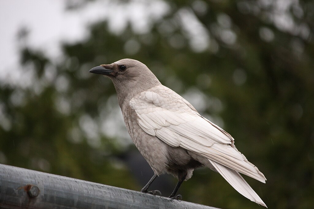
In fact, not all ravens are black. This crow is white because of albinism. Whether it serves as a counterexample to the claim that “all ravens are black”, depends on what the question exactly means.
Jg26908, CC BY-SA 4.0, via Wikimedia Commons.The question is not quite clear. If applying formal logic the “all ravens are black” means that are not a single white raven around. We can also discuss whether it applies to all current ravens only or also all past and future ravens. Are we talking about the color of their feathers or skin? And what about toy ravens, or ravens’ skeletons? What about the different species of ravens, some of which are not completely black? If this is what we want to show, the only completely foolproof data would contain the color of every single raven in the world.
But everyday language does usually not follow formal logic, so maybe what the claim states is instead: “The dominant color of all current species of ravens is black, and if there are ravens of different color, they are very rare, and that color is normally not carried forward to the next generation”. If this is the case, then we need to show that the percentage of ravens of different color is very small. This can be done fairly easily, given we can collect a representative sample of all ravens. It should include sample from everywhere, in particular Arctic where we know that there are white form of other animals. If such sample contains no (or very few) white ravens, then we can be reasonably certain that they are very rare (if they exist at all).
D.2.2 Data Frame
D.2.2.1 Name and color
The datase might look like
| Name | color |
|---|---|
| Dai-yu | yellow-green |
It contains two variables (columns) – name and color.
A row may represent a person–each row is a different person with a different favorite color. But we cannot say it for sure, because we only have a single row. It may also be that each row represents a color, and lists one person who likes this color. There are other possibilities, e.g. a single person may list more than one color.
D.2.2.2 Student grades
A dataset about student grades will probably contain student name, some kind of id, and grades in classes they have taken. These will be variables. Note that “grades in classes they have taken” is not quite well defined and can be done in different ways as different students have taken different classes. One option is to list all possible classes and just leave the grade field empty if the student hasn’t taken it (see the example below).
In such a data frame, the rows will probably represent students, as the data is about “students’ grades”.
An example might look like
| Name | netid | math126 | info180 | cse120 |
|---|---|---|---|---|
| Dai-yu | day123 | 3.3 | 4.0 | |
| Bao-yu | byu01 | 3.4 | 2.5 | |
| Bao-chai | chaibao | 3.9 | 3.9 |
Here each row represents different students. Everyone has got a grade for math126, but Bao-yu has not taken info180, and neither Dai-yu nor Bao-chai have taken cse120.
D.2.2.3 Why is name not categorical
Categorical data is often represented as text, but categorical values must fit into a limited set of possible values (see Section 3.2.2). Human names do not have a limited set of values and hence name is not a categorical value.
D.2.3 Loading and exploring data
D.2.3.1 Use wrong separator in data import
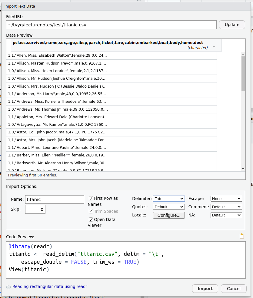
The figure here shows what happens.
- First, the data preview does not look like a clean data frame any more–all the columns and column names are piled together, and you see a lot of commas there. This is because R now assumes the separator is tab symbol, not comma. So commas will be treated just as any other symbol, and because there are no tab symbols, the columns will not be separated–we will just have a single column.
- Second, you can also see that the code is now somewhat different and includes more options set.
D.3 Using R and RStudio for data analysis
D.3.1 The tidyverse world
D.3.1.1 Price range paid
The approach should be exactly the same as the examples in the text,
just we have to pull out the fare column and
replace table() with range(na.rm=TRUE):
## [1] 0.0000 512.3292The first number, 0.0000 means that the lowest price value was 0 and
the highest was 512 (UK pounds of 1912). We do not know whether
0 actually means
that they did not pay anything for trip, it is possible that it is is
a code for missing value or just a data entry mistake.
D.4 dplyr pipelines
D.4.1 Writing pipelines
D.4.1.1 How many 3rd class women survived
Here is one way to do it:
- Take Titanic data
- Keep only 3rd class passengers
- Keep only women
- Keep only survivors
- Count the rows
Obviously, there are other ways of doing it.
D.4.1.2 Highest male survival rate
Here is one way to do it:
- Take Titanic data
- Keep only men
- Do the following for each passenger class
- Pull out survived variable
- Compute its average
We should get three numbers that are easy enough to compare. If needed (e.g. if there are many more numbers), we can add something like: Find the class with largest average.
Again, there are different ways of doing things.
D.4.2 The most important functions for pipelines
D.4.2.1 Most expensive tickets
We just select these two columns, and thereafter take a sample:
## # A tibble: 5 × 2
##    fare pclass
##   <dbl>  <dbl>
## 1  7.75      3
## 2 15.2       3
## 3 38.5       1
## 4  7.75      3
## 5 12.4       2
As you can see, in this sample the most expensive ticket is 38.5, and the respective passenger travelled in the 1st class.
D.4.2.2 Select name, age, pclass, survived
This is just about using the simplest approach of select:
## # A tibble: 4 × 4
##   name                              age pclass survived
##   <chr>                           <dbl>  <dbl>    <dbl>
## 1 Tucker, Mr. Gilbert Milligan Jr    31      1        1
## 2 Smith, Mr. Richard William         NA      1        0
## 3 Skoog, Mr. Wilhelm                 40      3        0
## 4 Wilhelms, Mr. Charles              31      2        1
Note that the last line, sample_n, is only there to avoid printing
too much data. It is not a part of the select procedure.
D.4.2.3 Filter 3rd class males
Here we need to remember both of the tricks: equality testing uses
double equal sign ==, and testing for male requires quotes like
“male”:
titanic %>%
   filter(pclass == 3) %>%  # note double equal sign '=='
   filter(sex == "male") %>%  # note: "male" in quotes
   nrow()
## [1] 493D.4.3 Grouped operations
D.4.3.1 Passenger fare by class
The solution is almost exactly the same as the example in Section 5.6:
## # A tibble: 3 × 2
##   pclass  fare
##    <dbl> <dbl>
## 1      1  87.5
## 2      2  21.2
## 3      3  13.3
We see that the third class tickets were the cheapest, £13; 2nd class was more expensive, £21, and the 1st class was the most expensive, £87 in average. The ranking of classes and ticket price is exactly what we expect.
D.4.3.2 Average price by class, sex
The solution is basically exactly the same as for average survival rate. Just here we need to compute the average of fare. We also need to remove missings–there are no missing surival data but there are missing fares:
## # A tibble: 6 × 3
## # Groups:   sex [2]
##   sex    pclass `mean(fare)`
##   <chr>   <dbl>        <dbl>
## 1 female      1        109.
## 2 female      2         23.2
## 3 female      3         15.3
## 4 male        1         69.9
## 5 male        2         19.9
## 6 male        3         12.4
As you see, even for a given class, women paid more. For instance, 2nd class women paid 23.2 while men paid 19.9 in average. The difference may have something to do with the amenities, such as better cabins, included in the price.
D.5 Preliminary data analysis
D.5.1 Preliminary data analysis
D.5.1.1 Load Titanic data in a wrong way
Let’s do it:
The first three lines look like:
##                            pclass.survived.name.sex.age.sibsp.parch.ticket.fare.cabin.embarked.boat.body.home.dest
## 1                              1,1,Allen, Miss. Elisabeth Walton,female,29,0,0,24160,211.3375,B5,S,2,,St Louis, MO
## 2 1,1,Allison, Master. Hudson Trevor,male,0.9167,1,2,113781,151.5500,C22 C26,S,11,,Montreal, PQ / Chesterville, ON
## 3        1,0,Allison, Miss. Helen Loraine,female,2,1,2,113781,151.5500,C22 C26,S,,,Montreal, PQ / Chesterville, ON
The data looks somewhat weird now–there are no clear columns. But the content of it–names and numbers–still seem reasonable.
We have correct number of rows:
## [1] 1309Wrong delimiter will not affect how many rows are loaded.
But the number of columns is wrong now:
## [1] 1We got only a single column! This is because the delimiter is what marks where one column ends and the other begins. If it is wrong, then R just thinks that all these fields belong to the same column35
This is confirmed by looking at the variable names:
## [1] "pclass.survived.name.sex.age.sibsp.parch.ticket.fare.cabin.embarked.boat.body.home.dest"All variable names are now concatenated into a single weird name that corresponds to the single column we got above.
All these results, except nrow(), clearly rise red flags. Something
must be wrong with the data, or as is the case here, the way how we
load these.
D.6 Descriptive statistics
D.6.1 Basic properties: location, range, distribution
D.6.1.1 Average and total line length
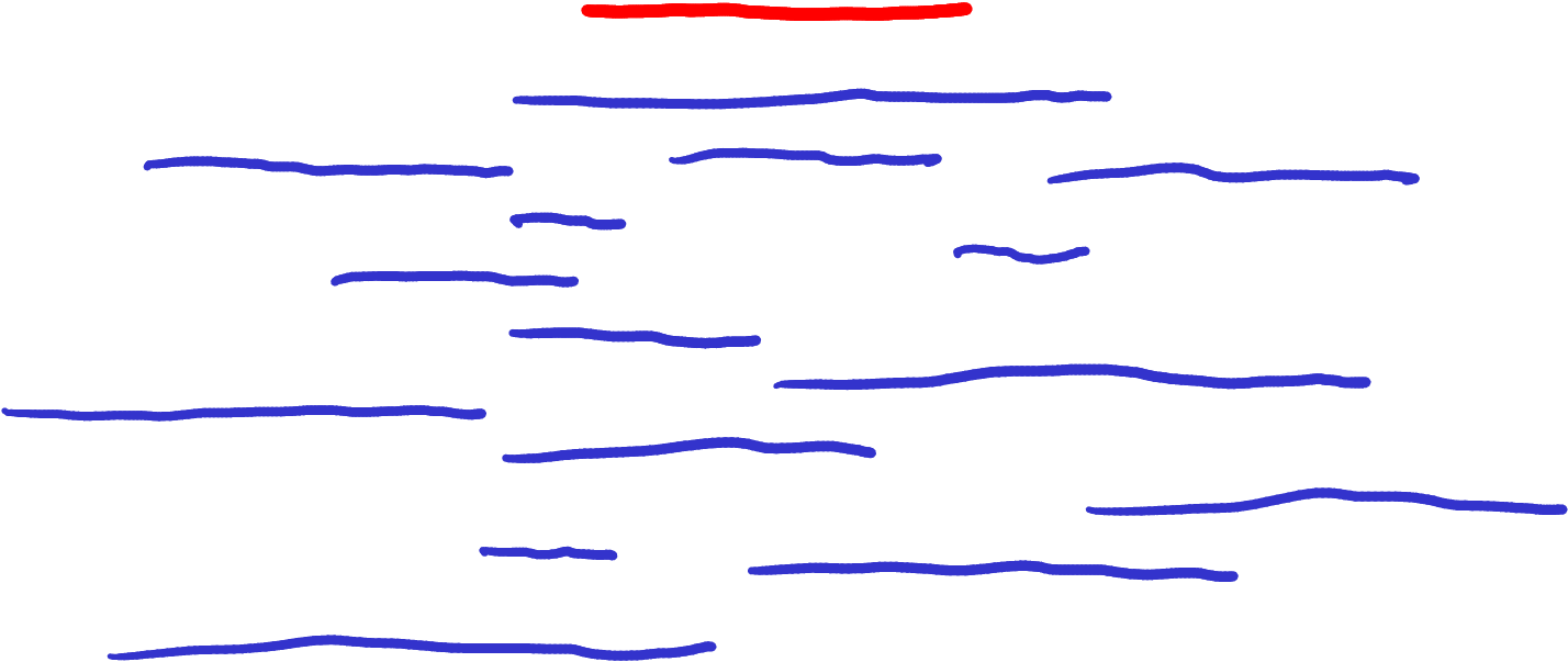
The thick red line shows the average length.
The average length is marked as the thick red line. There are 15 lines in total, so the total length is 15 times longer than the red line. This would perhaps not even fit to your screen!
D.6.1.2 Average fare on Titanic
This is basically exactly the same code as for age:
## # A tibble: 1 × 1
##    fare
##   <dbl>
## 1  33.3
Hence, “typical passenger” paid 33 pounds for the ticket, a number rather similar to average age.
D.6.1.3 Fare histogram with a different number of bins
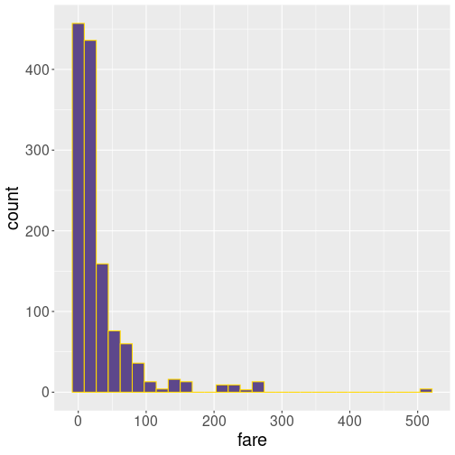
10 bins
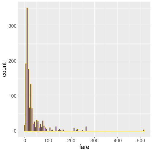
30 bins
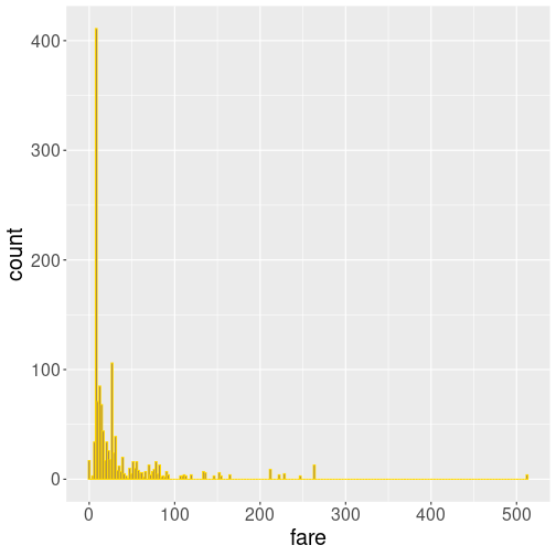
100 bins
250 bins
Out of these examples, 10 bins is very little but describes the general falling pattern–more expensive tickets are less common. In this sense, 30 bins do not add much to the picture. But at 100 bins, we can see that the most common fare is in fact not close to 0 but somewhat above it. Finally, 250 bins is clearly too much.
In my opinion, the best number is somewhere between 30 and 100.
D.7 Questions and answers
D.7.1 General questions and answerable questions
D.7.1.1 Can these questions be answered
What is the best movie of all time?: the problem is the concept of best (good) which has too many different meanings, and is also to a large extent subjective. One might consider questions “Which movie has been watched by the largest number of people”? or “Which movie has earned the largest even revenue?”, or maybe “Which movie has had the best reviews ever?”. All of these can be answered, based on data, to a certain extent, but even here we have various ambiguities. For example, what exactly constitutes to “watch” a movie? If your TV is playing but you are busy with other things, is it “watching”? But these are probably some of the closest we can come up with, and that are still to a certain extent answerable.
How old is universe?: this is a fairly easy question to answer, if we look away the questions regarding time time and space very early after the Big Bang. But if you do not care too much about the first few seconds, then cosmological data can easily answer it (and the answer is 13.8 billion years). Note that a seemingly very similar question–how big is universe–is harder to answer, as we run into problems with size in an expanding universe. We probably also need to specify that we are talking about the visible universe as there is little guidance to say anything about what lies beyond what we can see.
Is the world getting more dangerous?: this question has two problems: one related to the concept of danger, the other with the time dimension we are talking about. We can replace this with something more precise, e.g. measure danger as “probability that someone in the world dies through violence”, and replace the getting with comparison of, e.g. the time period of 1990-1993 and 2020-2023. Obviously, now we are looking at a very specific way to understand the question.
D.8 Visualizing data
D.8.1 Basic plot types
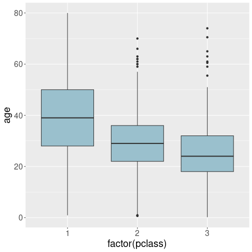
D.8.1.1 Boxplot of Titanic passenger age by class
Here we can just tell that pclass should be mapped onto the
x-axis. However, as pclass is a number, not a categorical
variable, we need to force it into a category through factor():
The plot suggests that the 1st class passengers were somewhat older, and the 3rd class was the youngest. This is plausible–younger passengers may have been both less wealthy, and also willin to do the 2-week trip in less convenient settings.
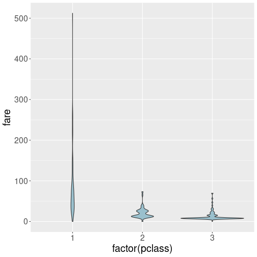
D.8.1.2 Violin plot of Titanic fare by class
The solution is very similar to that of the box plot:
However, as the fare ranges widely, in particular in the first class, the resulting violin plot is hard to understand. You may want to try log scale on the vertical axis. See Section 7.2.3 for more about age and price distributions.
But if you dig deeper into the plot, it will tell you that a) the first class passenger tended to pay more, some of them much more; b) third class passengers mostly paid quite little, but some of them paid more. c) Second class passengers paid an average amount. All this is plausible, and suggest that a lot of third class passengers preferred chap tickets.
D.9 Relationships
D.9.1 Visualizing trend lines
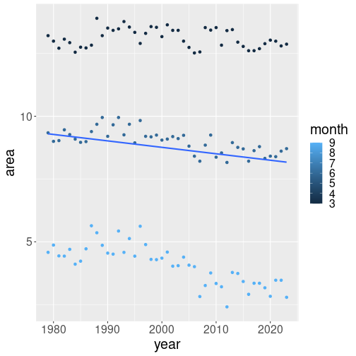
D.9.1.1 Month without factor
We just cut the factor() from around month in the code:
ice %>%
   filter(area > 0,
          month %in% c(3, 6, 9),
          region == "N") %>%
   ggplot(aes(x=year, y=area,
              col=month)) +
   geom_point() +
   geom_smooth(method="lm", se=FALSE)
Now we have single line. As month is a numeric variable (unlike
factor(month) which is categorical), ggplot does not make separate
trend lines for separate groups! It still colors the dots by the
corresponding month value, but for numeric variables, these are just
different shades of blue. Also, the trend line we see there is an
average for all three months.
D.10 Statistical inference
D.10.1 Statistical hypotheses
D.10.1.1 Errors when testing for cancer
If cancer is a rare condition, a suitable hypothesis might be
\(H_0\): this patient has cancer.
It does not have to be about the rare condition, but it may be easier to reject a rare condition. If you pick the alternative, it would sound
\(H_1\): this person does not have cancer.Type-1 error means incorrectly rejecting \(H_0\). Hence we falsely reject the claim that the patient has a cancer–we fail to detect a case that actually has cancer.
Type-2 error is the opposite: we incorrectly fail to reject the hypothesis–we claim that someone has cancer who actually does not have it.
Cancer is a serious condition, and detecting it may end up saving lives and money. So I may be worried about type-1 errors (failing to detect cancer). But it depends on what are the alternatives, what will happen further, and what are the associated costs.
If worried about type-1 errors, I would pick a small \(\alpha\). (Remember: \(\alpha\) is the probability of type-1 errors.)
Note that in medicine, usually one tests \(H_0\): the person does not have cancer, and hence the errors, and \(\alpha\) value are the opposite.
D.10.2 Confidence intervals
D.10.2.1 90% CI of passengers’ fare
The solution is very similar than what we did in Section 12.5.1. The most important difference is that in order to compute the 90%-confidence interval (CI), we need to “chop off” the lowest and the highest 5% of fare. Hence we need to find the 5% and 95% quantiles:
##      5%     95%
##   7.225 133.650
so 5% of passengers paid less than 7.225 and 5% paid more than 133.65.

Now we can make a similar plot:
titanic %>%
   ggplot(aes(fare)) +
   geom_histogram(bins = 100,
                  fill = "skyblue",
                  col = "white") +
   geom_vline(
      xintercept = c(7.225, 133.65),
      col = "orangered")
This histogram is harder to evaluate visually, but everyone will probably agree that most values fall between these two orange bars.
This is true here as the wrong separator,
<tab>is not present in any of the texts. But if there is a text that contains the symbol, the loading may fail alltogether.↩︎