Chapter 18 Unsupervised Learning
TBD: move behind networks
We assume you have loaded the following packages:
## /home/otoomet/R/x86_64-pc-linux-gnu-library/4.5/reticulate/python/rpytools/loader.py:120: UserWarning: Pandas requires version '1.3.6' or newer of 'bottleneck' (version '1.3.5' currently installed).
## return _find_and_load(name, import_)Below we load more as we introduce more.
18.1 Clustering
18.1.1 \(k\)-means in sklearn
Clustering is best understood in a 2-D framework where we can easily visualize the data and clusters. We start with making such a dataset and demonstrate how to use \(k\)-means clustering with sklearn library. But be aware that these data will be exceptionally good for clustering, real data is almost always much messier and often not even appropriate for cluster analysis.
We create 5 clusters. As a first step, we randomly create the corresponding cluster centers’ coordinates \(x_{1c}\) and \(x_{2c}\):
nc = 5  # number of clusters
np.random.seed(1)  # make the results replicable
## create cluster centers
x1c = np.random.normal(scale=5, size=nc)
x2c = np.random.normal(scale=5, size=nc)
The random locations are taken from normal distribution with scale
(i.e. standard deviation) equal to 5. We want the clusters to be
located sufficiently far from each other so they are
clearly distinct for this demonstration.
Next, we create 100 data points. We assign each data point to a cluster and thereafter put it into a random location near the corresponding cluster center. The clusters might have meaningful id-s but here we just assign them a numeric label \(0, 1, \dots, 4\).
n = 100  # number of data points
cl = np.random.choice(nc, n)  # cluster membership label for each dot
## create clusters around centers
x1 = x1c[cl] + np.random.normal(size=n)
x2 = x2c[cl] + np.random.normal(size=n)
Variable cl is the id (numeric label) of the corresponding cluster,
picked randomly with np.random.choice. Note how the points \((x, y)\)
are placed close to the corresponding cluster center \((x_{1c}, x_{2c})\) while
adding additional normal random noise.
However, this time scale has its default value, i.e. the standard
deviation of the noise is 1.
So data points are dispersed much less around
the cluster center compared to the centers itself.
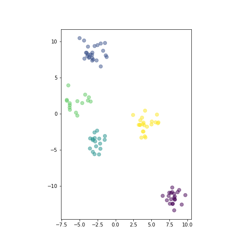
plot of chunk show-data
Randomly generated distinct clusters of datapoints. The horizontal and vertical scale is made equal.
The figure shows the generated data.
ax = plt.axes()
_t = ax.scatter(x1, x2, c=cl,
               s=50, alpha=0.5)
_t = ax.set_aspect("equal")
_t = plt.show()
There are five distinct clusters, here colored differently depending on the corresponding cluster id. The vertical and horizontal scale are made equal, so that human eye can correctly judge the distance we use below.
Next to our main task. This is to correctly detect the clusters in the data. Here we use \(k\)-means algorithm, a simple and perhaps the most popular clustering algorithms. It attempts to allocate the data points into a pre-defined number \(k\) clusters in a way that minimizes intra-cluster variation. See more in Lecture Notes Chapter 10.
Using unsupervised methods in sklearn is in many ways similar to using supervised ones, except that fitting the model must be done without the target y.
from sklearn.cluster import KMeans

X = np.column_stack((x1, x2))
m = KMeans(n_clusters=5)
_t = m.fit(X)
We import KMeans from sklearn.cluster. Next, we
create the design matrix \(\mathsf{X}\) which we need below for fitting.
Thereafter we set up the model with
just calling KMeans(). The most important argument it expects is
the number of clusters \(k\). There are other options regarding to the
iterations (max_iter), the exact algorithm (algorithm), etc.
Thereafter we fit the model, note that for the unsupervised model
fitting we only supply the design matrix X and no target. This
creates the fitted model that we can use in next steps for predicting
cluster labels and querying the location of cluster centers:
## labels:
##  [3 2 4 4 1 4 4 4 4 1 2 4 1 1 0 3 4 1 0 4]
the predict method computes the predicted cluster label for each
observation (in X), the possible label range from \(0\) to \(k-1\).
\(k\)-means relies on cluster centroids, those can be queried with
cluster_centers method:
## centers:
##  [[ -5.41322852   1.54188806]
##  [  8.0292849  -11.62947644]
##  [  4.20444648  -1.50785831]
##  [ -2.64264202  -3.99768911]
##  [ -3.11293253   8.42900307]]
This returns \(k\) (here 5) vectors (as rows of the matrix). Each vector corresponds to the centroid of the corresponding clusters, in the same order as labels. So the first row of the matrix is the centroid for cluster “0”. As the data here is 2-dimensional, the centroids contains two components
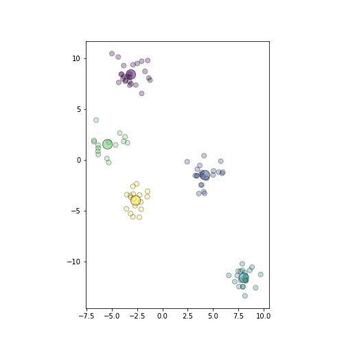
plot of chunk plot-predicted-data
Plot of the same datapoints as above. Different colors depict cluster membership, the big circles are the corresponding cluster centers.
It is fairly simple to visualize \(k\)-means results:
ax = plt.axes()
## plot datapoints in size 50,
## color as predicted cluster
_t = ax.scatter(X[:,0], X[:,1],
               c=hatCl,
               alpha=0.3, s=50,
               edgecolor="k")
## plot centers in size 200,
## colors as cluster labels
_t = ax.scatter(hatc[:,0], hatc[:,1],
               c=np.unique(hatCl),
               s=200, alpha=0.5,
               edgecolor="k")
_t = ax.set_aspect("equal")
_t = plt.show()
We also plot the centroids hatc
as larger circles in color that
corresponds to the cluster.
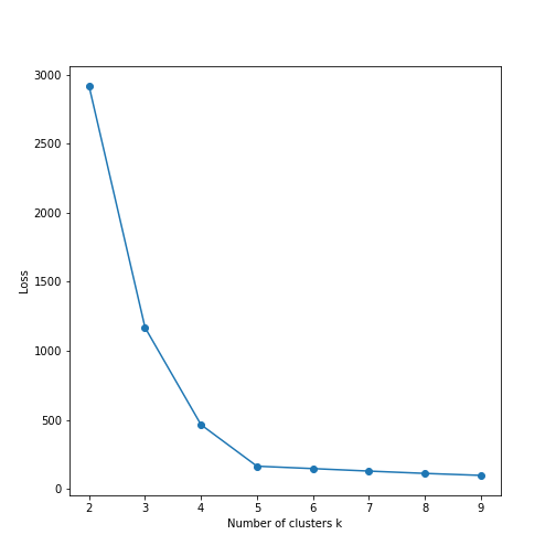
plot of chunk elbow-plot
It is also very easy to do elbow plot:
ks = range(2, 10)
          # range of possible
          # clusters, should be >1
loss = pd.Series(0.0, index=ks)
          # store loss values here
for k in ks:
    m = KMeans(k).fit(X)
    loss[k] = m.inertia_

_t = plt.plot(ks, loss, marker="o")
_t = plt.xlabel("Number of clusters k")
_t = plt.ylabel("Loss")
_t = plt.show()
The fitted model’s
inertia_ attribute contains the corresponding loss function value.
Here we fit \(k\)-means models for \(k = 2, 3, \dots, 9\), store the
respective loss, and plot it.
We can see that the loss falls rapidly to nearly zero at \(k=5\). Hence \(k=5\) is the optimal number of clusters in these data. Indeed, this can be confirmed visually on the images above.
We can also compute an analogue to confusion matrix:
## array([[ 0, 21,  0,  0,  0],
##        [ 0,  0,  0,  0, 25],
##        [ 0,  0,  0, 17,  0],
##        [15,  0,  0,  0,  0],
## [ 0, 0, 22, 0, 0]])One can see each original cluster (rows) is consistently predicted to a single cluster (columns), for instance all memebers of the original cluster “0” (the first row) are consistently predicted to be members of cluster “2”. This is as good accuracy as it is possible to achieve, as the algorithm has no way to know what was the original label of the clusters.
18.1.2 Hieararchical clustering in sklearn
Hierarchical clustering works in a fairly similar way in sklearn:
from sklearn.cluster import AgglomerativeClustering

m = AgglomerativeClustering(n_clusters = 5)
cl = m.fit_predict(X)
There are on noticeable difference though: the
AgglomerativeClustering model does not have .predict method. One
should use .fit_predict, this does both fitting and predicting in
one go.
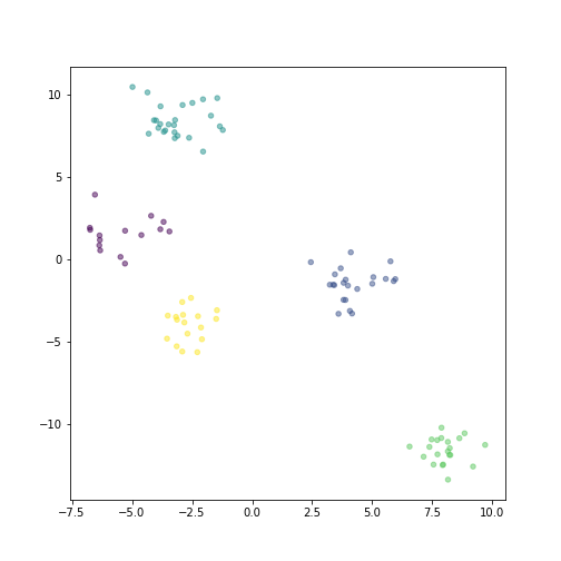
plot of chunk hierarchical-plot
One these data, the hierarchical clusters are exactly the same as \(k\)-means (just their labels may differ):
This is because the data is so cleanly split into different clusters, and hence all clustering algorithms will pick up the same structure.
