Chapter 17 Support Vector Machines
We assume you have loaded the following packages:
## /home/otoomet/R/x86_64-pc-linux-gnu-library/4.5/reticulate/python/rpytools/loader.py:120: UserWarning: Pandas requires version '1.3.6' or newer of 'bottleneck' (version '1.3.5' currently installed).
## return _find_and_load(name, import_)Below we load more as we introduce more.
Support Vector Machines are many ways similar to logistic regression, but unlike the latter, they can capture complex patterns. However, they are not interpretable.
17.1 Yin-Yang Pattern
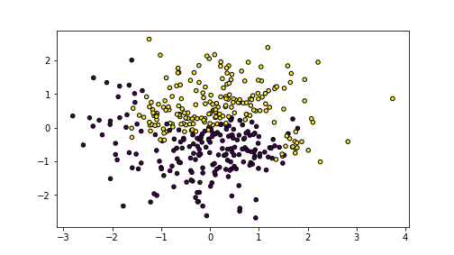
We demonstrate the behavior of SVM-s using a 2-D dataset where data points are in a yin-yang pattern. The dots can be created as
N = 400  # number of dots
X1 = np.random.normal(size=N)
X2 = np.random.normal(size=N)
X = np.column_stack((X1, X2))
d = X1 - X2
y = X1 + X2 - 1.7*np.sin(1.2*d) +\
    np.random.normal(scale=0.5, size=N) > 0
The data looks like this:
plot of chunk unnamed-chunk-5
The images shows yellow and blue dots that are in an imperfect yin-yang pattern with a fuzzy boundary between the classes.
17.2 SVM in sklearn
SVM classifier is implemented by SVC in sklearn.svm. It accepts
number of arguments, the most important of which are kernel to
select different kernels, and the corresponding parameters for
different kernels, e.g. degree for polynomial degree and gamma for
the radial scale parameter. Besides that, SVC behaves in a similar
fashion like other sklearn models, see Section
@(linear-regression-sklearn) for more information. We can
define the model as:
SVC(kernel='linear')In a Jupyter environment, please rerun this cell to show the HTML representation or trust the notebook.
On GitHub, the HTML representation is unable to render, please try loading this page with nbviewer.org.
SVC(kernel='linear')
SVC(kernel='linear')In a Jupyter environment, please rerun this cell to show the HTML representation or trust the notebook.
On GitHub, the HTML representation is unable to render, please try loading this page with nbviewer.org.
SVC(kernel='linear')
Next, let’s demonstrate the decision boundary using linear, polynomial, and radial kernels. We predict the values on a grid using the following function:
def DBPlot(m, X, y, nGrid = 100):
    x1_min, x1_max = X[:, 0].min() - 1, X[:, 0].max() + 1
    x2_min, x2_max = X[:, 1].min() - 1, X[:, 1].max() + 1
    xx1, xx2 = np.meshgrid(np.linspace(x1_min, x1_max, nGrid),
                           np.linspace(x2_min, x2_max, nGrid))
    XX = np.column_stack((xx1.ravel(), xx2.ravel()))
    hatyy = m.predict(XX).reshape(xx1.shape)
    plt.figure(figsize=(10,10))
    _ = plt.imshow(hatyy, extent=(x1_min, x1_max, x2_min, x2_max),
                   aspect="auto",
                   interpolation='none', origin='lower',
                   alpha=0.3)
    plt.scatter(X[:,0], X[:,1], c=y, s=30, edgecolors='k')
    plt.xlim(x1_min, x1_max)
    plt.ylim(x2_min, x2_max)
plt.show()SVC(kernel='linear')In a Jupyter environment, please rerun this cell to show the HTML representation or trust the notebook.
On GitHub, the HTML representation is unable to render, please try loading this page with nbviewer.org.
SVC(kernel='linear')
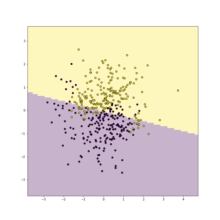
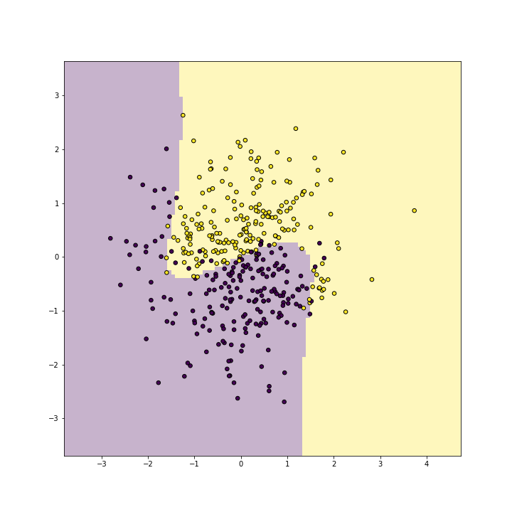
Linear kernel is very similar to logistic regression, and shows a similar linear decision boundary:
SVC(kernel='linear')In a Jupyter environment, please rerun this cell to show the HTML representation or trust the notebook.
On GitHub, the HTML representation is unable to render, please try loading this page with nbviewer.org.
SVC(kernel='linear')
SVC(kernel='linear')In a Jupyter environment, please rerun this cell to show the HTML representation or trust the notebook.
On GitHub, the HTML representation is unable to render, please try loading this page with nbviewer.org.
SVC(kernel='linear')
plot of chunk unnamed-chunk-8
SVC(kernel='linear')In a Jupyter environment, please rerun this cell to show the HTML representation or trust the notebook.
On GitHub, the HTML representation is unable to render, please try loading this page with nbviewer.org.
SVC(kernel='linear')
The result is not too bad–it captures the yellow and purple side of the points, but it clearly misses the purple “bay” and the yellow “peninsula”.
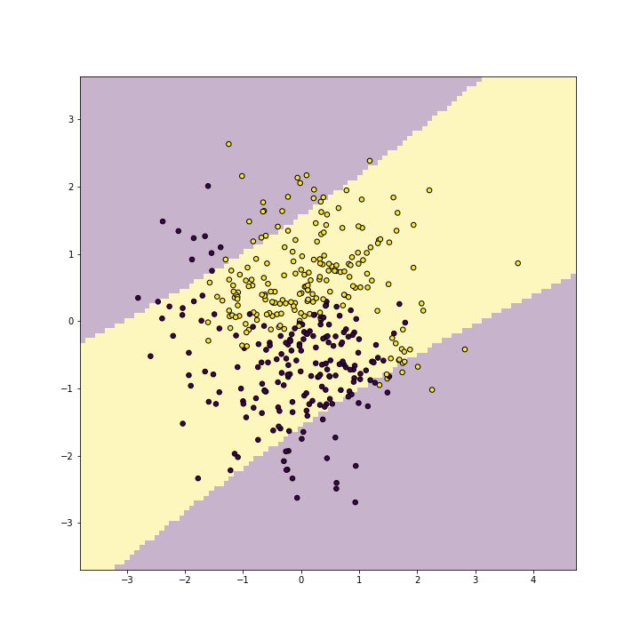
Next, let’s replicate this with a polynomial kernel of degree 2:
SVC(kernel='linear')In a Jupyter environment, please rerun this cell to show the HTML representation or trust the notebook.
On GitHub, the HTML representation is unable to render, please try loading this page with nbviewer.org.
SVC(kernel='linear')
SVC(degree=2, kernel='poly')In a Jupyter environment, please rerun this cell to show the HTML representation or trust the notebook.
On GitHub, the HTML representation is unable to render, please try loading this page with nbviewer.org.
SVC(degree=2, kernel='poly')
plot of chunk unnamed-chunk-9
SVC(degree=2, kernel='poly')In a Jupyter environment, please rerun this cell to show the HTML representation or trust the notebook.
On GitHub, the HTML representation is unable to render, please try loading this page with nbviewer.org.
SVC(degree=2, kernel='poly')
SVC(degree=2, kernel='poly')In a Jupyter environment, please rerun this cell to show the HTML representation or trust the notebook.
On GitHub, the HTML representation is unable to render, please try loading this page with nbviewer.org.
SVC(degree=2, kernel='poly')
As you can see, polynomial(2) kernel is able to represent a blue band on a yellow background. It id debateable whether this is any better than what linear kernel can do, but one can easily see that such a band would be a good representation for other kind of data.
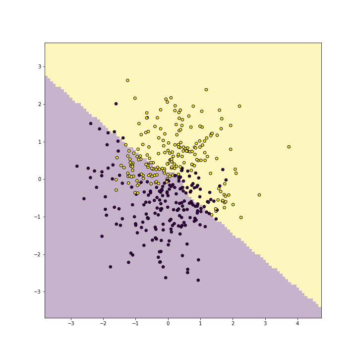
Next, replicate the above with degree-3 kernel:
SVC(degree=2, kernel='poly')In a Jupyter environment, please rerun this cell to show the HTML representation or trust the notebook.
On GitHub, the HTML representation is unable to render, please try loading this page with nbviewer.org.
SVC(degree=2, kernel='poly')
SVC(kernel='poly')In a Jupyter environment, please rerun this cell to show the HTML representation or trust the notebook.
On GitHub, the HTML representation is unable to render, please try loading this page with nbviewer.org.
SVC(kernel='poly')
plot of chunk unnamed-chunk-10
SVC(kernel='poly')In a Jupyter environment, please rerun this cell to show the HTML representation or trust the notebook.
On GitHub, the HTML representation is unable to render, please try loading this page with nbviewer.org.
SVC(kernel='poly')
SVC(kernel='poly')In a Jupyter environment, please rerun this cell to show the HTML representation or trust the notebook.
On GitHub, the HTML representation is unable to render, please try loading this page with nbviewer.org.
SVC(kernel='poly')
And finally with a radial kernel:
SVC(kernel='poly')In a Jupyter environment, please rerun this cell to show the HTML representation or trust the notebook.
On GitHub, the HTML representation is unable to render, please try loading this page with nbviewer.org.
SVC(kernel='poly')
SVC(gamma=1)In a Jupyter environment, please rerun this cell to show the HTML representation or trust the notebook.
On GitHub, the HTML representation is unable to render, please try loading this page with nbviewer.org.
SVC(gamma=1)

plot of chunk unnamed-chunk-11
SVC(gamma=1)In a Jupyter environment, please rerun this cell to show the HTML representation or trust the notebook.
On GitHub, the HTML representation is unable to render, please try loading this page with nbviewer.org.
SVC(gamma=1)
SVC(gamma=1)In a Jupyter environment, please rerun this cell to show the HTML representation or trust the notebook.
On GitHub, the HTML representation is unable to render, please try loading this page with nbviewer.org.
SVC(gamma=1)
Radial kernel replicates the wavy boundary very well with (training) accuracy above 0.9.
17.3 Find the best model
Finally, let’s manipulate a few more parameters to devise the best model. We do just a quick and dirty job here, as our task is to demonstrate the basics of SVM-s:
SVC(gamma=1)In a Jupyter environment, please rerun this cell to show the HTML representation or trust the notebook.
On GitHub, the HTML representation is unable to render, please try loading this page with nbviewer.org.
SVC(gamma=1)
SVC(gamma=1)In a Jupyter environment, please rerun this cell to show the HTML representation or trust the notebook.
On GitHub, the HTML representation is unable to render, please try loading this page with nbviewer.org.
SVC(gamma=1)
for degree in [2,3,4]:
    for coef0 in [-1, 0, 1]:
        m = SVC(kernel="poly", degree=degree, coef0=coef0)
        _ = m.fit(Xt, yt)
        print(f"degree {degree}, coef0 {coef0},"
              + f" accuracy: {m.score(Xv, yv)}")
SVC(coef0=1, degree=4, kernel='poly')In a Jupyter environment, please rerun this cell to show the HTML representation or trust the notebook.
On GitHub, the HTML representation is unable to render, please try loading this page with nbviewer.org.
SVC(coef0=1, degree=4, kernel='poly')
The best results are with ceof0 = 1. Here is the corresponding plot
with polynomial degree 2:
SVC(coef0=1, degree=4, kernel='poly')In a Jupyter environment, please rerun this cell to show the HTML representation or trust the notebook.
On GitHub, the HTML representation is unable to render, please try loading this page with nbviewer.org.
SVC(coef0=1, degree=4, kernel='poly')
SVC(coef0=1, kernel='poly')In a Jupyter environment, please rerun this cell to show the HTML representation or trust the notebook.
On GitHub, the HTML representation is unable to render, please try loading this page with nbviewer.org.
SVC(coef0=1, kernel='poly')
plot of chunk unnamed-chunk-13
SVC(coef0=1, kernel='poly')In a Jupyter environment, please rerun this cell to show the HTML representation or trust the notebook.
On GitHub, the HTML representation is unable to render, please try loading this page with nbviewer.org.
SVC(coef0=1, kernel='poly')
You can see that it picks up the boundary very well.