Chapter 7 Visualizations: Plotting Data
7.1 Base R plotting
Base R contains a powerful and simple data plotting and visualization package, called graphics. It is always installed, and automatically loaded when you start R. Bare-R plotting it allows a lot of tools for fine-tuning your plots, however, the default values may feel somewhat simplistic and require more adjustment than dedicated data plotting methods like ggplot.
7.2 Plotting data–the ggplot way
ggplot is one of the most popular data visualization frameworks in R. It is oriented to plotting data (base-R graphics is oriented to vectors) and it works very well with datasets. It has its own distinct logic that is rather different from the base-R approach. For efficient working with ggplot, one has to define the logical connection between data and its visual representation, and leave all the details to be sorted out by ggplot. If you are not happy with the default results, you should try to adjust either a theme, or scales, the way how data and its representation are connected. This approach makes ggplot a very well suited library for data visualization, but a little cumbersome when one just needs a quick plot of a few numbers that are not even cointained in a dataset.
ggplot expressions tend to follow a layered structure. They contain individual layers (functions) that are dedicated to different tasks; fine tuning plot elements in the same function where you do the plotting is much less common than in base-R plotting. Individual layers are combined together with “+” sign, and the result is a ggplot-object that can either be stored into a variable, or directly printed. An example ggplot expression looks like this:
## create object, store in 'p'
p <- ggplot(data,
                           # use dataset 'data'
       aes(x=time, y=value, col=type)) +
                           # put 'time' on x-axis,
                           # 'value' on y-axis,
                           # set color according to 'type'
   geom_line() +
                           # make a line plot
   scale_color_manual(values=c(new="red", old="blue")) +
                           # ask the colors to be red for "new",
                           # blue for "old" cases
   labs(x="Years", y="dollars")
                           # add legend
print(p)
                           # print (i.e. plot) the object
In this example we create a new ggplot object p. It contains a
number of layers, including data, variable mapping (the aes
function), type of plot, color selection and others. In order to make
the plot to appear on screen or in rmarkdown file, we have to print the
object.5
Next, we discuss each element in ggplot expression in more detail.
7.2.1 The main ideas: aesthetics, variables and geometry
The central concepts in ggplot are aesthetics and variables. Variables in this context are data variables, i.e. variables in the data frame. Aesthetics are visual properties of the visualization. The most important examples of aesthetics include
- x, y: the location (horizontal/vertical)
- col (also color): color
- alpha: transparency
- size: point size, line width
- linetype
- group: which data points belong together in a single group.
The central element of a ggplot visualization is aesthetics mapping, i.e. a connection between visual elements and data. For instance, we may want map variable “time” to the horizontal (x) position, and variable “temperature” to the vertical (y) position. This may create simple x-y plot.
Let’s do this using ice extent data. The dataset originates from NSIDC (National Snow & Ice Data Center) and looks like
ice <- read.delim("../data/ice-extent.csv.bz2")
tail(ice, 4)
## year month data.type region extent area time
## 1051 2022 8 NRTSI-G N 5.99 4.02 2022.625
## 1052 2022 8 NRTSI-G S 16.97 13.66 2022.625
## 1053 2022 9 NRTSI-G N 4.87 3.43 2022.708
## 1054 2022 9 NRTSI-G S 18.01 14.05 2022.708The relevant variables here are
- time: fractional year (\(\mathit{time} = \mathit{year} + \mathit{month}/12 - 1/24\)).
- extent: sea ice extent, M \(km^2\). Sea ice extent is sea area where ice concentration is over 15%. This is a measure of sea ice that is less error prone that sea ice area, area where sea is completely frozen over.
- region: “N”/“S” for Northern or Southern hemisphere.
We take a subset of 12 most recent observations from the Northern hemisphere:
subset <- ice %>%
   filter(region == "N") %>%
   slice_tail(n=12)
subset
## year month data.type region extent area time
## 1 2021 10 Goddard N 6.82 5.43 2021.792
## 2 2021 11 Goddard N 9.83 8.57 2021.875
## 3 2021 12 Goddard N 12.15 10.74 2021.958
## 4 2022 1 NRTSI-G N 13.88 12.22 2022.042
## 5 2022 2 NRTSI-G N 14.61 12.86 2022.125
## 6 2022 3 NRTSI-G N 14.59 12.73 2022.208
## 7 2022 4 NRTSI-G N 14.04 12.42 2022.292
## 8 2022 5 NRTSI-G N 12.88 11.06 2022.375
## 9 2022 6 NRTSI-G N 10.86 8.60 2022.458
## 10 2022 7 NRTSI-G N 8.25 5.89 2022.542
## 11 2022 8 NRTSI-G N 5.99 4.02 2022.625
## 12 2022 9 NRTSI-G N 4.87 3.43 2022.708Now we can finally get to plotting. We want to plot ice extent
(vertical axis)
against time (horizontal axis). Using ggplot concepts, we map time
to x and map extent to y. Remember: time and extent are
variables (more precisely data variables) and x and y are
aesthetics, visual properties of the plot. This can be done using aes function as
aes(x=time, y=extent). This tells ggplot what to draw. We also
have to tell it how to draw–do we want a scatterplot, barplot,
histogram… This is done by specifying the geom. For instance,
we can ask to do a line plot using
function geom_line:
ggplot(subset, aes(x=time, y=extent)) +
   geom_line()
This gives us a basic line plot that is acceptable for many purposes.
Note the two layers, two functions, connected with “+”–the first is
ggplot() that specifies data and the aesthetics mapping, the other
is geom_line() that specifies how to plot these data.
If line plot is not what we want, we just have to request an another
type of graph by specifying a different
geom. For instance, geom_point() will produce a scatterplot instead:
ggplot(subset, aes(x=time, y=extent)) +
   geom_point()
The result is not particularly impressive but again, it is good enough for many purposes.
But we can we can easily have both lineas and points on the plot. This
is very simple thanks to
the ggplot-s layered approach: we can have more than
one geometry by just adding more geometry layers with +:
ggplot(subset, aes(x=time, y=extent)) +
   geom_line() +
   geom_point()
Both these geoms share the same data (subset) and the same
aesthetics (x = time and y = extent), both specified in
ggplot(). It is also possible to
use different data and different aesthetics for different layers, see
arguments data and mapping for the corresponding geoms.
We can also map more aesthetics than two to the current plot. For instance, we can map the ice extent to size (representing both point size and line width), and map (again!) the extent to dot color:
ggplot(subset, aes(time, extent, size=extent, col=extent)) +
   geom_line() +
   geom_point()
Note that we have dropped argument names x and y as these are the default aesthetic names. But we have added mapping for size and col.
The graph looks much more interesting, but we may want to limit the
size and color aesthetics to the dots only and keep all the line
segments of the same size and the similar color. The problem here is
that all geoms will inherit aesthetics that are specified in
the ggplot() function. Fortunately, we
can also specify
aesthetic mapping in geom-s, those apply only for the corresponding
geom. So we specify the color and size mapping in
geom_point() only:
ggplot(subset, aes(time, extent)) +
   geom_line() +
   geom_point(aes(size=extent, col=extent))
Now both geoms inherit the basic layout x=time and y=extent.
But geom_point also maps extent to both point size and
color while no such relationship is present for geom_line().
Note also that ggplot picks a suitable color scale between
light and dark blues, and a suitable dot size scale. We do not have
to specify how exactly should colors, extent values, and dots size
correspond to each other. If we want to change this correspondence,
we have to use scales (see below).
You can also see that the values of extent change three visual
properties at the same time: vertical location of the point, its size
and its
color. Although not very common in practice, there is nothing wrong
with such an approach. One value can modify several properties at the
same time. Finally, the plot also indicates that dots are drawn on
top of the lines. Geoms are drawn in this order as they are called in
when building the ggplot plot, and we called geom_point after
geom_line.
As an alternative, we can achieve a similar result using fixed
aesthetics. These are visual properties that are fixed and not
related to any variables in data. For instance, we can choose a
single color and line width for geom_line:
ggplot(subset, aes(time, extent, size=area, col=extent)) +
   geom_line(col="yellow4", size=0.5) +
   geom_point()
Fixed properties for geom_line must be specified outside
of aes function. While geom_line inherited the aesthetic mapping
for size and col from the aes call inside ggplot function,
these are overridden inside geom_point itself by the fixed values.
Now the line is of yellow4 color and of size 0.5, no matter what are
the data values.
Exercise 7.1 Orange tree growth
Use “Orange” data:
data(Orange)
head(Orange, 3)
## Tree age circumference
## 1 1 118 30
## 2 1 484 58
## 3 1 664 87It contains circumference data (in mm) for a number of orange trees (Tree is the numeric id) at different age (in days).
- plot circumference as a function of age using dots
- color points according to the tree id
See the solution
Exercise 7.2 Orange tree growth with lines and dots:
- Repeat the orange tree plot
- Overlay black dots with lines, colored according to the tree id.
See the solution
7.3 geoms: different kind of plots
Section 7.2.1 introduced geoms, and demonstrated how to use those to create line plots and scatterplots. Here we discuss a selection of other plot types, and other tasks that can be achieved with different geoms. Here we discuss other plot types and additional elements one can add to the plots using different geoms.
septemberData <- ice %>%
   filter(month == 9, region == "N")
Histogram: geom_histogram(), of ice extent in September:
ggplot(septemberData,
       aes(extent)) +
   geom_histogram(bins=10, fill="deepskyblue", col="black")
The same using density plot geom_density():
ggplot(septemberData, aes(extent)) +
   geom_density(fill="deepskyblue", alpha=0.5)
marking lines: geom_vline(), geom_abline()
ggplot(septemberData, aes(extent)) +
   geom_density(bins=10, col="deepskyblue") +
   geom_vline(xintercept=min(septemberData$extent),
              col = "orangered1") +
   geom_abline(slope=1, intercept=0,
               col="gray", linetype="dashed")
7.4 Displaying distributions
One of the prime ways to understand data is to analyze its distribution. Here we stay with one dimensional cases, this has many applications and is also the simplest type of data to analyze.
7.4.1 Histogram
One of the simplest and most widely used ways to display distributions is histogram. The numeric values are split into bins, typically of equal width, and bins are plotted as bars with the height representing to the count of cases in each bin.
In ggplot, histogram can be created with geom_histogram(). It
requires only a single aesthetic, x; you may also want to adjust the
fill and border color, otherwise you get an unappealing gray plot.

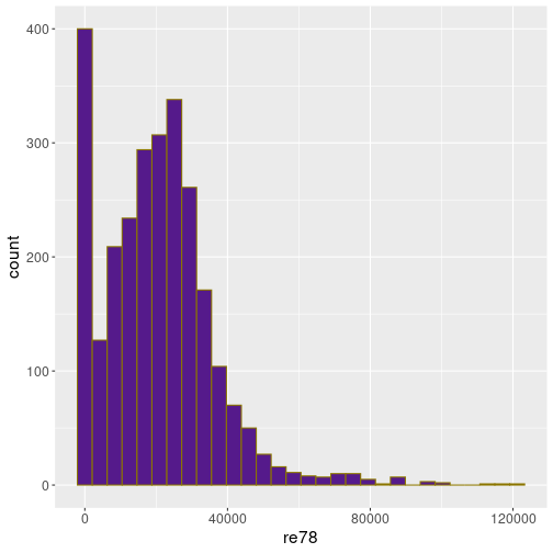
Here is a histogram of the real wage (in 1978) for Treatment data
treatment <- read_delim(
   "../data/treatment.csv.bz2"
)
ggplot(treatment,
       aes(re78)) +
   geom_histogram(fill = "purple4",
                  col = "gold4",
                  bins = 30)
You can see that the values range from 0 to 120,000 (dollars per year), but the most common values are between 10 and 30,000. There is also a strong peak at 0.

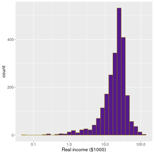
In
ggplot, this can be done with scale_x_log10():
treatment %>%
   filter(re78 > 0) %>%
   ggplot(aes(re78/1000)) +
   geom_histogram(fill = "purple4",
                  col = "gold4",
                  bins = 30) +
   scale_x_log10() +
   labs(x = "Real income ($1000)")
In order to avoid logarithm of 0, one can filter out those cases. This plot displays much more detail for low-income earners, but not that much for the better off–end of the spectrum. Which approach to choose, depends on the task.
7.4.2 Density plot
A problem with histograms are the sharp bin boundaries. This can create artifacts in the plots if data tend to cluster at certain values. A solution is to use density plots instead. Density plots “smears” the individual data points across a wider area, avoiding sharp boundaries in this way.
In ggplot, this can be done with geom_density(). It also needs a
single aesthetic, x, exactly as geom_histogram().

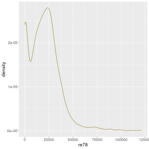
Here is the density plot for the same real wage as above in Section 7.4.1:
ggplot(treatment,
       aes(re78)) +
   geom_density(col = "gold4")
It conveys mostly a similar picture, but we do not have such sharp peaks and bins as in case of histogram.

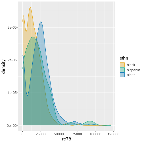
One can just create three lines, one for each group with aesthetic
col = ethn, but it may be
more appealing to also fill the curves using fill = ethn as well.
In order to make overlap visible, one may include transparency, here
alpha = 0.3.
ggplot(treatment,
       aes(re78,
           col = ethn, fill = ethn)) +
   geom_density(alpha = 0.3)
The figure suggests that income of the other-group peaks around 25,000, while income for hispanic and black peak around 10,000.

Exactly as in case of histogram, you may prefer to use log scale with density plots.
ggplot(treatment,
       aes(re78/100,
           col = ethn, fill = ethn)) +
   geom_density(alpha = 0.3) +
   scale_x_log10() +
labs(x = "Real income ($1000)")Remember: printing happens automatically in certain environments if the object is not stored in a variable.↩︎