Chapter 14 Assessing model goodness
14.1 Regression model performance measures
In Section 13.2 we discussed how to predict values based on linear regression with base-R modeling tools. Remember, the task there was to predict the distance of galaxies based on their radial velocity using Hubble data. Here we continue the same topic, but now the task is to compute the model performance indicators, in particular RMSE
14.1.1 Base-R tools
First, load the Hubble data and fit the linear regression model:
hubble <- read_delim("../data/hubble.csv")
m <- lm(Rmodern ~ vModern, data = hubble)
Remember, RMSE is root mean squared error, where error stands for the prediction error, \(\hat y - y\). So we can calculate it as
y <- hubble$Rmodern  # just to make it clear
yhat <- predict(m)
e <- yhat - y  # error
RMSE <- sqrt(mean(e^2))  # root-mean-squared-e
RMSE
## [1] 2.61722Exercise 14.1 Use the predicted values above to manually compute \(R^2\): \[\begin{equation*} R^{2} = 1 - \frac{ \frac{1}{N} \sum_{i} (y_{i} - \hat y_{i})^{2} }{ \frac{1}{N} \sum_{i} (y_{i} - \bar y_{i})^{2} } \end{equation*}\]
Compare your result with the regression output table–do you get the same value?
14.1.2 Tidymodels tools
library(tidymodels)
mf <- linear_reg() %>%
   fit(Rmodern ~ vModern, data = hubble)
We can combine the original and predicted values into a data frame for easy calculation of model goodness metrics:
results <- predict(mf, new_data = hubble) %>%
   cbind(hubble) %>%
   select(velocity = vModern, distance = Rmodern, .pred)
head(results, 3)
## velocity distance .pred
## 1 158.1 0.06170 3.865956
## 2 278.0 0.04997 5.385886
## 3 -57.0 0.50000 1.139209So now we have a data frame with three columns: distance, velocity, the measured velocity; distance, the actual measured distance, and .pred, the predicted distance. One can easily compute RMSE and \(R^2\) using the dedicated functions:
results %>%
   rmse(distance, .pred)
## # A tibble: 1 × 3
## .metric .estimator .estimate
## <chr> <chr> <dbl>
## 1 rmse standard 2.62results %>%
rsq(distance, .pred)## # A tibble: 1 × 3
## .metric .estimator .estimate
## <chr> <chr> <dbl>
## 1 rsq standard 0.819rmse() and rsq() are model goodness measure functions that take
three arguments: the dataset, and column names for the actual and
predicted values. (There are many more model goodness measures.)
If interested, one can combine these two into a single multi-metric
using metric_set():
goodness <- metric_set(rmse, rsq)
results %>%
   goodness(distance, .pred)
## # A tibble: 2 × 3
## .metric .estimator .estimate
## <chr> <chr> <dbl>
## 1 rmse standard 2.62
## 2 rsq standard 0.819This is handy if calculating the same metrics for multiple models over and over again.
14.2 Decision boundary
One of the very effective way to understand performace of classification is to use decision boundary plots. This section demonstrates these plots using logistic regression.
While very effective, the method is also very limited–it is only applicable for classification, and only in case of one or two numeric explanatory variables. Below, we use yin-yang data (see Section A.7).
14.2.1 Base-R tools
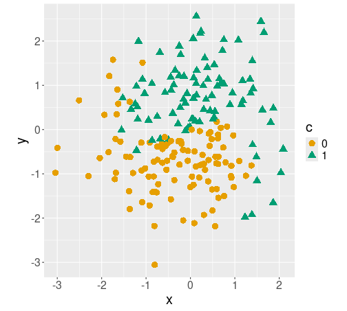
Different classes c plotted with different colors/symbols.
First, we load data:
yinyang <- read_delim(
   "../data/yin-yang.csv.bz2") %>%
   mutate(c = factor(c))  # convert
                          # to categorical
sample_n(yinyang, 4)
## # A tibble: 4 × 3
## x y c
## <dbl> <dbl> <fct>
## 1 -1.08 1.51 0
## 2 -0.197 -0.321 0
## 3 0.603 0.976 1
## 4 0.300 0.454 1The figure shows how the different classes c are located on the plane. The boundary between circles and triangles is wavy, and somewhat fuzzy. For easier handling of data below, we also convert the class c to categorical.
The task is to predict the class on every point on the plane, and visualize it with the corresponding color. We proceed as follows: first, estimate a logistic regression model where we model the category c using the coordinates x and y. Thereafter we predict the category for every point on the plane (well, not for every point, but for each point on a fine grid). And finally, we visualize the predicted points using similar colors.
We start with a simple logistic regression (see Section 12.2) modeling c using x and y:
m <- glm(c ~ x + y, family = binomial(), data = yinyang)Thereafter, we need to make the grid.
nGrid <- 100  # 100x100 grid
ex <- seq(min(yinyang$x), max(yinyang$x), length.out=nGrid)
ey <- seq(min(yinyang$y), max(yinyang$y), length.out=nGrid)
grid <- expand.grid(x = ex, y = ey)
                           # this creates 100x100 dataframe of
                # regular grid points
## Show a sample:
grid %>%
   sample_n(4)
## x y
## 1 -0.2413692 -1.183499
## 2 -0.7598071 -2.148050
## 3 -0.1376816 2.391013
## 4 2.0916016 2.050583The grid is now a data frame, containing 10000 points, one for each grid point; its columns are called x and y as in the original data.
Next, we need to predict the category
\(\hat c\) (call it chat below) for each grid point (see Section
13.2.2). We’ll add this as a column to grid
for plotting below:
grid$chat <- predict(m, newdata = grid, type = "response") > 0.5
sample_n(grid, 5)  # show a sample
## x y chat
## 1 -1.9522144 2.5044897 TRUE
## 2 -0.6042758 -3.0558621 FALSE
## 3 -2.9890903 -1.6941433 FALSE
## 4 -0.2413692 -2.9423855 FALSE
## 5 -0.7598071 0.6321263 TRUE
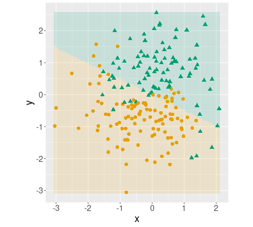
Decision boundary plot. The predictions for every point on the plane are shown in pale colors, overlied with the original data points.
Finally, plot both the predicted value for each gridpoint using
geom_tile() with
transparency 0.15; and add the data points to it using geom_point():
ggplot() +
   geom_tile(data = grid,
             aes(x, y, fill = chat),
             alpha = 0.15) +
   geom_point(data = yinyang,
              aes(x, y, col = c, pch = c),
              size = 3) +
   theme(legend.position = "none") +
   coord_fixed()
The plot indicates that the logistic regression model captures the basics of the data–orange circles tend to be in the orange area while green triangles tend to be in the green area. However, it misses the wavy pattern as the decision boundary for logistic regression is a line.
Exercise 14.2 Use polynomial logistic regression by adding terms \(x^2\); \(x^2\) and \(y^2\); \(x^2\), \(y^2\) and \(x\cdot y\) to the model. Will it capture the actual class boundary better?
14.2.2 tidymodels
A downside with the base-R tools for modeling is that different models have slightly different API-s and so if you want to try a different model, you also need to change the code. This is where tidymodels shine–all models can be used just through a unified API (see Section 13.3). Below an example.
First define and fit the model:
m <- logistic_reg() %>%
   fit(c ~ x + y, data = yinyang)
Thereafter create the grid, and predict the class on the grid:
nGrid <- 100  # 100x100 grid
ex <- seq(min(yinyang$x), max(yinyang$x), length.out=nGrid)
ey <- seq(min(yinyang$y), max(yinyang$y), length.out=nGrid)
grid <- expand.grid(x = ex, y = ey)
## Add the predicted value to the 'grid' data frame>
grid$chat <- predict(m, type = "class",
                     new_data = grid) %>%
   pull(.pred_class)
There are two main differences compared to base-R: first,
predict(type = "class") will already predict the appropriate class,
so additional conversions are not needed; and second–the result is a
data frame with a single column (.pred_class), we need to pull out
that column in order to add this to grid.
Decision boundary plot, made using tidymodels.
Finally, plotting can be done in the exact same way as above in Section 14.2.1:
ggplot() +
   geom_tile(data = grid,
             aes(x, y, fill = chat),
             alpha = 0.15) +
   geom_point(data = yinyang,
              aes(x, y, col = c, pch = c),
              size = 3) +
   theme(legend.position = "none") +
   coord_fixed()
As the model is the same, the plot is identical.
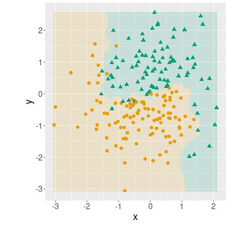
But where tidymodels shine, is when you want to test different models. For instance, if you want to try \(k\)-NN with five nearest neighbors on the same data, you can write the model in a fairly similar way:
m <- nearest_neighbor(mode = "classification",
                      neighbors = 5) %>%
   fit(c ~ x + y, data = yinyang)
And thereafter you can use exactly the same code as above to create a similar decision boundary plot.
Exercise 14.3 Strictly speaking, the plots above are not decision boundary plots
but decison region plots–they mark the different regions with
different color, but do not specifically mark the boundary.
Try to use geom_contour() to mark the boundary instead of the region.
Hint: you may want to denote categories by numbers, and plot the countour in-between.
14.3 Confusion matrix
Confusion matrix (CM) is one of the central tools to assess classification quality. Below, we’ll use Titanic data to demonstrate those tools.
titanic <- read_delim("../data/titanic.csv.bz2")
dim(titanic)
## [1] 1309 14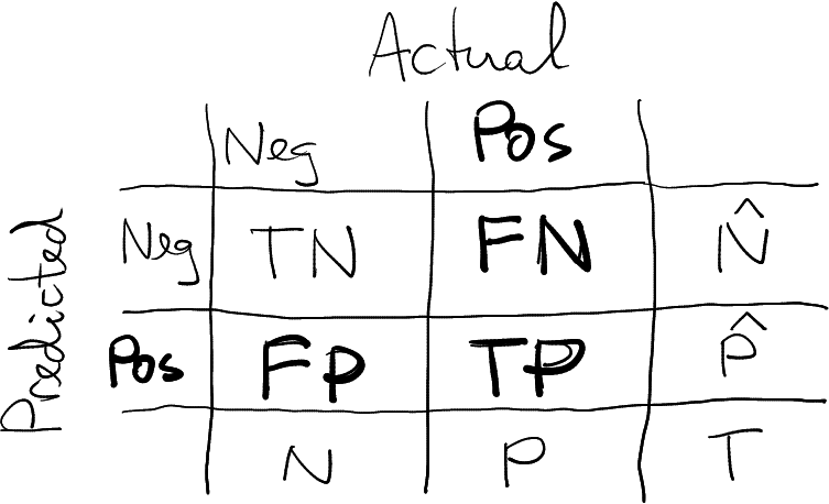
This section present the CM in this form. The positive cases are “relevant”, marked in bold.
- Actual values in columns, predicted values in rows
- Relevant (“positive”) values second, “negative” values first.
“Relevant” are those cases that we compute precision and recall for, marked as bold in the figure. Sometimes it is obvious, but this is not always the case.
14.3.1 Base-R tools to display confusion matrix
In order to display confusion matrix, you need to fit a model and predict the categories on the dataset (see Section 13.2.2):
y <- titanic$survived
m <- glm(survived ~ factor(pclass) + sex,
         family = binomial(),
         data = titanic)
phat <- predict(m, type = "response")
yhat <- phat > 0.5
(Here we did it on training data, but that does not have to be the case.)
Confusion matrix is just the basic cross-table that can be generated
using the table() function:
table(yhat, y)## y
## yhat 0 1
## FALSE 682 161
## TRUE 127 339 # table: first argument inrows
# second argument in columnsDepending on your variable names it may be a bit unclear whether the actual values are in rows or columns, it is advisable to name the arguments:
table(Predicted = yhat, Actual = y)## Actual
## Predicted 0 1
## FALSE 682 161
## TRUE 127 339Base-R does not have dedicated functions to compute the CM-based metrics (but you can use other packages). In fact, manually computing accuracy, the percentage of the correct predictions, is easier than loading the dedicated packages. Accuracy is just
mean(yhat == y)## [1] 0.7799847Computing precision is a bit more complex, here we just follow the definition:
Pr <- sum(yhat == 1 & y == 1)/sum(yhat == 1)
Pr
## [1] 0.7274678The same is true for recall:
Re <- sum(yhat == 1 & y == 1)/sum(y == 1)
Re
## [1] 0.678F-score is best to be computed from precision and recall:
2/(1/Pr + 1/Re)## [1] 0.7018634Exercise 14.4 Use treatment data and base-R tools to estimate a logistic regression model in the form \[\begin{equation*} \Pr(\mathit{treat}_{i} = \mathit{TRUE}) = \Lambda(\beta_{0} + \beta_{1} \cdot \mathit{age}_{i}). \end{equation*}\]
Construct the confusion matrix, and compute Accuracy, precision, and recall. Explain your results.
Add more variable to your model: ethn, u74, u75, and re75. Repeat the above.
However, even if you use base-R modeling tools, there is nothing wrong to use dedicated functions from other libraries for precision, recall, and other related measures. Here an example using tidymodels (see Section 14.3.2):
yardstick::f_meas_vec(factor(y), factor(as.numeric(yhat)),
                      event_level = "second")
## [1] 0.7018634This example uses f_meas_vec() function from yardstick package, a
part of tidymodels. It expects two vectors, truth and estimate,
both of which must be factors with similar levels. That’s why we need
to convert the predictions (logical) into a numeric.
By default it
considers the first level (here “0”, died) the relevant one, here we
tell we want to compute F-score for the second level (“1”, survived).
Anyway, as you see, the result is exactly the same.
14.3.2 tidymodels approach
Tidymodels (see Section 13.3) offers tools to build unified workflows for predictive modeling, and CM-related functionality is well integrated into that toolkit.
library(tidymodels)As in the case with base-R tools, you need to fit a model and predict the outcome class in order to construct the CM:
y <- factor(titanic$survived)  # for easier notation
mf <- logistic_reg() %>%
   fit(y ~ factor(pclass) + sex,
       data = titanic)
yhat <- predict(mf, new_data = titanic)
Tidymodels are built in a way that it is advantageous to combine the actual and predicted results into a single data frame. You can add predicted results to your original data, but here we create a new one. Also, we rename the precise but somewhat awkward column name .pred_class to yhat:
results <- cbind(yhat, y) %>%
   rename(yhat = .pred_class)
Confusion matrix can be constructed with the function conf_mat().
It expects a data frame, and two column names: actual first and
predicted second:
results %>%
   conf_mat(y, yhat) # conf_mat: actual first, predicted second
## Truth
## Prediction 0 1
## 0 682 161
## 1 127 339Note that it is the other way around as the base-R table
behaves–there you need to give predicted first and actual values
second. But CM is exactly the same as when using the base-R
table(), just it automatically provides clear dimension names.
Accuracy, precision and other measures can be queried with the dedicated functions. The examples here all expect similar arguments: a data frame that contains both the actual and predicted values; column names for the actual (first) and predicted (second) values; and which factor level to be considered “relevant” (first, by default):
results %>%
   accuracy(y, yhat, event_level = "second")
## # A tibble: 1 × 3
## .metric .estimator .estimate
## <chr> <chr> <dbl>
## 1 accuracy binary 0.780results %>%
precision(y, yhat, event_level = "second")## # A tibble: 1 × 3
## .metric .estimator .estimate
## <chr> <chr> <dbl>
## 1 precision binary 0.727results %>%
recall(y, yhat, event_level = "second")## # A tibble: 1 × 3
## .metric .estimator .estimate
## <chr> <chr> <dbl>
## 1 recall binary 0.678results %>%
f_meas(y, yhat, event_level = "second")## # A tibble: 1 × 3
## .metric .estimator .estimate
## <chr> <chr> <dbl>
## 1 f_meas binary 0.702Note that all these functions return data frames, not single values!
There are also versions of the functions that expect two vectors (actual and predicted) instead of a data frame, for instance
recall_vec(y, yhat$.pred_class, event_level = "second")## [1] 0.678Unlike the data frame version, the vector-version of recall returns a single value.
Exercise 14.5 Repeat the exercise above with tidymodels tools: Use treatment data to estimate a logistic regression model in the form \[\begin{equation*} \Pr(\mathit{treat}_{i} = \mathit{TRUE}) = \Lambda(\beta_{0} + \beta_{1} \cdot \mathit{age}_{i}). \end{equation*}\]
Construct the confusion matrix, and compute Accuracy, precision, and recall. Explain your results.
Add more variable to your model: ethn, u74, u75, and re75. Repeat the above.
Comment the difference of output in terms of base-R and tidymodels.
If you are often computing a set of metrics, you may want to combine
multiple functions into a single call using metric_set():
pr <- metric_set(precision, recall)
results %>%
   pr(truth = y, estimate = yhat, event_level = "second")
## # A tibble: 2 × 3
## .metric .estimator .estimate
## <chr> <chr> <dbl>
## 1 precision binary 0.727
## 2 recall binary 0.678This will compute both precision and recall with a single call, and return a data frame with one row for each.
Finally, the summary() method for CM provides all these metrics, and
much more:
results %>%
   conf_mat(y, yhat) %>%
   summary(event_level = "second")
## # A tibble: 13 × 3
## .metric .estimator .estimate
## <chr> <chr> <dbl>
## 1 accuracy binary 0.780
## 2 kap binary 0.528
## 3 sens binary 0.678
## 4 spec binary 0.843
## 5 ppv binary 0.727
## 6 npv binary 0.809
## 7 mcc binary 0.529
## 8 j_index binary 0.521
## 9 bal_accuracy binary 0.761
## 10 detection_prevalence binary 0.356
## 11 precision binary 0.727
## 12 recall binary 0.678
## 13 f_meas binary 0.702This may be good for a quick evaluation of your work, but if you are writing a report for the others to read, you should focus on a 1-2 relevant measures only.
thematic::thematic_on(font = thematic::font_spec(scale=1.8))
# theme_set(text = element_text(size = 24))