Chapter 12 Regression Models
This chapter discusses linear and logistic regression. These are one of the most basic and most widely used statistical models to describe relationship in data. Linear regression is used to describe continuous outcome variables, and logistic regression is used for binary outcome variables. Below, we discuss how to implement and evaluate these in R. We assume that you know the theoretical side of the models, here we only discuss the implementation in R.
12.1 Linear regression
This section describes linear regression. First, we discuss how to
optimize the values manually, but most of the section is devoted to
built-in R modeling tools, namely formulas that you can use with
dedicated model functions, such as lm().
12.1.1 Working With Iris Virginica Data
We demonstrate the usage of linear regression–function lm–with
iris data. Iris data, first used by
Ronald Fisher 1936, is
included in the built-in R dataset iris. It contains sepal and
petal measures
for three species of iris, setosa, virginica, and
versicolor.
See Section
A.3 for more about the data and the flower parts.
More specifically, we analyze the relationship between the petal
width and length for iris virginica only,
focusing on a single species only will keep the
data more homogeneous.
We start by filtering and plotting virginica data (see dplyr package for more details):
data(iris)
virginica <- iris %>%
   filter(Species == "virginica")
head(virginica, 3)
## Sepal.Length Sepal.Width Petal.Length Petal.Width Species
## 1 6.3 3.3 6.0 2.5 virginica
## 2 5.8 2.7 5.1 1.9 virginica
## 3 7.1 3.0 5.9 2.1 virginicaThe table above displays a few examples of the data. We see that petals are approximately 4-5 cm long and 1-2 cm wide.
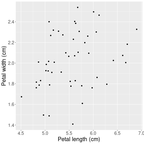
Next, let’s make a plot of petal lengths versus width to have an idea about what kind of relationship can we expect:
ggplot(
   virginica,
   aes(Petal.Length, Petal.Width)) +
   geom_jitter() +
   labs(x = "Petal length (cm)",
        y = "Petal width (cm)")
Not surprisingly, their width and length are related–longer leaves tend to be wider, but the relationship is quite noisy. Just be looking at the figure, we can also guess that just a straight line will be a good enough way to summarize this relationship. There is no reason to pick anything more complex like a curve.
Note that we have added a little
jitter to data because the measurements have limited precision
(0.1 cm) and otherwise some datapoints will overlap.
See Plotting Data: The
ggplot way for more details
about ggplot.
Next, let’s describe the relationship using linear regression.
12.1.2 Manually Compute and Minimize \(SSE\)
While statistical software provides easy ways to solve the linear regression problems, it is instructive to compute and optimize the sum of squared errors, \(SSE\), manually. As a reminder, we define \(SSE\) as \[\begin{equation} SSE(\beta_{0}, \beta_{1}) = \sum_{i=1}^{N} (y_{i} - \hat y_{i} )^{2} \end{equation}\] where \(\hat y_i = \beta_0 + \beta_1 \cdot x_i\) is the predicted value for case \(i\). It depends on the corresponding explanatory variable \(x_i\), and the unknown coefficients \(\beta_0\) and \(\beta_1\). Solving the linear regression problem means finding vector \((\beta_0, \beta_1)\) so that \(SSE\) is as small as possible.
Attempt a. We can start by picking just arbitrary values for \(\beta_0\) and \(\beta_1\) in a reasonable range. Take \(\beta_0 = 0\) and \(\beta_1 = 0.5\), i.e. assume that 0-length leaves are of zero width (this is a reasonable assumption), and that 1 cm longer leaves are 0.5 cm wider. This may or may not be correct but at least it does not feel outrageously wrong. Let us compute \(SSE\) and plot the corresponding regression line:
## define x and y for clarity
x <- virginica$Petal.Length
y <- virginica$Petal.Width
## define parameter values
beta0 <- 0
beta1 <- 0.5
## Compute predicted width
yHat <- beta0 + beta1*x
## Compute SSE by its definition
SSE <- sum((y - yHat)^2)
SSE
## [1] 33.16The code does the following: first, it defines \(x\) and \(y\) for clarity. Thereafter, it assigns \(\beta_0\) and \(\beta_1\) to the values we picked above. Next, we compute \(\hat y\), yHat, by following the definition of linear regression prediction above. And finally we compute SSE but following its definition.
The value 33.16 does not tell much by itself. But we can compare it with \(SSE\) values computed for different \(\mathbb{\beta}\)-s and hence tell which parameter vector is better. See below for the plot.
Attempt b. Now use parameters \(\beta_0 = 0\) and \(\beta_1 = 0.4\):
beta0 <- 0
beta1 <- 0.4  # only change one parameter value
yHat <- beta0 + beta1*x
SSE <- sum((y - yHat)^2)
SSE
## [1] 6.0676The new result, 6.0676, is much better than the previous one, and hence \((0, 0.4)\) is a better vector of parameters than \((0, 0.5)\). (See below for the plot.)
Attempt c. Set \(\beta_0 = -0.1\) while keeping our previous best value \(\beta_1 = 0.4\):
beta0 <- -0.1
beta1 <- 0.4
yHat <- beta0 + beta1*x
SSE <- sum((y - yHat)^2)
SSE
## [1] 4.6196This \(SSE\), 4.6196 is even smaller, indicating that we have found an even better combinations of \(\beta_0\) and \(\beta_1\).
Exercise 12.1 It is a good exercise to continue the manual optimization further.
Repeat this procedure many times and see how small \(SSE\) will you
get. I recommend to make a function sse(beta0, beta1) to make the
calculations easier.
You may consider following coordinate descent approach: manipulating one parameter (either \(\beta_0\) or \(\beta_1\)) while keeping the other constant until you find a smaller \(SSE\), and thereafter manipulating the other parameter. You can repeat the procedure many times over.
See a solution
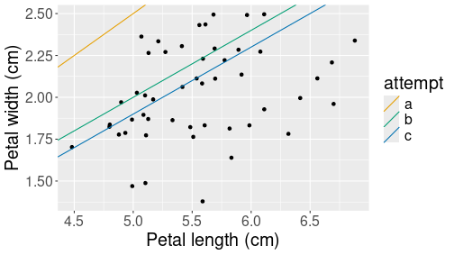
All three attempts depicted as the corresponding prediction lines.
Finally, let’s plot all three predicted models:
## Create data frame of the
## three attempted parameters
lines <- data.frame(
   attempt = c("a", "b", "c"),
   intercept = c(0, 0, -0.1),
   slope = c(0.5, 0.4, 0.4))
## Make a scatterplot with
## the predicted lines
ggplot(virginica,
       aes(Petal.Length, Petal.Width)) +
   geom_jitter() +
   labs(x = "Petal length (cm)",
        y = "Petal width (cm)") +
   geom_abline(data=lines,
               aes(intercept=intercept,
                   slope=slope,
                   col=attempt))
The code adds straight lines to the previous by specifying their intercept (\(\beta_0\)) and slope (\(\beta_1\)). The lines are distinguished by their color, denoting our three attempts, here labeled as letters a, b and c. The figure shows clearly that the last attempt, c, is the best one, but it still seems to predict too large values. We should perhaps make the intercept \(\beta_0\) even smaller to get the predicted values into the middle of the point cloud.
Exercise 12.2 Use the same virginica data. However, now analyze the relationship between sepal width and sepal length, not petal width and petal length.
- Optimize the parameters \((\beta_0, \beta_1)\) manually until the resulting \(SSE < 5\).
See the solution
12.1.3 Using R modeling tools
R language is designed for statistical work and it includes several
unique tools to help with modeling. Here we mainly discuss
formulas, special objects in R language that are designed for
creating statistical models.
Internally, formulas and the provided dataset are used to construct
the
design matrix, a data structure that is used for the actual
computation.
In this section we discuss formulas in linear
regression context using the lm function.
12.1.3.1 lm and formulas
Linear regression in R is typically run with lm function. In its
basic form, it takes two arguments: formula and data. The formula
defines the outcome and explanatory variables in the form
outcome ~ var1 + var2 + ...where outcome is the name of the dependent variable (without quotes), and var1, var2, etc are the names of independent variables (without quotes). data is just the dataset where these variables “live”. If they are not found in the dataset, R looks for the variables in the workspace (and in other parent environments). This formula is equivalent to the mathematical notation \[\begin{equation} \mathit{outcome}_i = \beta_0 + \beta_1 \cdot \mathit{var1}_i + \beta_2 \cdot \mathit{var2}_i + \epsilon_i \end{equation}\] where \(i\) counts the observations.
So the example regression model with petal width and length of virginica flower, \[\begin{equation} \text{petal width}_i = \beta_0 + \beta_1 \cdot \text{petal length}_i + \epsilon_i \end{equation}\] can be run as
m <- lm(Petal.Width ~ Petal.Length, data=virginica)Remember the basic formula:
outcome ~ explanatory + explanatory...So the outcome variable goes left and explanatory variables go right, they must be separated by tilde.
This code fits the model and stores the result in variable
m. We can get nice output table using summary method:
summary(m)##
## Call:
## lm(formula = Petal.Width ~ Petal.Length, data = virginica)
##
## Residuals:
## Min 1Q Median 3Q Max
## -0.6337 -0.1608 0.0041 0.1812 0.4503
##
## Coefficients:
## Estimate Std. Error t value Pr(>|t|)
## (Intercept) 1.1360 0.3794 2.995 0.00434 **
## Petal.Length 0.1603 0.0680 2.357 0.02254 *
## ---
## Signif. codes: 0 '***' 0.001 '**' 0.01 '*' 0.05 '.' 0.1 ' ' 1
##
## Residual standard error: 0.2627 on 48 degrees of freedom
## Multiple R-squared: 0.1038, Adjusted R-squared: 0.08508
## F-statistic: 5.557 on 1 and 48 DF, p-value: 0.02254The output displays all the estimates, t- and p-values, statistical significance and some diagnostic data. In particular, we can see that \(R^2 = 0.104\), not an impressive result. This confirms our visual impression that the point cloud is far from a straight line.
One can also
extract coefficients alone, without the table with coef method:
coef(m)## (Intercept) Petal.Length
## 1.136031 0.160297This results with a named vector of coefficients, it
is handy when one needs to use the estimated values in code.
confint method displays the corresponding confidence intervals:
confint(m)## 2.5 % 97.5 %
## (Intercept) 0.37326439 1.8987982
## Petal.Length 0.02357139 0.2970225We can use the formula approach and include more explanatory variables, e.g. we can include all the information about sepals in order to estimate the petal width as \[\begin{equation} \text{petal width}_i = \beta_0 + \beta_1 \cdot \text{petal length}_i + \beta_2 \cdot \text{sepal length}_i + \beta_3 \cdot \text{sepal width}_i + \epsilon_i \end{equation}\]
m <- lm(Petal.Width ~ Petal.Length + Sepal.Length + Sepal.Width,
        data=virginica)
summary(m)
##
## Call:
## lm(formula = Petal.Width ~ Petal.Length + Sepal.Length + Sepal.Width,
## data = virginica)
##
## Residuals:
## Min 1Q Median 3Q Max
## -0.51430 -0.17403 0.00328 0.16883 0.44503
##
## Coefficients:
## Estimate Std. Error t value Pr(>|t|)
## (Intercept) 0.50026 0.39454 1.268 0.211192
## Petal.Length 0.14968 0.12084 1.239 0.221751
## Sepal.Length -0.09258 0.10803 -0.857 0.395875
## Sepal.Width 0.43869 0.11698 3.750 0.000493 ***
## ---
## Signif. codes: 0 '***' 0.001 '**' 0.01 '*' 0.05 '.' 0.1 ' ' 1
##
## Residual standard error: 0.2348 on 46 degrees of freedom
## Multiple R-squared: 0.3136, Adjusted R-squared: 0.2689
## F-statistic: 7.006 on 3 and 46 DF, p-value: 0.00056We can see that \(R^2\) almost tripled over the previous model; it also looks like the only significant predictor for petal width is sepal width, a variable we did not include in the previous model.
More importantly, we see that our formula included four terms: three
flower characteristics and the intercept. Note that plus sign, +,
in the formula is not mathematical addition–after all, we were not
adding together these lengths and widths. Instead, + means to
include the variable in the model. So we just included petal
length and sepal dimensions into the model in a way that linear
regression considers appropriate. In a similar fashion, minus sign
- means to exclude the variable from model. For instance, we can
exclude the intercept, denoted by 1, from the first model:
m <- lm(Petal.Width ~ Petal.Length - 1, data=virginica)
summary(m)
##
## Call:
## lm(formula = Petal.Width ~ Petal.Length - 1, data = virginica)
##
## Residuals:
## Min 1Q Median 3Q Max
## -0.63253 -0.22492 0.05783 0.18080 0.54895
##
## Coefficients:
## Estimate Std. Error t value Pr(>|t|)
## Petal.Length 0.362951 0.007181 50.55 <2e-16 ***
## ---
## Signif. codes: 0 '***' 0.001 '**' 0.01 '*' 0.05 '.' 0.1 ' ' 1
##
## Residual standard error: 0.2833 on 49 degrees of freedom
## Multiple R-squared: 0.9812, Adjusted R-squared: 0.9808
## F-statistic: 2555 on 1 and 49 DF, p-value: < 2.2e-16Note that \(R^2\) is unreliable in case of the model does not contain intercept.
Finally, the asterisk * between two variables as in x * z
means to include both x, z, and their interaction term \(x\times z\)
into the model. For instance, if we want to estimate
\[\begin{equation}
\text{petal width}_i =
\beta_0
+ \beta_1 \cdot \text{petal length}_i
+ \beta_2 \cdot \text{sepal width}_i
+ \beta_3 \cdot \text{petal length}_i \times \text{sepal width}_i
+ \epsilon_i
\end{equation}\]
we can do it as
m <- lm(Petal.Width ~ Petal.Length*Sepal.Width, data=virginica)
summary(m)
##
## Call:
## lm(formula = Petal.Width ~ Petal.Length * Sepal.Width, data = virginica)
##
## Residuals:
## Min 1Q Median 3Q Max
## -0.47266 -0.15242 0.02304 0.15318 0.47864
##
## Coefficients:
## Estimate Std. Error t value Pr(>|t|)
## (Intercept) -4.3377 2.6763 -1.621 0.1119
## Petal.Length 0.8914 0.4636 1.923 0.0607 .
## Sepal.Width 2.0713 0.9249 2.240 0.0300 *
## Petal.Length:Sepal.Width -0.2862 0.1586 -1.804 0.0777 .
## ---
## Signif. codes: 0 '***' 0.001 '**' 0.01 '*' 0.05 '.' 0.1 ' ' 1
##
## Residual standard error: 0.2288 on 46 degrees of freedom
## Multiple R-squared: 0.3487, Adjusted R-squared: 0.3063
## F-statistic: 8.211 on 3 and 46 DF, p-value: 0.0001753The table shows four coefficients: intercept, petal length, sepal
width, and the interaction effect of petal length and sepal with. The
latter is denoted by : as Petal.Length:Sepal.Width.
These three symbols, +, -, and * cover the modeling tools that
are most frequently needed for linear and logistic regression
modeling. Next we discuss a few other tools that are occasionally
very handy.
TBD: discuss . in formulas
12.1.4 Categorical variables and factor
Categorical variables are special kind of variables where the values are not numbers, but a small number of selected categories. See Section 2.1.7 for more.
Categorical variables are handled fairly transparently by the model
formulas. In particular, all text (character) variables are
automatically transformed to categoricals, with the reference category
being the first one (in alphabetical order). However, sometimes the
categories are coded as numbers. In that case, the models assume that
the categories are similar numbers as all others, i.e. one can do all
standard mathematics with these. If this is not desired, one has to
explicitly convert numbers to categories with the factor function.
For instance, let’s use the orange tree data to model the tree size as a function of age for different trees. The dataset looks like
orange <- read_delim("../data/orange-trees.csv")
orange %>%
   slice(c(1,2, 7,8))
## # A tibble: 4 × 3
## tree age circumference
## <dbl> <dbl> <dbl>
## 1 1 118 30
## 2 1 484 58
## 3 1 1582 145
## 4 2 118 33In particular, note the tree is a numeric variable.
We want to to model the tree size in a way that they all grow at the same rate, but may have different initial size. Formally, the size of tree \(i\) at age \(t\) will be: \[\begin{equation} \text{circumference}_{it} = \beta_0 + \beta_1 \cdot \text{tree}_{i} + \beta_2 \cdot \text{age}_{t} + \epsilon_{it}. \end{equation}\] This means we assume all trees grow at the same rate \(\beta_2\), but they may have different initial sizes \(\beta_0 + \beta_1 \cdot \text{tree}_i\). Obviously, the tree id \(\text{tree}_i\) is a category. But if we model it as
lm(circumference ~ tree + age, data = orange) %>%
   summary()
##
## Call:
## lm(formula = circumference ~ tree + age, data = orange)
##
## Residuals:
## Min 1Q Median 3Q Max
## -46.310 -15.599 -4.168 20.197 42.397
##
## Coefficients:
## Estimate Std. Error t value Pr(>|t|)
## (Intercept) 9.256793 12.132031 0.763 0.451
## tree 2.714286 2.840950 0.955 0.347
## age 0.106770 0.008288 12.883 3.3e-14 ***
## ---
## Signif. codes: 0 '***' 0.001 '**' 0.01 '*' 0.05 '.' 0.1 ' ' 1
##
## Residual standard error: 23.77 on 32 degrees of freedom
## Multiple R-squared: 0.8391, Adjusted R-squared: 0.8291
## F-statistic: 83.44 on 2 and 32 DF, p-value: 2.017e-13The problem is, however, that \(\text{tree}\) is a number, and hence we only get a single value for \(\beta_2\). This can be interpreted as “if tree is larger by one unit, then circumference is larger by 2.7 mm”. This does not make much sense, as there are no inherent relationship between tree id and its circumference.
As a solution, we need to convert it to a categorical:
lm(circumference ~ factor(tree) + age,
   data = orange) %>%
   summary()
##
## Call:
## lm(formula = circumference ~ factor(tree) + age, data = orange)
##
## Residuals:
## Min 1Q Median 3Q Max
## -30.505 -8.790 3.737 7.650 21.859
##
## Coefficients:
## Estimate Std. Error t value Pr(>|t|)
## (Intercept) 1.113936 7.572732 0.147 0.884072
## factor(tree)2 35.714286 8.157252 4.378 0.000142 ***
## factor(tree)3 -5.571429 8.157252 -0.683 0.500025
## factor(tree)4 39.714286 8.157252 4.869 3.65e-05 ***
## factor(tree)5 11.571429 8.157252 1.419 0.166690
## age 0.106770 0.005321 20.066 < 2e-16 ***
## ---
## Signif. codes: 0 '***' 0.001 '**' 0.01 '*' 0.05 '.' 0.1 ' ' 1
##
## Residual standard error: 15.26 on 29 degrees of freedom
## Multiple R-squared: 0.9399, Adjusted R-squared: 0.9295
## F-statistic: 90.7 on 5 and 29 DF, p-value: < 2.2e-16Now the tree id, numbers 1-5, will be treated as categories. Tree 1 will be the reference category, and we can see that trees 2 and 4 are statistically significantly larger than tree 1.
Exercise 12.3 Use titanic data to model the survival probability as \[\begin{equation} \text{survived}_{i} = \beta_0 + \beta_1 \cdot \text{pclass}_{i} + \beta_2 \cdot \text{sex}_{i} + \epsilon_{i}. \end{equation}\] Note that it is asked to use linear regression, not logistic regression here, to model probability. This is called linear probability model.
Do it in two ways: first, use pclass as a number, and second, convert pclass to a categorical. Interpret the results in both cases, including the intercept.
See the solution
12.1.5 Using functions in formulas
Often we want to estimate models that include functions, such as logarithms of exponents of certain variables. We demonstrate this using Treatment data, a dataset about job training programs in the U.S. in 1970s. Let’s analyze how does post-training income (variable re78) depend on education (educ) and age.
However, when using a linear model to describe income, it is typically
better to model logarithm of it. So we want to estimate
\[\begin{equation}
\log(\mathit{re78}_i)
=
\beta_0
+ \beta_1 \cdot \mathit{educ}_{i}
+ \beta_2 \cdot \mathit{age}_{i}
+ \epsilon_{i}.
\end{equation}\]
Fortunately, this is easy to achieve by just writing log(re78) ~
in the model formula. There is an additional issue though–many
people earn no income, and hence their re78 is 0. We cannot compute
the logarithm of 0. Instead, we can only look at those who actually
earn a positive income:
treatment <- read_delim("../data/treatment.csv.bz2")
treatment %>%
   filter(re78 > 0) %>%
   lm(log(re78) ~ educ + age,
      data = .) %>%
   summary()
##
## Call:
## lm(formula = log(re78) ~ educ + age, data = .)
##
## Residuals:
## Min 1Q Median 3Q Max
## -5.5497 -0.2395 0.1326 0.4328 2.1902
##
## Coefficients:
## Estimate Std. Error t value Pr(>|t|)
## (Intercept) 7.827642 0.088168 88.78 <2e-16 ***
## educ 0.111117 0.005142 21.61 <2e-16 ***
## age 0.019198 0.001516 12.67 <2e-16 ***
## ---
## Signif. codes: 0 '***' 0.001 '**' 0.01 '*' 0.05 '.' 0.1 ' ' 1
##
## Residual standard error: 0.7431 on 2341 degrees of freedom
## Multiple R-squared: 0.1908, Adjusted R-squared: 0.1901
## F-statistic: 276 on 2 and 2341 DF, p-value: < 2.2e-16The result shows that one additional year of education is associated with roughly 11 pct points more income. Income also grows in age, but at a much slower pace. Finally, \(R^2\) of the model is 0.19, this is a typical results for such regression models.
Exercise 12.4 What is a better way to model age dependency–just \(\mathit{age}\) or \(\log \mathit{age}\)? Replace age with log age in the model above, and see if it improves \(R^2\).
See the solution
But modeling the dependence on age through a single linear term
\(\beta_2 \cdot \mathit{age}_{i}\) may be too restrictive. This assumes
that the income will grow each year at the same pace, no matter if the
worker is young or old. But in practice, the income typically peaks
in fifties, and will either plateau or start falling right before the
retirement. A common solution is to add a quadratic term in age,
\(\beta_3 \cdot \mathit{age}_{i}^2\), to the model, so it will look like
\[\begin{equation}
\log(\mathit{re78}_i)
=
\beta_0
+ \beta_1 \cdot \mathit{educ}_{i}
+ \beta_2 \cdot \mathit{age}_{i}
+ \beta_3 \cdot \mathit{age}_{i}^2
+ \epsilon_{i}.
\end{equation}\]
Such term can be included into the formula by I(age^2). Remember,
the ordinary mathematical operators like + and * have different
meaning in formulas. The I() function, however, preserves the
ordinary meaning of the operators, so I(age^2) means to add an
additional term \(\mathit{age}^2\):
treatment %>%
   filter(re78 > 0) %>%
   lm(log(re78) ~ educ + age + I(age^2),
      data = .) %>%
   summary()
##
## Call:
## lm(formula = log(re78) ~ educ + age + I(age^2), data = .)
##
## Residuals:
## Min 1Q Median 3Q Max
## -5.6291 -0.2333 0.1229 0.4229 2.0966
##
## Coefficients:
## Estimate Std. Error t value Pr(>|t|)
## (Intercept) 6.5761289 0.2071765 31.742 < 2e-16 ***
## educ 0.1062689 0.0051469 20.647 < 2e-16 ***
## age 0.0989778 0.0120690 8.201 3.89e-16 ***
## I(age^2) -0.0011108 0.0001667 -6.662 3.35e-11 ***
## ---
## Signif. codes: 0 '***' 0.001 '**' 0.01 '*' 0.05 '.' 0.1 ' ' 1
##
## Residual standard error: 0.7363 on 2340 degrees of freedom
## Multiple R-squared: 0.2059, Adjusted R-squared: 0.2049
## F-statistic: 202.2 on 3 and 2340 DF, p-value: < 2.2e-16We see that the age term now has a much larger value than above, while
age^2 terms is negative and highly significant. Hence the model
captures a similar plateauing property–the income initially grows in
age, but flattens out after a certain number of years.
12.1.6 Polynomial regression
When data is noisy, then a linear fit–just describing the relationship with a single line–is usually good enough. But sometimes it clearly misses the mark. A common way to adjust for curved relationship is to use polynomial regression.
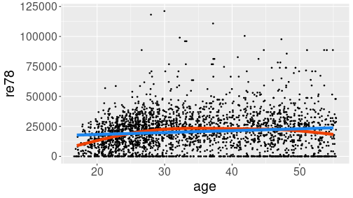
Hump-shaped relationship between age and income (re78) in Treatment data.
Here is an example from Treatment data (see Section A.6). We start by showing the relationship between age and income:
treatment <- read_delim(
   "../data/treatment.csv.bz2")
ggplot(treatment,
       aes(age, re78)) +
   geom_jitter(size = 0.6) +
   geom_smooth(se = FALSE,
               col = "orangered2",
               linewidth = 2) +
   geom_smooth(se = FALSE,
               method = "lm",
               col = "dodgerblue2",
               linewidth = 2)
The example shows two smoothing curves: a line (blue) and a curve (red). Out of these two, the red curve seems better to capture the steady income growth through twenties, and slight decline in fifties. Line, obviously, misses these effects.
This problem can be addressed by including higher polynomials of age
into the model. R formulas normally assign a different meaning to
common mathematical operations, such as + and *. However, you can
use function I() to insulate the math operations from the special
interpretation. In this example, we can estimate the model
\[\begin{equation*}
\mathit{re78}_i = \beta_0 +
\beta_1 \cdot \mathit{age}_i +
\beta_2 \cdot \mathit{age}_i^2 +
\epsilon_i
\end{equation*}\]
as
m <- lm(re78 ~ age + I(age^2), data = treatment)
summary(m)
##
## Call:
## lm(formula = re78 ~ age + I(age^2), data = treatment)
##
## Residuals:
## Min 1Q Median 3Q Max
## -24251 -10596 -680 8106 99225
##
## Coefficients:
## Estimate Std. Error t value Pr(>|t|)
## (Intercept) -18567.922 3887.278 -4.777 1.88e-06 ***
## age 2192.763 228.663 9.589 < 2e-16 ***
## I(age^2) -28.073 3.131 -8.966 < 2e-16 ***
## ---
## Signif. codes: 0 '***' 0.001 '**' 0.01 '*' 0.05 '.' 0.1 ' ' 1
##
## Residual standard error: 15320 on 2672 degrees of freedom
## Multiple R-squared: 0.04016, Adjusted R-squared: 0.03945
## F-statistic: 55.9 on 2 and 2672 DF, p-value: < 2.2e-16The result shows that both \(\mathit{age}\) and \(\mathit{age}\) are statistically significant. The coefficient of age^2 is negative, hence we have a hump-shaped relationship.
Unfortunately, the polynomial effects are hard to interpret, but these
can be fairly easily visualized. First, we do it through prediction
and thereafter using the geom_smooth() function.
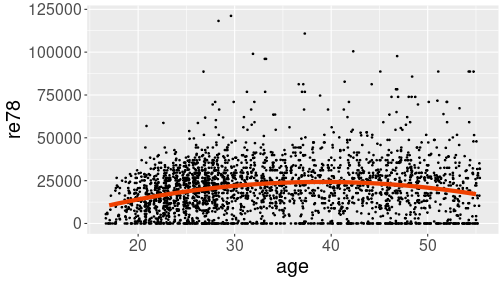
Prediction line, computed and plotted separately
## predict for given age range
predictionData <- data.frame(age = 17:55)
predictionData$re78 <- predict(
   m, newdata = predictionData)
## plot
ggplot(treatment, aes(age, re78)) +
   geom_jitter(size = 0.6)  +
   geom_line(data = predictionData,
             col = "orangered2",
             linewidth = 2)
The result shows a hump-shaped relationship that captures both low income in the early career, and decreasing income before retirement.
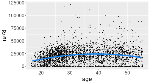
geom_smooth().
You need to set arguments method = "lm" (to use linear regression)
and formula = y ~ x + I(x^2) (to use quadratic regression):
Prediction line, computed and plotted separately
## predict for given age range
predictionData <- data.frame(age = 17:55)
predictionData$re78 <- predict(
   m, newdata = predictionData)
## plot
ggplot(treatment, aes(age, re78)) +
   geom_jitter(size = 0.6)  +
   geom_line(data = predictionData,
             col = "orangered2",
             linewidth = 2)
The result is similar to the one above. Note that the formula needs
to be specified as y ~ x + I(x^2), despite the variables being
called re78 and age. This is because here ggplot thinks in
terms of figure axis, not in terms of data.
In practice, the second approach with geom_smooth() may be easier,
but manual prediction as above allows to use more complex models that
geom_smooth() cannot handle.
12.2 Logistic regression
Logistic regression can be done by using fairly similar modeling tools as linear regression (see Section 12.1.3).
12.2.1 Relationship between a binary and a continuous variable
We demonstrate logistic regression using Treatment data, the same dataset we used in Section 12.1.5. Here is a small snippet from the relevant variables:
treatment %>%
   select(treat, age, ethn) %>%
   sample_n(4)
## # A tibble: 4 × 3
## treat age ethn
## <lgl> <dbl> <chr>
## 1 FALSE 33 other
## 2 FALSE 52 black
## 3 FALSE 32 other
## 4 FALSE 24 otherFor each individuals, the dataset records whether they participate or not in a labor market training program.
Relationship between age and treatment.
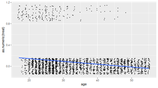
We’ll estimate how does participation probability (treat) depend on age. As the first step, let’s plot the relationship. This can be done in different ways, but in order to understand logistic regression, it is best to do a scatterplot where the individual data points are “jittered” out of their correct location. In order to be able to plot the trend line, we need to convert the logical treat to a number:
ggplot(treatment,
       aes(age, as.numeric(treat))) +
   geom_jitter(size = 0.3,
               width = 0.3, height = 0.15) +
   geom_smooth(method = "lm", se = FALSE)
The figure shows a negative trend–older people are less likely to participate in the program.
TBD: logistic curve and messing with betas
12.2.2 glm(): logistic regression in base-R
You can use glm() to estimate logistic regression. Its usage is
fairly similar to that of the linear regression, you just have to
specify family = finomial() as by default it uses a different model:
m <- glm(treat ~ age, family = binomial(), data = treatment)
summary(m)
##
## Call:
## glm(formula = treat ~ age, family = binomial(), data = treatment)
##
## Coefficients:
## Estimate Std. Error z value Pr(>|z|)
## (Intercept) 1.03426 0.32995 3.135 0.00172 **
## age -0.12294 0.01223 -10.052 < 2e-16 ***
## ---
## Signif. codes: 0 '***' 0.001 '**' 0.01 '*' 0.05 '.' 0.1 ' ' 1
##
## (Dispersion parameter for binomial family taken to be 1)
##
## Null deviance: 1345.3 on 2674 degrees of freedom
## Residual deviance: 1187.1 on 2673 degrees of freedom
## AIC: 1191.1
##
## Number of Fisher Scoring iterations: 7glm() outputs a similar summary table as lm() where the estimates
are the best possible \(\beta_0\) and \(\beta_1\). These can be used to
compute the best logistic estimate:
b0 <- coef(m)[1]
b1 <- coef(m)[2]
age_seq <- 17:55
phat <- 1/(1 + exp(-(b0 + b1*age_seq)))
predicted <- data.frame(age = age_seq, treat = phat)
ggplot(treatment, aes(age, as.numeric(treat))) +
   geom_jitter(size = 0.3,
               width = 0.3, height = 0.15) +
   geom_line(data = predicted, col = "purple2")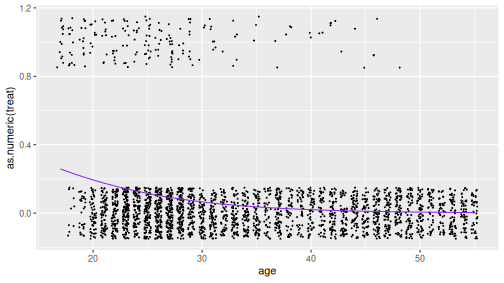
12.2.3 margins(): marginal effects
However, if you want to interpret the results, the coefficient will
not do. You want marginal effects. These can be computed using
function margins() in the margins library:
margins::margins(m)## age
## -0.007456This is the average marginal effect: the computer calculates the marginal effect for every observation, and takes the average over all the effects. This number should be interpreted as
those who are one year older, are in average -0.746 pct points more likely to participate.
If you ask summary of marginal effect, it also prints its standard deviation, \(z\)-value, \(p\)-value, and confidence intervals:
margins::margins(m) %>%
   summary()
## factor AME SE z p lower upper
## age -0.0075 0.0008 -9.1811 0.0000 -0.0090 -0.0059- factor: name of the variable
- AME: average marginal effect. The computer calculates the marginal effect of all cases and displays their average (hence the “in average” when you interpret the results).
- SE: standard error of AME
- z: the corresponding \(z\)-value, \(z = \mathit{AME}/\mathit{SE}\).
- p: the corresponding \(p\)-value
- lower, upper: the 95% confidence interval for AME
If you are not interested in average marginal effects but marginal
effects for specific age, you can specify the desired data by
using
the at argument. For
instance, let’s compute the marginal effects for a 17 year old, a 20
year old and a 30 year old:
margins::margins(m, at = data.frame(age = c(17, 20, 30))) %>%
   summary()
## factor age AME SE z p lower upper
## age 17.0000 -0.0235 0.0037 -6.3072 0.0000 -0.0309 -0.0162
## age 20.0000 -0.0192 0.0030 -6.5091 0.0000 -0.0250 -0.0134
## age 30.0000 -0.0076 0.0007 -11.0780 0.0000 -0.0089 -0.0062It results in a similar table containing three lines–one for each requested age value.
margins() has many other useful options, see the documentation for
more.
Exercise 12.5
Use the same treatment data- include education (educ) and race (ethn) to the previous model
- Compute and interpret the average marginal effects
- Now compute and interpret the marginal effects for a 20-year old hispanic person who has 13 years of education.
TBD: finish this
12.3 Summary
Main modeling tools:
Basic formula
outcome ~ var1 + var2 + ...+: include the variable to the model*: include both variables and their interaction effect:: is the interaction effect.(dot): include all variables, except the outcome, in the model.
Formulas
log(outcome) ~ var1 + I(var1^2) + ...log(outcome): include logarithm of outcome, instead of plain outcome- I(var1^2): include var1-squared
Regression models
- linear regression
lm(y ~ x, data = data) - logistic regression
glm(y ~ x, family = binomial, data = data) - marginal effects
margins::margins(m)wheremis a logistic regression model. - summary() prints a summary table of a regression model, or marginal effects.