B.1 Observational Studies
If you suspect that the variation in number of legs is environmental—and due to infection with parasites—you might start simply by carefully sorting the frogs into groups.
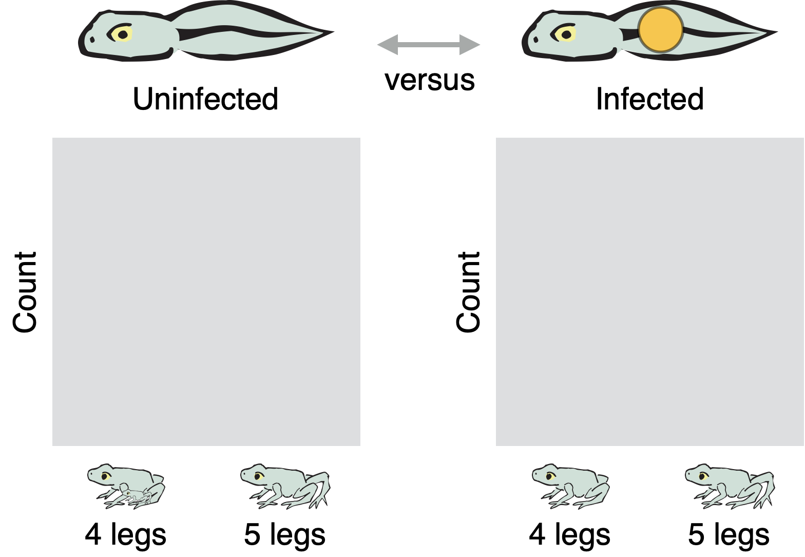
In a Cohort study, for example, you would sort the frogs from Top Pond into a group that are infected with parasites versus a group that are uninfected. Within each group, you would then sort the frogs into those that are deformed versus normal. If deformity is caused by parasites, then you should find a higher rate of deformity in the infected group than in the uninfected group. The same should be true in Bottom Pond.
You might organize the data from a cohort study like this:
Sketch graphs showing the pattern in the data if the environmental variation hypothesis is correct and if it is incorrect.
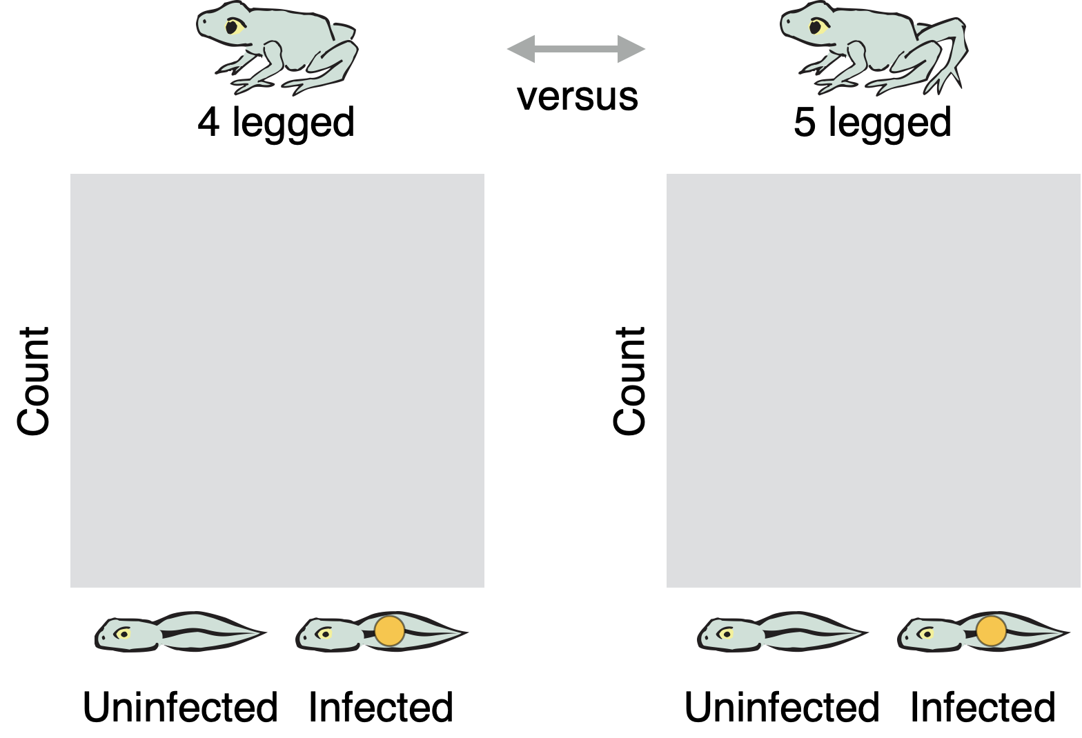
In a Case-Control Study, you would sort the frogs from Top Pond into a group that are deformed versus a group that are normal. Within each group, you would then sort the frogs into those that are infected with parasites versus those that are uninfected. If deformity is caused by parasites, then you should find a higher rate of infection among deformed frogs than among four-legged frogs. The same should be true in Bottom Pond.
You might organize the data from a case-control study like this:
Sketch graphs showing the pattern in the data if the environmental variation hypothesis is correct and if it is incorrect.
Observational studies can be highly suggestive, but they do not establish cause-and-effect. It is always possible—in the real world, if not in FrogPond—that some third variable produces both of the effects we are interested in and makes them appear to be causally linked. In a real pond, for example, there might be a toxin that induces deformities and makes frogs more susceptible to infections with parasites. In a cohort study, frogs infected with parasites would also have a higher rate of deformity. In a case-control study, deformed frogs would also have a higher rate of infection. Both studies would suggest that infection causes deformity, but this conclusion would be unfounded. To establish cause-and-effect, we have to run experiments.