This vignette relies on software developed for RAMP Simulation-Based Analytics (see SimBA)
Pseudo-Data
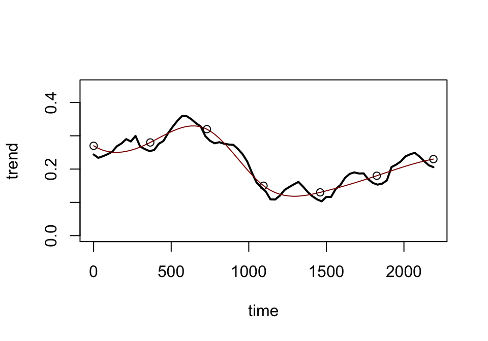
Suppose we have data describing PfPR and we have case data from facilities. From these two signals, we think the PfPR over the last six years looks something like this,
set.seed(23)t =c(0:6)*365tt =seq(0, 6*365, by =30)y =c(0.27, .28, .32, .15, .13, .18, 0.23)seas =sin(2*pi*(tt-120)/365)*.03trend =spline(t, y, xout=tt)$ynoise =rnorm(length(tt), 0, .3*y)^2signal = trend+seas+noiseplot(tt, signal, type ="l", ylim =c(0, 0.45), xlab ="time", ylab ="trend", lwd=2)lines(tt, trend, col ="darkred")points(t,y)
#segments(950, 0, 950, 0.4, col = "sienna", lwd=2)#segments(1315, 0, 1315, 0.4, col = "sienna", lwd=2)