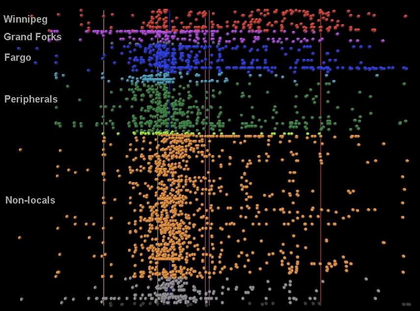
Time ------------------------------------------------------------------------------------------>
This visualization shows how tweet patterns varied across relative location to the event during the 2009 Red River Floods. Ties goes left to right. A single user's tweets are displayed in a single horizontal line. Users are sorted and colored according to their location (Red = local in Winnipeg; Purple = local in Grand Forks; Blue = local in Fargo; Green = Peripheral; Orange = remote). Vertical lines are timelines that represent the crests in Fargo (blue - though hard to see because the intensity of tweets covers it), Grand Forks (purple) and Winnipeg (red). One can see that tweet intensity varied a bit according to location (with Fargo users tweeting mostly around the time of the crest there, and Winnipeg Twitterers continuing to tweet until their own crest weeks later. (The Red River flows South to North). The intensity of tweeting for remote users was slightly shifted - a few days later than Fargo locals - showing that the remote crowd became aware of the event after the crest and the near record flooding, while the Fargo crowd was tweeting intensely in the days leading up to the flood.