Time ------------------------------------------------------------------------------------------>
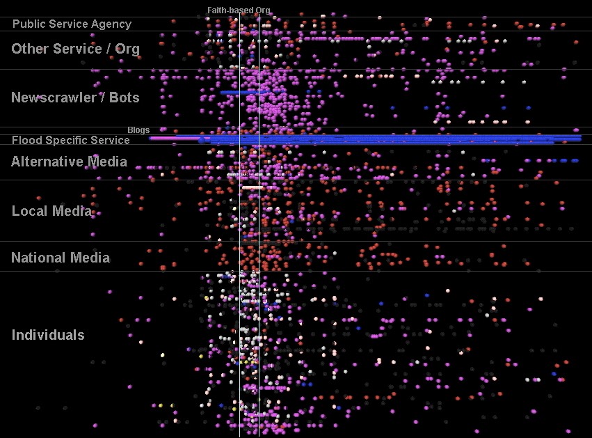
This visualization shows how "derivative" information presented in a data set of tweets from the 2009 Red River Floods. Red tweets are ones that contain a URL. Blue tweets are ones that contain information from somewhere else online. (The three blue lines are accounts set up to tweet out river heights every 15 minutes from NWS.) Purple tweets had links + other textual info that was not new to the online space (that's blue + red in the visualization). White tweets are RTs - this was early on in the diffusion of that convention - some still wrote out the word "retweet" in their tweet. Taken together, this visualization showed how the more than 90% of Twitter content that was derivative was distributed across different account types.