| How to Lie and Cheat with Statistics | |
|
Ok, this is what you have been waiting for. How can you lie with
statistics? Actually, the purpose of this page is NOT to teach you how to lie and cheat with statistics.
Rather, I hope you will learn how it is possible to be misled and how to
spot "statistical abuse." You can find poor use of statistics
everywhere: magazines, newspapers, polls, TV, even research papers. I do
not want to hear of any of you readers using these poor methods.
|
Contents of Statistics Pages |
The Average SwitcherooWhich average (mean, median, or mode) should be used to report the results of an experiment or survey? All three types of averages describe the data truthfully. However, depending on the data, the mean, median and mode can be very different from one another.Here is an example: suppose you asked 7 people how much money they brought to school. Here are the answers:
If you use the mean as the average, then it will look like people bring a lot of money to school. However, if you use the median and mode, it will look like people do not bring much money to school. Each way to describe the numbers is correct. However, because "Ken" brought $999 to school, the mean is much different than the median and mode. Therefore, when you hear someone say, "The average...", make sure you know which type of average (mean? median? mode?) they are talking about.
|
The Meaningless MeanQUESTION: When is a mean meaningless?ANSWER: When a mean is created from ordinal data. You will find this trick in many places...unfortunately this error can sometimes be found in research papers. If you remember from the page on scales, ordinal data can be ranked, but nothing can be said about differences between numbers. Let's use the hot pepper example again. A hot pepper is scored as a "1", a hotter pepper is scored as a "2" and the hottest pepper is scored as a "3." Let's say you wanted to test the hotness of these 3 peppers and gave them to people to taste. Here are the results:
What can be said and what cannot be said about the taste of these peppers? First, all of the people thought that Pepper C was the hottest. It also looks likes Peppers A and B tasted about the same. If you took the means of these numbers you would get:
Mean hotness of Pepper A = 1.6
Actually, it is not even correct to create a mean from these data. The mean hotness of one hot pepper (score = 1) and one of the hottest peppers (score = 3) does NOT necessarily give you the score of a hotter pepper (score = 2). It may be that the hottest pepper is 100 times as hot as the least hot pepper. These data just do NOT give you this information. They only give you rankings. |
The Sampling TrickIt is essential that data come from a random sample of the population. If it doesn't, then the results of the experiment or survey may not be an accurate reflection of the population. This happened in the early 1900s when polls were taken during the U.S. presidential campaign of Franklin D. Roosevelt (FDR). The polls surveyed only those people with telephones. The pollsters predicted one candidate would win, but FDR actually won the real election. The poll did NOT accurately reflect all of the voters because the opinions of only one part of the population (wealthy people with telephones) were taken into account.
|
Games with Graphics Misusing and
abusing graphics are easy ways to mislead people. People
like to see graphs for a quick way to evaluate a set of numbers. But
BEWARE! Make sure you are not fooled.
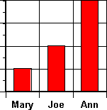
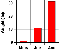
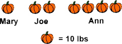
Let's use pumpkins grown in the gardens of Mary, Joe and
Ann. Here is the first graph: Misusing and
abusing graphics are easy ways to mislead people. People
like to see graphs for a quick way to evaluate a set of numbers. But
BEWARE! Make sure you are not fooled.
Let's use pumpkins grown in the gardens of Mary, Joe and
Ann. Here is the first graph:
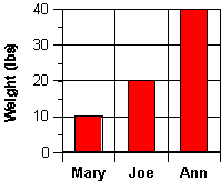
Here is a graph that is much better:
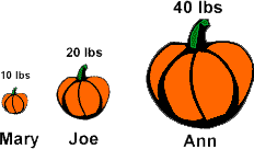
What if you wanted to convince people that Ann's pumpkin was bigger than Mary's and Joe's pumpkin. Look at this graph:
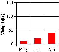
What if you wanted to convince people that all the pumpkins were about the same size. Look at this graph:
Often a picture is used to represent data. Here is a fair way to show the difference in the weights of the pumpkins using a picture:
However, let's try to show that Ann's pumpkin is much bigger than the rest:
|
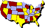
Meaningless GraphicsNewspapers and magazines like to use colorful pictures to represent public opinion and survey responses. However, often times the pictures are too simple to give meaningful information. Take this example:
That's all the information we have. The map really doesn't say very much. We don't know how it was determined that people like pizza...were people asked if they liked pizza? Were people asked how much pizza they ate in a week? a month? a year? Was the number of pizzas purchased at stores in different states counted? Was the number of pizza restaurants in different states counted? We also do not know if there are any real differences between how much people like pizza in the different states. How much do people love pizza in California? What is the difference between how much people love pizza in Utah compared to how much they like pizza in Nevada? There are no scales or measurements to indicate any of this information. Although this type of graphic gives almost no information, it is used frequently in many popular magazines. |
|
Back to to Data Collection and
Analysis.
|

|
For more ways to misuse statistics, there are two interesting books:
For general information, see:
|
| BACK TO: | Experiments and Activities | Table of Contents |
![[email]](./gif/menue.gif) Send E-mail |
 Get Newsletter |
 Search Pages |

 But is this fair? Can
you say that Pepper C was about twice as hot as Peppers A and B?
Probably not. Here's why. What if Pepper A and Pepper B were not very
hot at all, but Pepper C was so hot that you had to drink many glasses of
water to cool the taste. The numerical differences between the taste
of these peppers has
no meaning. The ranking of the peppers is fine...Pepper C IS hotter than
Pepper A and B, but these data give NO indication of HOW MUCH hotter.
Therefore, be careful when you read about differences between numbers that
come from rankings.
But is this fair? Can
you say that Pepper C was about twice as hot as Peppers A and B?
Probably not. Here's why. What if Pepper A and Pepper B were not very
hot at all, but Pepper C was so hot that you had to drink many glasses of
water to cool the taste. The numerical differences between the taste
of these peppers has
no meaning. The ranking of the peppers is fine...Pepper C IS hotter than
Pepper A and B, but these data give NO indication of HOW MUCH hotter.
Therefore, be careful when you read about differences between numbers that
come from rankings. The size of the sample
is another important consideration. If you flipped a coin 5 times and it
came up "heads" 4 times, would you be correct to say that the coin will
land on heads 80% of the time? It did for your sample of 5 flips. But
what would happen if you flipped the coin 100 times or 1000 times. Would
heads still come up 80% of the time? The number of people or number of
trials in an experiment that are needed to give you an accurate estimate
of the population is dependent on several variables. One important
consideration is how much variability there is in the response. If a
response has a high degree of variability, then a larger sample will be
needed. In general, the larger the sample size, the better the
estimation.
The size of the sample
is another important consideration. If you flipped a coin 5 times and it
came up "heads" 4 times, would you be correct to say that the coin will
land on heads 80% of the time? It did for your sample of 5 flips. But
what would happen if you flipped the coin 100 times or 1000 times. Would
heads still come up 80% of the time? The number of people or number of
trials in an experiment that are needed to give you an accurate estimate
of the population is dependent on several variables. One important
consideration is how much variability there is in the response. If a
response has a high degree of variability, then a larger sample will be
needed. In general, the larger the sample size, the better the
estimation.