Designing information
I have what most transgender people call a deadname : the name I was given at birth that I have since replaced with a chosen name. Some trans people, including myself, find deadnames to be a painful piece of information, reminding us a past life and identity associated with fear and shame. And so changing it can bring the opposite of those things: confidence, affirmation, and pride.
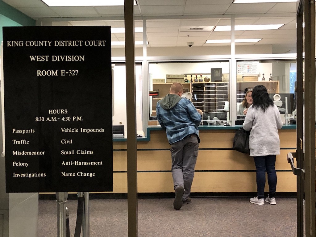
Unfortunately, accessing and modifying records of one’s name is rarely easily. To change my legal name, I needed to pay the city of Seattle $201.50, fill out an elaborate form, and participate in a hearing in front of a judge before a received a certified court order. To change my Social Security information, I had to wait in a Social Security office for four hours for a five minute appointment, and bring every piece of documented evidence of my citizenship, along with the court order, and then wait six weeks for confirmation that it had been changed. My driver’s license took multiple trips, each time to address some missing piece of information in a poorly explained process. And then, because I have relatively organized password manager, I spent about 100 hours visiting the websites of 700 companies that had my name, or encoded my name in my email address. Some refused to change it (e.g., Google, Best Buy, academic publishers); some refused to change it without me mailing an original court order (e.g., government institutions); some refused to change it without a faxed copy of the court order and my new ID (e.g., financial institutions); some required hour long phone calls with customer support with many people asking to speak to my husband for approval; some made it nearly impossible to find where on the website to change it. And some, thankfully, had a clear profile page where I could easily update my name. It was an exhausting, expensive, slow, and sometimes humiliating process that required me to come out as transgender to hundreds of skeptical strangers.
All of these experiences were about accessing information stored in a database and modifying it. And what my experience illustrate is that the interfacesinterfaces: A technology used to faciliate information creation, retrieval, searching, browsing, and/or analysis. we design to provide access to information—the paper forms, the websites, the policies, the procedures, and the media we use—determine so much about our experience with information: whether we can access it at all, whether we can find it, whether we trust the source, and what harm it causes in the process. In this chapter, we will discuss the many challenges in designing interfaces like these for information, and briefly discuss methods for overcoming these challenges.
Design
Throughout this book, we have alluded to the design of many things: data and data encodings, information technologies, information systems, the many policies that shape what information is gathered, stored, secured, and retrieved. All of these designed things emerge from an activity broadly known as designdesign: The human activity of envisioning how to change the status quo into a more preferred one. .
Design, to put it simply, is about envisioning future experiences. Or, as (once again) Herb Simon put it:
To design is to devise courses of action aimed at changing existing situations into preferred ones.
Design, therefore, comes with two central challenges: 1) understanding existing situations, and 2) figuring out what future situations we prefer. For the many things to design to make information accessible, this means different things:
- Designing data . This might mean understanding what data already exists, what its limitations are, and envisioning new kinds of data that address those limitations. Returning to the name change example above, this might mean designing database schemas that avoid using someone’s name, or other data like an email address that might contain their name, as a primary key, so that the name may be easily changed.
- Designing information technologies . This might include examining the problems and limitations of websites, mobile apps, search engines, and forms, and designing better ones. For example, I use wireless Bluetooth headphones between multiple devices, which are exceptionally annoying to unpair, and then repair between devices. Design might involve envisioning different device networking protocols that avoid these problems.
- Designing information systems . This might involve examining how existing information systems are failing to meet an information need, and then envisioning a change to the system, or even a complete redesign, to meet that need. For example, one of the common struggles of college students is registering for the classes they need to graduate: so many aspects of this system fail to meet student needs, with information released too late to plan schedules, confusing registration priority systems, inability to predict and meet demand for courses, and so on. Redesigning systems requires more than just building a new registration website; it requires reimagining how courses are scheduled, how student demand is expressed, and how limited resources are allocated.
- Designing information policies . This might involve examining the unintended consequences of a policy and imagining new policies that preserve the benefits of a policy while avoiding those unintended consequences. For example, web search engines are prone to embedding racist stereotypes in search results 12 ; design might entail defining new retrieval policies for algorithms to follow, accounting for and preventing harmful stereotyping.
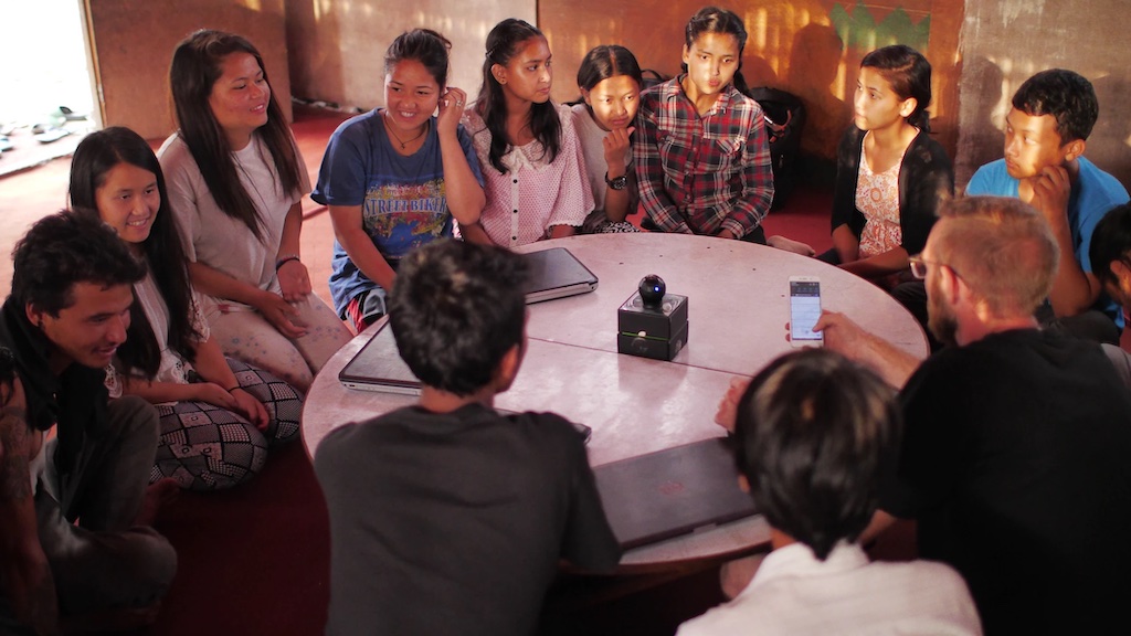
Throughout all of these kinds of design, a central question is for whom one is designing 3 (or in Simon’s language, whose preferences are considered). This question is fundamentally about who is considered a stakeholderstakeholder: Someone who might be directly or indirectly impacted by the creation of a new information technology. of a design. Stakeholders are anyone who is a direct user of some information system, as well as anyone indirectly affected by in some information system, even if they do not use it directly. For example, consider the most ubiquitous information system, Google: billions of people use it and they are clearly stakeholders, but there are also billions who do not. These non-users are also stakeholders; imagine, for example, someone who travels to a country and uses Google to find a local restaurant. Even if a restaurant owner doesn’t use Google, the fact that Google may not show them on Google Maps, or may have incorrect information about their address, means that the restaurant owner will not get the tourist’s business, simply because others are relying on it.
There are many design paradigms that approach the problem of understanding stakeholder needs differently:
- Human-centered design uses interviews, observations, and other empirical methods to study how people use existing designs to identify alternative designs that might better serve their needs. This approach may produce design that meet direct stakeholder needs, but they often overlook indirect stakeholders.
- Value-sensitive design 5 considers both direct and indirect stakeholders but from the perspective of values rather than tasks. Values include things like autonomy, community, cooperation, democratization, sustainability, fairness, dignity, justice, and privacy. This approach may help ensure that designs meet the particular values of a community of stakeholders, but still requires a designer to decide whose values take priority.
- Design justice 3 considers all stakeholders, but from the perspective of justice, rather than values, focusing on marginalized groups first, and using community-based methods to envision designs with a community, rather than for a community. This approach stems from the premise that 1) marginalized groups are too often overlooked in design because they aren’t considered “average”, and 2) designing for the benefit of marginalized groups frequently ends up benefiting everyone by accounting for a greater diversity of human experiences.
- Posthumanist design 4 broadens design to consider not only human values and justice, but non-humans, including not only other species on earth and the broader ecosystems in which all life lives. This approach “decenters” humanity in the design process, looking at the broader systems on which humanity depends (which may or may not depend on humanity).
In all of these paradigms, there are a set of key design activities:
- Research . Not to be confused with academic research, design research (or sometimes “user research”) involves understanding the status quo 8 . There are countless methods for doing this, including interviewing or surveying people, observing their work and play, participating in their activities, or gathering data or academic discoveries about a problem. Design justice tends to approach these in partnership with communities, whereas other paradigms position researchers as “outside” a community, but designing on its behalf.
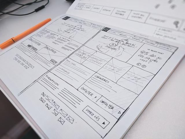
- Ideation . This is the most imaginative part of design, generating possible futures that might make current situations in a community into more preferred situations 10 . Ideation can involve brainstorming, sketching, storytelling, and more, all in service of creating visions for the future. For data, this might mean brainstorming data to collect; for information technologies, this might mean imagining new types of data analyses or interactive experiences. For information systems, it might mean imagining new processes that orchestrate people, technology, and data together.
- Prototyping . With a particular idea in mind, prototyping involves creating concrete experiences that reflect a possible future 2 . The goal of prototyping is to approximate that future so that it can be evaluated, but without having to actually create that future. Prototyping data might mean drafting a data structure or data schema. Prototyping information technologies might mean making website or mobile app mockups or algorithmic pseudocode for how a retrieval algorithm might work. Prototyping information systems might mean creating storyboards that narrate the different experiences and roles of people and information technology in a particular use case.
- Evaluating . With a prototype, designers can evaluate whether it might be a preferred future 7 . These methods are similar to research, but focus on stakeholders’ judgments about a particular future; what makes them difficult is deciding how much to trust people’s reactions to hypothetical, approximate depictions of what the future might be.
While the list of activities above is sequential, design activities are often anything but linear: they are more frequently iterative, returning to all four of these activities. Evaluations can reveal problems that require new prototypes or new questions for research; ideation can result in new questions for research. Prototypes can trigger new ideation. Design is therefore less a procedure and more like a collection of interrelated activities, each requiring a different mindset and skills.
There are many interrelated terms in design that can make the practice confusing. One is Human-Computer Interaction , which is an academic research area concerned with how people interact with and through computing and information technology. Interaction Design and User Experience Design are commonly phrases in industry that refer to the design of interactive, information experiences. Information Architecture often refers to the design of data, metadata, and interfaces to facilitate browsing, searching, and sensemaking. We will return to these in the last chapter of the book in information careers.

Interfaces
While there are many things to design in order to make information systems that meet stakeholder needs, interfaces are of particular importance, as they are the prime mediator—aside from other people—between people and information systems. Interfaces to information can take many forms, including paper (e.g., forms, newspapers), film (e.g., photographs, movies, library archives), audio (e.g., podcasts), computers (e.g., keyboards, mice, touch screens, smart speakers), and more. Designing each of these interfaces is hard in its own way, with print posing typographic challenges, film posing lighting challenges, and audio and video posing editing challenges.
Computer interfaces, more broadly known as user interfaces, may be some of the most challenging interfaces to design. One of the central reasons is that unlike most forms of information media, they are interactive : when we provide input, they react based on our input. This creates an illusion of intelligence. In fact, some work has found that people treat computers as social actors 11 , expecting them to have intelligence, follow social norms, and behave like other people, even when we are fully aware that they will not. This work found that we gender computers just like we gender people; we are polite to them when they are strangers; we ascribe a self to them, and that when we treat them as human, we like them better.

Interfaces can be good on many different dimensions, including:
- Usefulness . Interfaces that meet stakeholders’ information needs might be deemed useful, but knowing whether they do can be difficult. Moreover, useful interfaces are not necessarily good in other ways: they may be hard to learn, frustrating to use, unreliable, and even harmful, much like the name change interfaces I described at the beginning of the chapter, which were useful but hard and slow to use.
- Usability . Interfaces that are efficient to use without error are usable, but they are not necessarily useful. For example, many users of WeChat find it incredibly useful, supporting calls, messaging, search, payments, news, taxies, hotels, and much more, but many users, especially new ones, find it overwhelmingly complex to use.
- Accessibility . Interfaces that can be used by anyone, independent of their physical or cognitive abilities, are accessible. Unfortunately, few interfaces achieve such universal accessibility, with many excluding people who are blind, low vision, deaf, or have motor disabilities that make them unable to use a mouse, keyboard, or touchscreen. Interfaces that are usable to some might be unusable to others because of accessibility issues.
Accessibility is particularly important for information interfaces: if someone cannot physically operate an interface that mediates information, then they cannot access that information. This is a critical concern, as 1 in 7 people worldwide have some form of disability that might interfere with their ability to use an interface. Moreover, all people, independent of their abilities now, will eventually be disabled in some way as we age or become injured. It is unfortunate then that designers often take what is called a “medical” or “rehabilitation” lens on disability, imagining that the problem lies with the disabled person, focusing on fixing them rather than fixing interfaces. A disability justice lens, much like a design justice lens, recognizes that accessibility problems are in the interface designs themselves, and that it is the responsibility of designers to center people with disabilities in design to ensure that they work for everyone 1 .
In fact, disability has been the catalyst for many of the information technologies in history: telephones were invented in the 1880’s while trying to visualize sounds optically for teaching people who are deaf; texting was invented in the 1960’s as a way of transmitting text over phone lines to support people who are deaf; machine vision was invented in 1974 to help people who are blind access books; video captioning was invented in 1972 to enable deaf viewers to read audio; and the synthesized speech found in virtual assistants and smart speakers was invented in 1976 for people who are blind to hear text. Much of our modern information interfaces, then, emerged from design processes that centered people with disabilities.
Information Architecture
If one thinks of interfaces as the “containers” for information, one can think of information architecture as the labels on those containers that help us understand the structure of an interface and its contents. More generally, it is the organization and structure of information interfaces, ideally optimized to help people use the interface to meet an information need 14 .
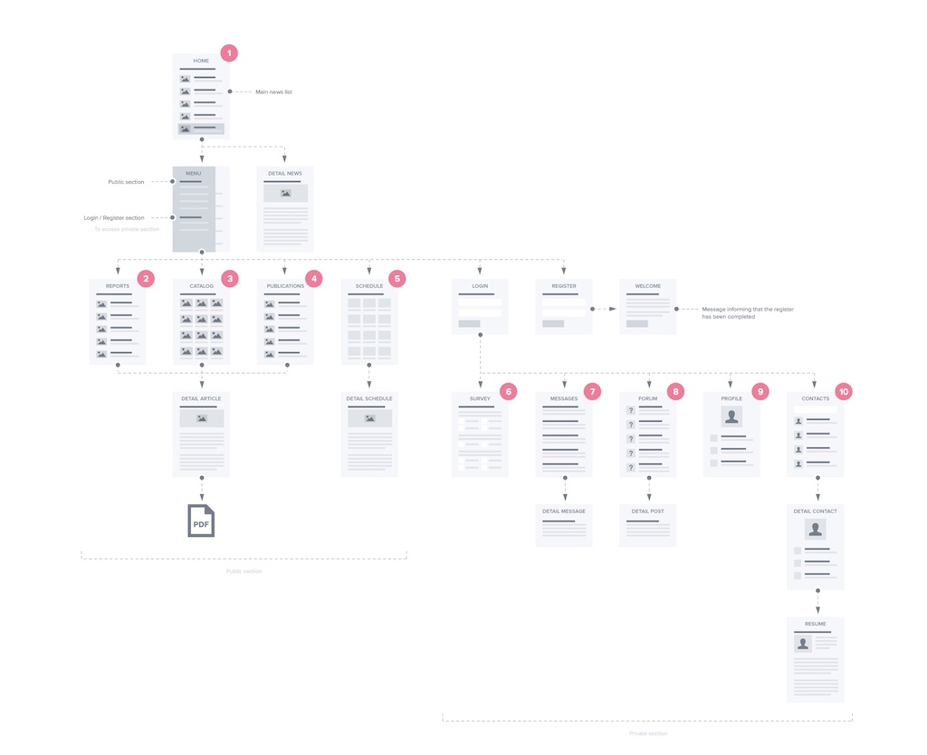
Ultimately, the primary tool for guiding people to the information they need are symbols. For example, a button label like “search” might indicate some key search functionality, or the word “contact” on a restaurant website might indicate where a visitor can find a restaurant’s phone number. Words, phrases, iconography, and other symbols are a central kind of metadata for communicating the location of functionality or content in an interface. For example, in the site map in the figure above, words, icons, and symbols found on links, buttons, and images are the key way that users will know how to navigate the site, finding the information they need. Or, if they search instead, they will likely use words to describe the content they want.

Given the necessity of words, one central challenge in information architecture is the vocabulary problem 6 . First described in 1987 at the advent of graphical user interfaces, this series of studies observed that when asked to choose words for some given content or functionality, people would choose a diversity of labels that often did not overlap. For example, when the experiments non-verbally demonstrated copying some text in a word processor, participants might use the words “ copy ”, “ duplicate ”, “ repeat ”, “ replicate ”, or even “ clone ”. Of course, this problem is inherent to natural language: we often have many synonyms to describe the same phenomena. The problem was that it was quite rare for there to be any single word that covered the majority of participants’ expectations. These results suggest that there is no “best” word or phrase to describe some content or functionality in an interface.
The vocabulary problem has implications for both ways that people seek information in interfaces. When searchingsearching: Attempting to retrieve particular information from an information system. for information, it means that people’s queries for the same information are likely to use different words 9 . This means that any content being searched likely needs to have multiple descriptions to cover the diversity of vocabulary that people might use, or that users will have to learn the “official” vocabulary for some concept in order to find it. For example, imagine being new to English and trying to get a driver’s license. A reasonable search in simple English might be Seattle allow drive , but that returns results about driving laws and vehicle requirements. Someone has to learn the official vocabulary of U.S. driving regulations, which includes words like “license” and “permit.” Query recommendation can help when someone’s vocabulary is close, or mirror’s other’s confusion 17 , but it can’t make up for al lack of knowledge.
The vocabulary problem is equally problematic when browsingbrowsing: Exploring what information exists in an information system. for information, except rather than having to describe the information, users have to recognize descriptions of what they want. The challenge in designing the architecture of a website or app is that designers typically only get one label to describe that information, and the vocabulary problem means that the label will probably only be recognized as relevant for a fraction of visitors. Worse yet, that label will be amidst a sea of other labels, icons, and symbols competing for attention, many of which might be false positives , signaling relevance, but actually being irrelevant 13 . For example, suppose I was looking for a Seattle city permit to hold a street party in my neighborhood. The top navigation menu on the city website has the options “ Services & Information ”, “ Departments ”, “ Elected Officials ”, “ Boards & Commissions ”, “ Media Contacts ”, “ Staff Directory ”, “ News ”, “ Events ”, and “ Visiting Seattle .” It might be reasonable to choose “ Events ”, except that turns out to be about events the city itself is holding, not about events a resident wants to hold. “ Departments ” is also a good guess, since there is probably a department for permits, but that turns out to be a list of several dozen phone numbers. The answer is buried in “Services & Information”, then “Parking”, then “Permits”, and then “Apply for a Street Use Permit” in a list of 52 types of permits. These are the kinds of search and browsing problems that information architecture solves.

One clever combination of interface design and information architecture is faceted browsing 16 , seen above. This interface leverages the metadata of content on a site to generate a filtering interface that allows visitors to browse the metadata, select metadata that describes properties of what they are seeking, and then see matching results. Interfaces like these are only possible by carefully identifying what kinds of metadata will be most recognizable and relevant for users to describe what they want—and then painstakingly building that metadata database for all of the content on the site. Faceted browsing is an excellent example of how interfaces and information architecture must be designed together to optimize retrieval.
One short chapter on the intersection between information, design, and interfaces is not nearly enough to convey the rich practices that surround the design of information, information technology, and information systems. However, fundamentally, these practices ultimately stem from the desire to connect people to information by making accessible, usable, and useful interfaces. The key challenge is designing interfaces that don’t just serve the common cases, but also the diversity of cases at the margins of human experience and needs. Only then will information be truly accessible to everyone.
Podcasts
- Listen now! Offer ends soon, Recode Daily, Vox . Discusses the dark patterns used throughout design to manipulate people into interacting and generating ad revenue, including new policies that are beginning to regulate these design patterns.
- The Next Billion Users, 99% Invisible . A Google sponsored podcast about how Google conducts research using ethnographic methods from anthropology to understand users who don’t yet have access to the internet.
- The Worst Video Game Ever, 99% Invisible . Discusses the E.T. game for Atari, one of the worst video games ever, which nearly caused the collapse of the fledgling video game industry int he early 1980’s.
- All Rings Considered, 99% Invisible . Discusses the history of the design of mobile phone ringtones.
References
-
Cynthia L. Bennett and Daniela K. Rosner (2019). The Promise of Empathy: Design, Disability, and Knowing the "Other". ACM Conference on Human Factors in Computing Systems.
-
Bill Buxton (2010). Sketching user experiences: getting the design right and the right design. Morgan Kaufmann.
-
Sasha Costanza-Chock (2020). Design justice: Community-led practices to build the worlds we need. MIT Press.
-
Laura Forlano (2017). Posthumanism and Design. She Ji: The Journal of Design, Economics, and Innovation.
-
Batya Friedman, David G. Hendry (2019). Value Sensitive Design: Shaping Technology with Moral Imagination. MIT Press.
-
George W. Furnas, Thomas K. Landauer, Louis M. Gomez, and Susan T. Dumais (1987). The vocabulary problem in human-system communication. Communications of the ACM.
-
Morten Hertzum (2020). Usability Testing: A Practitioner's Guide to Evaluating the User Experience. Morgan & Claypool.
-
Julie A. Jacko (2012). Human computer interaction handbook: Fundamentals, evolving technologies, and emerging applications. CRC press.
-
Bernard J. Jansen, Danielle L. Booth, and Amanda Spink (2009). Patterns of query reformulation during Web searching. Journal of the American Society for Information Science and Technology.
-
Ben Jonson (2005). Design ideation: the conceptual sketch in the digital age. Design Studies.
-
Clifford Nass, Jonathan Steuer, and Ellen R. Tauber (1994). Computers are social actors. ACM Conference on Human Factors in Computing Systems.
-
Safiya Noble (2018). Algorithms of oppression: How search engines reinforce racism. NYU Press.
-
Peter Pirolli (2007). Information foraging theory: Adaptive interaction with information. Oxford University Press.
-
Louis Rosenfeld, Peter Morville (2002). Information architecture for the world wide web. O'Reilly Media, Inc..
-
Herbert A. Simon (1963). The Sciences of the Artificial. MIT Press.
-
Ka-Ping Yee, Kirsten Swearingen, Kevin Li, and Marti Hearst (2003). Faceted metadata for image search and browsing. ACM Conference on Human Factors in Computing Systems.
-
Zhiyong Zhang, Olfa Nasraoui (2006). Mining search engine query logs for query recommendation. ACM International Conference on World Wide Web.