What designers do
When I was an undergraduate, I didn’t have a clue about design. Like most students in technical fields, I thought design was about colors, fonts, layout, and other low-level visual details. I knew enough about user interfaces to know that design mattered , I just didn’t know how much or why.
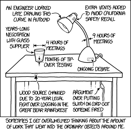
Then I went to grad school to get a Ph.D. at Carnegie Mellon’s Human-Computer Interaction Institute , where I studied not only computer science and behavioral sciences, but design as well, combining these fields together into my expertise in Human-Computer Interaction. Suddenly I was surrounded by designers, and taking design classes with design students in design studios. Quickly I learned that design was much, much more than what was visible. Design was where ideas came from. Design was methods for generating ideas. It was methods for evaluating ideas. It was ways of communicating ideas. I learned that design was problem solving 4 , and that it is design problem solving that shapes the world. After all, look around you: nearly everything in the space you’re reading this in is designed by someone, somewhere, to solve some problem. As this XKCD comic illustrates, once you realize the designed world around you, it’s hard not to see the design work behind everything around you:
After some time, I also realized that if design was problem solving, then we all design to some degree. When you rearrange your room to better access your clothes, you’re doing interior design. When you create a sign to remind your roommates about their chores, you’re doing information design. When you make a poster or a sign for a club, you’re doing graphic design. We may not do any of these things particularly well or with great expertise, but each of these is a design enterprise that has the capacity for expertise and skill.
Many people design extensively, but not professionally. For example, there are countless communities that come together to design, learn, and envision futures, all without formal design education, and yet still creating all kinds of things that sustain people in their communities. Consider LOL! , a makerspace in the Fruitvale district of Oakland, California, which is part of the Bay Area Consoritium of hackerspaces, and brings together people of color, immigrants, women, youth, transgender, queer, and low-income communities. Together, members of the local community come together to teach and learn design skills, to bring together art, crafts, computer programming, and electronics to meet the specific needs of the community, whether they might be food, energy, clothing, shelter. All of this is design , albeit without the venture capital, design degrees, and profit motive.
What does it mean to do design professionally then? In way, professional design is just design for pay, in a formal organization, often (but not necessarily) with a profit motive. Consider all of the job titles that have a little (or a lot) of professional design embedded in them:
- Graphic designers take information and find ways to present it in a way that efficiently engages people in understanding that information. As a grad student, I took several graphic design courses and learned just how hard this is to do (not the least of which because the Adobe Creative Suite has such a steep learning curve).
- Interaction designers envision new kinds of interactions with interactive technologies, usually as part of design consultancies. Some work on contract, helping other companies envision new products, others work “in-house”, designing for their company. Many of the graduates of the University of Washington’s Masters in Human-Computer Interaction + Design become interaction designers.
- User experience (UX) designers design and prototype user interfaces, defining the functionality, flow, layout, and overarching experiences that are possible in a product. In many bigger companies, UX designers determine what software engineers build.
- User experience (UX) researchers understand problems deeply so that designers can envision solutions to those problems or improve existing products.
- Product designers/managers investigate market opportunities and technical opportunities and design products that capitalize on those opportunities in a competitive landscape. The person that envisioned Airbnb ? A product designer. Mark Zuckerberg when he envisioned Facebook with the help of his investors and co-founders? A product designer.
- Software engineers do many kinds of design. They design data structures, algorithms, and software architectures. Front end developers occasionally help with interaction design, unless they work in an organization that has dedicated interaction designers.
In professional contexts, design is often where the power is. Designers determine what companies make, and that determines what people use. But people with the word “design” in their job title don’t necessarily possess this power. For example, in one company, graphic designers may just be responsible for designing icons, whereas in another company, they might envision a whole user experience. In contrast, many people without the word design in their title have immense design power. For example, some CEOs like Steve Jobs exercised considerable design power over products, meaning that other designers were actually beholden to his judgement. In other companies (some parts of Microsoft, for example), design power is often distributed to lower-level designers within the company.
What is it that all of these design roles have in common? They all involve these essential skills:
- Seeking multiple perspectives on a problem (sometimes conflicting ones). There’s no better way to understand what’s actually happening in the world than to view it from as many other perspectives as you can.
- Divergent thinking . This is the ability to creatively envision new possibilities. When designers consider alternatives in parallel 2 , they design better things.
- Convergent thinking . This is the ability to take a wide range of possibilities and choose one using all of the evidence, insight, and intuition you have.
- Exploiting failure . Most people avoid and hide failure; designers learn from it, because behind every bad idea is a reason for it’s failure that should be understood and integrated into your understanding of a problem.
- Externalizing ideas as sketches, prototypes, writing, and other forms. By doing this, designers express details, often revealing which parts of an idea are still ill- or undefined.
- Maintaining emotional distance from ideas. If you’re too attached with an idea, you might not see or accept a better one that you or someone else discovers.
- Seeking critique . No one has enough perspective or knowledge to know everything good and bad about design on their own. Seeking the perspective of others on an idea helps complete this picture.
- Justifying decisions . No design is acceptable to everyone. Designers must be able to justify a choice, compare it to alternative choices, and explain why the choice they made is the “best” choice relative to the tradeoffs.
In a way, all of these skills are fundamentally about empathy 5 , because they all require a designer to see problems and solutions from other people’s perspectives, whether these people are users, other designers, or people in other roles, such as marketers, engineers, project managers, etc. But, given the power that design holds to shape the world, empathy alone is not enough. In fact, many argue that to truly be just and inclusive, design should not be done by professionals on behalf of the world, but rather done with the world. This need for radical inclusion in design processes comes from designers’ inability, no matter how committed to understanding other people’s perspectives, to accounting for the needs of a community, or the potential unintended consequences of a design on a community. As Sasha Costanza-Chock puts it in their book Design Justice :
...designers tend to unconsciously default to imagining users whose experiences are similar to their own. This means that users are most often assumed to be members of the dominant and hence “unmarked” group: in the United States, this means (cis) male, white heterosexual “able-bodied,” literate, college educated, not a young child and not elderly, with broadband internet access, with a smartphone, and so on. Most technology product design ends up focused on this relatively small, but potentially highly profitable, subset of humanity. Unfortunately, this produces a spiral of exclusion, as design industries center the most socially and economically powerful users, while other users are systematically excluded on multiple levels
Given all of these skills, and the immense challenges of enacting them in ways that are just, inclusive, anti-sexist, anti-racist, and anti-ableist, how can one ever hope to learn to be a great designer? Ultimately, design requires practice. And specifically, deliberate practice 3 . You must design a lot with many stakeholders, in many contexts , and get a lot of feedback throughout. The rest of this book will help you structure this practice, showing you the kinds of methods and skills that you might need to learn to be a great designer and design facilitator— but it will be up to do you to do the practice, get the feedback, and learn.
References
-
Costanza-Chock, S. (2020). Design justice: Community-led practices to build the worlds we need. MIT Press.
-
Dow, S. P., Glassco, A., Kass, J., Schwarz, M., Schwartz, D. L., & Klemmer, S. R. (2010). Parallel prototyping leads to better design results, more divergence, and increased self-efficacy. ACM Transactions on Computer-Human Interaction (TOCHI).
-
Ericsson, K. A., Krampe, R. T., & Tesch-Rmer, C. (1993). The role of deliberate practice in the acquisition of expert performance. Psychological Review.
-
Jonassen, D. H. (2000). Toward a design theory of problem solving. Educational Technology Research and Development.
-
Wright, P., & McCarthy, J. (2008). Empathy and experience in HCI. ACM SIGCHI Conference on Human Factors in Computing (CHI).
How to design
How do you design “good” design? Does it come from lone genius? Is it luck? Is it the result of hard work? Where does all of this stuff that humanity makes actually come from? Here’s one (somewhat glamorizing) articulation of what design is:
The video gets a lot of things right: design is a way of thinking, a mindset, a form of optimistic approach to imagining better worlds. The video argues that it is something fundamentally human. But what makes design good ?
To answer that, we have to delve into the history of design. Starting in the 20th century, people started to think about these questions and come up with names and definitions for “ways” of designing we’ll call design paradigms . Some of these paradigms are things you might recognize from your own practices and some are things you might have already encountered in classes or in industry. Each paradigm has its strengths and weaknesses. Let’s talk about some of the more notable ones and how they differ.
Let’s start with one of the most basic approaches to design: appropriation 6 . This involves involves taking some object in the world and using it for some purpose it was not intended. This is actually something that every human does. Some might even consider it a defining human characteristic. For example, you appropriate when you take a broom and use it as a sword; you appropriate when you cut down a tree and carve it into a boat. The process here is a abductive leap from a simple observation about some object to a different vision for how that object might be used to achieve a goal 8 .
A cousin of appropriation is bricolage 9 , which is the act of creating new things from a diverse range of other things. Whereas appropriation is about reusing something in a new way, bricolage is about combining multiple things in to new designs. One of the most salient modern examples of bricolage is sample-based hip hop or electronic dance music. Much of the production in these songs is grounded in recordings from existing music, sometimes from disparate parts of recorded history. Bricolage uses appropriation, but goes beyond it, assembling novelty through recombination. Like appropriation, it is not an explicit process, but a kind of activity that humans engage in that can arrive at new designs.
In modern design education (found primarily in schools of design and art) we see another form of design process that some have called “designerly ways of knowing 5 . Here, the idea is that trained designers arrive at knowledge through synthesis —forming coherent systems of ideas from disparate parts—whereas other kinds of thinking involve analysis —taking a coherent system and deconstructing it, as scientists do with nature. Synthesis is similar to divergent thinking in that they both focus on new possibilities; analysis and convergent thinking are similar in that they both reduce possibilities.
This takes us to more explicit design paradigms, which arguably combine all of the skills above. One of the most common in the world today is human-centered design 1 (sometimes called user -centered design, but many people find the word “user” to be too limiting). In this paradigm, the idea is simple: before doing abduction, bricolage, synthesis, or any of these other lower level activities, first try to analyze the problem you are solving, then generate ideas, then test those ideas with the people who have the problem you are solving. Then, repeat this process of analyzing the problem, designing, and testing (which we call iteration) until you converge upon an understanding of the problem and an effective solution. The premise of this approach is that by modeling a problem, and verifying solutions to it, the design one arrives at will be a better solution than if a designer just uses the pre-existing knowledge in their head.
One critique of human-centered design is that it narrowly focuses on people and their needs rather than a systems-level view of the activities that people engage in, and the multiple people and systems involved in those activities. For example, consider the activity of driving a bus: it’s not just the driver that matters, but the dispatchers that communicate information to drivers, the other drivers on the road, and even the riders occasionally. One paradigm that addresses this more directly is activity-centered design 12 , which focuses less on problems or people’s needs and more on what they do , ensuring that what you design integrates well into the complex fabric of an activity. Contextual inquiry is a more systematic process for investigating activities, and the people, processes, and artifacts that support them 2 .
Some design scholars have questioned whether focusing on people and activities is enough to account for what really matters, encouraging designers to consider human values 7 . For example, instead of viewing a pizza delivery app as a way to get pizza faster and more easily, we might view it as a way of supporting the independence of elderly who do not have the mobility to pick up a pizza on their own. Or, perhaps more darkly, instead of viewing TSA screening at an airport a way of identifying potential terrorists, we consider it through the value of power, as the screening process had more to do with maintaining political power in times of fear than it did with actually preventing terrorism. This shift in framing can enable designers to better consider the values of design stakeholders through their design process, and identify people they may not have designed for otherwise (e.g., people who are house bound because of injury, or politicians).
Some design scholars are skeptical about human-centered design because they don’t believe modeling and verifying people’s needs through a few focused encounters is sufficient to actually address people’s problems, or systems of activities 12 . These and other critiques lead to a notion of participatory design 10 , in which designers not only try to understand the problems of stakeholders, but recruiting stakeholders onto the design team as full participants of a design process. This way, the people you’re designing for are always represented throughout the design process. The key challenge of participatory design is finding stakeholders that can adequately represent a community’s needs, while also participating meaningfully in a design process.
Participatory design, of course, has the risk of overlooking key stakeholders, and therefore producing designs that do not work for everyone. Universal design 3,11,13 attempts to address this, arguing that designers should assume that there will be a vast diversity in the types of people that want to use what you design, and so designing for diversity from the outset will maximize how many people can access your design. This paradigm emerges out of studies on accessibility and disability studies, which focus on how to empower people with diverse physical abilities to access technology, the built environment, and other designed things. Related to universal design is ability-based design 14 , which goes even further, arguing that the designed artifact itself should self-adapt to a person’s abilities and contexts at any given moment. For example, imagine a touch screen keyboard that detects and models a user’s physical ability and mobile context, and adapts the keyboard to suit a person’s needs in the moment. Both of these paradigms respond to the inherent diversity of human abilities, needs, and contexts.
One critique of all of these approaches, however, is that no design, no matter how universal, will equally serve everyone. This is the premise of design justice 4 , which observes that design is fundamentally about power, in that designs may not only serve some people less well, but systematically exclude them in surprising, often unintentional ways. Consider, for example, Black Americans, whose darker skin is often not recognized by hand soap and water dispensers in public spaces. This is not a natural limitation of technology—it is a consequence of designers choosing a sensor technology that must necessarily be calibrated for particular skin tones, and then calibrating it for white skin. Design justice argues, then, that some designs, when they cannot be universal, should simply not be made. And if they can be universal, then they should be made in ways that 1) center power inequalities, 2) center the voices of all directly impacted by the design outcomes, 3) prioritize impact on communities over designers’ intents, 4) view designers as facilitators rather than designers, 5) ensure designs are sustainable and community led, and 6) build upon and amplify the solutions that communities have already found.
You can think of all of these different design paradigms as simply having a different unit of analysis . Whereas human-centered design focuses on an individual, activity-centered design focuses on a system and the activities in it, value-sensitive design focuses on human value tensions amongst diverse stakeholders. Universal design focuses on all of humanity, whereas design justice focuses on power structures, oppression, and communities. Each different unit of analysis exposes different aspects of a problem, and therefore leads to different types of solutions.
If you’re engaging in design, how do you choose from these paradigms? If you have the freedom to choose, you have to consider your values: if you’re concerned with social justice, it is hard to recommend anything but the design justice perspective, as it places justice at the center of design. Other paradigms might be easier, since they involve giving up less power, working less with affected communities, and therefore taking less time. But that just means designing something that may be less effective, sustainable, and successful. In most professional design contexts, however, you might be forced to work within design paradigms that are less justice-focused, with more attention towards profit and speed. In these contexts, you’ll have to decide whether to compromise on just and effective outcomes to optimize speed and profit, or whether to advocate for change.
References
-
Bannon, L. (2011). Reimagining HCI: toward a more human-centered perspective. ACM interactions.
-
Beyer, H., & Holtzblatt, K. (1999). Contextual design. ACM interactions.
-
Burgstahler, S. (2009). Universal design: Process, principles, and applications. DO-IT..
-
Costanza-Chock, S. (2020). Design justice: Community-led practices to build the worlds we need. MIT Press.
-
Cross, N. (1982). Designerly ways of knowing. Design Studies.
-
Dourish, P. (2003). The appropriation of interactive technologies: Some lessons from placeless documents. Computer Supported Cooperative Work (CSCW).
-
Friedman, B., & Hendry, D. G. (2019). Value sensitive design: Shaping technology with moral imagination. MIT Press.
-
Kolko, J. (2010). Abductive thinking and sensemaking: The drivers of design synthesis. Design Issues.
-
Louridas, P. (1999). Design as bricolage: anthropology meets design thinking. Design Studies.
-
Muller, M. J., & Kuhn, S. (1993). Participatory design. Communications of the ACM.
-
Nesmith, M. (2016). Why we need universal design. TEDx Talks.
-
Norman, D. A. (2005). Human-centered design considered harmful. ACM interactions.
-
Story, M. F. (1998). Maximizing usability: the principles of universal design. Assistive Technology.
-
Wobbrock, J. O., Kane, S. K., Gajos, K. Z., Harada, S., & Froehlich, J. (2011). Ability-based design: Concept, principles and examples. ACM Transactions on Accessible Computing (TACCESS).
How to understand problems
As I mentioned I Chapter 1 , I subscribe to the view that design is problem solving. But without a clear understanding of what a “problem” is, how can it be solved? What does it mean to “solve” something anyway?
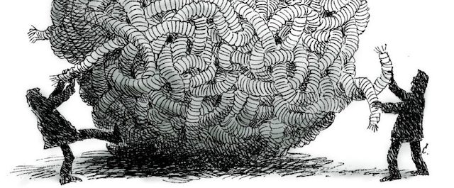
The problem is, once you really understand a problem, you realize that most problems are not solvable at all. They’re tangled webs of causality, which one might call “wicked” problems 3 . The best you can do is understand this complex causality and find opportunities to adjust, nudge, and tweak. Take, for example, this TED Talk by Sendhil Mullainathan on “solving” diarrhea and blindness:
Note how the “solutions” to the problems are all incremental: they change a few parts of a broken system, which leads to great improvements, but the problem is never “solved”.
What then is a “problem” if a problem is always complex and always changing? Herb Simon said, “Everyone designs who devises courses of action aimed at changing existing situations into preferred ones.” 6 . One view, then is that a problem is just an “undesirable situations” (meaning undesirable to a human). Therefore, problems are really just situations that people don’t want.
Now, that doesn’t mean that a situation is undesirable to everyone . For one person a situation might be undesirable, but to another, it might be greatly desirable. For example, most gambling addicts wish it was harder for them to gamble, but casinos are quite happy that it’s easy to gamble. That means that problems are inherently tied to specific groups of people that wish their situation was different. Therefore, you can’t define a problem without being very explicit about whose problem you’re addressing. And this requires more than just choosing a particular category of people (“Children! Students! The elderly!”), which is fraught with harmful stereotypes. It requires taking quite seriously the question of who are you trying to help and why , and what kind of help do they really need? And if you haven’t talked to the people you’re trying to help, then how could you possibly know what their problems are, or how to help them with design?
Therefore, the essence of understanding any problem is communicating with the people. That communication might involve a conversation, it might involve watching them work, it might involve talking to a group of people in a community. It might even involve becoming part of their community, so that you can experience the diversity and complexity of problems they face, and partner with them to address them.
In fact, it might even involve people themselves showing their problems to you.
Consider, for example, this video, by blind YouTuber Tommy Edison, who wanted to demonstrate the utter and complete design failures of ATMs at banks:
Why was it so hard for him to find the headphone jack? No one on the design team had any clue about the the challenges of finding small headphone jack holes without sight. They did , however, include a nice big label above the hole that said “Audio jack”, which of course, Tommy couldn’t see. Diebold, the manufacturer of the ATM had a wrong understanding of the problem of blind ATM accessibility. All of these show how they failed at the most basic task in understanding design problems: communicating with stakeholders.
By now, you should be recognizing that problems are in no way simple. Because everyone’s problems are personal and have different causes and consequences, there is no such thing as the “average user” 7 . Every single solution will meet some people’s needs while failing to meet others. And moreover, solutions will meet needs in different degrees, meaning that every solution will require some customization to accommodate the diversity of needs inherent to any problem. The person you’re designing for is not like you and really not like anyone else. The best you can do is come up with a spectrum of needs to design against, and then decide who you’re going to optimize for.
If you’re clever, perhaps you can find a design that’s useful to a large, diverse group. But design will always require you to make a value judgement about who does and who does not deserve your design help. Let that choice be a just one, that centers people’s actual needs. And let that choice be an equitable one, that focuses on people who actually need help (for example, rural Americans trying to access broadband internet, or children in low income families without computers trying to learn at home during a pandemic—not urban technophiles who want a faster ride to work).
How then, do you communicate with people to understand their problems?
There are many ways, including:
- Surveys communicate with people in a structured, asynchronous, impersonal way, getting you large scale insight, but in a way that can be unintentionally overly structured, biased on who responds, and shallow in insight.
- Interviews communicate with people in a synchronous, personal, semi-structured way, getting you deeper insights —assuming you have established good rapport— but at the cost of more time and a smaller range of people.
- Observations communicate with people by connecting you with their spaces, their practices, their collaborations, and their communication with others, revealing the inherent richness and complexity of their world, but with an even greater time commitment than interviews.
- Secondary research does not communicate with people, but leverages insights that others have gained from communicating with people, and published in research papers, books, and other sources.
These are just a few of hundreds of methods, each with their own strengths and weaknesses.
Let’s discuss two in more detail, to give you a sense of their tradeoffs.
Interviews
The essential quality of an interview is you asking someone questions and them giving you open ended answers.
Interviews can vary in how formal they are, ranging from a fully prepared sequence of questions to more of a conversation. They vary in how structured they were, ranging from a predefined list of questions in a particular order to a set of possible questions you might ask in a particular order.
The art and science of planning and conducting interviews is deep and complex 5 , so you shouldn’t expect to become an expert in this class. However, you can practice.
There are a few basic things to avoid in your questions.
- Don’t ask leading questions, which suggest the answer that you want. (“is there any part of bus riding you actually enjoy?” vs. “tell me about your experiences on buses”).
- Don’t ask loaded questions, which don’t imply a desired answer but still contain implicit assumptions that may not be true (“have you stopped riding the bus?” assumes that a person rides the bus)
- Avoid double-negatives , which require careful logic to untangle (“are you not dissatisfied with your transit options?”)
When you prepare for an interview, try to do the following:
- Define a focus so that my questions center around a theme relative to my design goals.
- Brainstorm set of possible questions that you hope will teach me about the problem I’m trying to understand.
- Review the questions for the issues above, identifying any wording issues or assumptions.
- Prepare an organized list of the questions that you want to ask.
- Find a few people that you think will have insights about the problem you’re trying to understand and schedule time to interview them, estimating how long the interview will take.
- “Pilot” the interview, testing the questions and seeing how long they take, refining the questions, the timing, and the order until it best achieves the goals of your focus.
- Schedule as many interviews as you have time for, recording each one with permission, either as handwritten notes or audio
- During an interview, first establish rapport, sharing things about yourself so that my informant trusts you and is willing to share things about themselves.
- With all of those notes or audio, analyzing what everyone said, synthesizing a perspective on what the problem is.
For examples of great interviews, consider any of those by Fresh Air host Terry Gross . She’s particularly good at establishing rapport, showing sincere interest in her guest, and asking surprising, insightful questions that reveal her guests’ perspectives on the world.
Interviews are flawed and limited in many ways. They are out of context; they require people to remember things (which people tend not to do well). That means your understanding of a problem could be biased or flawed based on fabricated memories, misrepresentations, or even lies. Another downside of interviews is that participants may change their responses to please the interviewer or conform with societal expectations for how a person should behave, based on the context of the interview. This is called participant response bias 4 .
Contextual Inquiry
The second method we’ll talk about is the exact opposite of an interview: rather than asking someone to tell you about their life in the abstract, you directly observe some aspect of their life and have them teach you about it.
You go to where someone works or lives, you watch their work or life, you ask them about their work or life, and from these observations, make sense of the nature and dynamics of their work or life.
This approach, called Contextual Inquiry , is part of a larger design approach called Contextual Design 1 .
I’m not going to cover the whole method or approach here, but these are the basics:
- Like an interview, define a focus . There’s too much to observe to see everything, so you have to decide what to pay attention to.
- Perform an inquiry in a real context.
- Create a partnership between you and your informant. You act as an interested learner, they act like a knowledgable expert. It should feel like a master/apprentice relationship.
- Don’t generate questions in advance; think of them as you observe.
- Focus on questions about the work that is happening in context.
- Record audio, photos, notes, and any other raw data you can use later to interpret
As with an interview, once you have your data, it’s time to step back and interpret it. What did you see? What implications does it have for the problem you’re solving? How does it change your understanding of the problem?
Here’s an example of what a contextual inquiry looks like and feels like:
This contextual inquiry is good in that it happens in context: the inquiry happens in an actual grocery store, in the place where the student shops. However, it fails in that the debrief devolves a bit into an interview, out of context. There’s nothing wrong with interviews, but that’s not the point of a contextual inquiry: the answers he provides to questions outside the grocery store are likely to be different in subtle but important ways than if he had been asked in context.
Like interviews, contextual inquiries are not perfect. They’re extremely time consuming and so it’s rare that you can do more than a few in a design project. That makes it hard to generalize from them, since you can’t know how comparable your few observations are to all of the other people in the world you might want to design for.
There is no right method for understanding problems. Every design context has its own constraints, whether money, time, skill, or circumstance. Consider, for example, the COVID-19 pandemic, which required many people to work from home to prevent community spread. Suddenly, designers who might have wanted to observe people in their work spaces with a contextual inquiry might mean observing their work at home . How could they watch someone using a computer, when the only camera in someone’s home might be the one pointing at their face? Every design situation requires a careful account of context; effective designers simply know their options and choose the right method for the situation.
Of course, if one is following the operating principles of design justice 2 , the notion of a “user research” method begins to melt away. If one is fully participating in a community as a designer, and views their role as facilitator, communicating with with stakeholders does not require a “method”. It means talking to your friends and members of your community and seeing how you can offer your skills to help.
References
-
Beyer, H., & Holtzblatt, K. (1997). Contextual design: defining customer-centered systems. Elsevier.
-
Costanza-Chock, S. (2020). Design justice: Community-led practices to build the worlds we need. MIT Press.
-
Coyne, R. (2005). Wicked problems revisited. Design Studies.
-
Dell, N., Vaidyanathan, V., Medhi, I., Cutrell, E., & Thies, W. (2012). Yours is better! Participant response bias in HCI. ACM SIGCHI Conference on Human Factors in Computing (CHI).
-
Rubin, H. J., & Rubin, I. S. (2011). Qualitative interviewing: The art of hearing data. Sage.
-
Simon, H. A. (1969). The sciences of the artificial. MIT Press.
-
Trufelman, A. (2016). On average. 99% Invisible.
How to define problems
So you’ve done a bunch of interviews, contextual inquiries, observations, and research. You have a big pile of data, insights, and thoughts. You probably also have a big pile of design ideas too! What do you do with this mess? How do you turn a hundred little insights into knowledge that you can to inform your design process? And what form should that knowledge take?
Ultimately, any effort to make sense of a problem is one of interpretation and synthesis . Your goal in reflecting on your insights is to try to understand several aspects of the data you have:
- What patterns do you see in the way people describe their problem?
- What do you know about what’s causing the problem?
- What are the various consequences of the problem?
- Which aspects of the problem seem changeable ?
In answering these questions, you can generate many forms of knowledge that will help you organize your understanding and evaluate which ideas you generate will be effective.
Let’s discuss some of these different forms, what they are, and what they’re good for.
One simple form of knowledge is to derive goals and values from your data. What are people trying to achieve? For example, let’s say you did a bunch of interviews about trying to find a place to rent in Seattle. One person talked about trying to afford rent, another person talked about trying to save time by finding the right location, another person had a physical disability that made the layout of the house important. You need to extract these goals and represent them explicitly and try to understand what they are. Different designs may serve different goals, and so understanding the space of goals that you might design for is critical.
Another form of knowledge to distill is who you’re designing for. Many designers will capture this in the form of personas 1,5 , which are fictional people that you’ve described that attempt to capture the different types of people you might design for.
They include demographics such as education, income, technical background, job description, goals, needs, desires, current tools and frustrations, likes and dislikes, and hobbies and interests.
For example, here’s a persona about someone and their eating habits:
Amy is a professor who works long, long days. She really values fresh, flavorful food, but she rarely gets home before 7, and by then, she has barely enough energy to get house chores done, let alone cook a fresh meal. She’s also usually quite hungry by the time she gets home, since she eats between noon and 1. Instead, she ends up eating a frozen dinner or leftovers or just eating out. She’s frustrated about how poorly she eats and how much money she spends eating out. She certainly doesn’t want to spend more time cooking.
(Yes, that’s me.)
A persona is only useful if it’s valid . If these details are accurate with respect to the data from your research, then you can use personas as a tool for imagining how any of the design ideas might fit into a person’s life. If you just make someone up and their details aren’t grounded in someone’s reality, your persona will be useless, because what you’re imagining will be fantasy.
In addition to personas, you can also define scenarios 3 , which capture what a person might attempt to do with something you design. A good scenario defines, who, what, when, where, why, how, and how often someone tries to accomplish a goal. A good scenario is specific, it specifies goals, but it does not specify interaction details (leaving those to be filled in with design ideas later).
For example, here’s a simple dinnertime scenario:
It’s Friday at 7:30 pm and Amy is really tired after work. Her wife isn’t home yet—she had to stay late—and so while she’d normally eat out, she’s not eager to go out alone, nor is she eager to make a big meal just for herself. She throws a frozen dinner in the microwave and heads to the living room to sit down on her couch to rest her legs. Once it’s done, she takes it out, eats it far too fast, and spends the rest of the night regretting her poor diet and busy day.
(Yes, that’s me too.)
Scenarios are closely related to the idea of use cases , but differ in when they’re created. You create a scenario before you have a design, to capture the problem context you want to address.
You create use cases after you have a design, helping you specify the intended use of a design.
It’s very unlikely that one persona and one scenario is going to faithfully capture everything you learned about the problem you’re trying to address. Create as many as you need to capture the diversity of the the goals, the people, and the scenarios you observed. And if you really want to be rigorous about scenarios, use methods such as claims analysis 4 to trace your scenario details back to data.
Once you have defined goals, personas, and scenarios, the final challenge is to try to explain the problem you’re solving to other people. If you can’t do this, you can’t convince them you have a real problem to solve, you can’t convince other people to help you solve it, and you certainly can’t convince a boss or an investor that you should spend time on solving it. Therefore, you’ll want to take all of the knowledge you have and try to write a simple argument that articulates the problem.
As an example, let’s assume we’re trying to solve the problems in the persona and scenario described above. How can we explain the problem in a persuasive, logical manner that’s grounded in all of the research we did on the problem?
- We want to make it easier to make dinner.
That’s a pretty lousy argument. The whole problem is bundled up in the word “easier”. We’re not going to convince anyone with bland, vague statement like that. Let’s try to break it down.
- Few people have time to make a healthy dinner.
- We want to make it easier to make a healthy dinner.
That’s marginally better, as it breaks down a problem and a solution space. But who are these people?
And why don’t they have time? And what does “easier” have to do with time? Let’s try again:
- Millions of Americans get home from work with little time to cook a meal, let alone a fresh healthy meal.
- The result is that many Americans and their children eat unhealthy meals on most weeknights.
- This contributes to many chronic diseases such as obesity, heart disease, and diabetes.
- It also means that few Americans can enjoy the true pleasures of tasting fresh, local food.
- We’re going to design a service that addresses all of these problems...
Better, right? It shows the scale of the problem and it shows multiple consequences of the problem. It even adds a bit of context to the problem, talking about weeknights specifically and the types of food that Americans can’t enjoy. It leverages the detail from the scenario and persona, but integrates them into a logical argument.
Now, compare it to the first one we wrote above: which problem are you more excited about solving? Which one would you green light if you were a manager? Which one would you fund if you were an investor? Which one captures the essence of the problem you’ve observed in your community? The beginning (and end) of any good design process is an impenetrable argument for the importance of what you’re doing.
Notice how a good argument actually looks something like a scenario. The difference is in the structure and the intent. The scenarios are structured as narratives and you create them to help you envision and test design ideas. Arguments, in contrast, are inherently about the causality of a problem and you write them to persuade someone that a problem is real and important. They help model the causality of a problem, revealing factors that influence, events that trigger it. They also highlight the consequences of the problem, surfacing what about the situation is undesirable to the people you’re trying to design with or for.
Capturing these models of problems is essential in design contexts where designers are separate from stakeholders; the models can act as a form of boundary object 2 , helping designers work with other people, like developers, product managers, project managers, marketers, and others to understand who is being helped and why. But from a design justice perspective, one might wonder what the value of articulating a persona, scenario, or problem statement in words is. Wouldn’t everyone in the community you’re servicing understand these problems intuitively, from their lived experience? Even in a community, everyone is different: coming to agreement on who is being served, why they are being served, and what one believes is causing the problem, and how it impacts a particular group, is key to focusing design efforts.
It’s also key to surfacing who precisely is benefiting from design, which is key to ensuring that design efforts are equitable, helping to dismantle structures of oppression through design, rather than further reinforce, or worse, amplify them.
References
-
Adlin, T., Pruitt, J., Goodwin, K., Hynes, C., McGrane, K., Rosenstein, A., and Muller, M. J. (2006). Putting personas to work. ACM SIGCHI Conference on Human Factors in Computing (CHI).
-
Barrett, M., and Oborn, E. (2010). Boundary object use in cross-cultural software development teams. Human Relations.
-
Bødker, S. (2000). Scenarios in user-centred design—setting the stage for reflection and action. Interacting with Computers.
-
Carroll, J. M., & Rosson, M. B. (1992). Getting around the task-artifact cycle: how to make claims and design by scenario. ACM Transactions on Information Systems (TOIS).
-
Peterson, M. (2016). The Problem with Personas. Prototypr.
How to be creative
In our chapter on how to design , I mentioned a mystical abductive process called “creativity”. But I didn’t explain where it comes from, how it works, or how you “do” it. Is this something that you can learn to do? It is something you’re born with?
We don’t understand creativity fully, but researchers are actively trying to understand it 3 . Here’s my take: I believe creative thinking is an inherently divergent , generative activity that all people can do. However, most societies do not value creative thinking and so our skills in generating ideas rapidly atrophies, as we do not practice it, and instead actively learn to suppress it 1 . That time you said something creative and your mother called you weird? You learned to stop being creative. That time you painted something in elementary school and your classmate called it ugly? You learned to stop taking creative risks. That time you offered an idea in a class project and everyone ignored it? You must not be creative. Add up all of these little moments and where most people end up in life is possessing a strong disbelief in their ability to generate ideas. Some of my students have also argued that pressure to pursue more “logical” careers rather than creative ones disincentivizes youth to pursue (and therefore practice) creative endeavors.
Here’s another take on this same basic idea by David Kelly, who founded IDEO, a famous modern design firm:
His point? Half of being creative is believing you can, because the ability is already in you.
Here’s another reflection, this one by Ira Glass of This American Life :
And here’s yet another talk expressing the same idea, this time on how the design of our current educational systems suppress creative confidence:
Now, creative confidence is not all you need to be creative. Kelly would argue that you also need process . Glass argues that you also need to develop taste . Wisdom from many creators have found many strategies that might be called process that can organize and channel your naturally creative mind.
Let’s discuss a few of these.
First, I just argued, people are inherently creative, at least within the bounds of their experience, so you can just ask them for ideas. For example, if I asked you, as a student, to imagine improvements or alternatives to lectures, with some time to reflect, you could probably tell me all kinds of alternatives that might be worth exploring. After all, you have more experience than nearly anyone sitting through lectures that haven’t met your needs, causing you to fall asleep, be bored, or be confused. These alternatives might not be well formed, or they might just be gestures toward a space of possible ideas, but they will be grounded in the realities of a problem. It would still be your job as a designer to help craft those beginnings of a creative idea into something more concrete. That partnership between a stakeholder of a problem and a designer who can help them express an idea is a powerful form of design justice.
Another way to generate creative ideas is to steal them from other contexts. Why would you spend a bunch of time generating good ideas when there are so many good ideas already out there? Find those good ideas, combine them into something new, and you’ll have something even better. These good ideas can come from anywhere: look to products on the market, products that are no longer on the market, the solutions that people are already using to solve a problem. One of the least studied repositories of great ideas is in libraries, which store descriptions of nearly everything ever invented. Want to design a better input device for mobile computing? Researchers have spent the last 60 years investigating thousands of them , and they’ve carefully described how to make each and every one of them, detailing how well they worked. You could take any of these, start a company based on them, and never have to invent anything.
So you’ve done your market research, your literature search, your user research, and every solution you’ve found is still inadequate. You want to invent something better. Another strategy is called quality through quantity . Linus Pauling, a Nobel Prize winning chemist, once said:
The best way to have a good idea is to have a lot of ideas.
Your best idea will probably be your 100th idea and not your first, because it will incorporate all of the wonderful things about the first 99 ideas. So start generating those bad ideas, figuring out what’s wrong with them, and then making better ones.
How do you figure out what’s wrong with those bad ideas? Externalize often . The more you express those ideas—in words, in sketches, in prototypes, in demos—the more visible those flaws will be to you and other people. There’s a reason that Leonardo da Vinci kept a notebook in which he sketched and wrote every idea he had: it allowed him to see those ideas, share those ideas, critique those ideas, and improve those ideas. Had he kept them all in his head, his limited capacity to see and reason about those ideas would have greatly limited his productivity.
I still haven’t said where you get ideas. In my experience, ideas come from surrounding yourself with rich context. To illustrate, let’s try a little experiment. Let’s think about the problem of how to get people in Seattle to work more quickly. Have any ideas?
It’s hard to generate anything in a vacuum with no stimulation, right? Now let’s try generating some ideas after looking at some context:


Can you think of any ideas now? What kind of ideas are you thinking of? Surround yourself with the complexity and rich contexts of the world and you’ll have no problem generating ideas, though they’ll be inherently informed by what you see 2 .
Other creativity strategies are more analytical. For example, if you want to think of something new, question assumptions . Einstein asked whether time is really uniform and absolute in space. That’s a pretty disruptive idea. Even questioning smaller assumptions can have big design implications. Consider several of the assumptions that recent software companies questioned:
- Do hotels have to be big box businesses (Airbnb)?
- Do people have to use a checkbook to manage their money (Mint)?
- Do cars have to be powered by gas (Tesla)? (Actually, electric cars were invented in 1832 ).
These are not big, challenging questions to ask , they’re just big, challenge questions to answer .
Another analytical route to generating ideas is analogical reasoning , which Plato and Aristotle called “shared abstractions.” The basic idea is to take something concrete (like a horse), generalize it to something more abstract (a grass-powered human vessel), then modify the abstraction (a gas-powered human vessel), then finally make something more concrete (car). See? We just invented cars with analogy. Here’s another example: what is a teacher? If we really abstract away the details of what teachers do, they’re entities that shape the future thoughts and behaviors of people, by consent. If we take that abstract idea of what teachers do and try to make it concrete in a different way, what can we come up with? Intelligent tutoring software that shapes people’s behavior. Maybe advertisements are teachers because they also try to shape behavior, but not by consent. What if there were advertisements that did teach by consent? See how this abstract idea of what a teacher is starts to generate new conceptions of how to shape behavior? The creative strategy here is finding the essence of something, and then manifesting that essence into something new. By no means is it a mechanical process—there is still a synthetic leap required from one domain to another—but analogies can scaffold this leap.
All of these strategies require some faith. You have to believe that you can generate things, you have to trust that surrounding yourself with the rich detail of the world that you will notice things, and you have to trust that by noticing many things, you’ll generate many ideas. Yes, some people may be better at these skills than others, but that’s only because they’ve practiced more. So start practicing.
References
-
Csikszentmihalyi, M. (2014). Society, culture, and person: A systems view of creativity. Springer Netherlands.
-
Dorst, K. and Cross, N. (2001). Creativity in the design process: co-evolution of problem-solution. Design studies.
-
Farooq, U. (2006). Eureka! past, present, and future of creativity research in HCI. ACM Crossroads.
How to prototype
You think you understand your design problem. You have an idea of how to solve it. Now you just have to build it, and problem solved, right?
Wrong. Here are several ideas why just building something is the wrong next step:
- Building things takes a long time and is very expensive, and usually much more than anyone thinks. Don’t spend 6 months engineering something that isn’t useful.
- Once you have built something, what if it doesn’t work? You’ll have done all of that building and have to throw it all away, or worse yet, you’ll try to make your solution work, even though it never will, because of the sunk cost fallacy 3 .
- What if you build something and not only does it not solve the problem, but your understanding of the problem was all wrong? Then, not only do you have to throw away what you build, but you have to reframe the problem.
Designers avoid these problems by making and testing prototypes . At the beginning of a project, there are many uncertainties about how something will work, what it will look like, and whether it addresses the problem. Designers use prototypes to resolve these uncertainties, iterate on their design based on feedback, and converge toward a design that best addresses the problem.
This means that every prototype has a single reason for being: to help you make decisions. You don’t make a prototype in the hopes that you’ll turn it into the final implemented solution. You make it to acquire knowledge, and then discard it, using that knowledge to make another better prototype.
Because the purpose of a prototype is to acquire knowledge, before you make a prototype, you need to be very clear on what knowledge you want from the prototype and how you’re going to get it. That way, you can focus your prototype on specifying only the details that help you get that knowledge, leaving all of the other details to be figured out later. Let’s walk through an example. Imagine you’re working with a community of assisted living residents who want the ability to easily order a pizza without having to remember a phone number, make a phone call, or share an address. You have an idea for a smart watch application that lets you order delivery pizza with a single tap. You have some design questions about it. Each of these design questions demands a different prototype:
- Will residents accidentally order pizza? How would you find out without having to build the whole thing? Perhaps you wouldn’t build anything, and you’d just study the occurrence of accidental taps in smart watch platforms. Or perhaps you’d take an existing single-tap smart watch application and pretend it was your single tap pizza ordering application, seeing if you accidentally activate the app’s single app functionality.
- What feedback do residents need that their pizza is on the way? You could look at the feedback that the online ordering gives and design a UI that gives the same feedback. Or, you could simulate the feedback with text messages, setting up an experiment where you pretend to be the application and give the feedback the app would give via messages.
- Would residents feel safe ordering pizza from their watch? This is harder to build a prototype for, since to find out, you’d need to actually give people the capability. Perhaps you’d extend your existing pizza delivery smartphone app with the watch functionality (building it for the phone instead of the watch) and see if anyone uses it as part of a beta program. If you see high demand, you could get data on how many of those smartphone users have smart watches and then decide whether to take the risk of building the actual watch application.
As you can see, prototyping isn’t strictly about learning to make things, but also learning how to decide what prototype to make and what that prototype would teach you. These are judgements that are highly contextual because they depend on the time and resources you have and the tolerance for risk you have in whatever organization you’re in.
You don’t always have to prototype. If the cost of just implementing the solution is less than prototyping, perhaps it’s worth it to just create it. That cost depends on the skills you have, the tools you have access to, and what knowledge you need from the prototype.
Because the decision to prototype depends on your ability and your tools, good designers know many ways to prototype, reducing the cost of prototyping. A designers’ prototyping toolbox is extremely diverse, because it basically contains anything you might use to simulate the existence of your design. Let’s discuss a few genres of prototypes that are common in the software industry, ranging from low to high fidelity.
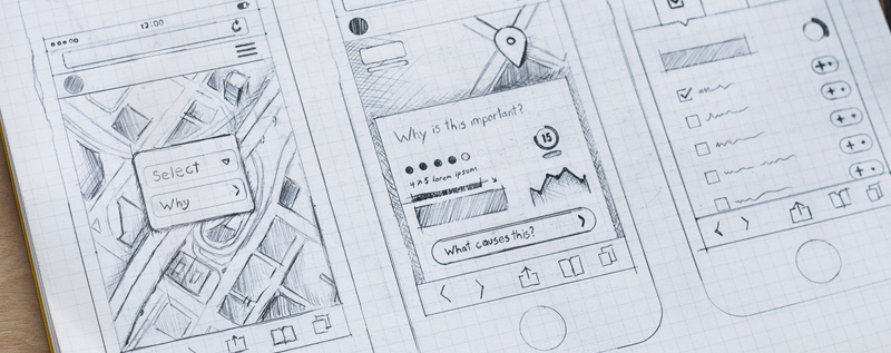
The fastest and easiest form of prototype is a sketch , which is a low-fidelity prototype that’s created by hand. See the drawing at the top of this page? That’s a sketch. Get good at using your hands to draw things that you want to create so that you can see them, communicate them, and evaluate them. With enough skill, people can sketch anything, and they almost always do it faster than in any other media. On the other hand, because they have the least detail of any prototype (making them low-fidelity), they’re most useful at the beginning of a design process.
Another useful prototyping method is bodystorming :
In this method, rather than using our hands, we use our whole bodies to simulate the behavior and interactions we want to explore. Like sketching, it’s incredibly fast, and doesn’t really require any special tools.
Sketching and bodystorming are the lowest-fidelity methods of prototyping, requiring very little to prepare. If you’re willing to get some paper, pens, and tape, you can also try creating paper prototypes
Whereas a sketch is just an informal drawing used to facilitate communication, a paper prototype is something you can actually test. Creating one involves creating a precise wireframe for every screen a person might encounter while using a design, including all of the feedback the user interface might provide while someone is using it. This allows you to have someone pretend to use a real interface, but clicking and tapping on paper instead of a screen. If you plan the layout of an interface in advance, then decide which parts of the interface you need to change in order to test the interface with someone, you can build one of these in less than an hour.
With even more time, you can use video and video editing to show interactions with an interface:
Another popular technique is called Wizard of Oz prototyping 1,2 . This technique is useful when you’re trying to prototype some complex, intelligent functionality that does not yet exist or would be time consuming to create, and use a human mind to replicate it. For example, imagine prototyping a driverless car without driverless car technology: you might have a user sit in the passenger seat with a couple of designers in the back seat, while one of the designers in the back seat secretly drives the car by wire. In this case, the designer is the “wizard”, secretly operating the vehicle while creating the illusion of a self-driving car. Wizard of Oz prototypes are not always the best fidelity, because it may be hard for a person to pretend to act like a computer might. For example, here’s Kramer, from the sitcom Seinfeld, struggling to simulate a computer-based voice assistant for getting movie times:
A more recent example is late-night host James Corden prototyping gesture-based musical instruments for his Apple Watch (with the help of his band):
Beyond these low-fidelity methods are a wide range of higher fidelity prototyping tools, which support rapid prototyping of particular genre of designs, such as web and mobile applications. Tools like these, including Figma , InVision , Adobe XD , and Sketch , support collaboration, interactive wireframes, and workflows for importing and exporting to other media. The level of fidelity that these tools offer allow you to closely mimic a final product without having to build a final product, but they take much more time to use, because you have to make more decisions about more details.
Clearly, there are lot of different media you can use to answer a design question. Which one to use depends on the time/fidelity tradeoff that you’re willing to make 4 . If you need an answer fast, but can tolerate only a slight increase in certainty, low-fidelity will help you gain a little knowledge very fast. If you’re willing to spend more time getting a more certain answer, you probably need something higher-fidelity. There is no right choice: it depends entirely on the context in which you’re making the decision.
Of course, after all of this discussion of making, it’s important to reiterate: the purpose of a prototype isn’t the making of it, but the knowledge gained from making and testing it. This means that what you make has to be closely tied to how you test it. What aspect of the prototype is most critical to the test, and therefore must be high fidelity?What details can low-fidelity, because they have less bearing on what you’re trying to learn?Who will you test it with, and are they in a position to give you meaningful feedback about the prototype’s ability to serve your stakeholders’ needs?As we will discuss in the coming chapters, these questions have their own complexity.
References
-
Hoysniemi, J., Hamalainen, P., and Turkki, L. (2004). Wizard of Oz prototyping of computer vision based action games for children. Conference on Interaction Design and Children (IDC).
-
Hudson, S., Fogarty, J., Atkeson, C., Avrahami, D., Forlizzi, J., Kiesler, S., Lee, J. and Yang, J. (2003). Predicting human interruptibility with sensors: a Wizard of Oz feasibility study. ACM SIGCHI Conference on Human Factors in Computing (CHI).
-
Lehey, R. L. (2014). Letting go of sunk costs. Psychology Today.
-
Sauer, J. and Sonderegger, A. (2009). The influence of prototype fidelity and aesthetics of design in usability tests: Effects on user behaviour, subjective evaluation and emotion. Applied Ergonomics.
How to design interfaces
For most of these readings, we’ve been talking about design in manner agnostic to the medium in which you’re designing. You might use the methods and ideas we’ve talked about to design anything from toothbrushes to tablets. But media vary. Smartphones are different things than desktop computers. Tablets are different from augmented reality. Each of these media have their own challenges, their own constraints, and their own conventions. And so there’s knowledge about each medium that a designer needs to know.
Here, we’ll discuss the ubiquitous medium of screen-based user interface design for digital computers, since that’s currently the dominant medium in society (this includes desktops, laptops, tablets, smartphones and even smart watches, but not augmented reality, virtual reality, or other non-screen interactions). Let’s discuss some of the core concepts in screen-based human-computer interaction 3 and some of the paradigms that exist in this medium.
First, let’s start with some basics you probably already know. Computers are functional machines, and so their behavior is governed by the concepts of input , output , and algorithms that compute output based on input. Computers take input, process it with some algorithm, and then provide output. Everything about a human interface for a computer is therefore about these three things.
Let’s define each of them. Input is any kind of data that a user provides to a computer. Most often, these are keystrokes, mouse positions, mouse clicks, taps, and other sequences of low-level inputs. These lower-level inputs are usually aggregated into higher level inputs, such as clicks, taps, text strings, and gestures, which user interfaces then process. Every user interface accepts some range of input, and those inputs each have some structure . Part of a user interface is providing means by which users can express those inputs in valid structures.
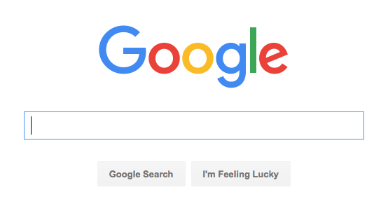
What’s the range of input that Google accepts on its search page? It has a text box, which accepts unicode text strings. It responds to all kinds of keystrokes and accepts all kinds of symbols from all kinds of languages. The button on the right also accepts a mouse click. The low-level structure of the text input is a sequence of characters. Google takes that low level structure and parses in into a higher level structure of keywords, which it then uses as input to its search engage. Throughout these choice of inputs are critical issues of diversity, equity, and inclusion. For example, if Google could only be used with a mouse, it would immediately exclude all people who cannot use a mouse because of a disability such as a motor impairment or blindness.
The Google search page actually accepts many other implicit inputs too. There are a variety of personalization settings, such as search history, search preferences, and even sensor input (such as your location) that it also accepts as input. The user interface doesn’t provide explicit controls for providing this input, but it is user input nonetheless. These implicit inputs contain issues of justice. For example, what harms may come by Google tracking your location when you search? For many, no harm, but what about people do not secure their accounts, and might be stalked by a violent ex, or someone in witness protection?
Some of these implicit inputs also have default values. For example, when you first used Google, your search history was empty, your language preference was chosen based on your IP address, and so on. Defaults represent a designers’ beliefs of a user’s most likely expectations, intents, and tasks. It’s important to remember that there is no “average user,” and so your choice of defaults will inevitably serve some people better than others. For example, if Google detects that a browser is in the United States, what language should it default too? Some might say English, but that prioritizes English-speaking people over others. But should it be Spanish? Or more dependent on a specific region?Or tied to a browser setting? All of these alternatives will serve each user differently. Designers therefore have a responsibility to think carefully about who their serving through a choice of defaults, engaging with communities to understand how they’ll be impacted.
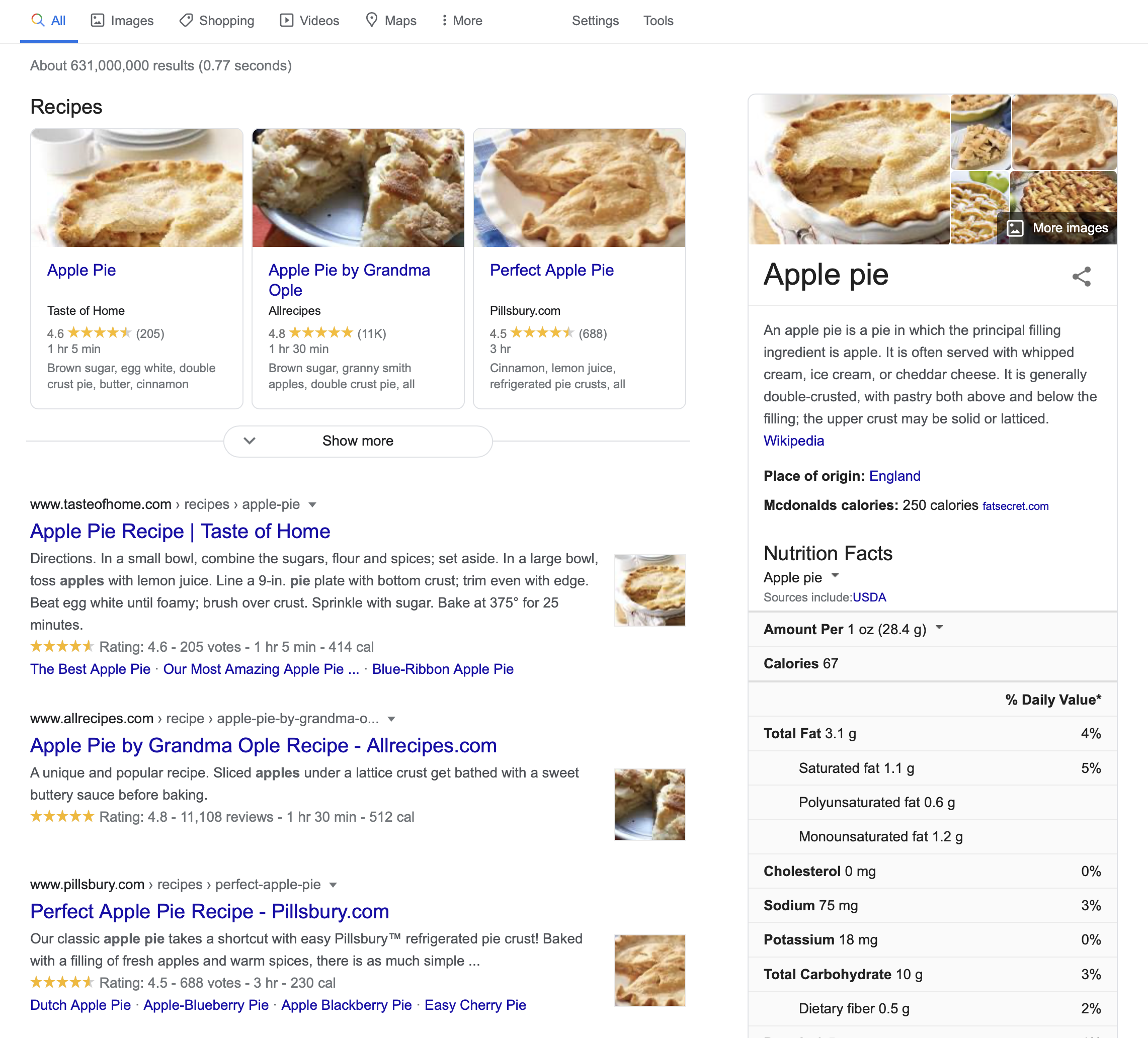
The Google search results are the search engine’s output . Like input, output can come in many forms and also has structure. The search results above include a stacked list of results, including a top result, several image search results, and a list of results. Each result has particular metadata that was computed and displayed. Of course, just as with inputs and defaults, outputs also contain issues of inclusion and justice. For example, when Google’s list of search results was a flat list, it was easily navigated by a screen reader, which blind people might use to read and select search results. Now that Google’s results are more hierarchical—a list of recipes, a floating box on the margin with knowledge about apple pie, and a list of results, they are much harder for screen reader users to navigate, but not much harder for sighted people to navigate. This demonstrates how, once again, no design choice is neutral, and serves all people equally well.
Inside the implementation of a user interface are several kinds of data and algorithms that determine its behavior. One of the most central kinds of data is state . State is data stored in memory that represents information about an application its current status. Think of it like a variable in a program that gets reflected somehow in the user interface’s appearance or behavior. For example, consider an alarm clock. Its state includes things like the current time , an alarm time and a Boolean alarm on state. These states could be displayed to a user and modified by a user in a variety of ways. (Think of all of the alarm clock designs you’ve encountered in your life: they all have basically the same state with entirely different interfaces). All user interfaces respond to input by executing event handlers , which take the input and perform some operation on state, then provide some feedback to explain the result of the operation. Pressing a snooze button on an alarm, for example, sends input to an event handler, which responds to the input by disabling the alarm sound (setting the alarm on state to false) for a fixed period of time.
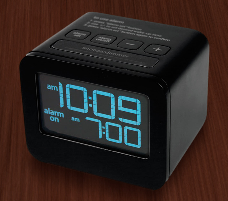
A mode is a state that causes a user interface, given the same input, to provide different output depending on the value of the state. For example, some alarm clocks have a switch that allows you to move between two “show time” and “change time” modes. This is captured in a two-valued “time mode” state, which is either “show time” or “change time.” When the mode is “show time” mode, the hour and minute buttons may do nothing, but when the mode is “change time,” the buttons might increment the hour and minute. Because in our example a switch controls this mode, this is an example of a passive mode , which requires user input to set and unset (the user has to remember to pull the switch back to “show time” mode). There are also active modes . For example, imagine that instead of a switch to change modes, there was a button that had to be held down to change the time. People wouldn’t have to remember to exit this mode because of the physical action they performed to enter the mode (pressing the key), the opposite physical action will exit the mode (releasing the key). Let’s tie all of this terminology to design. The primary goal of a user interface designer is to define inputs, outputs, and event handlers to modify state. That means that before you ever make a user interface for something, you have to first decide what input, output, and state exist in your design, independent of how those are manifested in a user interface. This is a fundamentally larger question about the information and behavior that your application will have. You should really design these before you ever worry about the user interface for a design, as your user interface is completely dependent on your decisions about what an application stores and can do.
Let’s design a clock user interface for a smartphone. Let’s start with a super simple clock that just displays the time. It has a “current time” state, a “setting time” mode. It accepts three types of inputs: a request to switch between showing the time and setting the time, and requests to increment the hour and minute. Because it accepts three inputs, it also has three event handlers to modify the “setting time” mode, and increment the hours and minutes. Note that we haven’t yet said what any of this looks like or how it’s laid out on the screen.
If we adopt the aesthetic of designs being invisible, a good design would make the inputs, state, and outputs discoverable, clear, and efficient to use. That means we have to answer one big design question: how can we make it clear that to set the time, they need to 1) switch to time setting mode, 2) repeatedly increment the hours and minutes until reaching the current time, and 3) switch back to time display mode?
To help us think about this we can use the concepts of gulfs of execution and evaluation 2 . The gulf of execution is the gap between what a person wants to do with an interface and what inputs are actually possible to provide. It’s the struggle every person has to translate their goal into input that further their goal. For example, if you were using an alarm clock, one of the gulfs to bridge is how to make the alarm active; an interface with a big switch that says “on” and “off” has a small gulf for the user to bridge; they’ll probably figure out what those buttons mean. An interface that has a similar switch hidden away in a menu that’s not discoverable poses a much larger gulf of execution.
The gulf of evaluation is the gap between the output and feedback an interface provides and a person’s ability to relate that output to their goal. In our alarm example, if pressing the visible on/off to “on” made the switch visibly move to an “on” state (and perhaps even make a satisfying click sound), that’s the interface bridging the gulf of evaluation, providing feedback to the user to help them understand the effect of pressing the switch. In the other interface where the switch was hidden, imagine a user pressing on the time, trying to see if that would activate the alarm, but the interface providing no feedback. That’s a very large gulf of evaluation, requiring the user to guess what the lack of a response means.
When you’re designing a user interface, you’re looking for a design that makes these gulfs as easy to bridge as possible. In most screen-based user interface design, bridging these gulfs requires a few strategies.
The first strategy for bridging gulfs of execution to define clear affordances 1 . An affordance is a relationship between a person and a property of what can be done to an interface in order to produce some effect. For example, a physical computer mouse can be clicked, which allows information to be communicated to a computer. However, these are just a property of a mouse; affordances arise when a person recognizes that opportunity and knows how to act upon it. To know that a user interface has an affordance, user interfaces provide signifiers , which are any sensory or cognitive indicator of the presence of an affordance. Consider, for example, how you know that a computer mouse can be clicked. Its physical shape might evoke the industrial design of a button. It might have little tangible surfaces that entreat you to push your finger on them. A mouse could even have visual sensory signifiers, like a slowly changing colored surface that attempts to say, “I’m interactive, try touching me.” These are mostly sensory indicators of an affordance.
To apply this strategy to our clock design, that means we want to provide some signifer that there’s a time setting mode. Let’s try this:
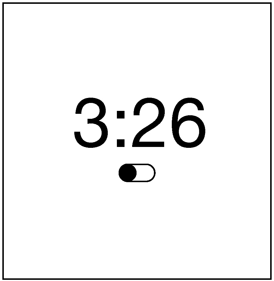
Does it work? It depends on whether the users would be familiar with this iOS convention of a switch looking like a little movable circle in a track. Conventions are design patterns (combinations of design decisions) that people have already learned. By using them, you don’t have to teach something new to a person. That’s why Apple requires all interfaces in its App Stores to use the same graphical user interface controls, the same typography, the same keyboard shortcuts, and similar layouts: this way, users can learn something once and reuse that knowledge everywhere.
To account for users that might not know this convention, we could add some labels to help someone learn the convention:
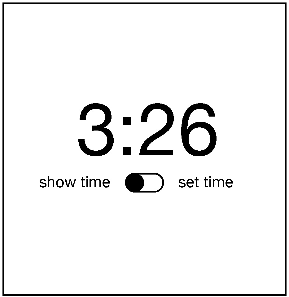
Will users unfamiliar with the convention know that they can tap that switch toggle it? Maybe. It’s worth usability testing. They’ll probably try to tap the labels and nothing will happen and they’ll get confused.
To bridge the gulf of evaluation, you must provide feedback that is immediate and explains to the person viewing it what the computer did with their input. This is a teaching moment. Once someone enters the time setting mode, how will we teach them what to do next? We need to give them some feedback:
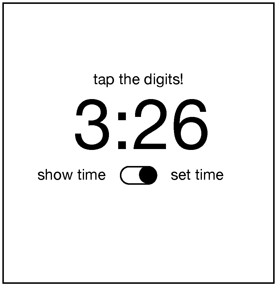
That’s pretty direct and not very elegant, but I bet it’s clear. How will we help them remember to switch back into show time mode? Ah, now we’ve come to a tricky design problem. We could keep adding more text to remind them to do it, but that gets pretty cluttered. We could also reconsider having a time setting mode altogether and instead just have users tap the hours and minutes whenever they want to change them. But that might be error prone, with people accidentally changing the time. The mode helps prevent those mistakes. Perhaps it could switch back automatically after some time? Or switch back when the user switches to another app? These are the joys of UI design: trying to find a way to balance simplicity, clarity, and convention.
Now, there is a central aspect of UI that he have not discussed yet, and yet is likely one of the most important aspects of designing clear user interfaces: typography . Why did I choose to center the time above? And the controls? Why did I choose the font that I did? Let’s see what happens if I change these choices in the worst possible way.
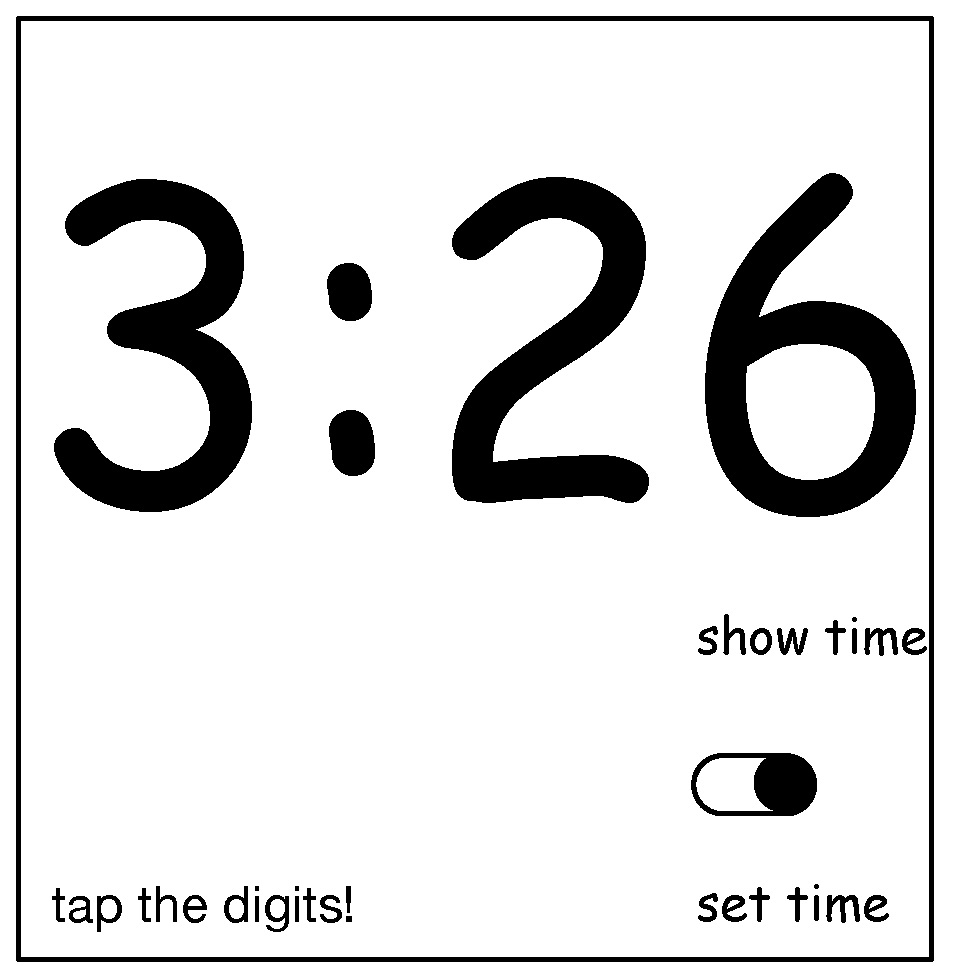
What makes this new design so much worse? Well, first, the left-to-right layout of the labels and the switch actually contained crucial information: when the switch is on the left, it’s show time mode, and when it’s on the right, it’s set time mode. The new design is highly ambiguous. It’s not even clear if the labels have anything to do with the switch because of the whitespace between the labels and the switch. And the prompt to set the time appears so far from the digits themselves, the word “tap” is no longer clear, because the proximity of the label clarified that “tap” meant “tap the digits just below this text”. As you can see, where you place words, the fonts you use, the space between them, and the alignment between them all contain crucial information for understanding the meaning of text (and can easily convey false signifiers). If you ignore typography, you both ignore essential opportunities to bridge the gulf of execution and evaluation, but you risk widening those gulfs considerably.
With these foundations, it’s possible to understand what a user interface constitutes. But to know whether a user interface is good requires an entirely different set of user interface evaluation skills. In the coming chapters, we’ll discuss methods for evaluating, and how they shape our knowledge of whether an interface is meeting needs.
References
-
Rex Hartson (2003). Cognitive, physical, sensory, and functional affordances in interaction design. Behaviour & Information Technology.
-
Edwin L. Hutchins, James D. Hollan, and Donald A. Norman (1985). Direct Manipulation Interfaces. Human-Computer Interaction.
-
Myers, B., Hudson, S. E., & Pausch, R. (2000). Past, present, and future of user interface software tools. ACM Transactions on Computer-Human Interaction (TOCHI).

How to be critical
So you have a design. How do you know if it’s any good? We’re going to talk about three ways to know in this book: 1) critique, 2) empiricism, and 3) analysis.
When you’re asked to give feedback on an idea, how can you give useful, constructive feedback? In the culture of design studios, designers give feedback via critiques 3,4 . As some have noted 8 , critiques are not just evaluation of designs, but collaborative deconstructions of what makes a design successful and what makes it fail.
In many ways, being critical is easier than being generative. Our society values criticism much more than it does creation, constantly engaging us in judging and analyzing rather than generating and creating things. It’s also easy to provide vague, high level critical feedback like “Yeah, it’s good” or “Not great, could be improved”. This type of critique sounds like feedback, but it’s not particularly constructive feedback, leading to alternatives or new insights.
Design critiques have a number of unique features that try to ensure that feedback is useful:
- Critiques are two-way . It is not just one person providing critical feedback, but rather the designer articulating the rationale for their decisions (why they made the choices that they did) and the critic responding to those judgements. The critic might also provide their own counter-judgements to understand the designer’s rationale further.
- The critic in a critique must engage deeply in the substance of the problem a designer is solving, meaning the more expertise they have on a problem, the better. After all, the goal of a critique is to help someone else understand what you were trying to do and why, so they can provide their own perspective on what they would have done and why. This means that critique is “garbage in, garbage out”: if the person offering critique does not have expertise, their critiques may not be very meaningful.
- Critiques are both divergent and convergent . They can generate ideas, or point in new directions. But they primary focus on revealing why something doesn’t work.
Because critiques are inherently negative to some extent, some approaches to critiques can be abusive. In some studios, people might call designs even design ers by nasty names. This is often done to attempt to free people to provide deeply honest feedback about design, train designers to have “thick skin,” impervious but open to negative feedback. But it can be highly discouraging to many novice designers, making them question their abilities.
One way to avoid this harm, while still sharing harsh feedback, is to follow a simple rule: if you’re going to say something sharply negative, say something genuinely positive first, and perhaps something genuinely positive after as well. Some people call this the “hamburger” rule, other people call it a “shit sandwich.” Whatever you want to call it, finding something positive to say about something you don’t like forces you to consider the possibility that there is something actually good about the idea, even though all you might notice is what isn’t working. It’s your responsibility to search for both and share both good and bad aspects of an idea. This strategy has the added bonus of making people much more likely to listen to your feedback, because they’ll be primed by positive feedback.
Let’s look at an example of a critique. Most aren’t filmed, so I can’t show you one. Instead, I made one up. Let’s pretend you showed me this user interface mockup and we engaged in a critique.
Here’s one possible design critique that would follow:
- Me : Please tell us about what we’re looking at.
- You : Sure. So I set out to design a cleaner alternative to the traditional Microsoft Outlook mail client. I was going for something that was simpler, had fewer options, and as more learnable that the current design.
- Me : What do you think works?
- You: I’m really happy with the subject, to, and from information. I think the subject is really nicely prominent, and that’s because that’s the content people really care about when they’re trying to see a message. I also think the proportions of each of the tiled windows is nicely balanced, giving equal attention to all of the elements.
- Me : I agree, the balance is nice. It gives the greatest weight to content, which is what email is really about. I’m struggling a bit with the the large subject line in the mail body, however. Do you see how the subject appears in both the the message list and the message body? There’s a redundancy there that I can’t really see being helpful. Also, from a task flow perspective, someone would read the subject in the message list, and then select the message, so they’d already know what the subject was. It seems like wasted space. I do think the prominence of the font itself is nice, however, and could be a good place for other prominent metadata. Do you have any thoughts on what else might go there?
- You : that’s a good question. I guess from a task perspective, the first thing someone really wants to see after reading the subject line is the message itself. Maybe that whole container of metadata isn’t really necessary, or doesn’t need to be as prominent.
- Me : I wouldn’t go that far. Some of that metadata like who else received the message, could be pretty important. Maybe try putting the names of the other recipients.
There are several things to notice about the exchange above. It’s respectful, with each person listening and accepting what the other person is saying. It’s collaborative, with each person contributing knowledge to the conversation. It’s grounded in design rationale and design judgement, focusing on why choices are made and why different choices were made, and how that might effect the success of the solution.
Another form of critique that can be applied to design is Socratic questioning . In this form of critique, the person giving the critique wants to deeply probe the designer’s way of thinking and dig beneath the surface of their design. Some types of questions to achieve this include:
- Clarification questions, which encourage the designer to clarify their thought process.
- Questions that challenge the designer’s assumptions .
- Questions that encourage the designer to consider alternative perspectives .
- Questions that encourage the designer to spell out the implications and consequences of their design.
Now imagine a dozen other students observing this dialog. What would they get from it? They’d see, like you’re seeing on this web page, an example of how to share feedback, how to receive it, and deep domain knowledge about the nature of email as social media. This means that you have much to gain just by watching critique happen, in addition to participating in it yourself.
As we noted before, good critique isn’t just about method, but also expertise. One aspect of expertise that is critical is expertise in the domain a design is exploring. Recent evidence suggests, however, that peers in classrooms can get pretty close to more expert feedback when students get feedback on their feedback 5 . There are limits to this though: while feedback on your critique can improve your critique skills, nothing can replace domain expertise, however, which is invaluable for understanding the structure and dynamics of a problem space. From a design justice perspective, this might mean arranging a critique session not with other designers, but with stakeholders, asking them to bring their lived experience and knowledge of their domain to critically analyzing your design. This can require some careful planning, as people who are experts in their lives and domains are often unwilling to be critical to someone who has designed something 2 . This phenomena, called participant response bias, means that it can be essential to have someone that is impartial, or at least perceived to be impartial, to receive the feedback.
There’s one critical aspect of critiques that we haven’t discussed yet, however. How does someone judge what makes a design “good”?In one sense, “good” is a domain-dependent idea. For example, what makes an email client “good” in our example above is shaped by the culture and use of email, and the organizations and communities in which it is used. Therefore, you can’t define good without understanding context of use.
On the other hand, there are some design principles that one might use to make more absolute judgements of “good” design. Let’s start with some common, but vague principles, that are not particularly useful:
- Intuitive . Human beings are not born with much innate knowledge. What people mean when they use this word is that someone can infer from the information in a design what the purpose or intent of something is, based on all of the prior knowledge they’ve acquired in their life, including encounters with a long history of user interface conventions and domain concepts. That is not “intuitive,” but rather, closely mapped to someone’s knowledge.
- User-friendly . This is another imprecise phrase. What does it mean to be “friendly” with a user? Nice? Supportive? Helpful? This phrase suggests a lot without meaning a lot, and does not facilitate precise design critique.
There are many design principles in broad use that are a bit more precise, even though they might not be universally good in all contexts:
- Simple . This is a design aesthetic that prizes minimalism and learnability. These can be good qualities, reducing how much people have to learn to use an interface and how long it takes to learn. But simplicity isn’t always good. Should moderation tools in social media simple? There’s nothing inherently simple about regulating speech, so they might need to be complicated, to reflect the complexity of preventing hate speech.
- Novel . In some design cultures (e.g., fashion design), the best design is the new design that pushes boundaries and explores undiscovered territories. Novelty is powerful in that it has the power to surprise and empower in new ways. It also has the power to convey status, because possession of new design suggests knowledge and awareness of the bleeding edge of human creativity, which can have status in some cultures. But novelty trades off against simplicity, because simplicity often requires familiarity and convention 6 .
- Powerful . This aesthetic values the ability of designs to augment human ability. Take, for example, a graphing calculator. These are exceedingly complex little devices with thousands of functions that can support almost any kind of mathematics. It’s certainly not simple or novel, but it’s extremely powerful. But power isn’t always good. Sometimes power leads to complexity that poses barriers to use and adoption. Powerful designs can also amplify harm; for example, powerful saved searches on Twitter enable trolls to quickly find people to harass by keyword. Is that harm worth whatever other positive might come from that power, such as saved time?
- Invisible . Some trends in design aesthetics value designs that “get out of the way”, trying to bring a person as close as possible to their activity, their information, and their goals. Designs that achieve invisibility don’t try to be the center of attention, but rather put the attention on the work that a person is doing with the design. Good example of designs that attempt to be invisible are the many intelligent assistants such as Siri and Alexa , which try to provide “natural” interfaces that don’t need to be learned, personalized, or calibrated. All of this may come at the expense of power and control, however, as the mechanisms we often use for invisibility are automated.
- Universal . The premise of universal design 7 as something that all of humanity should be able to access, prizing equality over other values. For example, designing a website that is screen readable so that people who are blind can read it often constrains the type of interactivity that can be used on a site. What’s better: power and novelty or universal access? Maybe there are some types of designs that are so powerful, they should only be used by certain people with certain knowledge and skills. Of course, universal designs are rarely universal; all design exclude somehow.
- Just . The premise of design justice 1 is the purpose of design should not be to amplify inequities and injustices in the world, but to dismantle them. This might mean that a design that ultimately serves the enrich and empower the wealthy (e.g., Facebook Ads) might be deemed worse than a design that helps dismantle an unjust system (e.g., a social media network for small-business loan networking amongst Black owned businesses)
Of course, you can see by now that I take a relativistic view of design aesthetics. I think all design choices are made relative to a prioritized set of values. I think good design process makes these values explicit, consciously deciding which aesthetics supersede others, who to support, who to exclude.
References
-
Costanza-Chock, S. (2020). Design justice: Community-led practices to build the worlds we need. MIT Press.
-
Dell, N., Vaidyanathan, V., Medhi, I., Cutrell, E., & Thies, W. (2012). Yours is better! Participant response bias in HCI. ACM SIGCHI Conference on Human Factors in Computing (CHI).
-
Irandoust, H. (2006). The Logic of Critique. Argumentation.
-
Kowitz, B. (2014). The key to happy, productive designers: Teaching your team to critique. VentureBeat.
-
Kulkarni, C., Wei, K. P., Le, H., Chia, D., Papadopoulos, K., Cheng, J., ... & Klemmer, S. R. (2015). Peer and self assessment in massive online classes. Design Thinking Research.
-
Norman, D. A. (1999). Affordance, conventions, and design. ACM interactions.
-
Story, M. F. (1998). Maximizing usability: the principles of universal design. Assistive Technology.
-
Wolf, T. V., Rode, J. A., Sussman, J., & Kellogg, W. A. (2006). Dispelling "design" as the black art of CHI. ACM SIGCHI Conference on Human Factors in Computing (CHI).

How to evaluate empirically
Critique leverages intuition, expertise, and judgement. These are powerful, invaluable sources of feedback, but they do have limitations. Most notably, they can be subjective and sparse. What if instead of expert speculation about whether a design will work (which is prone to “blind” spots 5 , such as masking hard problems that experts view as easy), you want to actually observe whether it will work?
Observation, of course, requires empirical methods. These contrast to critical methods in that they remove expert judgement from evaluation, leaving only observable phenomena in how someone interacts with a design. This has the benefit of limiting subjectivity, which can, in some circumstances, be quite wrong in its interpretations and predictions.
There are numerous empirical methods for evaluating designs. Here we’ll consider three general categories and their tradeoffs.
Usability Tests
One of the lowest cost methods that works well for low-fidelity prototypes is a task-based evaluation (also called a “user” or “usability” test). In a usability test, you define some common tasks to perform with your user interface and you invite several people who are representative of the people you’re designing for to attempt to use your design. Usability tests can help you learn about lower level problems in a user interface (layout, labeling, flow, etc.), but they generally can’t help you learn about whether the design achieves its larger goals (whether it’s useful, valuable, meaningful, etc.). This is because a usability test doesn’t occur in the context of someone’s actual life, where those larger goals are relevant.
The goal of most usability tests is to discover aspects of a design that cause someone to fail at some task. We call these failures breakdowns , the idea being that someone can be following the correct sequence of steps to complete a task, but then fail to get past a crucial step. Once you’ve found the breakdowns that occur in your design, you can go back and redesign your interface to prevent breakdowns, running more usability tests after redesign to see if those breakdowns still occur. Usability tests allow the designer to observe these breakdowns in person, helping them to make highly informed interpretations of what caused them, informing redesign.
Running a usability test has a few essential steps.
First, you need to decide who is representative of the stakeholders you are designing for and then find several people to invite to participate. Who is representative depends entirely on whose problem you think you’re solving and partly on your ability to get access to people that have that problem. For example, if you are designing a course planner for students, you would want to recruit students (but what kind of students)?If your representative users are challenging to recruit, you might have to get creative. I’ve often had to walk into coffee shops and ask random strangers, or spam mailing lists to ask people to participate. You have to be a bit bold and courageous to find participants, and find ways of compensating them for their time and attention. If you’re working for a company that invests in a whole team to find people to participate in user studies, you might be able to delegate this recruiting work to them.
In addition to finding representative users, you need to define tasks for the participants to attempt to perform. Which tasks you choose depends on which tasks you think will be most important and common when people are using your solution. Good tasks define the goal you want a user to achieve with your design without giving away any of the knowledge they need to achieve the goal. If you do give away this knowledge, then it wouldn’t be a fair test of your design in the real world, because you wouldn’t have been there to help. For example, if your goal is for someone to print a document with your app by using the “print” button, your instructions can’t say “print the document”, because then the user would know that “print” is the key word to find. Instead, you might show them a printout of what you want and say, “Use this interface to make this”. The same applies if a participant asks you questions: you can’t answer them, because you wouldn’t normally be there to help. The design should do the teaching.
Once you’ve defined your tasks, try to define what path you expect them to take through your design to accomplish the goal. This way, as you are observing someone work, you can be monitoring where you expect them to go, and then note when they deviate from that path.
When a participant arrives to participate in your user study, welcome them, explain that you’re here to test the design and not them, and then explain what you’ll have them do. For example, you might have a script like this:
Today we’re interested in seeing how people use this new copier design... We’re here to test this system, not you, so anything that goes wrong is our fault, not yours. I’m going to give you some tasks to perform. I won’t be able to answer your questions during the test, because the goal is to see where people have difficulty, so we can make it easier. Do you have any questions before we begin?
To ensure the validity of the results that you get, you have to resist answering any of the questions that participants might ask unless it’s about something other than the design. It might reduce their discomfort and yours, but you won’t be there in real life and you want to see how hard the task is. Sit on your hands and close your mouth!
Once you conduct a test like this, and you observe several breakdowns, you may wonder why people were confused. One strategy is to ask your participants to think aloud 2 while they attempt to complete the task. You can say:
I need you to think aloud while working. Tell me constantly what you’re wondering about, confused about. If you stop talking, I’ll prompt you to resume talking.
If your design requires too much concentration to have someone think aloud while they’re using it (e.g., they’re playing a game), you can also record their interactions and then conduct a retrospective interview , having them reflect on the actions that they took while watching the recording. These recordings might just be the screen interactions, or they might also include the user’s context, facial expressions, or other details. Recording can also be useful for showing designers and engineers breakdowns, helping to persuade others in an organization that a design needs to be improved.
Not all think aloud is valid 3 . Human beings cannot reliably tell you about perceptual phenomenon such as 1) why they didn’t notice something or 2) what they noticed first. People can share valid knowledge of what questions they have, what reactions they have to your design, what strategies they’re trying, and anything else that requires explicit, conscious planning.
After finishing the user study, debrief with your participant, helping them to finish tasks they couldn’t complete (so they don’t feel like they failed), and reassure them that the design is still in progress, so any difficulties they experienced were your fault and not theirs. This is also a great opportunity to ask for additional feedback.
While user studies can tell you a lot about the usability problems in your interface and help you identify incremental improvements to your design, they can’t identify fundamental flaws and they can’t tell you whether your design is useful . This is because you define the tasks. If no one wants to complete those tasks in real life, or there are conditions that change the nature of those tasks in real life, your user study results will not reveal those things. The only way to find out if something would actually be used is to implement your design and give it to people to see if it offers real value (you’d know, because they wouldn’t want you to take it away).
Technology Probes and Experience Sampling
One way to assess the usefulness of your design is to situate it in a real context and watch what happens. Some designers will use a method called a technology probe 4 , which deploys a prototype into a context, allowing designers to research how the prototype has changed their practices through interviews, logging, and other types of data collection. It’s also possible to use experience sampling 1 , which is a more narrow strategy of just interrupting users with brief surveys about how their experience with a prototype, gathered in the context of using it. Both of these methods emphasize ecological validity , or the degree to which an evaluation generalizes to real situations. By using actual real-life contexts, you can better understand how people use your design in their natural environments.
These situated forms of evaluation, while the most likely to lead to insights that will reflect reality, have high cost. Your design needs to be implemented and reliable enough that someone can actually use it in daily life. This means that these methods often come later in a design process, after a high fidelity, functional prototype exists.
A/B Tests
While situated evaluations like experience sampling can reveal the context in which something is used, it can be challenging to evaluate whether a design is working at scale. When an implementation is built enough to run at some scale, it is now common in industry to compare designs experimentally , giving one design to a percent of the user population and another design to the rest of the population, then measuring the difference in behavior of the two populations. Experiments like these are quite popular in industry, in which one design (usually the current design, and therefore the “control” condition) is compared to some new design (usually a new design, and therefore the “experimental” condition). You might know these by the name A/B/ tests, where the A usually represents a “control” condition and the B usually represents an “experimental” condition. A/B tests are usually deployed in online settings, and the experiment is run remotely. Experiments such as these can provide the strongest evidence of causality. For example, a designer makes the “sign up” button larger and more prominent on the webpage she is testing in her experimental condition. After running the experiment for some time, the designer looks at how many new accounts were created in the control and experimental conditions. She finds that more accounts were created in the experimental condition, leading her to believe that the increased visibility of the “sign up” button caused more users to sign up compared to the control condition.
One challenge of designing good A/B tests is ensuring that the results can be trusted. Industry is also still learning how to design good experiments 6 ; most A/B tests fail to meet even minimum standards of the kinds of randomized controlled experiments used in science. Some data science education is beginning to prepare data scientists who can design sound experiments, working alongside designers to evaluate specific, measurable features of designs.
A major limitation of A/B tests is that because it’s difficult to come up with holistic measures of success, the results tend to be pretty narrow. Perhaps that’s okay if your definition of success is increased profit. Making more money is easy to measure. But if your definition of success is harder to measure (e.g., there’s less hate speech on your platform), A/B tests might be much harder to conduct. The ease with which A/B tests can run, and the difficulty of measuring meaningful things, can lead designers to overlook the importance of meaningful things. A good designer will resist this path of least resistance, focusing on the outcomes that matter to a design, independent of what tools make easy.
References
-
Consolvo, S., Harrison, B., Smith, I., Chen, M. Y., Everitt, K., Froehlich, J., & Landay, J. A. (2007). Conducting in situ evaluations for and with ubiquitous computing technologies. International Journal of Human-Computer Interaction.
-
Ericsson, K. A., & Simon, H. A. (1980). Verbal reports as data. Psychological Review.
-
Gill, A. M., & Nonnecke, B. (2012). Think aloud: effects and validity. ACM International Conference on Design of Communication (SIGDOC).
-
Hutchinson, H., Mackay, W., Westerlund, B., Bederson, B. B., Druin, A., Plaisant, C., ... & Roussel, N. (2003). Technology probes: inspiring design for and with families. ACM SIGCHI Conference on Human Factors in Computing (CHI).
-
Nathan, M. J., & Petrosino, A. (2003). Expert blind spot among preservice teachers. American Educational Research Journal.
-
Riche, Y. (2016). A/B testing vs. User Experience Research. LinkedIn.

How to evaluate analytically
Thus far, we’ve discussed two ways of evaluating designs. Critique collaboratively leverages human judgement and domain expertise and empiricism attempts to observe how well a design works with people trying to actually use your design. The third and last paradigm we’ll discuss is analytical . Methods in this paradigm try to simulate people using a design and then use design principles and expert judgement to predict likely problems.
There are many of these methods. Here are just a sample:
- Heuristic evaluation 5 is a collection of user interface design principles that, when applied systematically to a user interface, can identify many of the same breakdowns that a user test would identify. We’ll discuss this method here.
- Walkthroughs 7 are methods where an expert (that would be you, novice designer), defines tasks, but rather than testing those tasks with real people, you walk through each step of the task and verify that a user would know to do the step, know how to do the step, would successfully do the step, and would understand the feedback the design provided. If you go through every step and check these four things, you’ll find all kinds of problems with a design.
- Claims analysis 3 is a method where you define a collection of scenarios that a design is supposed to support and for each scenario, you generate a set of claims about how the design does and does not support the claims. This method is good at verifying that all of the goals you had for the design are actually met by the functionality you chose for the design.
- Cognitive modeling 6 is a collection of methods that build models, sometimes computational models, of how people reason about tasks. GOMS 4 , for example, which stands for Goals, Operators, Methods, and Selection Rules, is a way of defining expert interactions with an interface and using the model to predict how long it would take to perform various tasks. This has been useful in trying to find ways to optimize expert behavior quite rapidly without having to conduct user testing.
In this chapter, we’ll discuss two of the most widely used methods: walkthroughs and heuristics.
Cognitive Walkthrough
The fundamental idea of a walkthrough is to think as the user would , evaluating every step of a task in an interface for usability problems. One of the more common walkthrough methods is a Cognitive Walkthrough 7 . Despite having been published in the early nineties, the technique is quite general, since it focuses on what people are thinking while using an interface rather than the interface.
To perform a walkthrough, the steps are quite simple:
- Select a task to evaluate (probably a frequently performed important task that is central to the user interface’s value). Identify every individual action a user must perform to accomplish the task with the interface.
- Obtain a prototype of all of the states necessary to perform the task, showing each change. This could be anything from a low-fidelity paper prototype showing each change along a series of actions, or it might be a fully-functioning implementation.
- Develop or obtain persona of representative users of the system. You’ll use these to help speculate about user knowledge and behavior.
Then, for each step in the task you devised above, answer the following four questions:
- Will the user try to achieve the right effect? In other words, would the user even know that this is the goal they should have? If not, there’s a design flaw.
- Will the user notice that the correct action is available? If they wouldn’t notice, you have a design flaw.
- Will the user associate the correct action with the effect that the user is trying to achieve? Even if they notice that the action is available, they may not know it has the effect they want.
- If the correct action is performed, will the user see that progress is being made toward the solution of the task? In other words, is there feedback that confirms the desired effect has occurred? If not, they won’t know they’ve made progress. This is a design flaw.
By the end of this simple procedure, you’ll have found some number of missing goals, missing affordances, gulfs of execution, and gulfs of evaluation.
Here’s an example of a cognitive walkthrough in action:
Notice how systematic and granular it is. Slowly going through this checklist for every step is a powerful way to verify every detail of an interface. There are some flaws with this method. Most notably, if you choose just one persona, and that persona doesn’t adequately reflect the diversity of your users’ behavior, or you don’t use the persona to faithfully predict users’ behavior, you won’t find valid design flaws. You could spend an hour or two conducting a walkthrough, and end up either with problems that aren’t real problems, or overlooking serious issues that you believed weren’t problems.
Some researchers have addressed these flaws in persona choice by contributing more theoretically-informed persona. For example, GenderMag is similar to the cognitive walkthrough like the one above, but with four customizable persona that cover a broad spectrum of facets of software use 1 :
- A user’s motivations for using the software.
- A user’s information processing style (top-down, which is more comprehensive before acting, and bottom-up, which is more selective.)
- A user’s computer self-efficacy (their belief that they can succeed at computer tasks).
- A user’s stance toward risk-taking in software use.
- A user’s strategy for learning new technology.
If you ignore variation along these five dimensions, your design will only work for some people. By using multiple personas, and testing a task against each, you can ensure that your design is more inclusive. In fact, the authors behind GenderMag have deployed it into many software companies, finding that teams always find inclusiveness issues 2 .
Here’s an example of people conducting a GenderMag walkthrough on several different interfaces. Notice how evaluators refer explicitly to the persona to make their judgements, but otherwise, they’re following the same basic procedure of a cognitive walkthrough:
You can download a helpful kit to run a GenderMag walkthrough.
Heuristic Evaluation
Here, we’ll discuss just one of these: Heuristic Evaluation 5 . This method provides the simplest illustration of what it looks like to apply an analytical method to a design. The basic idea behind a heuristic evaluation is to evaluate whether an interface is learnable by a new user. It works best with 4-5 experts spending a few hours with an interface. Each expert inspects every screen, every button, every label, every feedback, and every state of the interface, evaluating each little detail in the interface against a set of design heuristics. By the end, the group of experts should have found a large number of violations of these design heuristics , which may indicate mild to severe usability problems with the interface. Here is a good example of a heuristic evaluation.
In practice, most people find the heuristics themselves much more useful than the process of applying the heuristics. This is probably because exhaustively analyzing an interface is literally exhausting. Instead, most practitioners learn these heuristics and then apply them as they design ensuring that they don’t violate the heuristics as they make design choices. This incremental approach requires much less vigilance.
Let’s get to the heuristics.
Here’s the first and most useful heuristic: user interfaces should always make visible the system status . Remember when we talked about state ? Yeah, that state should be visible. Here’s an example of visible state:

This manual car shift stick does a wonderful job showing system status: you move the stick into a new gear and not only is it visually clear, but also tactilely clear which gear the car is in. Can you think of an example of an interface that doesn’t make its state visible? You’re probably surrounded by them.
Another heuristic is real world match . The concepts, conventions, and terminology used in the system should match the concepts, conventions, and terminology that users have. Take, for example, this control for setting a freezer’s temperature:
I don’t know what kind of model you have in your head about a freezer’s temperature, but I’m guessing it’s not a letter and number based mapping between food categories. Yuck. Why not something like “cold to really cold”?
User control and freedom is the principle that people will take many paths through an interface (not always the intended ones), and so wherever they end up, they should be able to return to where they came from or change their mind. The notions of “Cancel” and “Undo” are the best examples of user control and freedom: they allow users to change their mind if they ended up in a state they didn’t want to be in. The dialog below is a major violation of this principle; it gives all of the power to the computer:
Consistency and standards is the idea that designs should minimize how many new concepts users have to learn to successfully use the interface. A good example of this is Apple’s Mac OS operating system, which almost mandates that every application support a small set of universal keyboard shortcuts, including for closing a window, closing an application, saving, printing, copying, pasting, undoing, etc. Other operating systems often leave these keyboard shortcut mappings to individual application designers, leaving users to have to relearn a new shortcut for every application.
Error prevention is the idea that user interfaces, when they can, should always prevent errors rather than giving feedback that they occurred (or worse yet, just letting them happen). Here is a violation of this principle in Apple’s Contacts application that once caused me a bunch of problems:
Study this for a bit. Can you see the problem? There are two adjacent commands that do very different things. See it yet? Okay, here it is: “Go to my card” (which is a frequent command for navigating to the address book card that represents you) is right next to “Make this my card” (which is whoever you have selected in the application.) First of all, why would anyone ever want to make someone else have their identity in their address book? Second, because these are right next to each other, someone could easily change their identity to someone else. Third, when you invoke this command, there’s no feedback that it’s been done. So when I did this the first time, and browsed to a page where my browser autofilled my information into a form, suddenly it thought I was my grandma. Tracking down why took a lot of time.
Recognition versus recall is an interesting one. Recognition is the idea that users can see the options in an interface rather than having to memorize and remember them. The classic comparison for this heuristic is a menu, which allows you to recognize the command you want to invoke by displaying all possible options, versus a command line, which forces you to recall everything you could possibly type. Of course, command lines have other useful powers, but these are heuristics: they’re not always right.
Flexibility and user efficiency is the idea that common tasks should be fast to do and possible to do in many ways. Will users be saving a lot? Add a keyboard shortcut, add a button, support auto-save (better yet, eliminate the need to save, as on the web and in most OS X applications). More modern versions of this design principle connect to universal design, which tries to accommodate the diversity of user needs, abilities, and goals by offering many ways to use the functionality in an application.
Help users diagnose and recover from errors says the obvious: if an error must happen and you can’t prevent it, offer as much help as possible to a user to help them address whatever the problem is. Here’s my favorite extreme example of this:
Of course, not every dialog needs this level of support, but you’d be surprised by just how much help is necessary. Diagnosing and recovering from errors is hard work.
I’m not fond of the last two heuristics, mostly because they’re kind of black and white. The first is offer help and documentation . This isn’t a particularly useful heuristic because its prescription is so high level. The second is minimalist design , which just seems like an arbitrary aesthetic. We’ve already discussed different notions of what makes design good . Just ignore this one.
If you can get all of these design principles into your head, along with all of the others you might encounter in this class, other classes, and any work you do in the future, you’ll have a full collection of analytical tools for judging designs on their principled merits. There’s really nothing that can substitute for the certainty of actually watching someone struggle to use your design, but these analytical approaches are quick ways to get feedback, and suitable fallbacks if working with actual people isn’t feasible.
All of these methods, while quite powerful at accelerating evaluation, make some fairly fundamental assumptions about what makes design “good”. And most of these assumptions implicitly conceive of “good” as efficient, learnable, and error-preventing. These methods do little, therefore, to assess the numerous other conceptions of design quality we have discussed, such as accessibility or justice. To evaluate those, one has to consider other methods that explicitly focus on those qualities. Moreover, all depend on you to make assumptions about people too, drawing upon persona and assumptions of common knowledge, all of which may be untrue of marginalized groups. Design has a long way to go before its methods are truly equitable, focusing on the edge cases and margins of human experience and diversity, rather than on the dominant cases. It’s your responsibility as a designer to look for those methods and demand their use.
References
-
Burnett, M., Stumpf, S., Macbeth, J., Makri, S., Beckwith, L., Kwan, I., Peters, A., Jernigan, W. (2016). GenderMag: A method for evaluating software's gender inclusiveness. Interacting with Computers.
-
Burnett, M.M., Peters, A., Hill, C., and Elarief, N. (2016). Finding gender-inclusiveness software issues with GenderMag: A field investigation. ACM SIGCHI Conference on Human Factors in Computing (CHI).
-
Carroll, J. M., & Rosson, M. B. (1992). Getting around the task-artifact cycle: how to make claims and design by scenario. ACM Transactions on Information Systems (TOIS).
-
John, B.E. and Kieras, D.E. (1996). The GOMS family of user interface analysis techniques: comparison and contrast. ACM Transactions on Computer-Human Interaction (TOCHI).
-
Nielsen, J., & Molich, R. (1990). Heuristic evaluation of user interfaces. ACM SIGCHI Conference on Human Factors in Computing (CHI).
-
Olson, J. R., & Olson, G. M. (1990). The growth of cognitive modeling in human-computer interaction since GOMS. Human-Computer Interaction.
-
Polson, P. G., Lewis, C., Rieman, J., & Wharton, C. (1992). Cognitive walkthroughs: a method for theory-based evaluation of user interfaces. International Journal of Man-Machine Studies.