How to evaluate empirically
Critique leverages intuition, expertise, and judgement. These are powerful, invaluable sources of feedback, but they do have limitations. Most notably, they can be subjective and sparse. What if instead of expert speculation about whether a design will work (which is prone to “blind” spots 5 5 Nathan, M. J., & Petrosino, A. (2003). Expert blind spot among preservice teachers. American Educational Research Journal.
Observation, of course, requires empirical methods. These contrast to critical methods in that they remove expert judgement from evaluation, leaving only observable phenomena in how someone interacts with a design. This has the benefit of limiting subjectivity, which can, in some circumstances, be quite wrong in its interpretations and predictions.
There are numerous empirical methods for evaluating designs. Here we’ll consider three general categories and their tradeoffs.
Usability Tests
One of the lowest cost methods that works well for low-fidelity prototypes is a task-based evaluation (also called a “user” or “usability” test). In a usability test, you define some common tasks to perform with your user interface and you invite several people who are representative of the people you’re designing for to attempt to use your design. Usability tests can help you learn about lower level problems in a user interface (layout, labeling, flow, etc.), but they generally can’t help you learn about whether the design achieves its larger goals (whether it’s useful, valuable, meaningful, etc.). This is because a usability test doesn’t occur in the context of someone’s actual life, where those larger goals are relevant.
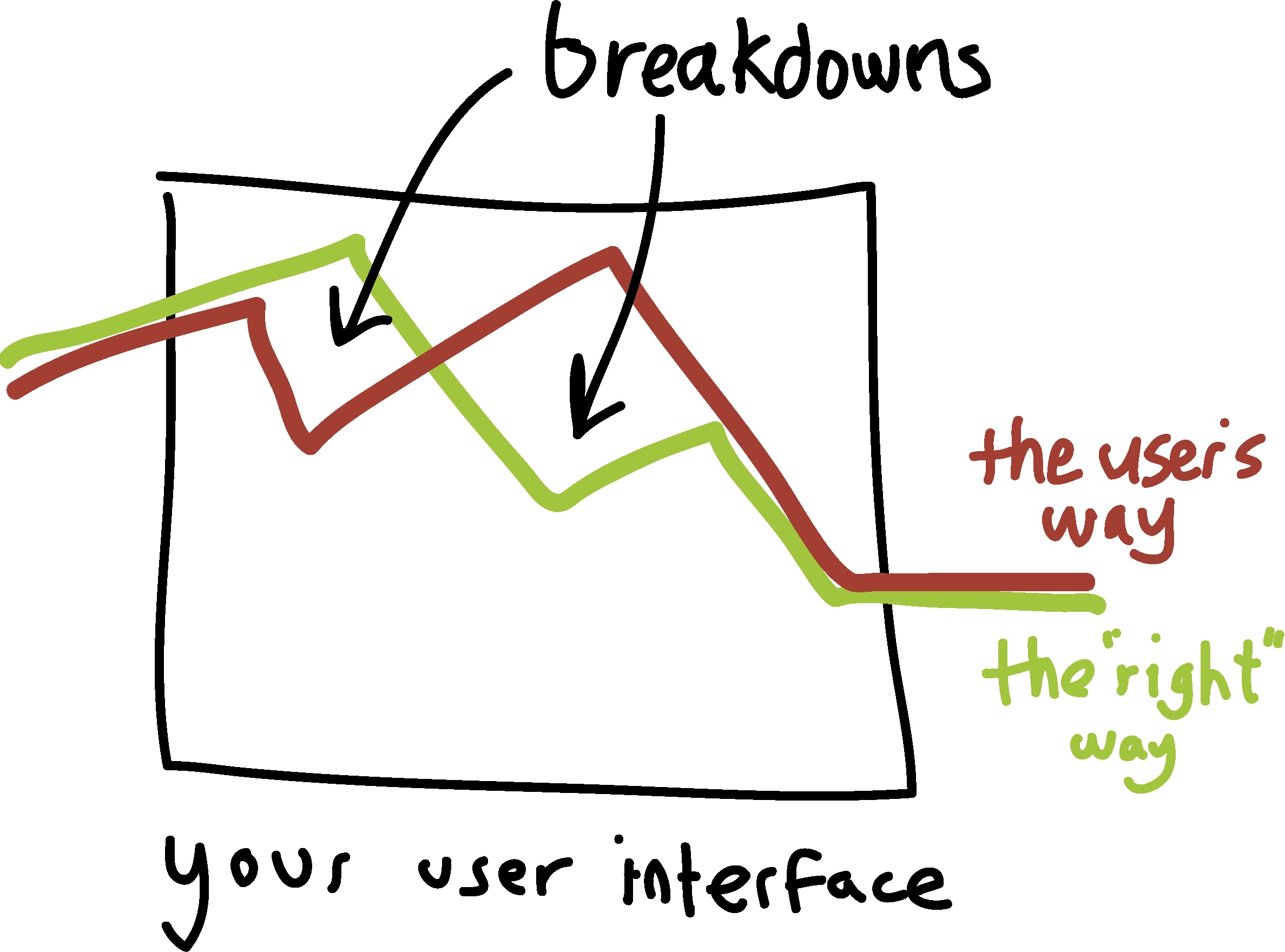
The goal of most usability tests is to discover aspects of a design that cause someone to fail at some task. We call these failures breakdowns , the idea being that someone can be following the correct sequence of steps to complete a task, but then fail to get past a crucial step. Once you’ve found the breakdowns that occur in your design, you can go back and redesign your interface to prevent breakdowns, running more usability tests after redesign to see if those breakdowns still occur. Usability tests allow the designer to observe these breakdowns in person, helping them to make highly informed interpretations of what caused them, informing redesign.
Running a usability test has a few essential steps.
First, you need to decide who is representative of the stakeholders you are designing for and then find several people to invite to participate. Who is representative depends entirely on whose problem you think you’re solving and partly on your ability to get access to people that have that problem. For example, if you are designing a course planner for students, you would want to recruit students (but what kind of students)?If your representative users are challenging to recruit, you might have to get creative. I’ve often had to walk into coffee shops and ask random strangers, or spam mailing lists to ask people to participate. You have to be a bit bold and courageous to find participants, and find ways of compensating them for their time and attention. If you’re working for a company that invests in a whole team to find people to participate in user studies, you might be able to delegate this recruiting work to them.
In addition to finding representative users, you need to define tasks for the participants to attempt to perform. Which tasks you choose depends on which tasks you think will be most important and common when people are using your solution. Good tasks define the goal you want a user to achieve with your design without giving away any of the knowledge they need to achieve the goal. If you do give away this knowledge, then it wouldn’t be a fair test of your design in the real world, because you wouldn’t have been there to help. For example, if your goal is for someone to print a document with your app by using the “print” button, your instructions can’t say “print the document”, because then the user would know that “print” is the key word to find. Instead, you might show them a printout of what you want and say, “Use this interface to make this”. The same applies if a participant asks you questions: you can’t answer them, because you wouldn’t normally be there to help. The design should do the teaching.
Once you’ve defined your tasks, try to define what path you expect them to take through your design to accomplish the goal. This way, as you are observing someone work, you can be monitoring where you expect them to go, and then note when they deviate from that path.

When a participant arrives to participate in your user study, welcome them, explain that you’re here to test the design and not them, and then explain what you’ll have them do. For example, you might have a script like this:
Today we’re interested in seeing how people use this new copier design... We’re here to test this system, not you, so anything that goes wrong is our fault, not yours. I’m going to give you some tasks to perform. I won’t be able to answer your questions during the test, because the goal is to see where people have difficulty, so we can make it easier. Do you have any questions before we begin?
To ensure the validity of the results that you get, you have to resist answering any of the questions that participants might ask unless it’s about something other than the design. It might reduce their discomfort and yours, but you won’t be there in real life and you want to see how hard the task is. Sit on your hands and close your mouth!
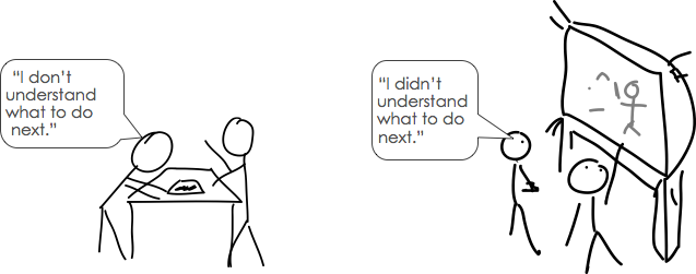
Once you conduct a test like this, and you observe several breakdowns, you may wonder why people were confused. One strategy is to ask your participants to think aloud 2 2 Ericsson, K. A., & Simon, H. A. (1980). Verbal reports as data. Psychological Review.
I need you to think aloud while working. Tell me constantly what you’re wondering about, confused about. If you stop talking, I’ll prompt you to resume talking.

If your design requires too much concentration to have someone think aloud while they’re using it (e.g., they’re playing a game), you can also record their interactions and then conduct a retrospective interview , having them reflect on the actions that they took while watching the recording. These recordings might just be the screen interactions, or they might also include the user’s context, facial expressions, or other details. Recording can also be useful for showing designers and engineers breakdowns, helping to persuade others in an organization that a design needs to be improved.
Not all think aloud is valid 3 3 Gill, A. M., & Nonnecke, B. (2012). Think aloud: effects and validity. ACM International Conference on Design of Communication (SIGDOC).
After finishing the user study, debrief with your participant, helping them to finish tasks they couldn’t complete (so they don’t feel like they failed), and reassure them that the design is still in progress, so any difficulties they experienced were your fault and not theirs. This is also a great opportunity to ask for additional feedback.
While user studies can tell you a lot about the usability problems in your interface and help you identify incremental improvements to your design, they can’t identify fundamental flaws and they can’t tell you whether your design is useful . This is because you define the tasks. If no one wants to complete those tasks in real life, or there are conditions that change the nature of those tasks in real life, your user study results will not reveal those things. The only way to find out if something would actually be used is to implement your design and give it to people to see if it offers real value (you’d know, because they wouldn’t want you to take it away).
Technology Probes and Experience Sampling
One way to assess the usefulness of your design is to situate it in a real context and watch what happens. Some designers will use a method called a technology probe 4 4 Hutchinson, H., Mackay, W., Westerlund, B., Bederson, B. B., Druin, A., Plaisant, C., ... & Roussel, N. (2003). Technology probes: inspiring design for and with families. ACM SIGCHI Conference on Human Factors in Computing (CHI).
Consolvo, S., Harrison, B., Smith, I., Chen, M. Y., Everitt, K., Froehlich, J., & Landay, J. A. (2007). Conducting in situ evaluations for and with ubiquitous computing technologies. International Journal of Human-Computer Interaction.
These situated forms of evaluation, while the most likely to lead to insights that will reflect reality, have high cost. Your design needs to be implemented and reliable enough that someone can actually use it in daily life. This means that these methods often come later in a design process, after a high fidelity, functional prototype exists.

A/B Tests
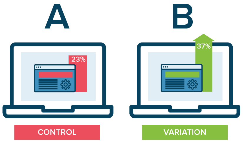
While situated evaluations like experience sampling can reveal the context in which something is used, it can be challenging to evaluate whether a design is working at scale. When an implementation is built enough to run at some scale, it is now common in industry to compare designs experimentally , giving one design to a percent of the user population and another design to the rest of the population, then measuring the difference in behavior of the two populations. Experiments like these are quite popular in industry, in which one design (usually the current design, and therefore the “control” condition) is compared to some new design (usually a new design, and therefore the “experimental” condition). You might know these by the name A/B/ tests, where the A usually represents a “control” condition and the B usually represents an “experimental” condition. A/B tests are usually deployed in online settings, and the experiment is run remotely. Experiments such as these can provide the strongest evidence of causality. For example, a designer makes the “sign up” button larger and more prominent on the webpage she is testing in her experimental condition. After running the experiment for some time, the designer looks at how many new accounts were created in the control and experimental conditions. She finds that more accounts were created in the experimental condition, leading her to believe that the increased visibility of the “sign up” button caused more users to sign up compared to the control condition.
One challenge of designing good A/B tests is ensuring that the results can be trusted. Industry is also still learning how to design good experiments 6 6 Riche, Y. (2016). A/B testing vs. User Experience Research. LinkedIn.
A major limitation of A/B tests is that because it’s difficult to come up with holistic measures of success, the results tend to be pretty narrow. Perhaps that’s okay if your definition of success is increased profit. Making more money is easy to measure. But if your definition of success is harder to measure (e.g., there’s less hate speech on your platform), A/B tests might be much harder to conduct. The ease with which A/B tests can run, and the difficulty of measuring meaningful things, can lead designers to overlook the importance of meaningful things. A good designer will resist this path of least resistance, focusing on the outcomes that matter to a design, independent of what tools make easy.
References
-
Consolvo, S., Harrison, B., Smith, I., Chen, M. Y., Everitt, K., Froehlich, J., & Landay, J. A. (2007). Conducting in situ evaluations for and with ubiquitous computing technologies. International Journal of Human-Computer Interaction.
-
Ericsson, K. A., & Simon, H. A. (1980). Verbal reports as data. Psychological Review.
-
Gill, A. M., & Nonnecke, B. (2012). Think aloud: effects and validity. ACM International Conference on Design of Communication (SIGDOC).
-
Hutchinson, H., Mackay, W., Westerlund, B., Bederson, B. B., Druin, A., Plaisant, C., ... & Roussel, N. (2003). Technology probes: inspiring design for and with families. ACM SIGCHI Conference on Human Factors in Computing (CHI).
-
Nathan, M. J., & Petrosino, A. (2003). Expert blind spot among preservice teachers. American Educational Research Journal.
-
Riche, Y. (2016). A/B testing vs. User Experience Research. LinkedIn.