Interactive Interfaces
It’s hard to imagine, but the interactive digital world we have to today only become a reality in the early 1980’s. Before that, interacting with a computer was much like we described in the previous chapter : carefully writing computer programs, one instruction at a time, and executing it to get a result. Nearly all of the things that define our modern world: the internet, social media, instant video streaming, messaging, and millions of apps, websites, and games — simply hadn’t been invited.
This is a reminder that nothing about the user interface designs we use today is fundamental or inevitable. Consider, for example, if researchers in the 1960’s had devoted their attention to making programming easier rather than inventing the graphical user interface. That alternate future might have created a world in which we were all coders rather than clickers.
What happened instead was a series of inventions by researchers tackling a foundational question: what if communicating with computers was less like carefully crafting instructions, and more like a conversation with a computer? In our first chapter on history , we talked about Ivan Sutherland’s 1962 experiments with Sketchpad , which envisioned pen-based interactions with constrained graphical objects, where a user could interactively create diagrams with tap and drag of a pen. Around the same time, Douglas Englebart began work on NLS , which envisioned an entire system of commands, file systems, mice, keyboards, and the internet. Inspired by this work, Alan Kay joined Xerox PARC in 1970, envisioning graphical objects in virtual windowed worlds in Smalltalk . All of these offered very different but converging visions for how people would engage computing interactively instead of through code, and elements of each of these systems emerged as the core components of modern graphical user interfaces.
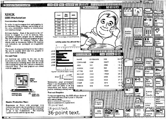
Most of these ideas came together at Xerox PARC during the design and development of the Star. Its interface, shown at the beginning of this chapter, contained all of the elements you’re familiar with today. These elements are typically referred to with the acronym WIMP , which stands for Windows , Icons , Menus , and Pointer . This paradigm, which leveraged a desktop metaphor full of files, programs, and interactive widgets such as buttons, scroll bars, toggles, and other controls, became the dominant paradigm for desktop computing. And the paradigm persists: even in the newest smartphone, tablet, and AR/VR operating systems, we still interact with windows, icons, menus and other widgets in nearly identical ways. We may use multi-touch or gesture interactions, but these are just other ways of pointing.
In this chapter, we’ll discuss each of these concepts, and the ideas that followed, describing the problems WIMP was trying to solve and that ideas emerged to solve these problems. Understanding this history and foundation will help us understand the interface innovations that have come since.
Windows
The first big idea that emerged at Xerox PARC was the concept of a window . The fundamental problem that windows solved is how to provide visual access to a potentially infinite amount of content larger than the size of a screen on a fixed size display . It’s hard to imagine a world before windows, and to appreciate how much they shape our interactions with computers today until you think about the world in terms of programming interfaces: prior to windows, the only way of seeing a computer’s output was in a long temporal log of textual output. The idea of using two dimensions to display program output, and to use pixels instead of characters, and to allow for an infinite canvas of pixels, was incomprehensible.
Part of making windows work required inventing scroll bars , which solve the problem of how to navigate an infinite canvas of content. This invention was far from straightforward. For example, in this “All the Widgets” video, you can see a wide range of alternatives for how windows and scroll bars could work:
Some were just directional, instructing the window to move up or down a content area, much like the swiping gestures we use on touchscreens today to scroll. Others used a scroll bar “knob” to control what part of a larger document the window would show, where the size of the knob was proportional to the amount of content visible in the window (this is the idea that we see in operating systems today). These many iterations eventually converged toward the scroll bars we use today, which are sized proportional to the amount of content visible, and are draggable.
Researchers have since explored many more advanced techniques for windows and scrolling, including forms of scrolling that are aware of the underlying content to support non-linear navigation paths 6 , hardware input devices such as “scroll rings” to support movement through documents 11 , and techniques for intelligently collapsing content in displays to help a user focus on the content most relevant to their task 1 . Responsive web design, in which windows lay out their content based on the size of a window, shares similar ideas to these content aware techniques, in that it aims to automatically lay out content on a screen to fit the physical dimensions of different screen sizes 9 . All of these techniques involve linking metadata about the content to the layout and navigation of that content.
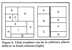
The invention of windows also required the invention of window managers . The problem here was deciding how to lay out windows on to a fixed sized display. There were countless ideas for different arrangements. The Star had windows that could be resized, dragged, and overlapped, which the Macintosh adopted, and led to the interaction designs we all use today. But early versions of Microsoft Windows had tiled windows (as shown above), which were non-overlapping grids of windows. Other variations involved “stacks” of windows, and keyboard shortcuts for flipping between them.
Of course, Windows, macOS, and Ubuntu now have many advanced window management features, allowing the user to see a zoomed out view with all active windows and move them to different virtual desktops. Modern mobile operating systems such as iOS, Android, and Windows Phone all eschewed multiple windows for a paradigm of one full-screen window at a time with navigation features for moving between full-screen applications. Researchers in the 1980’s were behind many of these innovations 12 , and researchers continue to innovate. For example, some have explored windows that are organized by tasks 18 .
Icons
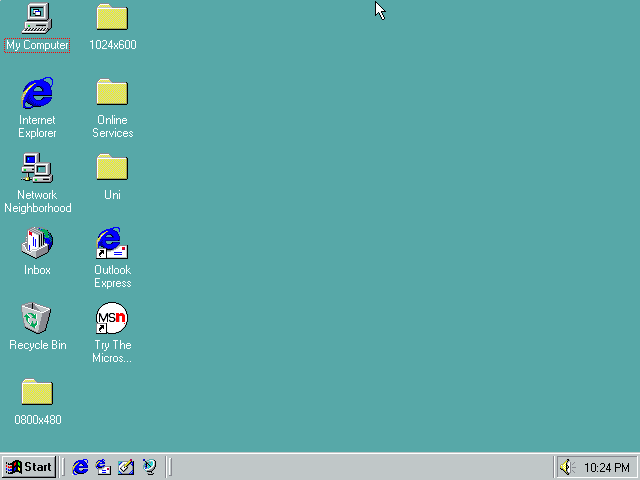
How to display infinite content was one problem; another challenge was how to represent all of the code and data stored inside of a computer’s memory. Prior to the WIMP interfaces, invisibility was the norm: to know what applications or data were available, one had to type a command to list programs and files. This forced users to have to remember these commands, but also to constantly request these listings in order to navigate and find the applications or data they needed.
The Star eliminated the burden of remembering commands and requesting listings by inventing icons . With icons, all of these operations of seeing what was available, starting a program, or opening a file were mapped to a pointing device instead of a keyboard: double-clicking on a program to launch it, double-clicking on a document to open it, and dragging an icon to change its location in a file system. This also necessitated some notion of a “desktop,” on which program and document icons would be stored, providing a convenient place to start work. Again, none of these ideas had to work this way, and in fact, newer operating systems don’t: for many years, iOS did not expose a concept of files or a desktop. Instead, there were only icons for programs, and data is presented as living only “inside” that application. Of course, there are still files stored on the device, they are just managed by the application instead of by the user. Eventually, after much demand, Apple released a Files application to make files visible.
Menus and Forms
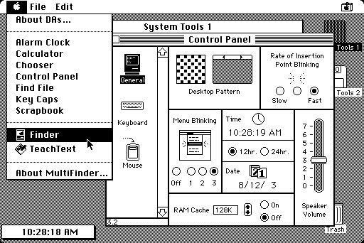
Programs have commands, which are essentially an API of functions that can be called to perform useful operations. The command lines that existed before WIMP interfaces required people to remember all of the commands available and how to property construct a command to execute them. Menus solved this problem by providing an always available visual list of commands, and forms for gathering data to execute them.
The earliest menus were simple lists of commands that could be selected with a pointing device. Some menus were attached to the border of a window, others were anchored to the top of the screen, and others still were contextual and attached to a specific icon or object representing some data, document, or program. You see all of these different types of menus in modern interfaces, with wide variation in where a menu is invoked. But all menus still behave like the original Star , and were mainstreamed with the introduction of the Macintosh, which borrowed the Star ’s design.
A key part of menu design was handling commands that required more input than a click. For example, imagine a menu item labeled “Sign in...” that signs the user into a service, asking for an email address and password. WIMP interfaces needed a way to gather that input. The Star team invented forms to solve this problem. Most forms are displayed in popup windows that solicit input from users before executing a command, though they come in many forms, such as sheets or “wizards” with multiple screens of forms.
While menus and forms don’t seem like a major opportunity for innovation, researchers have long studied more effective and efficient forms. For example, rather than linear lists of labels, researchers have explored things like hierarchical marking menus that are radial, can be moved through without clicking, and can result in a memory for pointing trajectories for rapid selection of items 19 . Other ideas have included menus that follow the mouse for quick access to contextual functionality 2 and fisheye menus that scale the size of command descriptions to fit larger numbers of commands in the same amount of space. Researchers have also explored forms that gather input from users in a floating dialog that still allows the user to interact with an application, so they can get information necessary to provide input 13 . And of course, modern voice interfaces found in smart speakers and phones are nothing more than spoken forms, which require all input to be conveyed as part of a spoken sentence.
Pointers
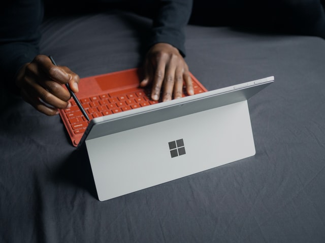
None of the core WIMP actions — moving a window, opening an application, selecting a command — are possible without the last element of WIMP, pointers . They solved a fundamental problem of interacting with a 2-dimensional display: how can a user indicate the window they want to move or resize, the icon they want to select, or the menu item they want to invoke? The key insight behind pointing is that so much about interacting with a computer requires a precise statement of what is being “discussed” in the dialog between the user and the computer. Pointers are a way of indicating the topic of discussion, just as pointing is in conversations between people.
The power of this idea becomes apparent when we consider interfaces without pointers. Consider, for example, speech interfaces. How might you tell a computer that you want to delete a file? In a speech interface, we might have to say something like “Delete the file in the folder named ‘Documents’ that has the name ‘report.txt’”, and it would be up to the computer to search for such a file, ask for clarification if there was more than one match, return an error if nothing was found, and of course, deal with any speech recognition mistakes that it made. Pointers solve all of those problems with a single elegant interaction, borrowed from human embodied interaction. We will talk about pointing in more detail in a later chapter.
Widgets
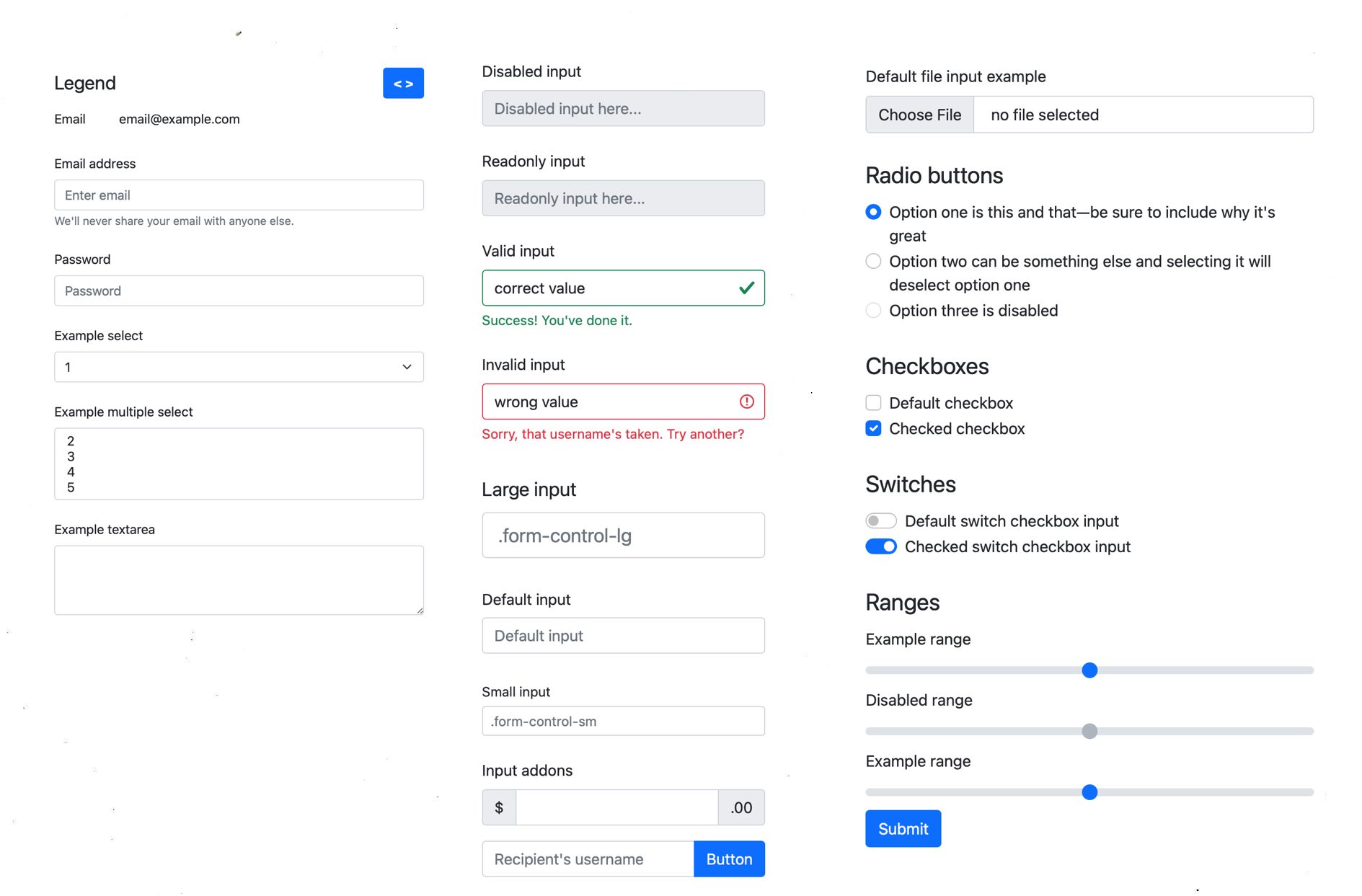
One can build entire interfaces out of windows, icons, menus, and pointers. However, application designers quickly realized that users need to do more than just open files, folders, and programs: they also need to provide input, and do so without making mistakes. Widgets are how we do this: sliders, check boxes, text boxes, radio buttons, drop down menus, and the many other controls found in graphical user interfaces are generally designed to make it possible to precisely specify an input within a certain set of constraints:
- Sliders provide a control for specifying continuous numeric values within a numeric range.
- Check boxes provide an error-free mechanism for specifying binary values (and sometimes tertiary values, which are often represented by a dash).
- Text boxes provide an interface for specifying string values, often with sophisticated error-prevention mechanisms such as form validation and user efficiency features such as auto-complete.
- Radio buttons and drop down menus provide error-preventing interfaces for specifying categorical values.
Each one of these widgets has been carefully designed to allow rapid, error-free, efficient input of each of these data types, and none were immediately obvious.
Of course, since these early widgets were invented, researchers have discovered many other types of widgets designed for data types that don’t map well onto this small set of primitive widgets. For example, some researchers have designed widgets for selecting time values on non-linear scales 8 .
Copy and paste
Another gap that the early inventors of WIMP interfaces noticed is that there was no easy way to move data between parts of WIMP interfaces. Prior to WIMP, copying information meant storing some information in a file, copying the file or concatenating its contents to another file, and then saving that file. Copy and paste brilliantly streamlined this data transfer process by simply creating a temporary storage place for data is not stored in a file.
Researchers have explored many ways to improve the power of this feature, including techniques that have greater semantic awareness of the content being copied, allowing it to be parsed and pasted in more intelligent ways 17 . Others have explored ways of moving data between different machines by giving copied data identity 15 or by synchronizing clipboards across devices 10 . Some of these features are now mainstream; for example, iOS supports a cloud synchronized clipboard that enables pasting content between different devices logged into the same iCloud account.
Direct manipulation
Throughout WIMP interfaces, there is a central notion of immediacy : one takes an action and gets a response. This idea, which we call direct manipulation 5 , is not specific to WIMP, but far more general. The essence behind direct manipulation is:
- The object of interest is always represented visually (e.g., the file you want to move is presented on a screen).
- Operating on the object involves invoking commands through physical action rather than notation (e.g., click and drag the file from the current folder to a different folder instead of writing a command line command telling the computer to move it).
- Feedback on the effect of an operation is immediately visible and is reversible (e.g., as you drag, the file moves, and if you change your mind, you can just move it back).
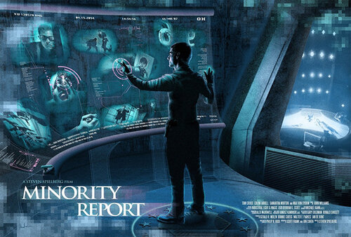
Direct manipulation interfaces, which include things like drag and drop interactions, or gesture-based interactions is in the Minority Report movie depicted above, can be learned quickly, can be efficient to use, can prevent errors. And because they are reversible, they can support rapid error recovery. Because of these benefits, many researchers have tried to translate tasks that traditionally require programming or other complex sequences of operations into direct manipulation interfaces. Early work explored things like alignment guides in drawing programs 14 , now popular in most graphic design software. Others have explored extensions of drag and drop to multiple devices, or more complex data manipulations 7 . More recently, researchers have applied techniques from programming languages and machine learning to support automatically converting sketches into scalable vector graphics suitable for the web 3 , to define the layout of data visualizations 4 , and to manipulate speech, music, and other audio more directly 16 . All of these leverage the same basic paradigm of explicit representation and manipulation of an object.
Non-WIMP interfaces
While all of the interactive interface ideas above are probably deeply familiar to you, it is important to remember that they are not natural in any way. They are entirely invented, artificial designs that solve very specific problems of presenting information to users, getting data from users, and supporting command invocation. The only reason they feel natural is because we practice using them so frequently. In designing interfaces, it’s reasonable to leverage everyone’s long history of practice with these old ideas. However, it’s also reasonable to question them when dealing with new types of data or interaction.
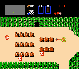
Games are the perfect example of this. They may have WIMP ideas in home screens and settings like menus and buttons, but the game play itself, and even some aspects of game menus, may avoid many aspects of WIMP. Consider for example, the lack of pointers on many video game consoles: rather than pointing to something, navigation is often by a directional pad or analog stick, giving discrete or continuous input about which trajectory a player wants to navigate in some space, but not a particular target. Or, consider the presence of non-player characters in games: the goal is not to execute commands on those characters, but interact with them for information, fight them, or perhaps even avoid them, and these behaviors are often not triggered by selecting things and invoking commands, but by pressing buttons, coming near something, or other gestures. These interfaces are still graphical, and often still have all of the features of direct manipulation, but are not WIMP in their interface metaphor.
As should be clear from the history above, nothing about graphical user interfaces is natural: every single aspect of them was invented to solve a particular problem, and could have been invented differently. One might argue, however, that humans do have relatively fixed abilities, and so some aspects of interactive interfaces were inevitable (we point to things in the physical world, so why wouldn’t we point to things in the virtual world?). Even if this is the case, it still takes hard work to invent these ways. Only after we find great designs do they become so ubiquitous that we take them for granted.
References
-
Patrick Baudisch, Xing Xie, Chong Wang, Wei-Ying Ma (2004). Collapse-to-zoom: viewing web pages on small screen devices by interactively removing irrelevant content. ACM Symposium on User Interface Software and Technology (UIST).
-
George Fitzmaurice, Azam Khan, Robert Pieké, Bill Buxton, Gordon Kurtenbach (2003). Tracking menus. ACM Symposium on User Interface Software and Technology (UIST).
-
Brian Hempel and Ravi Chugh (2016). Semi-automated SVG programming via direct manipulation. ACM Symposium on User Interface Software and Technology (UIST).
-
Thibaud Hottelier, Ras Bodik, Kimiko Ryokai (2014). Programming by manipulation for layout. ACM Symposium on User Interface Software and Technology (UIST).
-
Hutchins, E. L., Hollan, J. D.,, Norman, D. A. (1985). Direct manipulation interfaces. Human-Computer Interaction.
-
Edward W. Ishak and Steven K. Feiner (2006). Content-aware scrolling. ACM Symposium on User Interface Software and Technology (UIST).
-
Masatomo Kobayashi and Takeo Igarashi (2007). Boomerang: suspendable drag-and-drop interactions based on a throw-and-catch metaphor. ACM Symposium on User Interface Software and Technology (UIST).
-
Yuichi Koike, Atsushi Sugiura, Yoshiyuki Koseki (1997). TimeSlider: an interface to specify time point. ACM Symposium on User Interface Software and Technology (UIST).
- Ethan Marcotte. 2010. Responsive Web Design. A List Apart, No. 306
-
Robert C. Miller and Brad A. Myers (1999). Synchronizing clipboards of multiple computers. ACM Symposium on User Interface Software and Technology (UIST).
-
Tomer Moscovich and John F. Hughes (2004). Navigating documents with the virtual scroll ring. ACM Symposium on User Interface Software and Technology (UIST).
-
Myers, B. A. (1988). A taxonomy of window manager user interfaces. IEEE Computer Graphics and Applications.
-
Dennis Quan, David Huynh, David R. Karger, Robert Miller (2003). User interface continuations. ACM Symposium on User Interface Software and Technology (UIST).
-
Roope Raisamo and Kari-Jouko Räihä (1996). A new direct manipulation technique for aligning objects in drawing programs. ACM Symposium on User Interface Software and Technology (UIST).
-
Jun Rekimoto (1997). Pick-and-drop: a direct manipulation technique for multiple computer environments. ACM Symposium on User Interface Software and Technology (UIST).
-
Steve Rubin, Floraine Berthouzoz, Gautham J. Mysore, Wilmot Li, Maneesh Agrawala (2013). Content-based tools for editing audio stories. ACM Symposium on User Interface Software and Technology (UIST).
-
Jeffrey Stylos, Brad A. Myers, Andrew Faulring (2004). Citrine: providing intelligent copy-and-paste. ACM Symposium on User Interface Software and Technology (UIST).
-
Craig Tashman (2006). WindowScape: a task oriented window manager. ACM Symposium on User Interface Software and Technology (UIST).
-
Shengdong Zhao and Ravin Balakrishnan (2004). Simple vs. compound mark hierarchical marking menus. ACM Symposium on User Interface Software and Technology (UIST).