
Help
In our discussion of theory at the beginning of this book, I made the case that a precondition of using an interface is learning the interface. One way to make this learning seamless is to minimize gulfs of execution and evaluation. A good designer minimizes gulfs by understanding what people want and need to do with interfaces, and making the mapping between those things and interface actions as tight as possible. Another way that designers achieve this is by simplifying designs, so there’s simply less to learn.
Sometimes, however—let’s be honest, most of the time—the mapping from goals to action in interfaces isn’t so tight. Interfaces introduce new concepts and users have to learn them. Sometimes things go wrong, and to recover from an error, people need to acquire a more nuanced model of how the interface works. And sometimes, interfaces are just irreducibly complex, offering great power that requires instruction and practice to fully harness. And interfaces are only getting more complex: 3D printing, tangible interfaces, sensor-based interactions, new techniques for pointing and text, and the countless other new media we’ve discussed all require some learning to use successfully.
One way to support this learning is to train people. Apple Stores offer classes on how to use Apple software. Purveyors of augmented and virtual reality devices offer demos that help people acclimate to gestures and heads up displays. Community colleges offer classes on ubiquitous software programs like Microsoft Office, helping people who aren’t comfortable tinkering with interfaces to get explicit guidance on their use. YouTube is now full of millions of tutorial videos demonstrating how to use popular interfaces.
The highest ambition of interface learning, however, is for interfaces to teach themselves to people. What kinds of help interfaces can be layered on to interfaces to facilitate rapid independent learning? From tooltips to tutorials, in this chapter we’ll discuss these approaches, and speculate about the future of help.
Theories of help
There are several basic concepts in software help that are...helpful...to know about when understanding the vast range of ideas that have been explored. For instance, applications need to help with many distinct things even to just bridge gulfs of execution 7 7 Grossman, T., Fitzmaurice, G., & Attar, R. (2009). A survey of software learnability: metrics, methodologies and guidelines. ACM SIGCHI Conference on Human Factors in Computing Systems (CHI).
- Improving users’ understanding of task flow in an application
- Providing awareness of available functionality
- Helping users locate functionality
- Teaching users how to use functionality they have located
- Facilitating transitions from novice to expert user
Norman’s concept of a breakdownbreakdown: Mistakes and confusion that occur because a user’s mental model is inconsistent with an interface’s actual functionality. 12 12 Don Norman (2013). The design of everyday things: Revised and expanded edition. Basic Books.
Breakdowns are usually followed by a question. There are many types of questions, each corresponding to the help above 14 14 Sellen, A., & Nicol, A. (1995). Building User-centered on-line help. Human-Computer Interaction.
Providing answers to these questions usually requires natural language. For example, labeling a button appropriately can help a user learn what a button does or adding a header might help a learner understand the flow of interaction in an application. Choosing good words and phrases is therefore key to learnability.
There’s just one problem: research shows that there is rarely a best word or phrase. For example, consider all of the words that essentially mean “ send my data to the cloud ”: save, send, submit, upload, sync, etc. Depending on the context and functionality, all of these might be reasonable descriptions. The diversity of words suitable for describing software functionality is called the vocabulary problem 6 6 G. W. Furnas, T. K. Landauer, L. M. Gomez, S. T. Dumais (1987). The vocabulary problem in human-system communication. Commun. ACM 30, 11 (November 1987), 964-971.
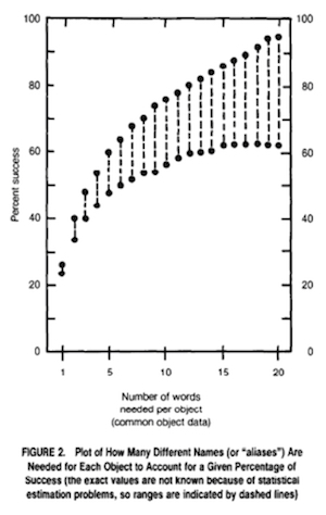
This trend of high variability of expected words suggests that any one word is rarely going to be sufficient for learning. Therefore interfaces will have to do a lot more than just label or index functionality with just one phrase. For example, they may need to index documentation with multiple different descriptions of the same content. They might also have to teach terminology to people so that they know how to find relevant functionality.
Tutorials
One of the most straightforward ways of offering help is to directly teach an interface to new users. This can include onboarding experiences that explain key features, explain how to navigate an interface, and show how to ask for futher help. In principle, this might seem like the most effective way to prevent future help needs. But in practice, most users are goal-oriented, and view onboarding tutorials as a distraction from whatever goal they are trying to complete. Rosson and Carroll 13 13 Rosson, M. B., & Carroll, J. M. (1987). Paradox of the active user. Interfacing thought: Cognitive aspects of human-computer interaction.
Searching for help
Perhaps the earliest form of interface help was to write documentation and provide an interface for browsing it. This approach involves titled articles, help topics, or question and answer pairs. In modern technical support platforms, you might find them called knowledge bases or technical support . These platforms vary in whether the designer authors the content or whether the content is crowdsourced from users of the software. For example, a typical support knowledge base might be entirely written by technical writers working for the company that created the software. In contrast, large companies might instead (or in addition to) create question and answer forums in which users ask and answer questions.
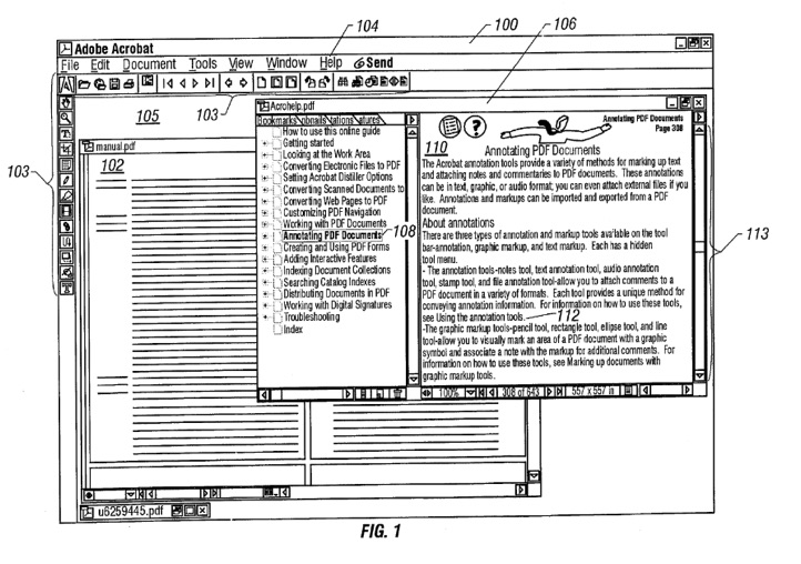
While the content that these media contain can often provide assistance for many of the breakdowns a user might have, they have many limitations:
- They require users to leave the interface they are learning and interact with a separate help interface.
- They require a user to express a query or browse, requiring them to know the right terminology to find help. This imposes the vocabulary problem described earlier.
- The answer may not have been written yet.
- With user-generated content, answers may be wrong or out of date.
Some research has tried to tackle these problems by providing more sophisticated representations of help content. For example, the Answer Garden system 1 1 Mark S. Ackerman (1998). Augmenting organizational memory: a field study of Answer Garden. ACM Transactions on Information Systems.
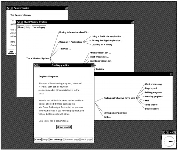
Mark S. Ackerman (1998). Augmenting organizational memory: a field study of Answer Garden. ACM Transactions on Information Systems.
Other approaches focused on contextualizing help in the form of tooltips, providing documents where the user was having trouble rather than requiring them to navigate elsewhere to find an answer. Balloon help, for example, first appeared on Macintosh System 7 , and is now ubiquitous in the form of tooltips:
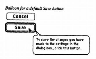
Tooltips can help with simple tasks, but failed to support long, complex procedures, and rely heavily on designers to anticipate help needs, since they are written at design time 5 5 David K. Farkas (1993). The role of balloon help. SIGDOC Asterisk J. Comput. Doc. 17, 2 (May 1993), 3-19.
My lab worked on a variation on contextual help that tried to address the problem of static tooltip content. Instead of attaching fixed content to an element, the Lemonaid system (seen below) allowed users to click on an arbitrary element in a user interface to identify the subject of help 4 4 Parmit K. Chilana, Amy J. Ko, Jacob O. Wobbrock (2012). LemonAid: selection-based crowdsourced contextual help for web applications. ACM SIGCHI Conference on Human Factors in Computing Systems (CHI).

Parmit K. Chilana, Amy J. Ko, Jacob O. Wobbrock (2012). LemonAid: selection-based crowdsourced contextual help for web applications. ACM SIGCHI Conference on Human Factors in Computing Systems (CHI).
In a rare effort to directly commercialize a help system, my collaborators and I co-founded a company called AnswerDash based on this idea. As with any commercialization effort, our product evolved well beyond the initial idea, incorporating page-specific popular questions and other crowdsourced help features. AnswerDash joined a much broader ecosystem of services built on older ideas, such as knowledge bases, tooltip, and tutorials. You can see some of AnswerDash’s interactive features in this promotional video:
While many newer products have begun to explore the use of digital voice assistants to provide help, they are not essentially different from all of the help retrieval systems above. The only difference is that rather than a person typing a query to a system, they speak it. That query then gets evaluated using all of the same retrieval mechanisms that have existed over the past several decades, relying on content written by technical writers or other users with answers.
Recommending help
Whereas the systems in the previous section required the user to proactively seek help, there have been several attempts to automatically detect when a user needs help. For example, many rudimentary techniques in help chat clients on the web use simple rules, such as “if the user takes no action on a page for 1 minute, offer to chat”. Another basic example is simply providing explanations of how to use a feature in the interface itself, rather than waiting for a user to seek help.
More intelligent techniques monitor activity more systematically, trying to build a more precise model of what a user needs, so it only helps when necessary. For example, the Lumiere system attempted to infer user goals from a history of their actions 8 8 Eric Horvitz, Jack Breese, David Heckerman, David Hovel, Koos Rommelse (1998). The Lumière project: Bayesian user modeling for inferring the goals and needs of software users. Conference on Uncertainty in Artificial Intelligence (UAI).

Eric Horvitz, Jack Breese, David Heckerman, David Hovel, Koos Rommelse (1998). The Lumière project: Bayesian user modeling for inferring the goals and needs of software users. Conference on Uncertainty in Artificial Intelligence (UAI).
This research was the inspiration for the much-derided Microsoft Clippy , which tried to help in the same way, but did not use any of the sophisticated prediction techniques. This use of inferior rule-based predictions resulted in Clippy interrupting at unwanted times, offering unwanted help.
Another potentially useful signal of a need for help is when users undo or erase actions they have just performed. One project showed that these events can indicate confusion about how to use a feature, where 90% of the undo and erase episodes indicated severe breakdowns in users’ ability to progress on a task 2 2 David Akers, Matthew Simpson, Robin Jeffries, Terry Winograd (2009). Undo and erase events as indicators of usability problems. ACM SIGCHI Conference on Human Factors in Computing Systems (CHI).
Another approach is targeting proactive help was to classify users by their expertise. For example, one system tracked low-level mouse movements and menu navigation behaviors and found they are strong indicators of application expertise 9 9 Amy Hurst, Scott E. Hudson, Jennifer Mankoff (2007). Dynamic detection of novice vs. skilled use without a task model. ACM SIGCHI Conference on Human Factors in Computing Systems (CHI).
Not all techniques for offering help proactively interrupt. For example, the CommunityCommands system embedded data about feature usage in the interface, passively suggesting to users what features they might find useful based on a user’s prior usage history 10 10 Wei Li, Justin Matejka, Tovi Grossman, Joseph A. Konstan, George Fitzmaurice (2011). Design and evaluation of a command recommendation system for software applications. ACM Transactions on Computer-Human Interaction.
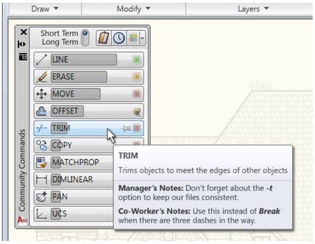
Wei Li, Justin Matejka, Tovi Grossman, Joseph A. Konstan, George Fitzmaurice (2011). Design and evaluation of a command recommendation system for software applications. ACM Transactions on Computer-Human Interaction.
Generating answers
While all of the systems above are ultimately driven by content written by humans, some systems assist in streamlining help content generation or generating help content automatically. For example, the MixT system allowed a content author to simply demonstrate an interaction with an application to quickly generate an interactive step-by-step tutorial superior to a screen recording 3 3 Pei-Yu Chi, Sally Ahn, Amanda Ren, Mira Dontcheva, Wilmot Li, Björn Hartmann (2012). MixT: automatic generation of step-by-step mixed media tutorials. ACM Symposium on User Interface Software and Technology (UIST).

Pei-Yu Chi, Sally Ahn, Amanda Ren, Mira Dontcheva, Wilmot Li, Björn Hartmann (2012). MixT: automatic generation of step-by-step mixed media tutorials. ACM Symposium on User Interface Software and Technology (UIST).
The Crystal system, which I helped invent, created fully automated help content on demand 11 11 Brad A. Myers, David A. Weitzman, Amy J. Ko, Duen H. Chau (2006). Answering why and why not questions in user interfaces. ACM SIGCHI Conference on Human Factors in Computing Systems (CHI).
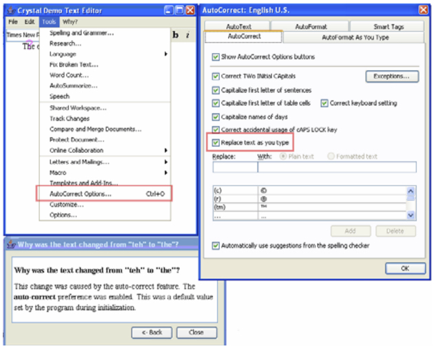
While these attempts to generate help automatically can be quite powerful when they work, they are limited. It’s not yet possible to generate answers to any question, for example. And it’s not clear the answers generated are always comprehensible to people. There needs to be significantly more research on these before they are likely to reach widespread use.
Despite the diversity of help interfaces that try to enable interfaces to teach themselves, there’s still a lingering question about whether just how good a help interface can be. Will the gold standard always be having another person—a teacher, essentially—to explain how an interface works? Or is this moot, because there are never enough people with the right expertise at the right time? Or is it possible to just design interfaces that are so learnable, separate help interfaces won’t be necessary?
I suspect that interfaces will always require help systems. They are too artificial and change too much to ever eliminate the need for learning and that means that something or someone will have to do the teaching. If anything, it’s people that will adapt, becoming more accustomed to the constant learning necessary to use new interfaces.
And yet, help has never been more necessary. With the rapid expansion of new interface modalities, new types of sensor-based input, and new experiences being designed around these platforms, explicitly teaching how to use interfaces is becoming a central challenge. Industry has yet to place this teaching at the center of its design processes, instead still viewing as restricted to unboxing or later technical support.
Unfortunately, while research has produced many compelling ideas that advance beyond the basic documentation and tooltips of the 1990’s, there has been little uptake of these ideas in industry. Some of this is due to business models — if a customer pays upfront, or a user is forced to use software licensed by an IT department, there’s little incentive to polish the long term learning experience, as the company will get paid either way. The shift to direct-to-consumer subscription services may better align these incentives, leading companies to focus on improving usability and documentation in order to retain customers long term.
References
-
Mark S. Ackerman (1998). Augmenting organizational memory: a field study of Answer Garden. ACM Transactions on Information Systems.
-
David Akers, Matthew Simpson, Robin Jeffries, Terry Winograd (2009). Undo and erase events as indicators of usability problems. ACM SIGCHI Conference on Human Factors in Computing Systems (CHI).
-
Pei-Yu Chi, Sally Ahn, Amanda Ren, Mira Dontcheva, Wilmot Li, Björn Hartmann (2012). MixT: automatic generation of step-by-step mixed media tutorials. ACM Symposium on User Interface Software and Technology (UIST).
-
Parmit K. Chilana, Amy J. Ko, Jacob O. Wobbrock (2012). LemonAid: selection-based crowdsourced contextual help for web applications. ACM SIGCHI Conference on Human Factors in Computing Systems (CHI).
-
David K. Farkas (1993). The role of balloon help. SIGDOC Asterisk J. Comput. Doc. 17, 2 (May 1993), 3-19.
-
G. W. Furnas, T. K. Landauer, L. M. Gomez, S. T. Dumais (1987). The vocabulary problem in human-system communication. Commun. ACM 30, 11 (November 1987), 964-971.
-
Grossman, T., Fitzmaurice, G., & Attar, R. (2009). A survey of software learnability: metrics, methodologies and guidelines. ACM SIGCHI Conference on Human Factors in Computing Systems (CHI).
-
Eric Horvitz, Jack Breese, David Heckerman, David Hovel, Koos Rommelse (1998). The Lumière project: Bayesian user modeling for inferring the goals and needs of software users. Conference on Uncertainty in Artificial Intelligence (UAI).
-
Amy Hurst, Scott E. Hudson, Jennifer Mankoff (2007). Dynamic detection of novice vs. skilled use without a task model. ACM SIGCHI Conference on Human Factors in Computing Systems (CHI).
-
Wei Li, Justin Matejka, Tovi Grossman, Joseph A. Konstan, George Fitzmaurice (2011). Design and evaluation of a command recommendation system for software applications. ACM Transactions on Computer-Human Interaction.
-
Brad A. Myers, David A. Weitzman, Amy J. Ko, Duen H. Chau (2006). Answering why and why not questions in user interfaces. ACM SIGCHI Conference on Human Factors in Computing Systems (CHI).
-
Don Norman (2013). The design of everyday things: Revised and expanded edition. Basic Books.
-
Rosson, M. B., & Carroll, J. M. (1987). Paradox of the active user. Interfacing thought: Cognitive aspects of human-computer interaction.
-
Sellen, A., & Nicol, A. (1995). Building User-centered on-line help. Human-Computer Interaction.