|
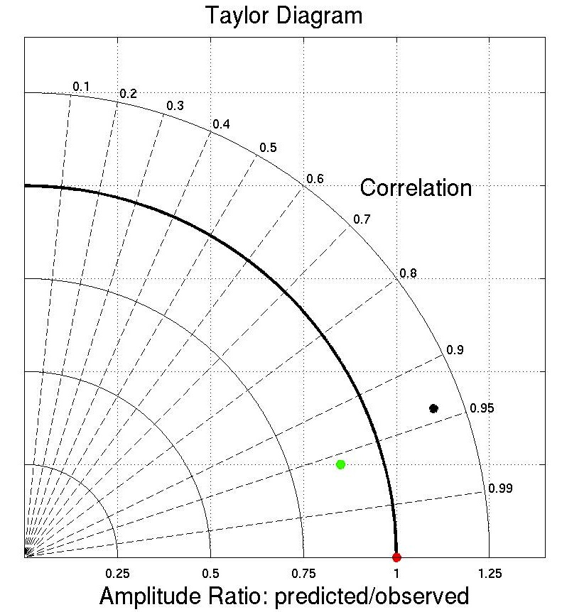
Taylor Diagram
To compare a time series with observations ("truth") we
use a Taylor diagram (2001), which includes the correlation
and the typical magnitude of anomalies relative to "truth."
The mean is first removed from each time series. The Taylor
diagram is a plot in polar coordinates where the angle
represents correlation r, given by theta = cos-1
r, and the standard deviation of the anomalies relative to
the standard deviation of "truth" is the radius R. In the
Taylor diagram the normalized error of the time series is
the distance of the colored dot to the red dot (perfect
result) on the x-axis. The time series corresponding to the
green dot has a correlation greater than 0.95. The anomaly
magnitudes are smaller than those of the data ("truth") so
the dot is inside the R=1 circle. A second time series,
corresponding to the black dot has a lower correlation and
larger magnitudes than "truth." The first time series has a
smaller normalized error, that is, the green dot is closer
to the red dot than is the black dot. |