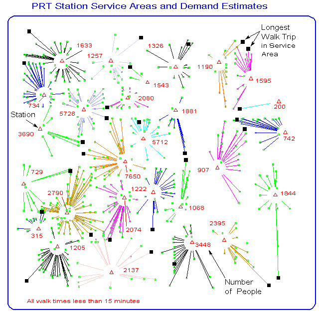
This display shows the locations of the people who are most likely to use each of the stations in the design. Straight lines are drawn from each demand location to the nearest (in walk time) PRT station. It is assumed that people will, more often than not, walk to the nearest PRT station to gain access to the system. The longest walk trip in each service area is shown with a square symbol. The total number of people in each service area is also shown. Note that one stations (upper left) has only one source of demand and is likely to be underloaded in 2005. In such a case, the design should be modified to delete or move this station to see if a performance improvement would result.
Return to the Bellevue PRT Study home page
Updated: April 15, 1996