Quasar Structure Function
The primary way to study Quasars is not to look at individual targets like in our previous exercises, but to look at huge datasets containing many different quasars and compare how each changes over time. The goal of this project is to take a large amount of quasar observations from SDSS and develop the Structure Function for our observations. Our data file will have over 17000 Quasars with 2 observations each. The datafile can be found here:
Structure Function Data File
Once again we need to use our favorite plotting program. The format for the datafile is shown below, with the later fields repeating for the second observation:
| Field (Column) | Format | Units | Label | Explanations |
|---|---|---|---|---|
| 1 | I5 | --- | SDR5ID | Row of Schneider catalog (out of 77429) corresponding to that QSO |
| 2 | F7.3 | mag | M_i | Absolute i band magnitude (same as "iMag" in master file) (9) |
| 3 | F6.4 | --- | redshift | Redshift |
| 4 | F6.3 | mag | A_u | Galactic absorption in u band (3) |
| 5 | I2 | --- | T_FFlag | FIRST target flag (16) |
| 6 | I2 | --- | T_RFlag | ROSAT target flag (16) |
| 7 | F6.3 | mag | FIRST | FIRST Peak flux density (AB mag) at 20 cm (same as "20mag" in master file)(4) |
| 8 | F7.3 | --- | SN_FIRST | The S/N ratio for FIRST flux |
| 9 | F7.3 | [ct/s] | logX | log of RASS BSC/FSC full band count rate (7) |
| 10 | F6.3 | --- | SN_X | The S/N ratio for RASS count rate |
| 11 | F9.3 | days | MJD_R | Modified Julian Date of r band observation |
| 12 | F6.3 | mag | u_PSF | SDSS BEST u band PSF magnitude (2) |
| 13 | F5.3 | mag | u_err | Error in B-umag |
| 14 | F6.3 | mag | g_PSF | SDSS BEST g band PSF magnitude (2) |
| 15 | F5.3 | mag | g_err | Error in B-gmag |
| 16 | F6.3 | mag | r_PSF | SDSS BEST r band PSF magnitude (2) |
| 17 | F5.3 | mag | r_err | Error in B-rmag |
| 18 | F6.3 | mag | i_PSF | SDSS BEST i band PSF magnitude (2) |
| 19 | F5.3 | mag | i_err | Error in B-imag |
| 20 | F6.3 | mag | z_PSF | SDSS BEST z band PSF magnitude (2) |
| 21 | F5.3 | mag | z_err | Error in B-zmag |
| ... Fields 11 through 21 repeated as necessary ... | ||||
Another thing to note is that this data is not corrected for extinction like previous data sets. The formula to correct for the extinction can be found here . For IDL users, my readcol looks like this- as you can see it is more complicated than before due to the size of the dataset:
readcol,'dm_2obs.dat',$ f='X,D,D,D,X,X,X,X,X,X,D,D,D,D,D,D,D,D,D,D,D,D,D,D,D,D,D,D,D,D,D,D',$ absi,redshift,A_u,$ mjd1,u1,erru1,g1,errg1,r1,errr1,i1,erri1,z1,errz1,mjd2,u2,erru2,g2,errg2,r2,errr2,i2,erri2,z2,errz2
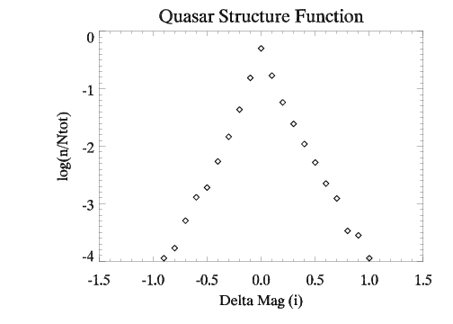
The Structure Function seeks to explain the magnitude differences between observations for a large number of quasars. It uses the variance as a measure of the distrubtion of magnitude changes throughout the sample. Most plotting programs have functions to calculate the variance for you, so this shouldn't be too difficult. The first plot to make to aid in creating the Structure Function is a plot of simply the magnitude difference between observations versus the total number of quasars in that magnitude range. This will allow us to see whether the distribution of magnitudes is gaussian, exponential, or some other function, and a rough idea of what the spread of our data set looks like. The X axis should be the difference in magnitude between observations. The Y axis should be the logarithm of the number of quasars in that magnitude range over the total number of quasars in the sample. The plot is shown below:

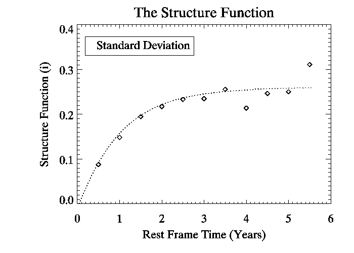
Now we want to do the same thing as above, but calculate the variance of the distribution and break our data set up based on the time difference of the observations. Remember we must account for redshift when dealing with the time difference of our observations, so don't forget to use equation 2 from the background page on redshift to correct the time scale. I broke up our dataset into half-year time blocks and did the same thing as I did for the previous plot, but this time only recorded the variance and standard deviation of the distribution. After doing this for our entire data set and simply plotting versus time, we get a plot like the following:

This is the Structure Function. As we can see the variance and standard deviation start low, and gradually increase until a plateau, with the trend showing a rough maximum standard deviation in magnitude of 0.27. The fit for the standard deviation follows an exponential, with the following form:

Here, X1 is the amplitude of the variability, X2 is the time scale of the variation, and X3 is a fitting factor to account for the possibility of more than 1 time scale. X1 should be around the magnitude of the greatest variation (within 0.1), while X2 is on the order of 1 year for the time scale of variation. X3 was found to be around 0.55. This value of X3 means that the results are unlikely to be explained by a single time scale and there are probably many at work.